2018
Biennale of Sydney
Identity, Print, Digital, Environmental
A fluid and kinetic brand identity for a celebrated art event.
Landing page for the Biennale of Sydney website.
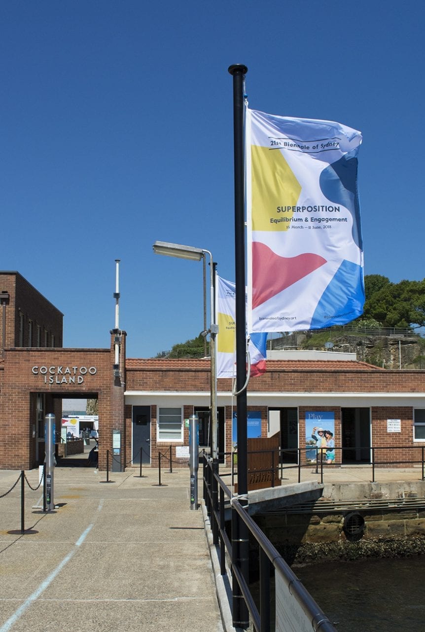
Flags featuring the branding for the Biennale of Sydney greet visitors as they arrive at the series of exhibitions installed on Cockatoo Island.
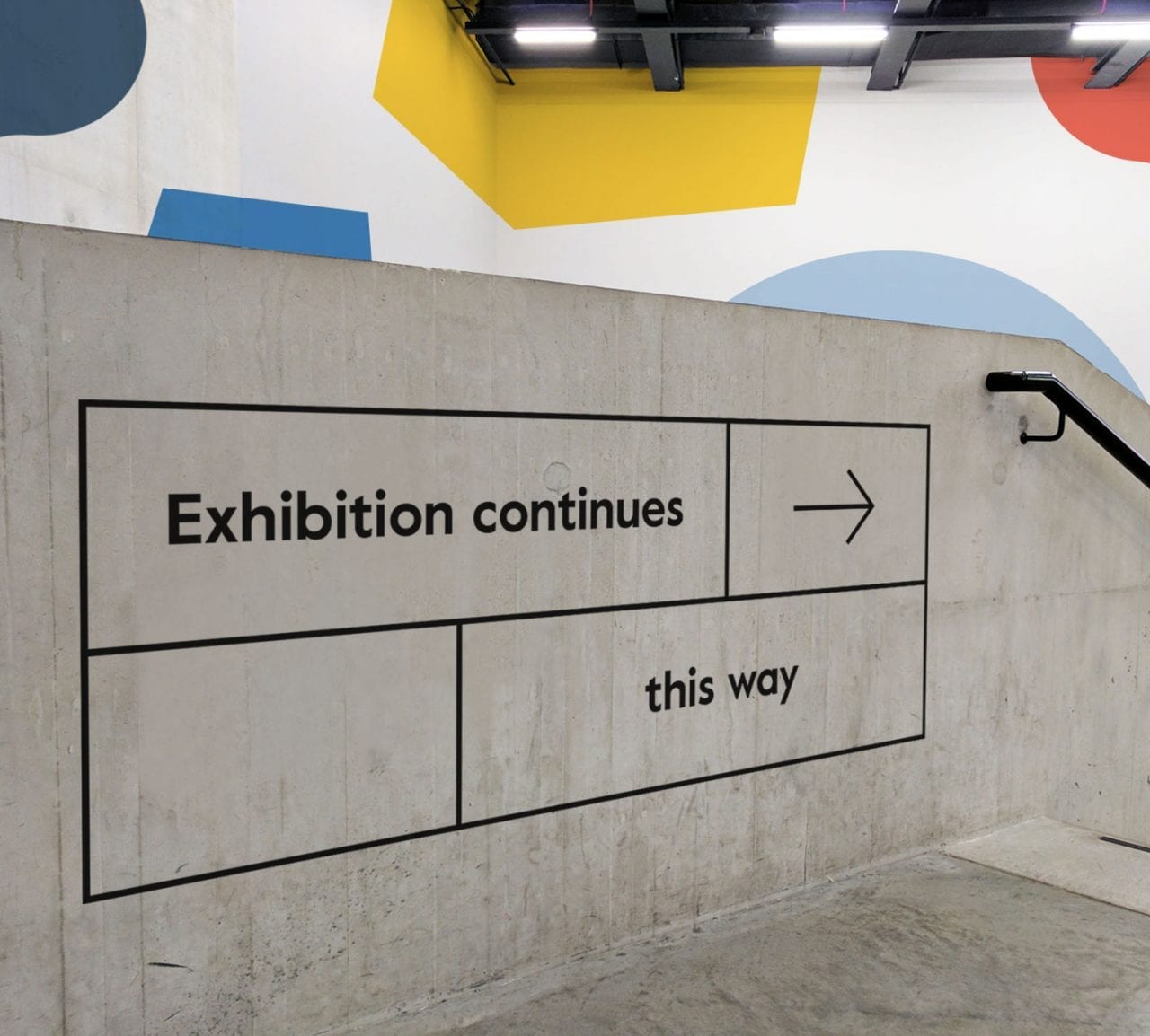
Wayfinding for the Biennale at the Museum of Contemporary Art in Sydney.
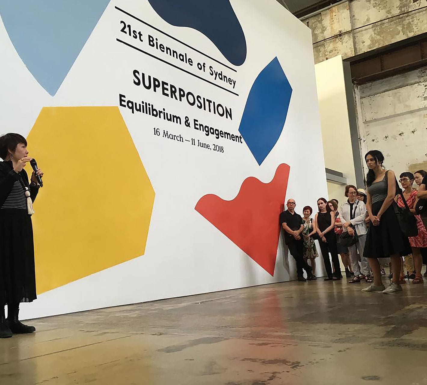
Supergraphics at the Museum of Contemporary Art in Sydney.
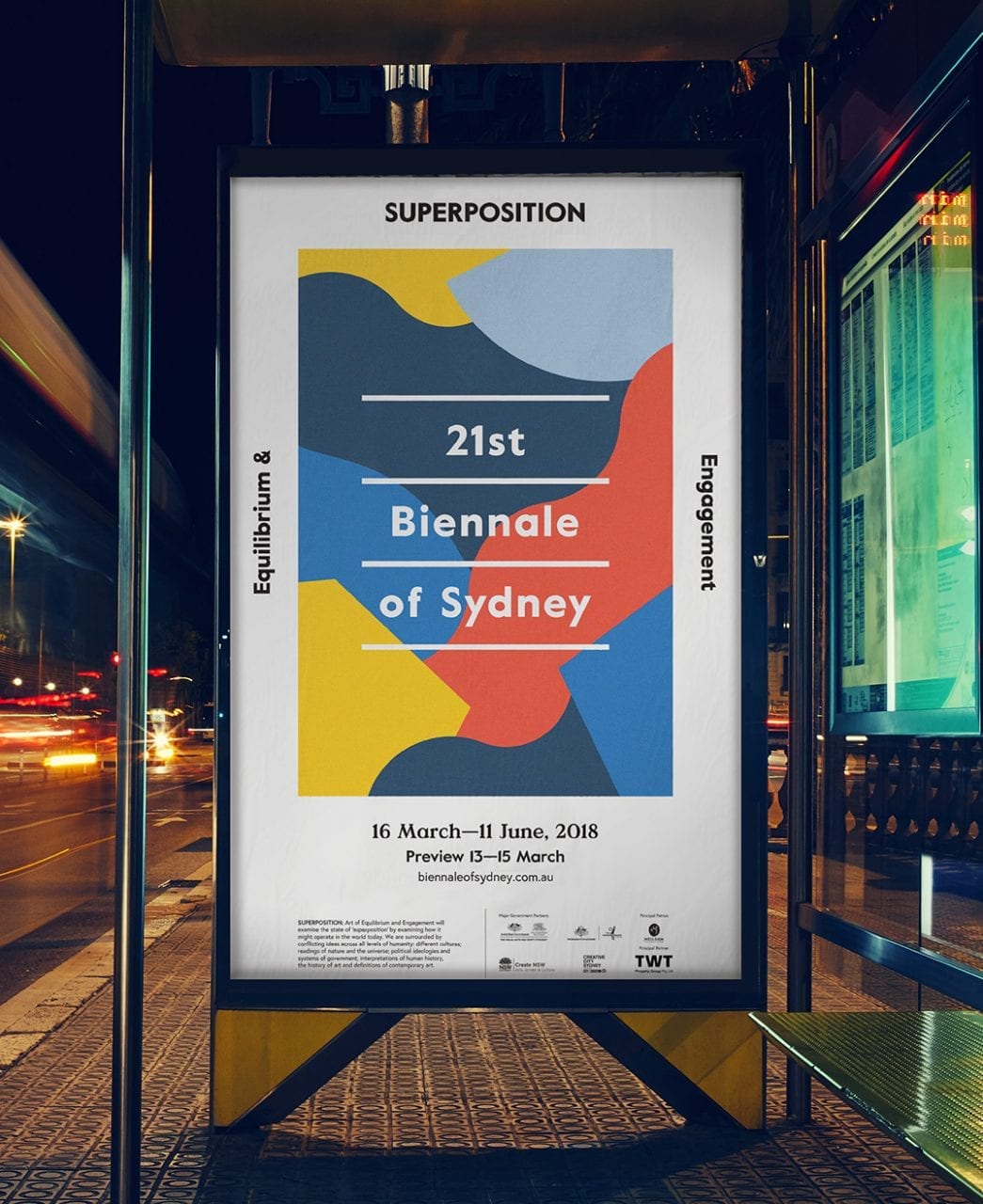
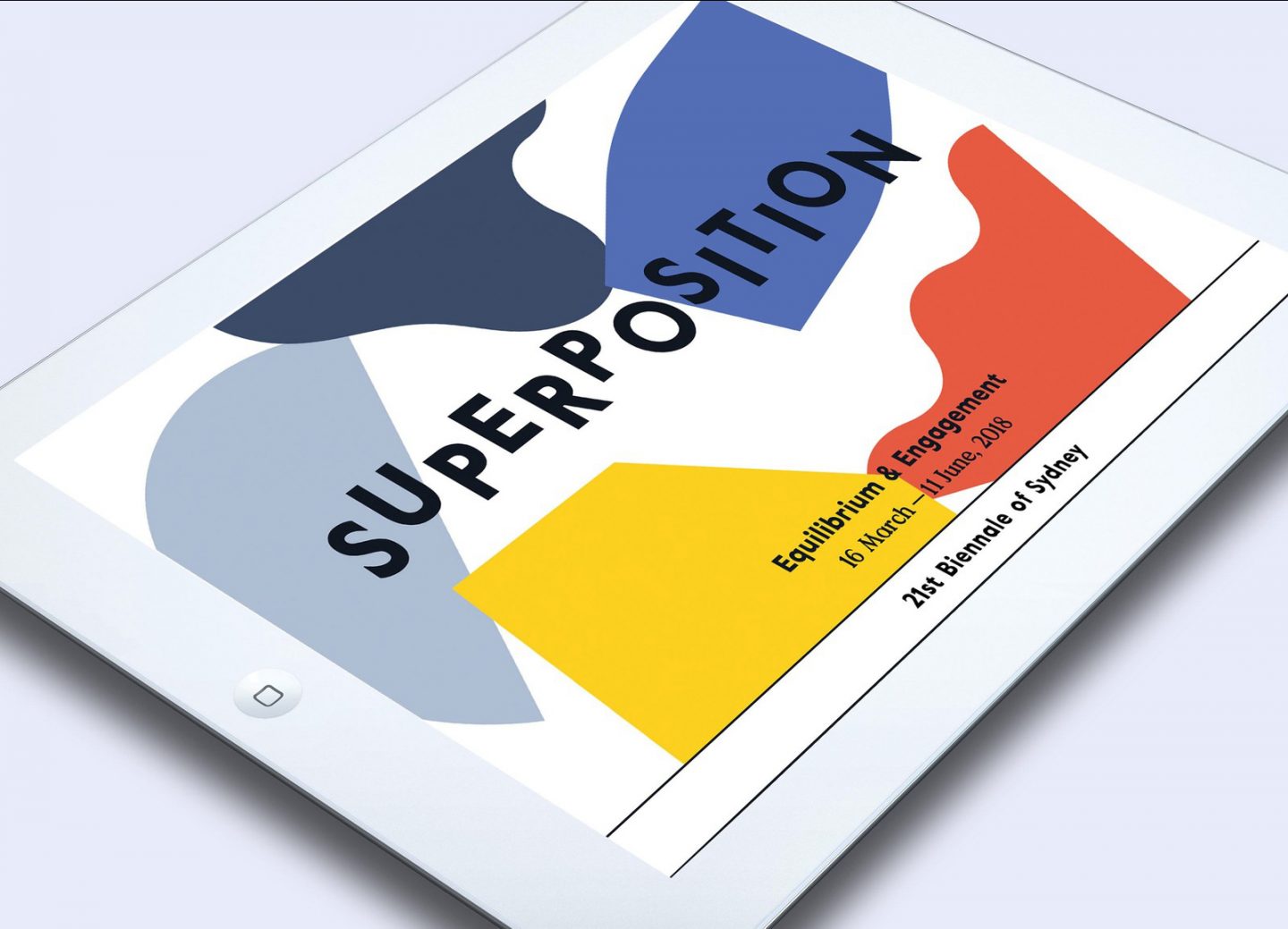
Exhibition poster for the Biennale of Sydney.
Overview
Held every two years, the Biennale of Sydney is a three-month-long exhibition accompanied by a program of artist talks, forums, guided tours and special events, nearly all of which are free to the public.
Under the direction of renowned curator Mami Kataoka, the guiding theme of the 21st biennale was a synthesis of multiple ideas. The subtitle “Superposition: Equilibrium & Engagement” references a theory from quantum physics in which all states of being exist simultaneously in equilibrium. The ancient Chinese philosophy of Wu Xing and its cycle of creation was another core concept of the biennale.
The identity system had to both illustrate these abstract curatorial themes and make them accessible to a wide public audience. I achieved this by creating a series of graphic forms which incorporate movement and sequence to convey the ideas of transformation and cyclicality. Within the various layouts and applications, the components of the identity—type, form, and color— are fluid and ever changing.
The biennale exhibits across seven venues in Sydney over the course of two months, as such, the identity system needed to be flexible enough to accommodate an ever–evolving variety of environmental, print and digital applications, whether they be flags, gifs, t–shirts, brochures, billboards, or museum vinyl.