01/11/2022
Marketing, Media, and Modernism
Modernism becomes the face of global capitalism in the post‑war era
Our guiding principle was that design is neither an intellectual nor a material affair, but simply an integral part of the stuff of life, necessary for everyone in a civilized society.Walter Gropius
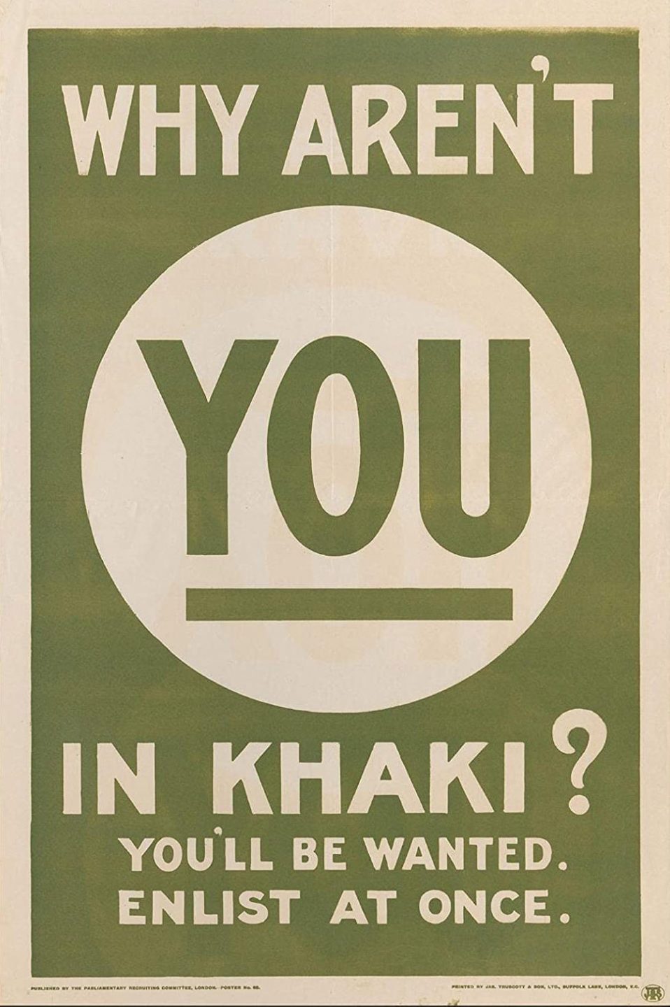
World War 1 British recruitment poster, 1915.
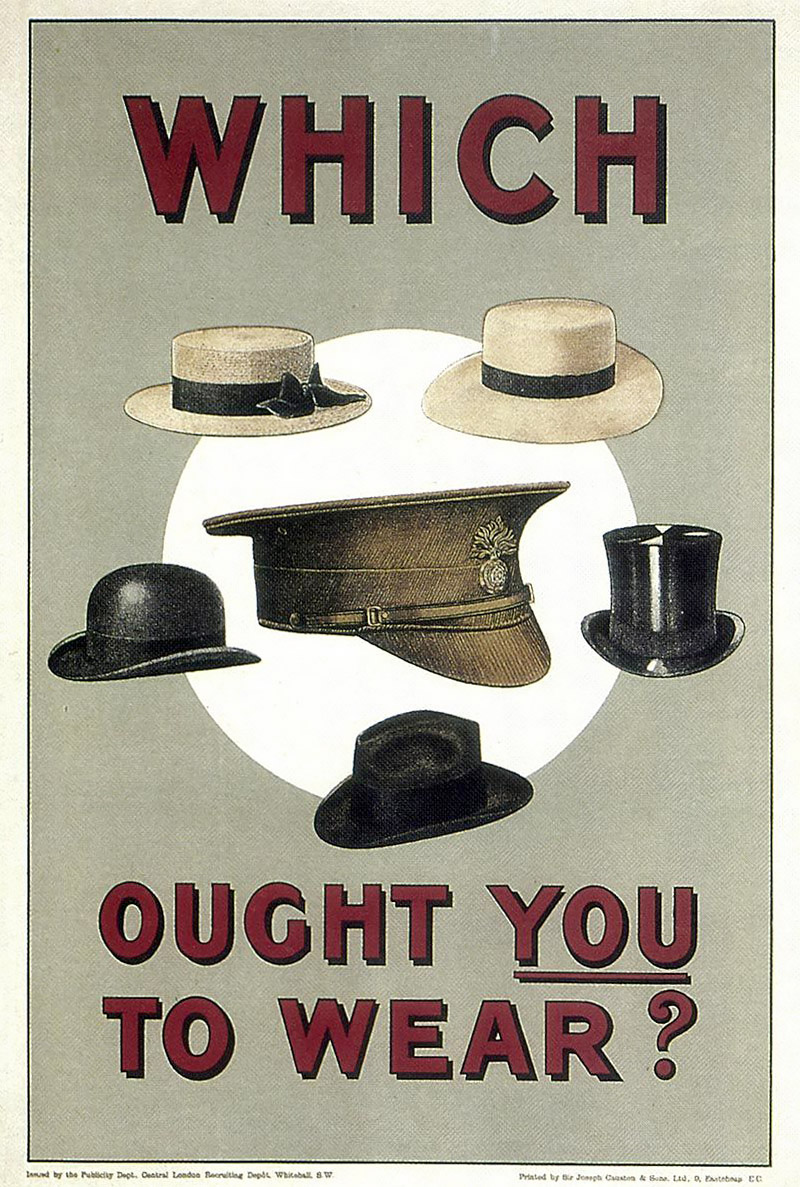
World War 1 British recruitment poster, 1915.
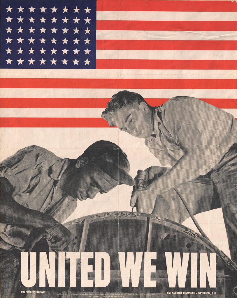
US government poster from the Office for the War Manpower Commission, 1943.
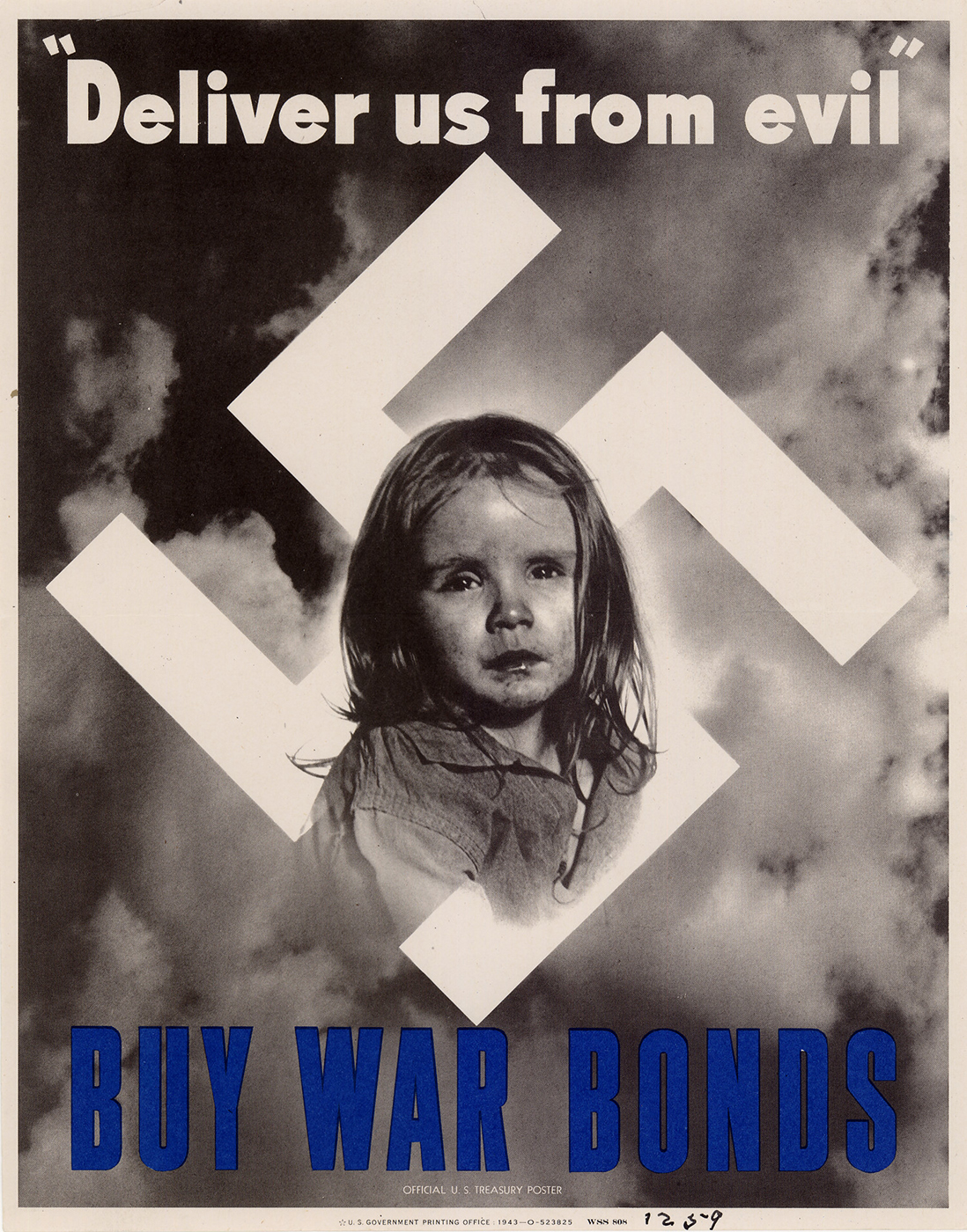
US war bonds poster, Harriet Nadeau, 1943.
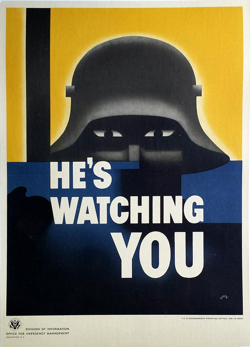
US war poster for the Office of Emergency Management, Glenn Grohe, 1942.
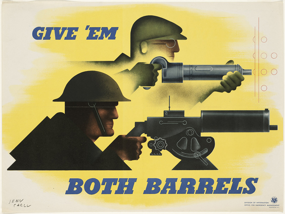
US war poster for the Office of Emergency Management, Jean Carlu, 1941.
What is Modernism?
Before surveying the impact of modernism in design, let’s first clarify just what the term modernism actually means.
Modernism, in the broad historical sense, is a cultural shift that first began in the late 19th and early 20th centuries as a response to huge transformations that were taking place throughout the world at that time. Industrialization, urbanization, the presence of colonialism, the rise of capitalism, and countless global conflicts resulted in a massive reshaping of economic systems, social structures, and life experiences —particularly within western countries. Modernism emerged within all industries and professions. At its core, it was about creating new forms, ideas, and behaviors to match a new world. Modernism represents a move away from tradition in favor of abstraction, progress, science, rationality, and capitalist interests.
To make things even more complicated the term modernism is also used to refer to a distinct style of design that connects to a specific time period and a particular set of cultural contributions. Within the field of visual communication, modernism crystallized into an established methodology in the early to mid-20th century within academic curriculums—first in Germany and then in Switzerland. As modernism progressed, more and more designers began to embrace its principles —clarity, legibility, organization, and universality. Sans-serif typefaces, grids, and minimalist layouts became the tools of a new visual language. The goal was not decoration, but communication — information stripped down to its essentials. At the same time, modernism projected the “look of the new”: bright colors, bold geometry, and stylized imagery that conveyed modern life as sleek, progressive, and forward-looking. These elements proved irresistible to advertisers who needed to capture, direct, and hold the consumer’s gaze.
After World War II, modernism expanded beyond the studio to become the visual infrastructure of mass media and marketing. Corporations, governments, and international organizations needed systems that were consistent, recognizable, and global. Designers like Paul Rand, Otl Aicher, and Massimo Vignelli developed corporate identity programs that applied modernist principles of order and clarity to logos, branding, and advertising — wrapping rational systems of communication in a striking visual language that expressed the zeitgeist of the moment.
Modernist design became a counterpart to the rise of consumer culture and corporate power. Its neutrality and efficiency gave corporations an image of trust, progress, and rationality. But its visual intensity — the bold shapes, stark contrasts, and graphic immediacy — also worked in step with marketing strategies designed to stimulate attention and desire.
How Did Modernism Take Over the World?
To understand why the language of modernism spread so rapidly after the second World War, we must consider the mindset of populations that had, over a span of 35 years, experienced the two most devastating conflicts in human history. Destruction and loss occurred on an unprecedented scale. The trauma, grief, and displacement generated by these events forever changed human consciousness and ultimately reshaped the social, political, and economic structure of the world.
Both World Wars developed within climates of extreme nationalism, mistrust, and political polarization. Within this turbulent atmosphere, sophisticated campaigns of propaganda were administered to persuade citizens to support and participate in military action. Millions of lives were sacrificed; countless cities were decimated—all for the sake of dominance, power, and retribution.
In the wake of World War 2, people sought to distance themselves from wartime strife. Cities were rebuilt, casualties were mourned, and the wounded were rehabilitated. Citizens moved forward with their lives and concentrated on putting the past behind them. There was a focus on the future—progress and innovation were seen as vital elements for prosperity and survival.
For many countries, the aftermath of World War 2 brought political benefit and economic gain. The resulting global infrastructure of trade and commerce set the stage for the rise of multinational corporations. Beginning in the 1950’s, business, media, and marketing would begin go worldwide— expanding across geographic as well as cultural borders.
This new culture of globalism needed a visual counterpart—a graphic language that could sell new emerging technologies, legitimize new world powers, and convince a wary public that the new modern, postwar way of life was better than what came before. Modernism became the look and feel of a modern, globally connected world on the cutting edge of progress and innovation.
By the time the European modernist approach made its way across the world, it had gone through several evolutions. Starting from the provenance of the Arts and Crafts movement, to the stylization of Art Nouveau, to the intellectual experimentation of avant garde movements like Futurism and Constructivism, early modernist approaches were in opposition to dominant modes of thinking and making. It was the industry mindedness of the Bauhaus curriculum that finally put modernist ideals in service of production, manufacturing, and marketing. Students and faculty alike discovered that, in a world where innovation and invention had become vital commodities, new ideas and fresh perspectives were valuable currencies. However, the work of Bauhaus designers like Joseph Bayer and Laszlo Moholy Nagy still contained traces of those earlier modernist incarnations—the considered craftsmanship of the Arts and Crafts perspective, the artfulness of art nouveau, and the vibrant expressiveness of the avant garde’s rebellion and radicalism.
The International Typographic Style
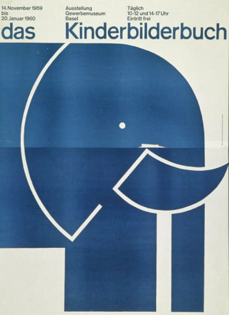
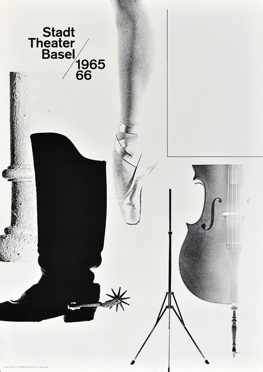
The Swiss modernized modernism. In their work we see a shift from past models. Designers from Zurich and Basel were not so much informed by what had come before as they were shaped by the circumstances of the present and inspired by visions of the future. Swiss designers like Joseph Mueller Brockman and Max Bill further refined the New Typography of the Bauhaus—replacing the geometric forms and asymmetric kineticism with a cool neutrality. Within the Swiss perspective, designers didn’t see themselves as artist—such an integral concept to the foundational spirit of the Bauhaus— rather, they saw their role as utilitarian. Through their work they were facilitating communication and connection —two things that were of utmost importance in the modern postwar era. Their approach was rational, methodical—almost scientific. Concerns were centered not on style or aesthetic but on clarity and function.
The version of modernism that developed out of the design curriculums in Switzerland visually and intellectually complemented the global capitalist culture of the fifties, sixties, and seventies. The neutral, type-centric approach of Swiss design spread quickly world-wide earning it the name International Typographic Style. It became the favored approach for corporate identity design. Graphic shapes and bold letterforms conveyed high-concept, future thinking sensibilities— perfect for companies looking to place themselves at the forefront of the burgeoning age of information. The unadorned rational approach of Swiss design resonated with audiences around the world who had weathered years of propaganda and political messaging. The clarity and transparency of communication inherent in the Swiss design methodology was a refreshing contrast to the slanted discourse that dominated the public sphere during the wars. During this time, there were countless innovations being developed across the globe. What better way to communicate and share advancements in fields like science and technology than through a design style with a shared methodology?
Poster design, Josef Müller-Brockmann, 1959.
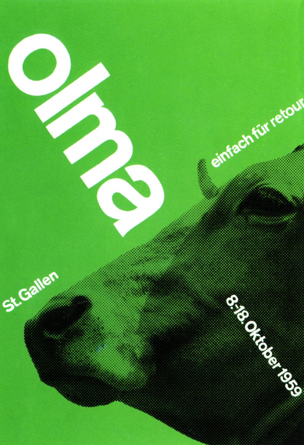
Poster design, Jörg Hamburger, 1967.
Poster design, Emil Ruder, 1956.
Poster design, Armin Hoffman, 1965.
A Universal Design Language
For many designers, adopting the visual approach of modernism was a way to break away from past histories of war, oppression, destruction, and political strife.
Italy first entered World War 2 as collaborators with the Nazi party. It was led into the war by Benito Mussolini, the fascist prime minister who had formed an alliance with Nazi Germany in 1936. In the summer of 1943, as Allied forces landed in Sicily, public support for the war and for Mussolini diminished. Mussolini was ousted on July 25 and his replacement, Gen. Pietro Badoglio, sought peace with the Allied powers, and reached an armistice later that year. In April of 1945, Mussolini was executed just two days before Adolf Hitler and Eva Braun committed suicide.
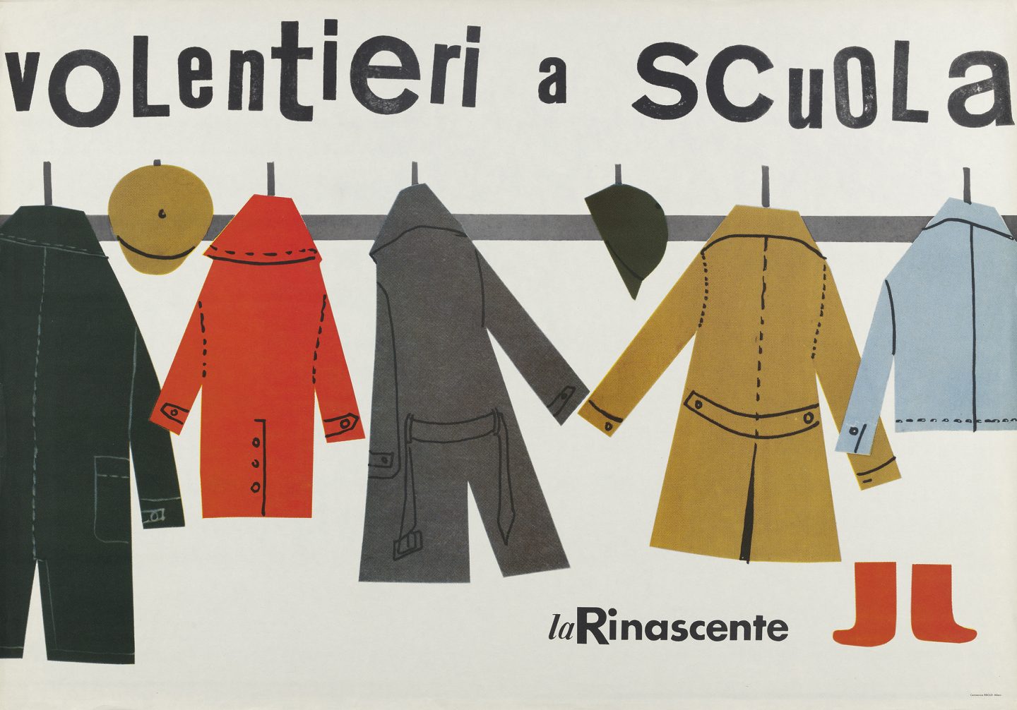
As part of the post-war treaty of 1947, Italy had to forfeit all claims to colonial acquisitions in Africa and Asia and had to pay 360 million in reparations. Many artists and designers working in Italy in the 50’s and 60’s were seeking to distance themselves from the fascism and colonialism of the past. They were looking to re-imagine the world through the contemporary lens of modernism. In the succeeding years, Italian designers like Lora Lamm and Bruno Munari would use their creative perspectives to envision a life that embraced the modern lifestyle. Their distinct approaches to design would strike the perfect balance between art and commerce.
Poland was one of the countries hit hardest by the rise of Nazi Germany and the impact of World War 2. About one fifth of the population—around 6 million citizens—were killed. Most of them were murdered through the war crimes of the Nazis. The Capitol city of Warsaw was almost entirely decimated by the Nazi regime after the Warsaw Uprising of 1944 in which an underground militia attempted to liberate Warsaw from German occupation.
In the years following the war, the population of Poland was in a state of crisis. Their cities were annihilated and their economy and the accompanying industries working within it ceased to exist. In the midst of this unfathomable loss and destruction, creatives from all fields came together to form an organization called the Polish Union of Artists. Filmmakers, designers, writers, and artists joined together in an attempt to reestablish and reinvigorate Polish culture after the war. One of the most significant developments was the rise of Polish poster design. Countless designers used the format of the poster to express hope for the future.
The self taught artist Tadeusz Trepkowski was born in Warsaw and lived through the devastation of World War 2. Through his poster design, he found hope and resilience while living in a country that had been torn apart by war. Many of his works directly address the atrocities of war and are meant to inspire those surviving its aftermath. Trepkowski’s work would inspire other Polish artists and designers such as Henryk Tomaszewski and Jerzy Flisak whose work departed from the subject of war and focused more on Polish art and culture.
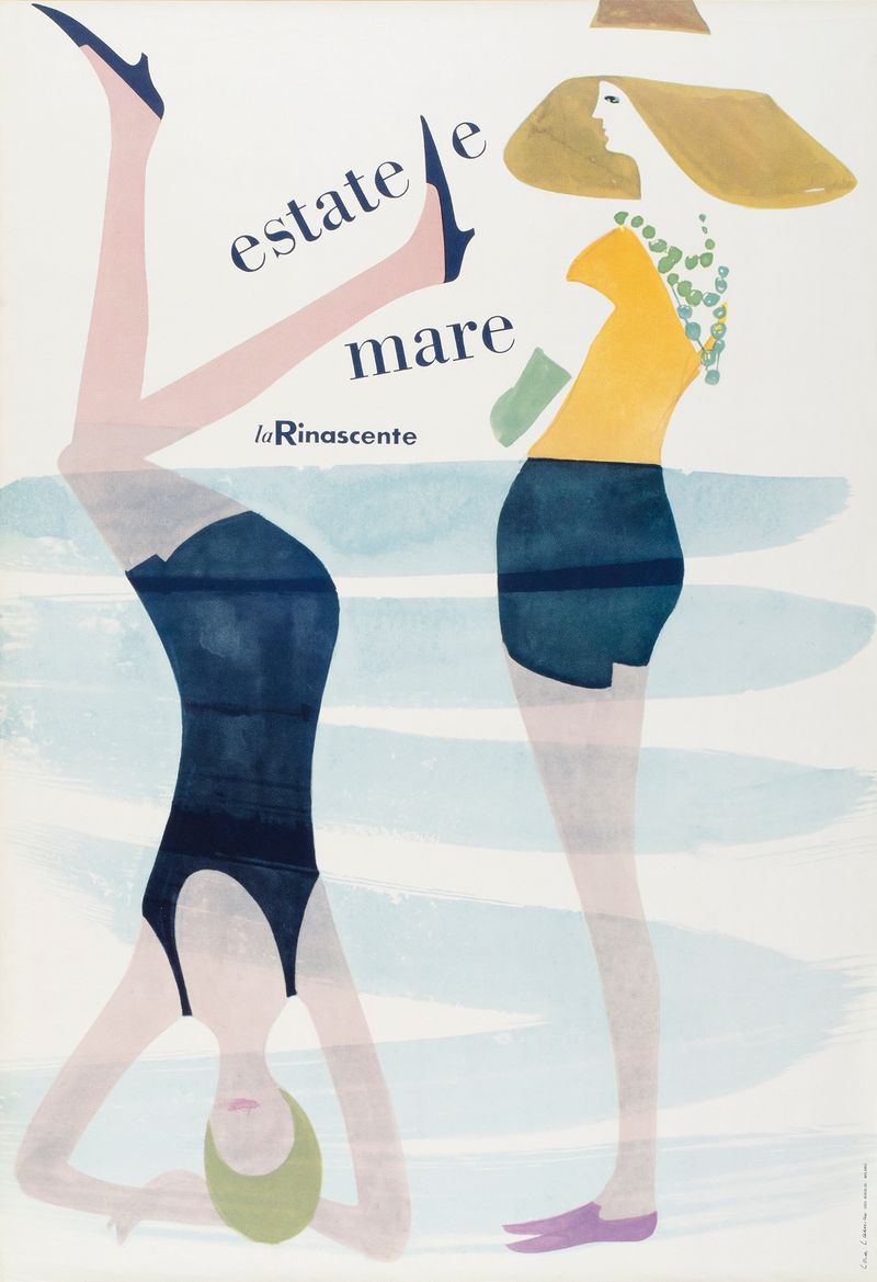
Poster for La Rinascente, an Italian department store, Lora Lamm, 1960.
Poster for La Rinascente, an Italian department store, Lora Lamm, 1960.
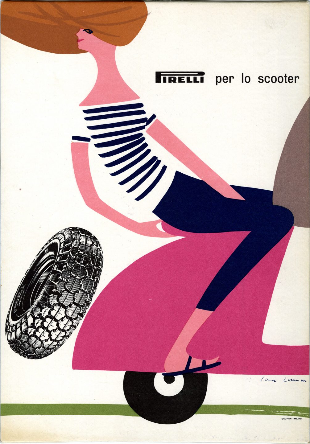
Illustrated advertisement for Pirelli tires, Lora Lamm, 1959.
Poster design, Tadeusz Trepkowski, lithograph, 1952.

Poster design, Tadeusz Trepkowski, lithograph, 1952.
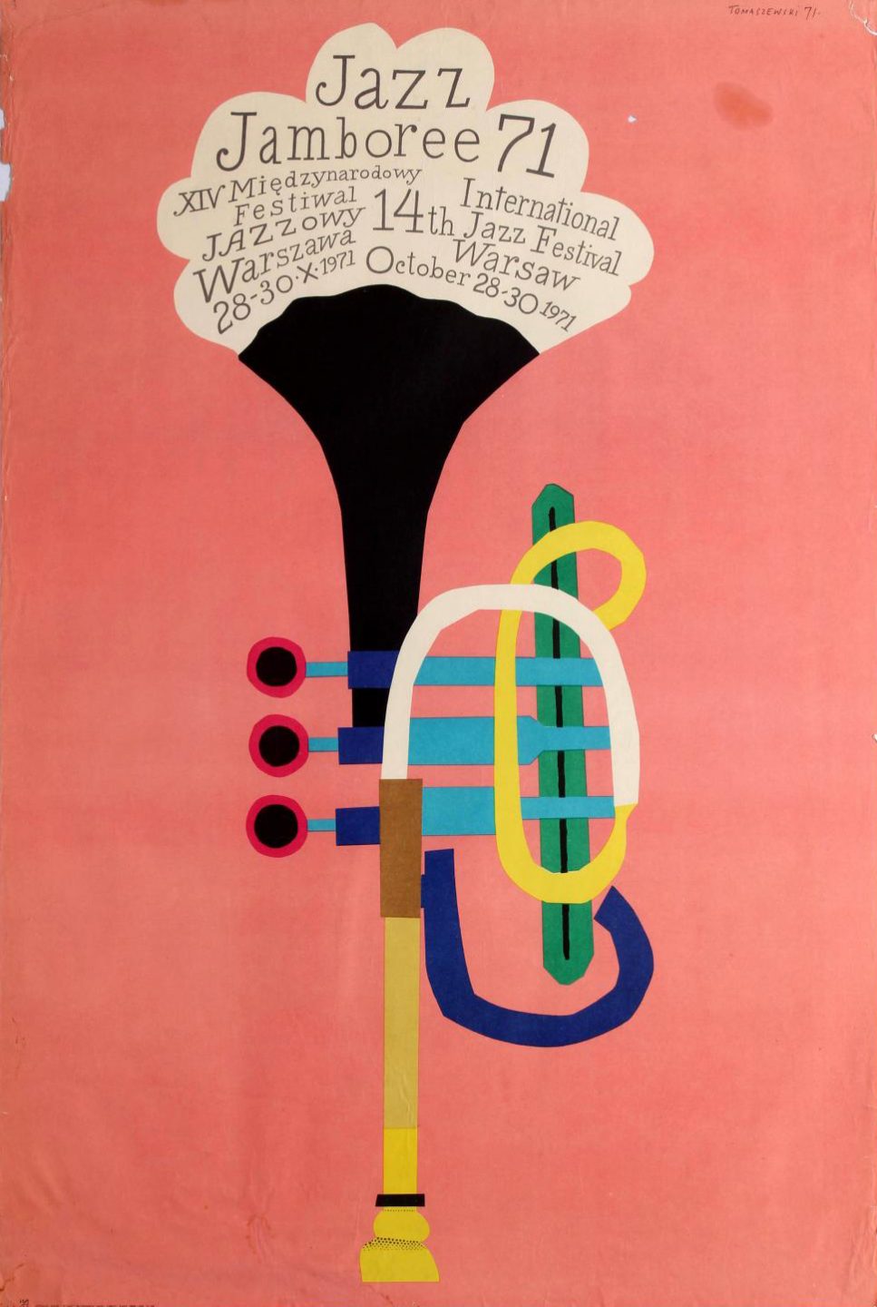
Poster for the Jazz Jamboree Music Festival in Warsaw, Henryk Tomaszewski, offset lithograph, 1971.
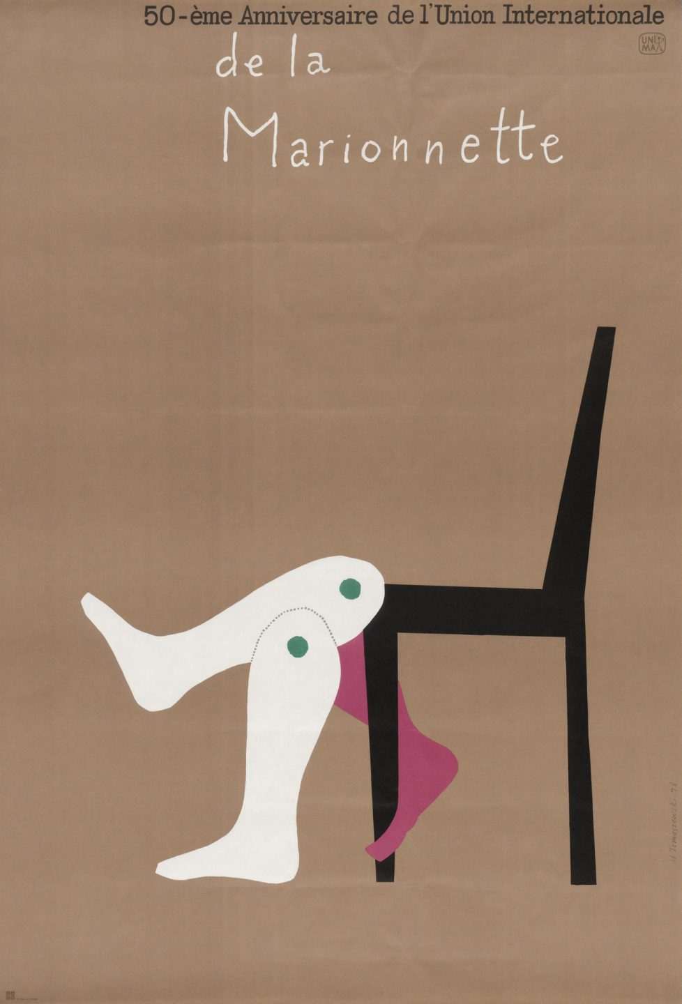
Performance poster, Henryk Tomaszewski, offset lithograph, 1979.
The Evolution of Modernism in Japan
The industry of Japanese graphic design started with the introduction of letterpress style printing and the incorporation of movable type in 1869. Japanese scholar and inventor Shozu Mitoki developed the first “Western-style” movable type system and first type school just as the period of Sakoku had ended. Though movable type had first appeared in Japan as early as 1590, it never caught on and woodblock printing remained the exclusive method employed by Japanese printers and publishers for centuries. Mitoki’s technique soon replaced woodblock printing as the dominant printing form of the time. Japan’s era of self imposed isolationism was soon succeeded by a period where Western values and approaches were quickly absorbed into Japanese culture. The Western practices of marketing and advertising, and the accompanying visual vocabulary of popular culture soon made its way into Japan’s design vernacular.
The adoption of the emerging modernist perspectives of European avant garde movements coincided with the rise of department stores throughout Japan in the early 1900’s. These centers included exhibition spaces, cafes, and salons. These were spaces where people from different classes could integrate. These shopping centers would hire designers to head up their promotional department. These creatives would execute in a style that combined the rich legacy of Japanese visual art and culture with the visual models of the emerging modernist movements. The resulting posters, promotional materials, environmental designs, and installations both referenced the graphic stylization and sophistication of Ukiyo-e prints as well as the European genres—art nouveau, art deco—the prints had inspired. Modernist design became a prominent part of Japanese consumerist culture at this time between the two world wars and can be found in magazines, advertisements and packaging.
Hisui Sugiura
Hisui Sugiura was one of the first designers to rise in prominence in Japan within this new climate of commerce. He studied at the Tokyo School of Art and began working as a designer for a Tokyo Newspaper in 1905. In 1910, he left the paper and became the chief designer for the Mitsukoshi department store. From 1922 to 1924, he went to Europe to study modern graphic design. He came back to Japan and during the 1920’s created a body of work that established him as one of the leaders of Japanese commercial design during this period.
In 1929 Siguira was appointed head of the design department at Musashino Art University in Western Tokyo. In 1935, he co-founded another school in Tokyo— the Tama Art University which is now one of the leading art and design schools in the country.
From 1927 -1930, he created two seminal publications. The first was a Japanese design journal titled The Complete Commercial Artist which was focused on the industry of graphic arts in Japan and featured articles on poster design, advertising, package design, shop signs, billboards, page layout, and typography.
The other publication was called Affiches—which translates to “posters” in French. Affiches was more centered on the appreciation of works of graphic design and contained work from leading designers around the world. In 1936 he created another magazine called Desegno which was more focused on design theory.
Through his contributions, Hisui brought many of the European styles and approaches that he was exposed to during his studies abroad to the emerging graphic design landscape of Japan. His work took these approaches and merged them with a uniquely Japanese aesthetic that expanded on the cultural legacy of Japanese art and design.
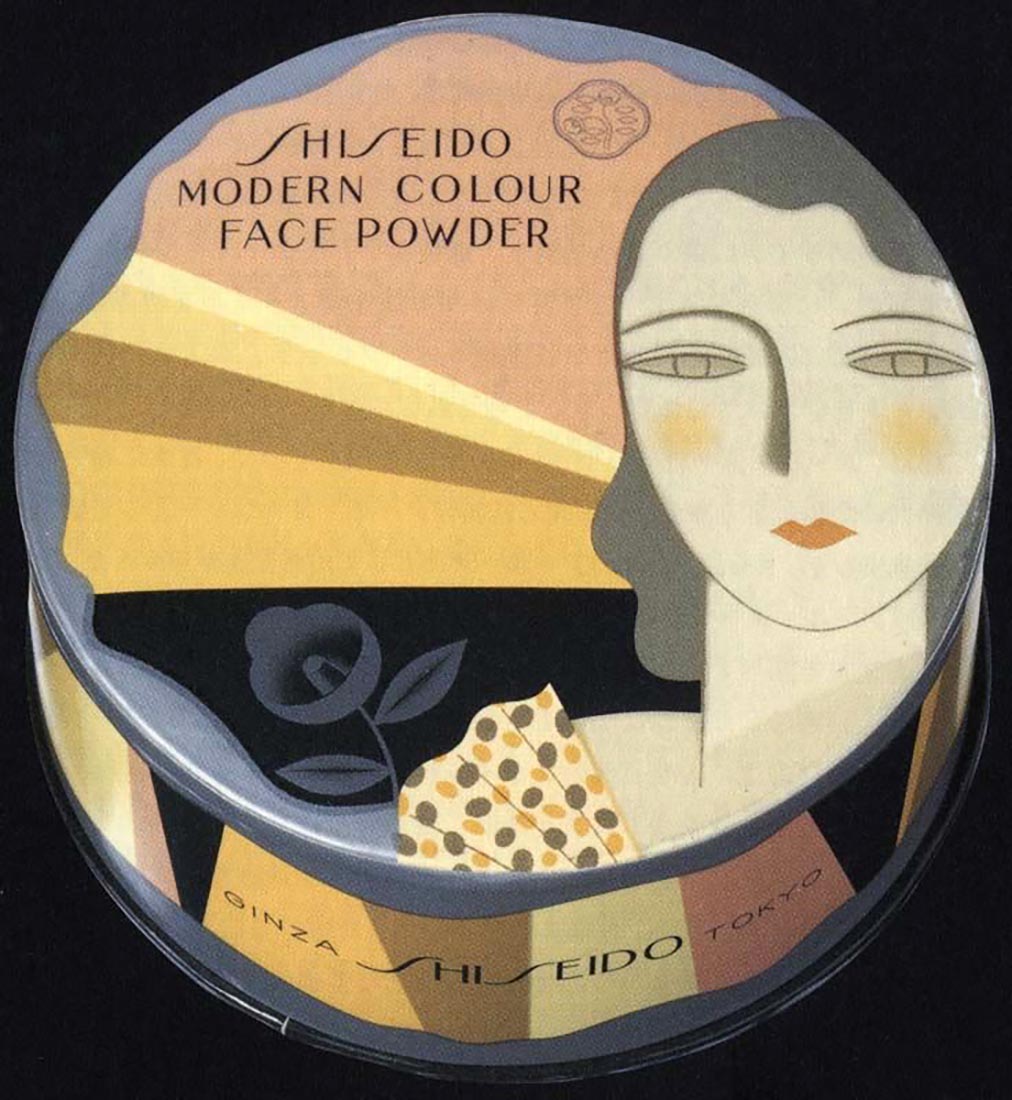
Ayao Yamana
Ayao Yamana started out as a poet before working as a designer for literary journals. His early work was heavily influenced by art nouveau artists like Aubrey Beardsley. He eventually brought his unique visual approach to the field of package design. In 1928, he started creating work for the Japanese cosmetics company Shiseido. His designs became synonymous with the image of the Japanese modern woman. During the 20’s and 30’s in Japan, female identity was slowly beginning to shift and transform due to exposure to Western culture and values. His work for Shiseido incorporated art deco influences, bold graphic forms, minimal geometric compositions, and calligraphic flourishes. He became Japan’s first graphic design superstar. In 1955 he went back to Shiseido where he continued to employ his signature style in the creation of packaging and advertisements.
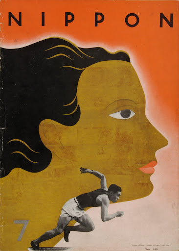
Beginning in the thirties there was a move away from Western influence and a return to more traditional perspectives of the past. This coincided with a shift in the government toward totalitarianism, militarism, and colonialism. The Emperor Hirihito took the throne in 1926 and soon after, Japan began an aggressive campaign of expansion which resulted in a series of violent wars with China. Fascist right-wing groups grew in popularity throughout Japan and nationalism was on the rise. These extreme changes could be seen within the art and design of the time.
In 1934, Yamana became the art director for Nippon Magazine. The modern style, once considered fashionable, now gave way to an aesthetic that aligned with the nationalistic spirit of the time. Nippon magazine was representative of these values —this can particularly be seen in female representation in the magazine which shows more traditional representation of female identity. The magazine was essentially a tool of propaganda to influence citizens of Japan to support the country’s colonial conquests.
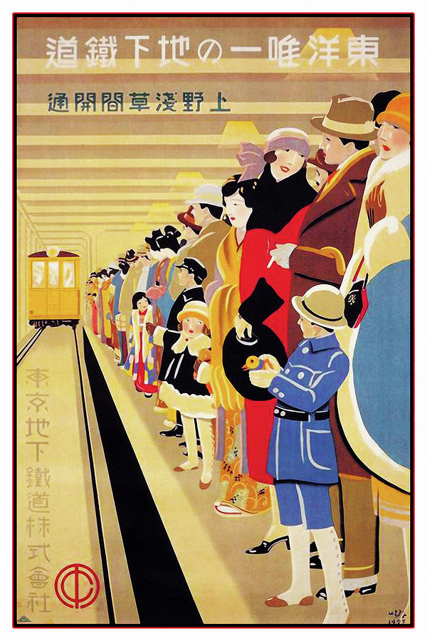
Subway poster, Hisui Sugiura, 1927.
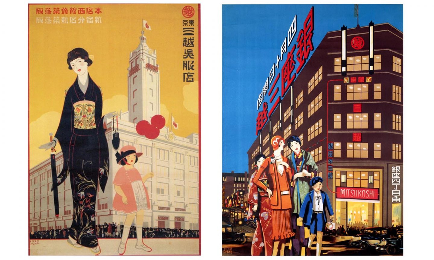
Posters for Mitsukoshi Department Store, Hisui Sugiura, 1925.
Poster, Hisui Sugiura, 1927.
Packaging for Shiseido cosmetics, Ayao Yamana, 1932.
Cover for Nippon magazine, Ayao Yamana, 1934.
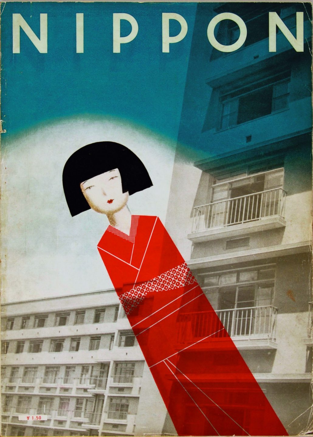
Cover for Nippon magazine, Ayao Yamana, 1934.
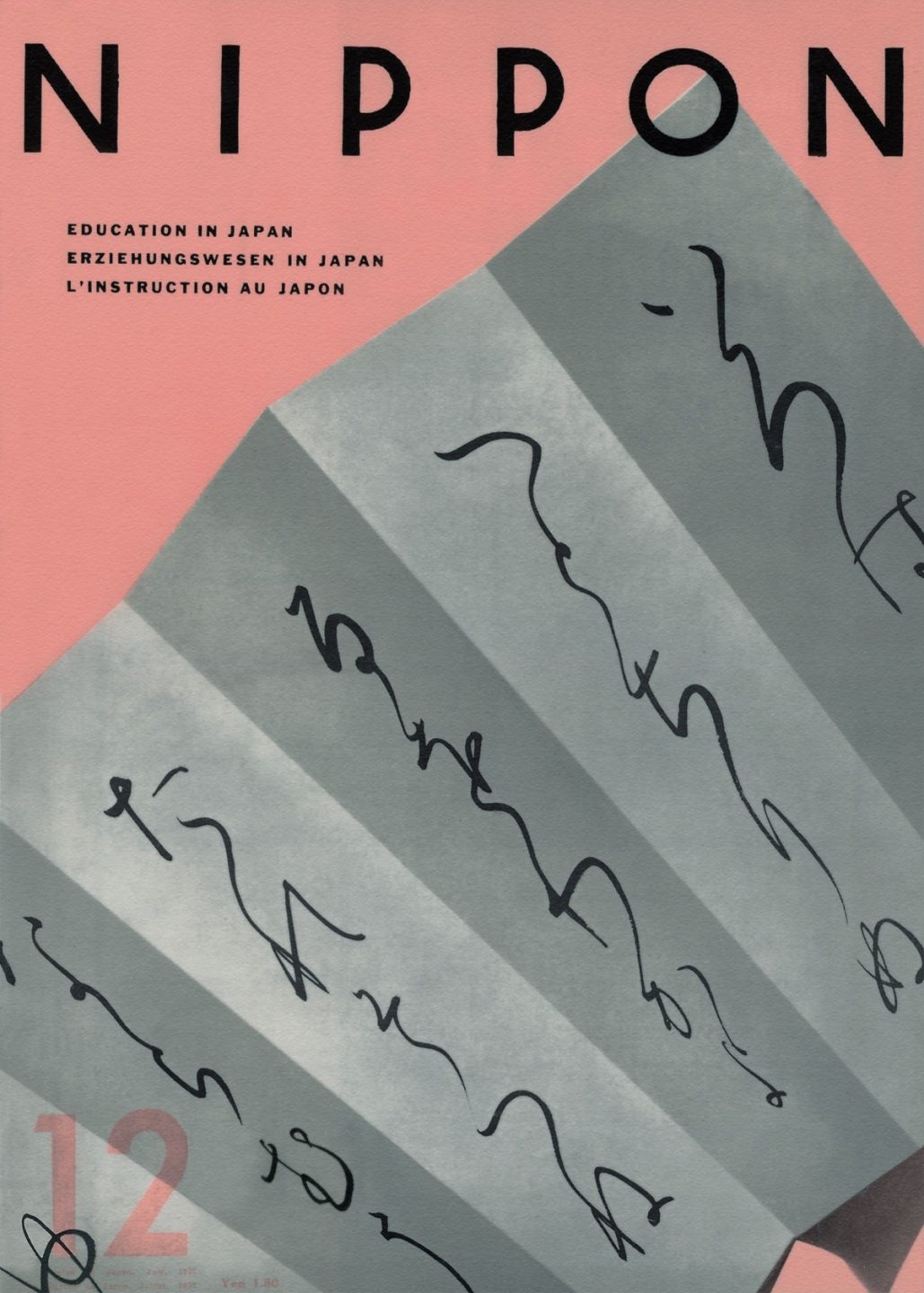
Cover for Nippon magazine, Ayao Yamana, 1937.
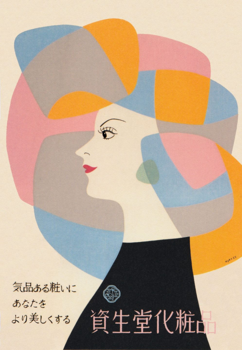
Illustrated advertisement for Shiseido cosmetics, Ayao Yamana, 1955.
Design as a Tool to Rebuild
The employment of atomic bombs on the cities of Hiroshima and Nagasaki in 1945 completely annihilated the architecture and infrastructure of the cities and resulted in the deaths of over 220,000 Japanese citizens. Many of those who immediately survived later developed terminal health problems. Under the US occupation that followed, Japan’s imperialist empire was dismantled and replaced with a democracy which resulted in significant changes like civil liberties, labor rights, and women’s suffrage.
Many Japanese artist and designers of the time saw their creative practice as a way to move past the tragedies of World War 2 and envision a new future. After the war, many organizations emerged in Japan that were dedicated to mobilizing citizens in an effort to rebuild the industries that had ceased to exist in the wake of the bombings. One of those organizations was the Japan Advertising Artists Club—or JAAC—which was formed in 1951. It became the leading organization in Japan for designers. The association would have yearly exhibitions and competitions. The first few exhibitions showcased packaging designs and posters for fake or non-existent products and events because the country had not yet recovered from the war. At this point, so there were no events being produced or products being manufactured.
In 1955, the leading designers of Japan organized an exhibition called Graphic 55. The event was held in Tokyo and showcased the work of 7 of Japan’s most influential designers—Takashi Kono, Yusaku Kamekura, Ryuichi Yamashiro, Kenji Ito, and Hiromu Hara among others. Graphic 55 also included the work of the celebrated American designer Paul Rand. This was the first exhibition which showcased contemporary post-war Japanese design within a global context. The intention of the exhibition was to position Japan as a country focused on innovation and completely recovered from the devastation of war. The event attracted visitors from all over the world and was the first step in establishing Japan as a center for global design.
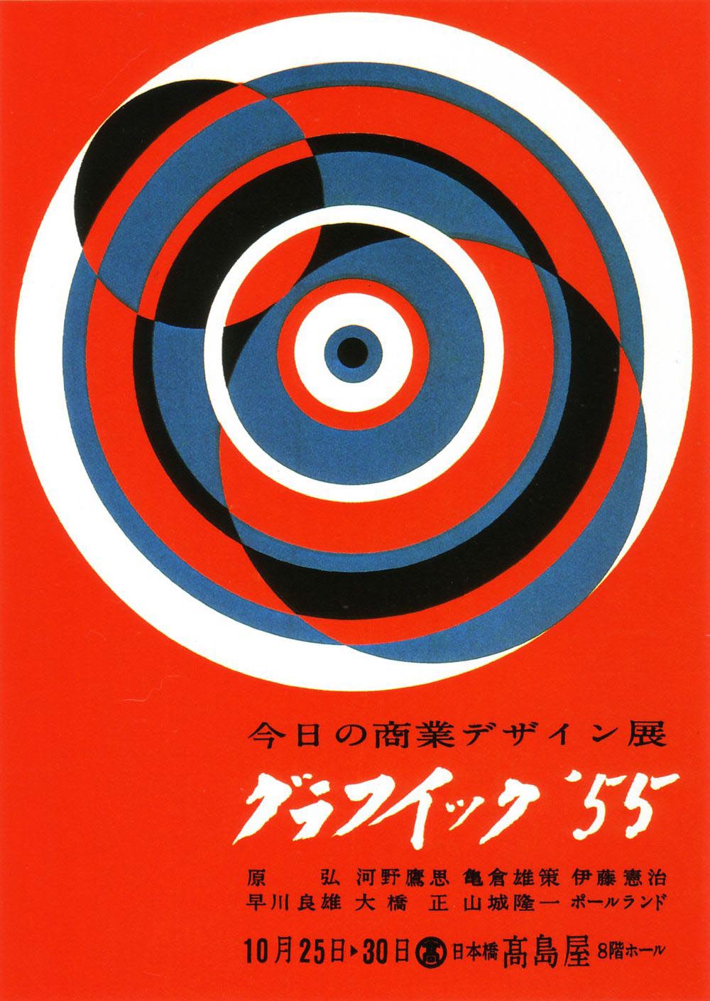
Exhibition poster for Graphic 55, 1955.
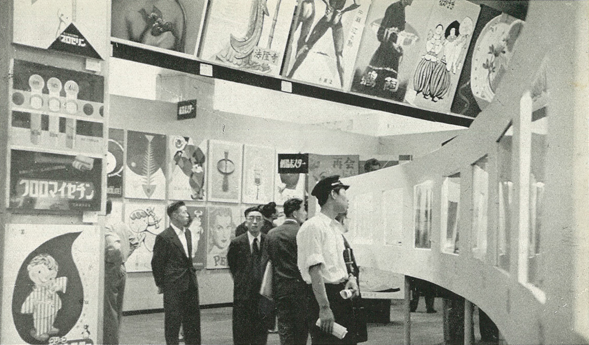
Photograph of the Graphic 55 exhibition in Tokyo in 1955.
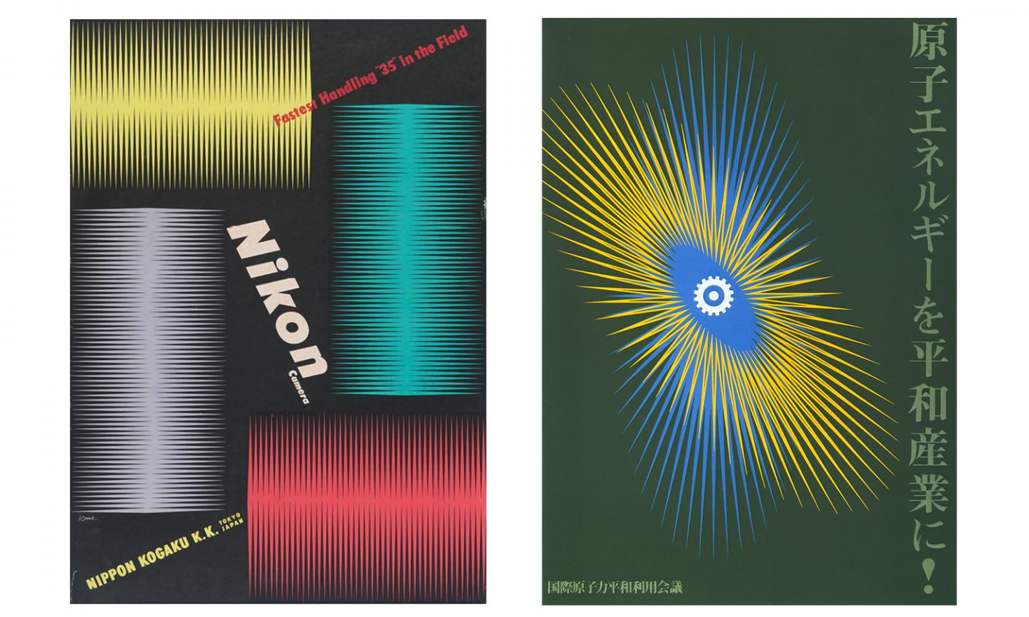
Graphic works by Yusaku Kamekura, left 1957, right 1956.
Graphic works by Hiromu Hara, 1955.
Graphic works by Kenji Ito, left 1954, right 1953.
The First Modern Olympics
Yusaku Kamekura studied at the Institute of New Architecture and Industrial Arts in Tokyo from 1935 to 1938. This was a private design institute established with the aim of introducing Bauhaus design theories in Japan. After he graduated, he worked as an art director on a number of Japanese magazines. Throughout his career he designed posters, books, magazines, corporate symbols, logos, street signs and packaging.
In 1951, he was one of the founding members of the Japan Advertising Artists Club. Through the organization, he participated in numerous design exhibitions including the famous Graphic 55 exhibition that took place in Tokyo in 1955.
Kamekura was chosen through an open competition to design the identity of the 1964 Olympics which were to take place in Tokyo. This was the first time that the design for the Olympics was approached as a complete identity system integrating type, form, and photography in a way that was aligned with contemporary modernist practices of the time. It was also the first Olympics that utilized iconography. The team that created the icons included the designer Tadanori Yokoo. From then on, every Olympics identity to come would include iconography as elements of design.
Kamekura’s work for the 64 Olympics positioned Japan as leaders in the global design community. His approach to the Olympics identity would serve as a point of reference for future Olympic designers Lance Wyman and Otl Aicher.
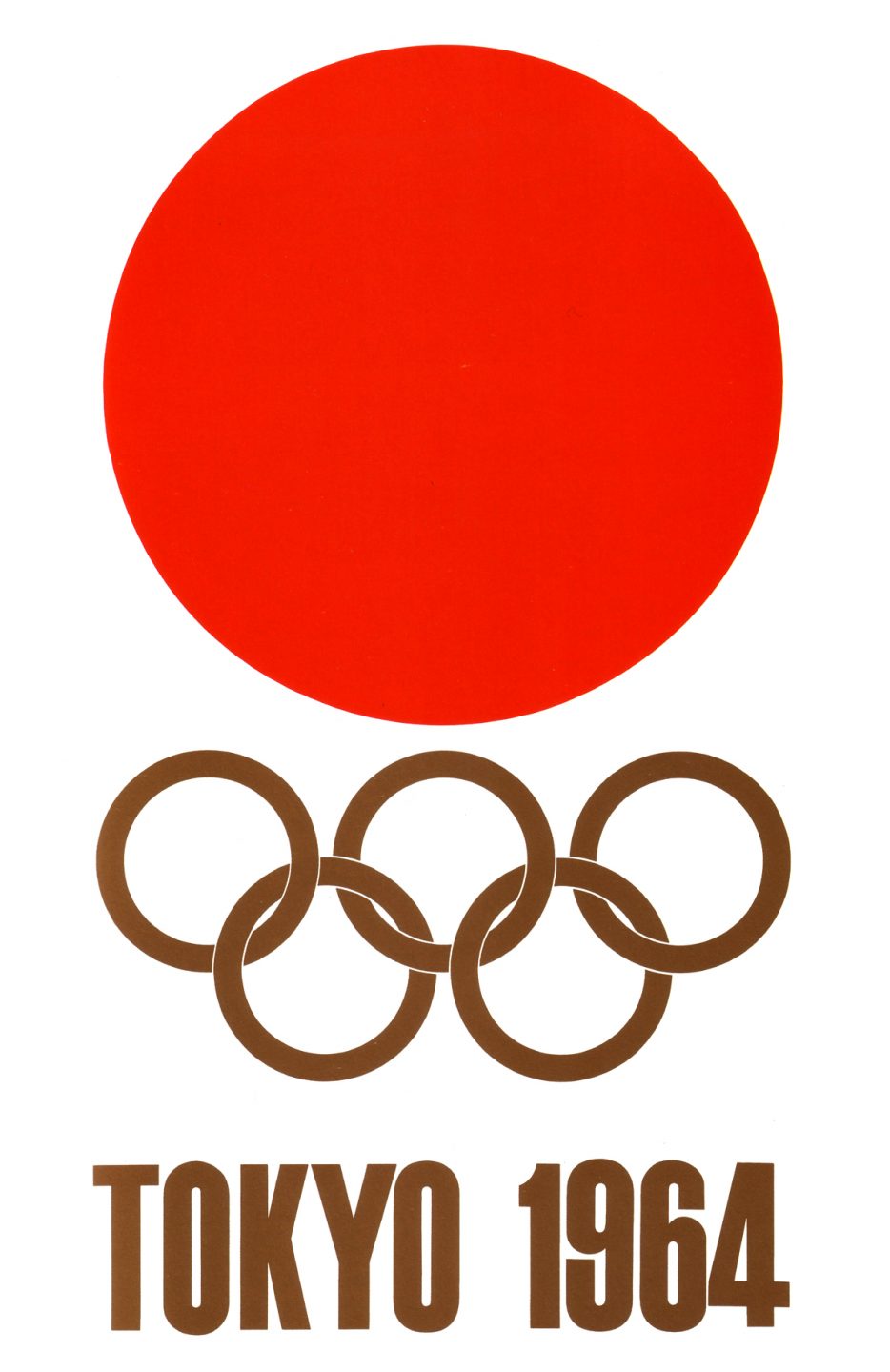
Poster showing the identity for the 1964 Tokyo Olympics, Yusaku Kamekura.
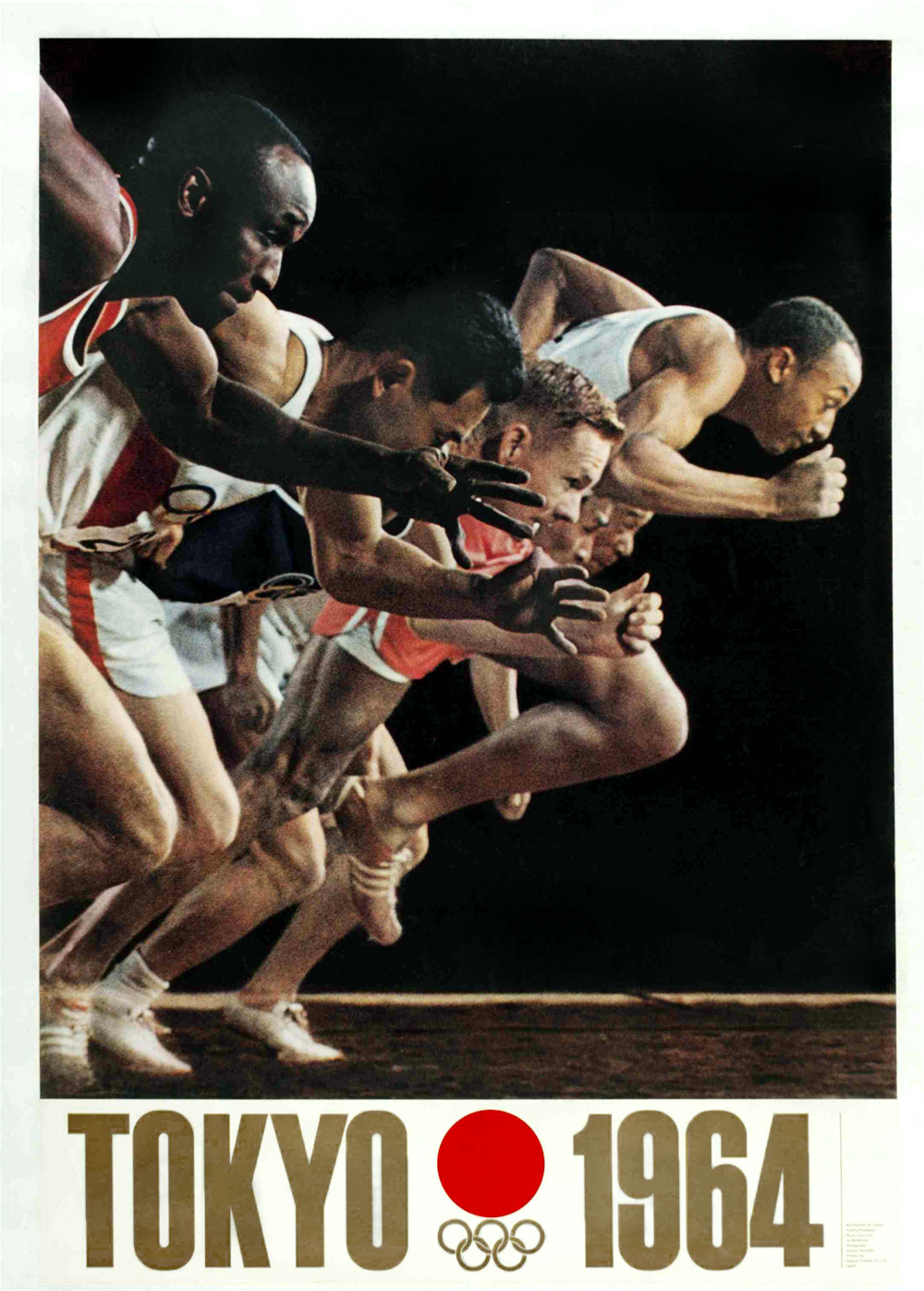
Poster for the 1964 Tokyo Olympics, Yusaku Kamekura.
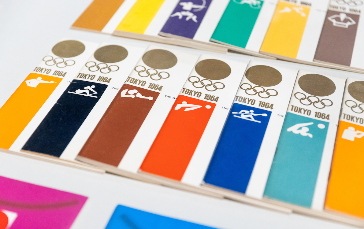
Brochure system for the 1964 Tokyo Olympics featuring the icon system created by Yusaku Kamekura and Tadanori Yokoo.
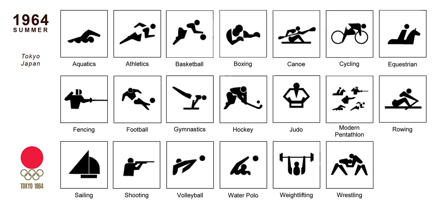
Icon system for the 1964 Tokyo Olympics featuring the icon system created by Yusaku Kamekura and Tadanori Yokoo.
Japan Becomes a Leader in Design
In the years following the Tokyo Olympics, Japan would position itself at the forefront of innovation in design and technology. Work from leading designers like Kamekura and Ryuichi Yamashiro would serve as an inspiration to younger emerging designers that would make a name for themselves during the sixties, seventies, and eighties.
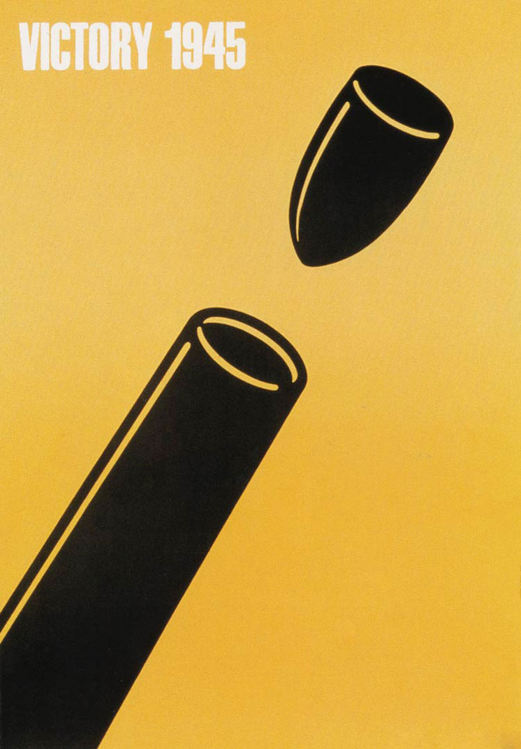
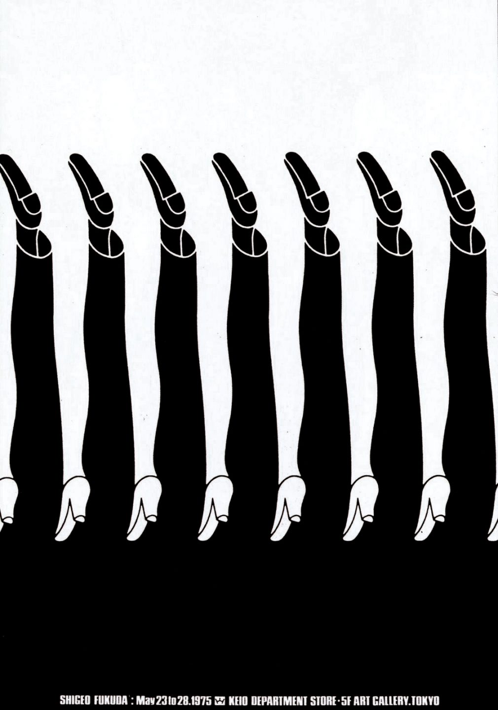
Shigeo Fukuda was born in 1932 in Tokyo to a family of toy makers. In 1956 he attended the Tokyo University of Fine Arts and Music. The first Japanese designer to be inducted into the New York Art Directors Club Hall of Fame, his work is recognizable for its simplicity and use of visual illusions. One of his most famous works is entitled Victory 1945 and it won him a grand prize at the Warsaw Poster Contest in 1975. Much of his work was designed to make a social impact rather than a commercial one and he was a strong advocate for pacifism and environmentalism.
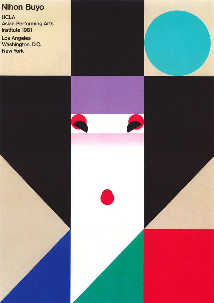
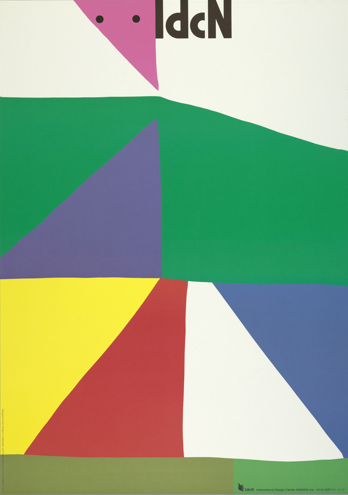
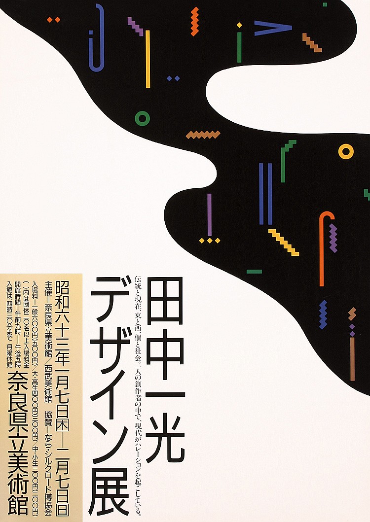
Born in Nara, Japan in 1930, Ikko Tanaka studied art at the Kyoto City School of Fine Arts. He created a style of graphic design that fused modernist principles and aesthetics with the Japanese tradition of visual art and design. In 1963 he formed Tanaka Design Studio where he has worked for countless large businesses and organizations. He designed, among other things, posters, logos, packaging and annual reports. He also designed identities for Expo ‘85 in Tsukuba, the World City Expo Tokyo ‘96, and Osaka University.
Ikko Tanaka is one of the founders of the design focused retail chain Muji whose first store opened in 1983. He was their art director until 2001 when the designer Kenya Hara took over.
Poster design, Shigeo Fukuda, 1975.

Poster design, Shigeo Fukuda, 1975.
Poster design, Shigeo Fukuda, 1975.
Poster design, Ikko Tanaka, 1981.
Poster design, Ikko Tanaka, 1990’s.
Poster for music festival, Ikko Tanaka, 1985.