01/19/2022
Capitalism and Globalization
In the wake of industrialization, marketing, media, and industry provide a new space for creative practice
Apart from the desire to produce beautiful things, the leading passion of my life has been and is hatred of modern civilizationWilliam Morris
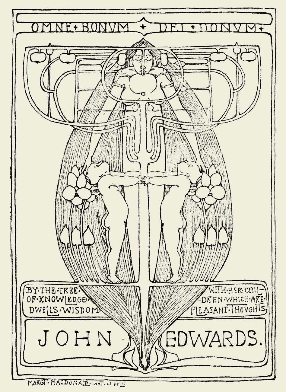
Bookplate for John Edwards by Margaret MacDonald of the Glasgow School, 1897.
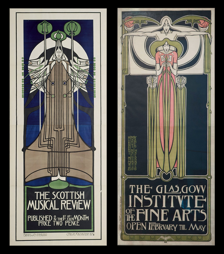
Left: Poster for The Scottish Musical Review magazine, Charles Rennie Mackintosh, lithograph, 1896. Right: Poster for The Glasgow Institute of the Fine Arts, Margaret Macdonald, Frances Macdonald, J. Herbert McNair, lithograph, 1895.
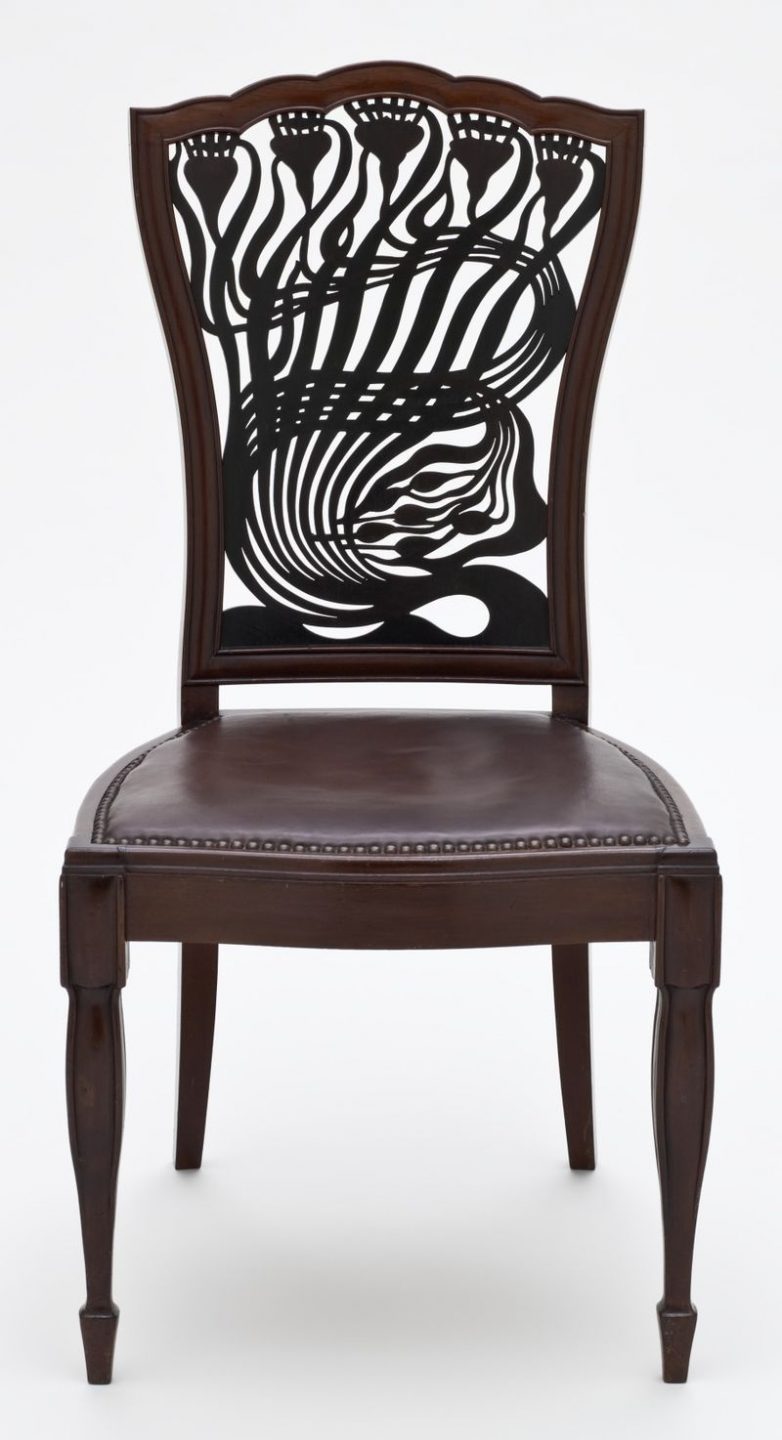
Chair by Arthur Mackmurdo of the Century Guild, 1882—83, the organic forms are recognized as an early example of the Art Nouveau style.
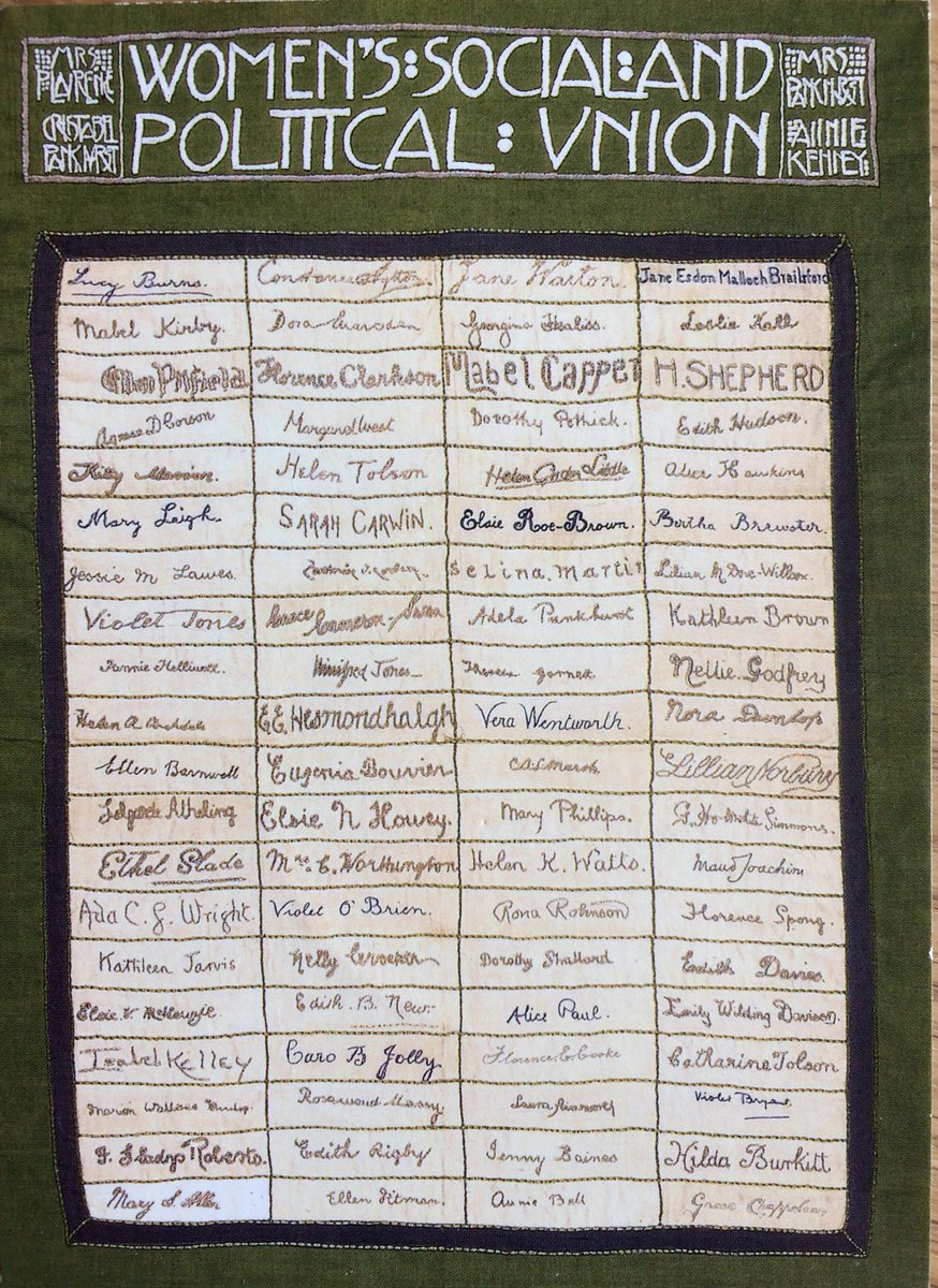
Hand embroidered banner featuring the signatures of eighty Suffragette hunger-strikers, Ann Macbeth, 1910.
Book design by Ann Macbeth, 1897.
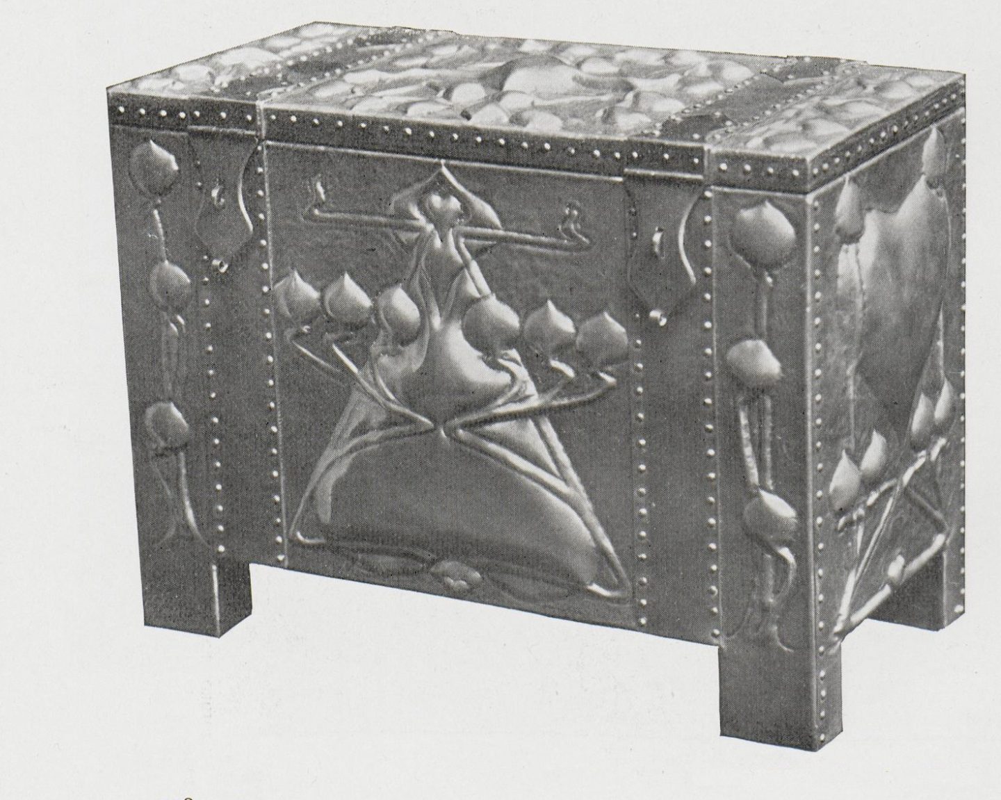
Jewelry box, De Courcy Lewthwaite Dewar, 1900.
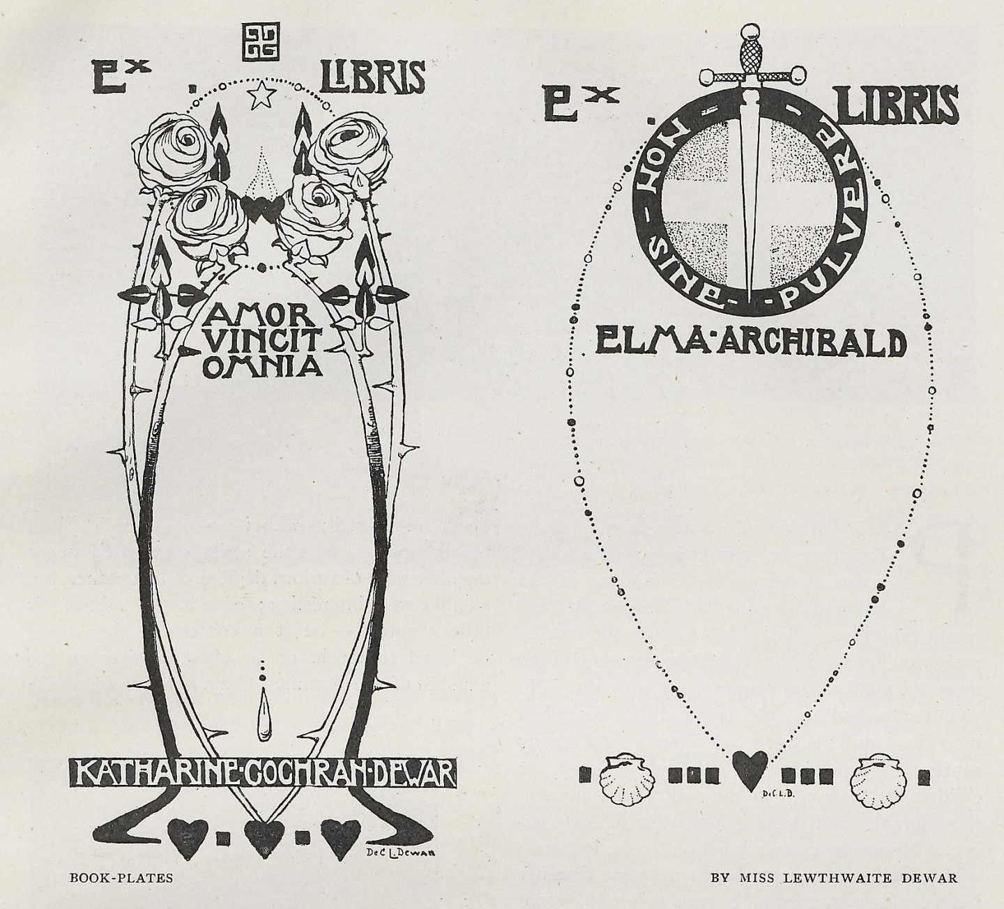
Bookplates by De Courcy Lewthwaite Dewar, 1908.
Glasgow Society of Lady Artists, external wall sign, featured on the facade of their studio at 5 Blythswood Square, Glasgow, Scotland.
The Arts and Crafts movement rejected the prevailing methods, beliefs, and values of the time—Victorian mass production and its accompanying consumerism— and, through creative participation, ultimately changed them. Part of this change was harnessing and readapting newly developed industrial processes and channeling them in service of design concerns such as craftsmanship, aesthetic beauty, and creative vision. These two functions of creative practice —as a tool for defining the creative potential of industrial formats and as a catalyst for galvanizing social change—will become defining factors of the modernist movements that appear throughout the early 1900’s.
The various communities which embraced Arts and Crafts ideologies were doing so in response to the negative repercussions of rampant industrialization and its resulting socio-economic structures. This approach of using creative work as a means of political and social action would inform and inspire subsequent movements like Art Nouveau, Futurism, Constructivism, and the Dadaists. Resistance was a key factor in the ethos of early modernism and the avant-garde communities. Visual experimentation and innovation were strategies for questioning tradition and undermining existing dominant cultural perceptions.
The creation of the Bauhaus marks a significant change in direction. Creative strategies would shift from rejecting and working outside dominant structures to using design thinking as a means to thrive within them. Eventually the spirit of rebellion and revolution that characterized these early modernist communities would be co-opted by the very systems that it was originally meant to oppose.
After the end of World War 2, modernism would be adopted world wide and practitioners of art, architecture, visual communication, advertising, and industrial design working within the modernist viewpoint would be positioned as leaders at the forefront of culture, industry, and technology. Within the spaces of marketing, media, and advertising, the visual language of modernism would become synonymous with innovation, invention, legitimacy, relevance, and progress—all elements meant to perpetuate the dominance of the capitalist Euro-centric world-view.
Art Nouveau Emerges
The modalities that defined the Arts and Crafts movement served as the foundation for the style known as Art Nouveau. References to Renaissance and pre-Renaissance visual techniques and formats, a significant characteristic of the Art and Crafts aesthetic, can be seen in works of the Art Nouveau canon. Within the style, these past influences are combined with sensibilities inspired by perspectives outside of the European consciousness. The creative approaches found in Japanese woodblock prints and traditional African sculpture and textiles represents a monumental shift from the realism that had been dominant in Europe for centuries. The impact these works had on the emerging creative movements forming in Europe in the late 19th century was transformative. Bold stylization, graphic abstraction, and pure geometric form began to infiltrate the graphic works of the period. The result was an emergence of new ways of seeing, thinking, and making—all generated by minds outside of Europe.
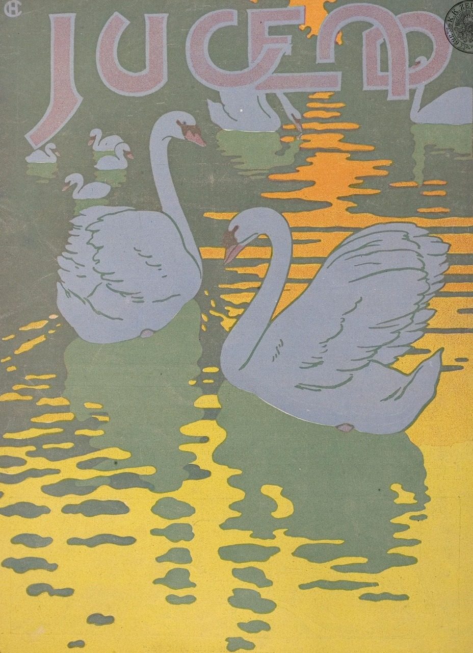
In France and Belgium, art nouveau was referred to as L’art Moderne and became, by the end of the 1800’s, the prominent style employed by contemporary creatives throughout Europe and beyond. Art Nouveau’s signature organic, abstract, and curvilinear forms permeated every field of design—art, illustration, visual communication, architecture, and craft. The visual aesthetic of Art Nouveau conjures associations to both nature and mysticism. This relationship between the natural environment and the spiritual world is another prominent feature of both traditional Japanese and African art and design and stands in sharp contrast to the culture of mass production which overtook Europe in the wake of industrialization.
With the appearance of Art Nouveau, artists and designers were no longer bound to naturalistic representation. They were no longer evaluated by their ability to realistically render the world around them. Art Nouveau is defined by experimentation— discovering new forms and modes of expression by using the imagination to look within. This visual innovation seemed new and exciting to a public in the midst of adjusting to a modernized world and would prove highly effective for capturing the attention of the early twentieth century consumer audience.
Creative departures were indicative of larger systemic changes. Art Nouveau was embraced by a society which was beginning to question the social, political, and economic structures of a post-industrialized world. There were revolutions throughout Europe and the Americas which supplanted oppressive monarchies and reimagined political structures; a critical lens was turned on the inequities and subjugations inherent in European colonialism. As the twentieth century progressed, these systems would become outdated and be replaced with more seemingly egalitarian versions of themselves which would align with the new capitalism that had emerged out of the industrial revolution. Many of the resulting colonial conquests that had been established during the Age of Discovery through the industrial revolution would eventually be disputed, resisted, and, in many cases dismantled. The imprint of the colonial perspective, however, would significantly shape the social and economic systems that emerged in the aftermath of two world wars.
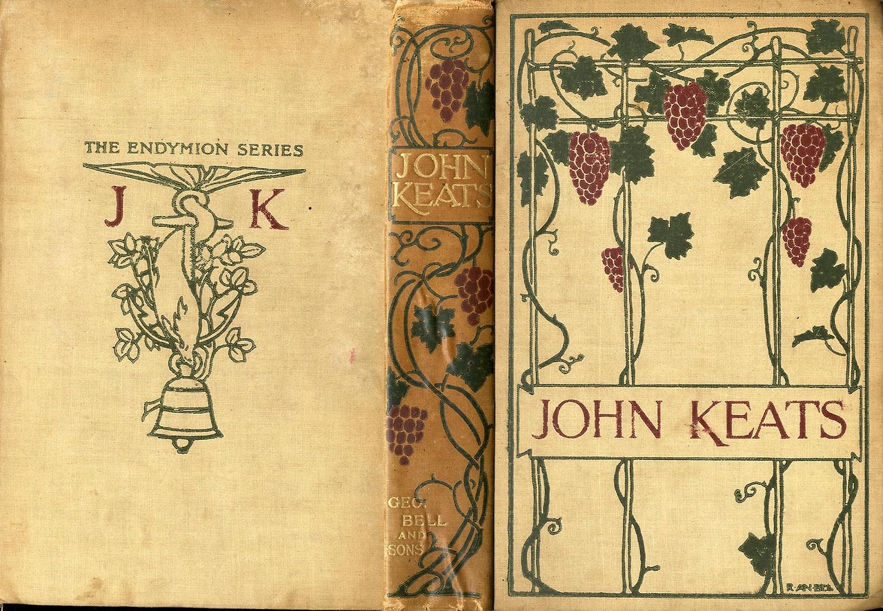
By the late 1800’s, Glasgow, Scotland was experiencing an economic boom which resulted in a flourishing cultural scene. Architecture, book design, and illustration were thriving industries during this time. Four students who attended the Glasgow School of Art are known as some of the earliest practitioners of the Art Nouveau style. The work of the sisters Frances and Margaret MacDonald, both painters and glass artists, and their husbands the architects Herbert Macnair and Charles Rennie Mackintosh would quickly attract attention and gain prominence through their unique visual approach. The creative couples looked to past historic examples for inspiration like medieval book design and Celtic ornamentation. They were also heavily influenced by the elongated sinewy forms and pictorial flatness of Japanese woodblock prints that were prevalent during this period. The two couples were known as “The Four” and also referred to as “The Spook School” for the incorporation of medieval Gothic imagery in their work.
The woman suffrage movement began in 1848, when a women’s rights convention was held in Seneca Falls, New York. By the late 1800’s, countless women’s groups dedicated to advancing women’s rights were beginning to emerge in key cities across Europe and the US. This movement was focused on giving women equal opportunities within the spheres of civic participation, financial pursuit, and educational and vocational development. In the wake of the industrial revolution, we see more and more women entering the filed of art and design.
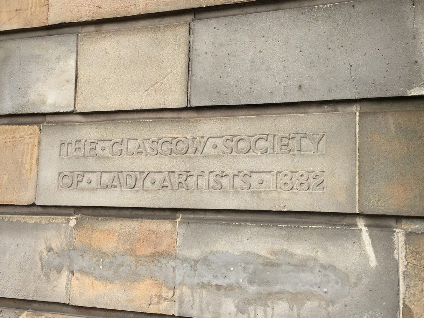
In Glasgow in the late 1800’s, the work of female artists like the MacDonald sisters, Jessie Marion King, Annie French, Ann Macbeth, and De Courcy Lewthwaite Dewar defined the creative vision of art and design during the Art Nouveau period. The Glasgow Society of Lady Artists was founded in 1882 by eight female students of the Glasgow School of Art with the aim of according due recognition to women in the fields of art, design, and craft. Many women participating in creative fields in Glasgow at this time were also activists in the suffragette movement.
The Vienna Secession
In 1897, a group of young artists working in Vienna Austria resigned from the country’s official artist’s guild—the Association of Austrian Artists. They separated from the guild because the organization promoted a style of art that was nationalistic, historic, and representational; the guild also forbid artists from outside the country to participate in their exhibitions. This small community of creative workers wanted to depart from the outdated approaches to art and design which the Association of Austrian Artists represented. They also wanted to collaborate and connect with creatives working outside of Austria.
This band of creatives called themselves the Vienna Secession and included painters, sculptors, architects, designers, and craftspeople who were working in the Art Nouveau style. The first president of the Secession was Gustav Klimt— Rudolf von Alt was made honorary president. In 1898, the Vienna Secession launched its official magazine called Ver Sacrum, which translates to “Sacred Spring”. The publication featured highly decorative borders, flowing organic ornaments, graphic patterns, and custom stylized typography—all elements representative of the period.
The most famous architectural work is the Secession Building designed by Joseph Maria Olbrich and built in 1898. It was meant to serve as a venue for exhibitions of the movement. The motto of the Secessionist movement is written above the entrance of the building: “To every age its art, to every art its freedom”.
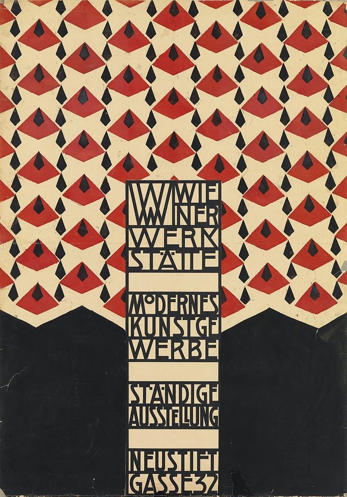
In 1903, 2 members of the Vienna Secession— the graphic designer and painter Koloman Moser, the architect Josef Hoffman—created a cooperative workshop of artist and artisans in Vienna. The Wiener Werkstätte began operations in three small rooms; it soon expanded to fill a three-story building with separate, specially designed facilities for metalwork, leather-work, bookbinding, woodworking and a paint shop. The range of product lines also included; leather goods, enamel, jewelery, postcards and ceramics. The Wiener Werkstätte even had a millinery department.
The collective lasted almost thirty years and became highly influential throughout Europe. The artists involved worked within and eventually expanded on the style of Art Nouveau. The Wiener Werkstätte style departed form the typical Art Nouveau approach and incorporated cubist geometry— alluding to the styles of cubism and art deco that were beginning to gain favor in Europe at the time. The Werkstätte’s focus on production and manufacturing was also highly influential and recognized as an inspiration for the Bauhaus school which centered on the merging of art, design, and technology. The Wiener Werkstätte closed in 1932 due to financial troubles.
Hand-stenciled poster for the Wiener Werkstätte, Josef Hoffman, 1905.
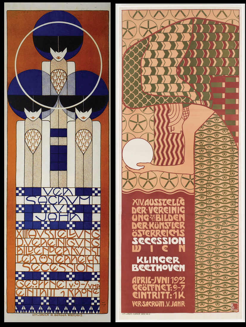
Left to right: Poster for the 13th Vienna Secession exhibition, Koloman Moser, 1902. Poster for the 14th Vienna Secession exhibition, Alfred Roller, 1902.
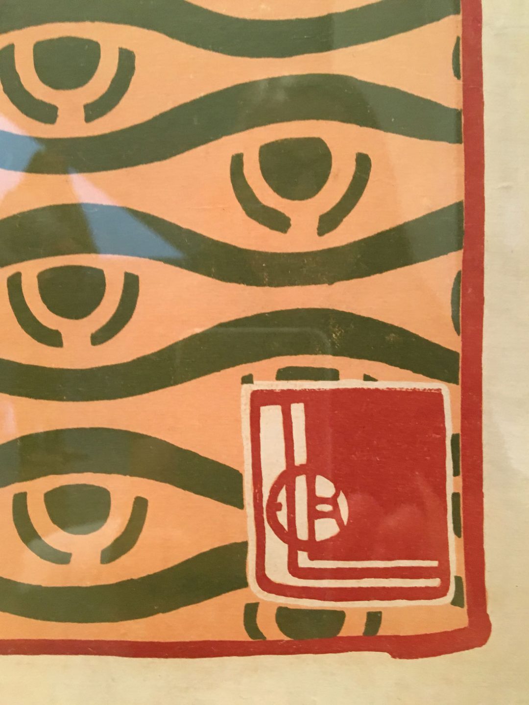
Detail from the poster for the 14th Vienna Secession exhibition showing the artist’s signature, Alfred Roller, 1902.
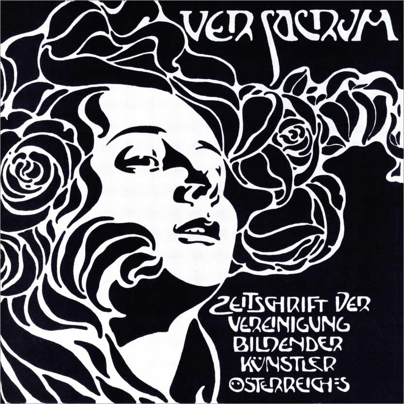
Cover for the Vienna Secession publication Ver Sacrum, Koloman Moser, 1899.
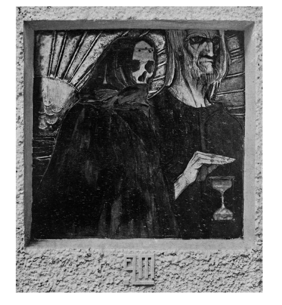
Time, Panel for the 14th Exhibition of the Vienna Secession, Elena Luksch-Makowsky, 1902.
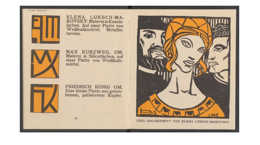
Woodcut for the catalogue of the 14th exhibition of the Vienna Secession, Elena Luksch-Makowsky, 1902.
Art Nouveau Goes Mainstream
By the turn of the century, Art Nouveau had expanded throughout Europe and made its way to the US which was in the midst of recovering from the Civil War. The imaginative approach of the Art Nouveau style opened up the opportunity for countless stylistic interpretations and methods of creative execution. We begin to witness artists and designers combining inspirations from the past and the present resulting in countless examples of experimentation and visual innovation.
Jugendstil or“Youth Style” was an artistic movement that adopted the Art Nouveau style for German audiences. It took place from 1895 until about 1910. It took its name from the art journal Jugend which was founded by the German artist George Hirth. Jugend was published from 1896 to 1940 and focused on the fields of graphic communication and interior design.
Again, taking inspiration from Japanese Ukiyo-e prints— which are one of the earliest examples in which the format of printing is elevated to the sphere of high art— graphic works of the Art Nouveau period further refined and expanded the limits of the chromolithographic process. In doing so, the contributions of this period blur the line between high art and commercial design. This merging of art and design is one of the hallmarks of Art Nouveau and the modernist movement that followed. The posters and advertisements associated with this era were created by individuals who thought of themselves as artists and approached their craft with seriousness and dedication. The resulting graphic works were regarded at the time as works of art. Posters for cigarettes, automobiles, and liquor were often taken from public spaces and displayed in homes or residences. The poster became a popular and collectible art-form of the time.
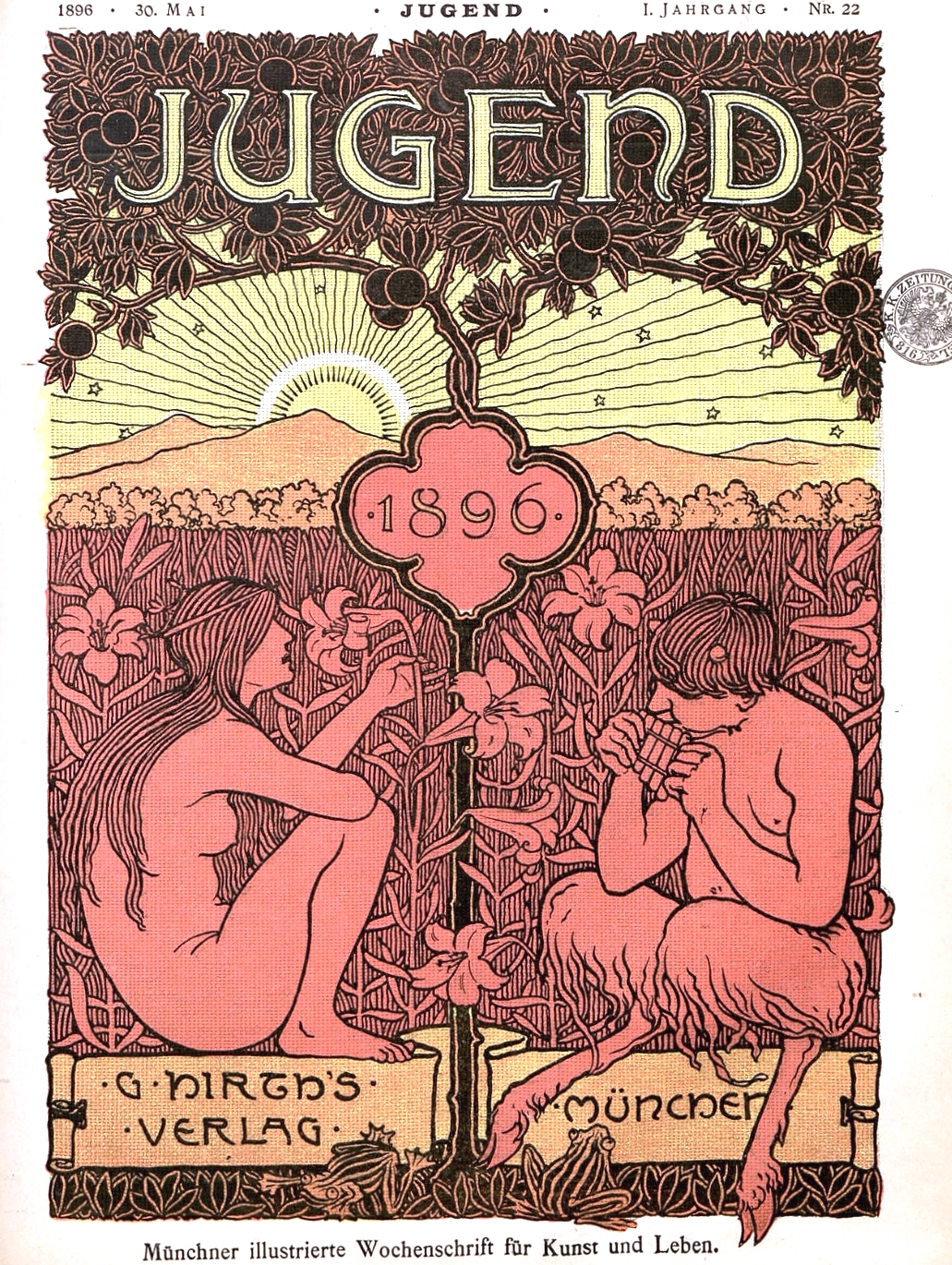
Cover for Jugend magazine, 1896.
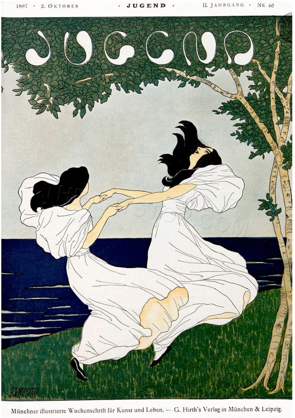
Cover for Jugend magazine, 1897.
Cover for Jugend magazine, 1899.
Aubrey Beardsley
One of the most influential and controversial artists of the art nouveau period produced his prolific body of work within a relatively short time frame. The British born Aubrey Beardsley died of tuberculosis when he was just 25. Within the six years before his death, Beardsley became infamous for his darkly stylized images of decadence and debauchery.
Beardsley traveled to Paris in 1892 and immediately became enamored with the city’s art and culture. The work of painters like Henri de Toulouse-Lautrec along with the Japanese ukiyo-e prints that were fashionable in Paris during this time had a significant impact on the young artist’s creative perspective. During his brief career, Beardsley produced numerous illustrations for books and magazines including The Yellow Book, a periodical he co-founded with the American writer Henry Harland.
Within his work we see a mixture of the medieval gothic aesthetic, with its moody countenance and elongated language of form, and the graphic flatness employed by Japanese artists from the Edo period such as Utagawa Kunimasa and Utagawa Hiroshige. We can also see the influence of the arts and crafts movement, specifically the work of William Morris and the Kelmscott press. The influence is most pronounced in a series of illustrations that Beardsley was commissioned for in 1893 by the publishing house of J.M. Dent. After seeing the finished work, William Morris threatened to sue Beardsley for plagiarism.
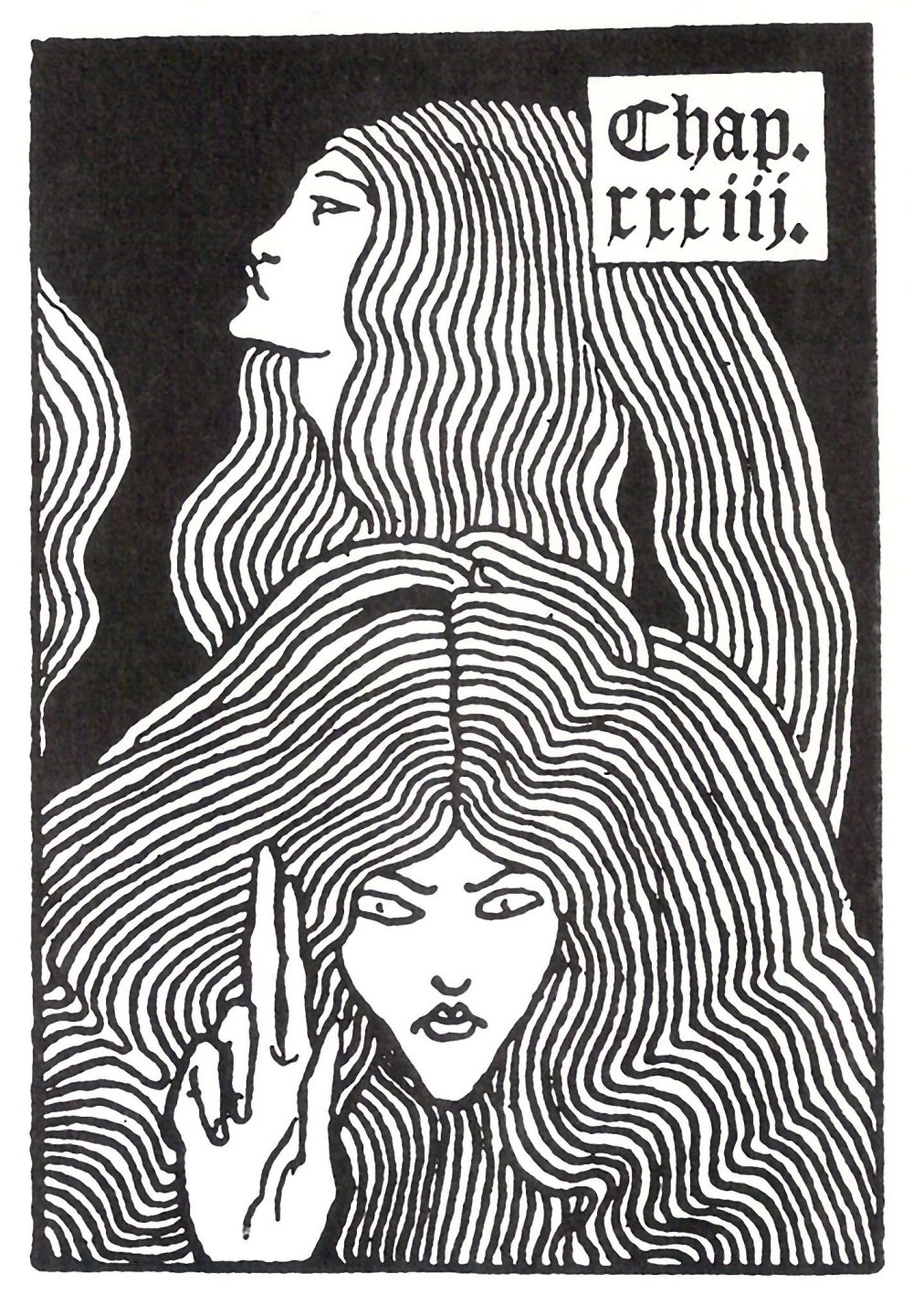
Illustration for Sir Thomas Malory’s Le Morte d’Arthur, Aubrey Beardsley, 1893-94.
Detail from an illustration for Sir Thomas Malory’s Le Morte d’Arthur, Aubrey Beardsley, 1893-94.
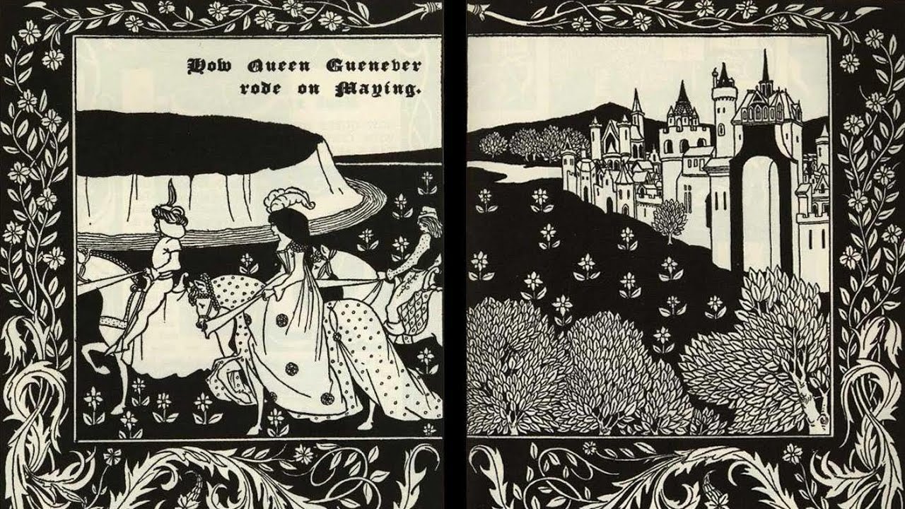
Spread from Sir Thomas Malory’s Le Morte d’Arthur, Aubrey Beardsley, 1893-94.
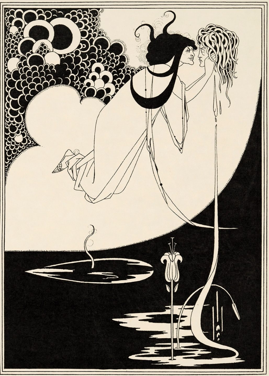
Illustration for Oscar Wilde’s Salome, Aubrey Beardsley, 1893.
The Beginning of Systems
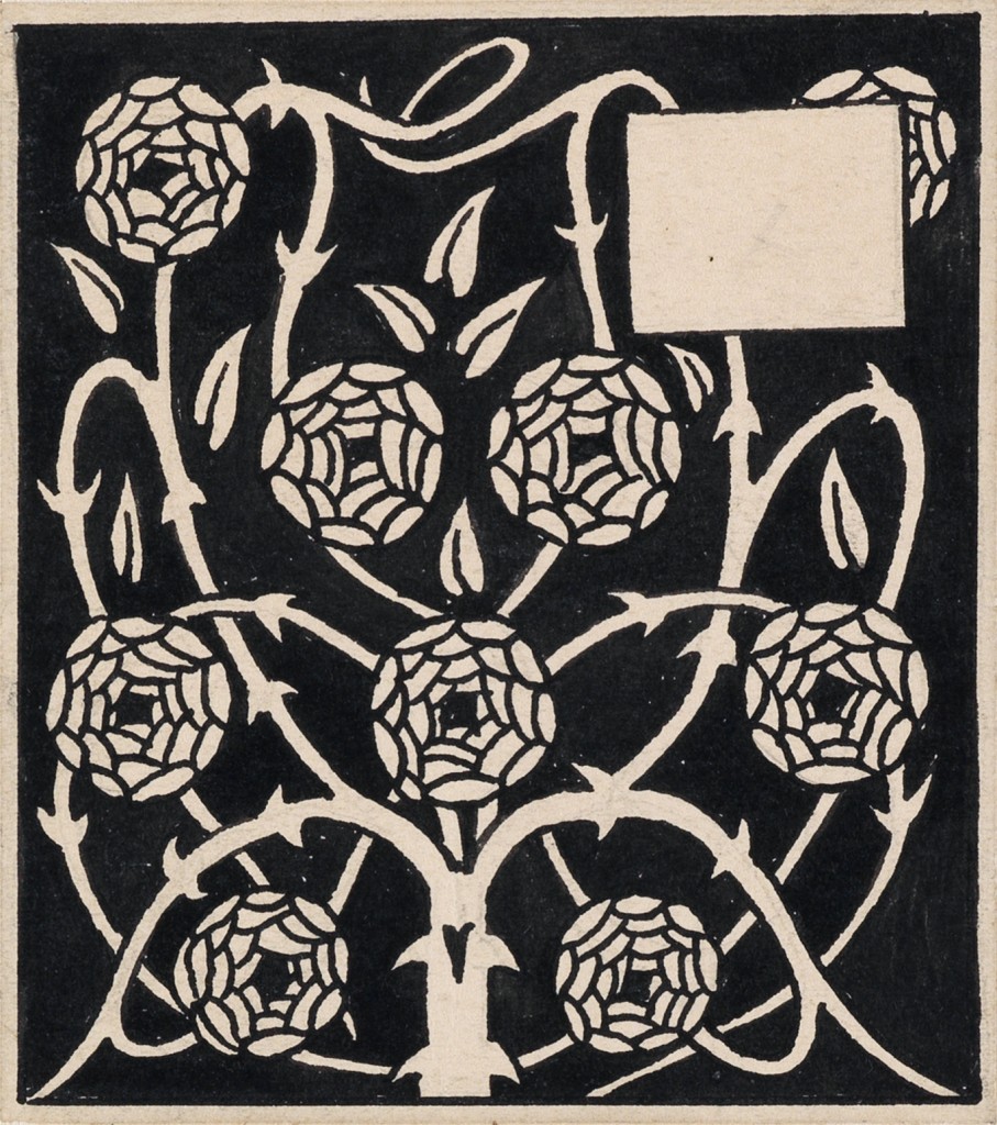
One of the hallmarks of Art Nouveau is the integration of creative fields. Within the period, there are countless examples of creative practitioners —artists, designers, architects—who engage in multiple disciplines simultaneously. We can trace the beginnings of this multidisciplinary approach to the Arts and Crafts movement. In the works of leading figures like William Morris and Arthur Mackmurdo we witness the merging of art, craft, and design. The Arts and Crafts movement advocated for a unified creative practice—one in which all disciplines worked together in harmony.
This unification of practices can also be seen in the work of Art Nouveau designers like Henry van de Velde who, during the period of Art Nouveau, worked as a painter, architect, and book designer. Another prominent example of multi disciplinary design can be found in the work Peter Behrens.
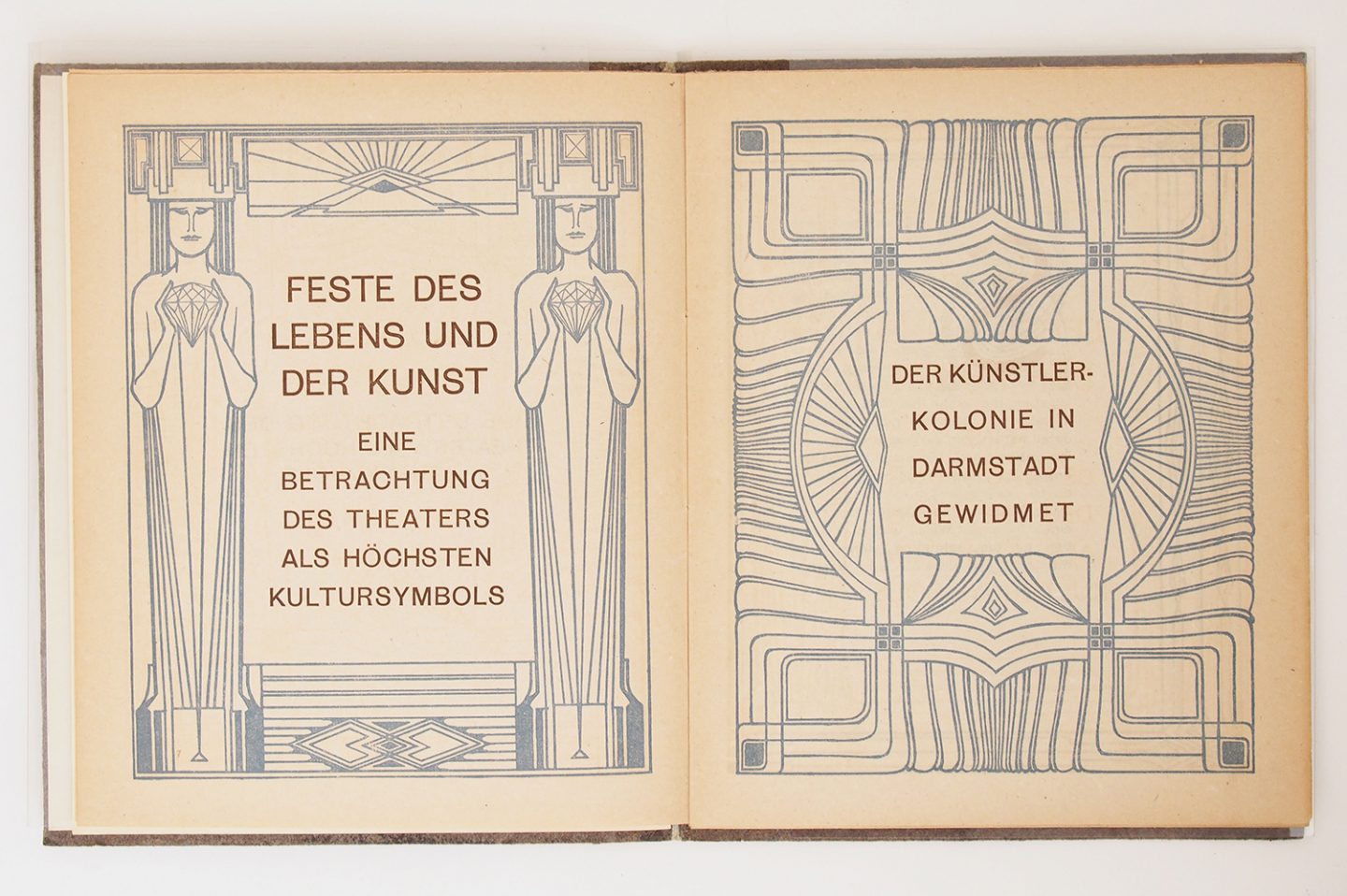
Beginning in the 1890’s in Munich, Peter Behrens began working as a painter, illustrator and bookbinder in the prevailing Art Nouveau style. In 1899, Behrens accepted an invitation to be part of an artist colony in Darmstadt. As part of the invitation, he was given a plot of land where he built his own house and fully conceived everything inside the house (furniture, towels, paintings, pottery, etc.) The building of this house is considered to be the turning point in his life, when he left the artistic circles of Munich and moved away from Art Nouveau to a style that is considered to be one of the first examples of modernism.
In 1903, Behrens moved to Dusseldorf to become the artistic director of The Dusseldorf School of Arts and Crafts. In 1904, a Dutch architect named J.L. Mathieu Lauweriks joined the faculty. Lauwerik’s approach was centered on using the grid as the primary underlying structure of creative works ranging from architecture to the creation of custom typography and letterforms. Behrens became fascinated with Lauwerik’s process and eventually integrated it into his own working methods.
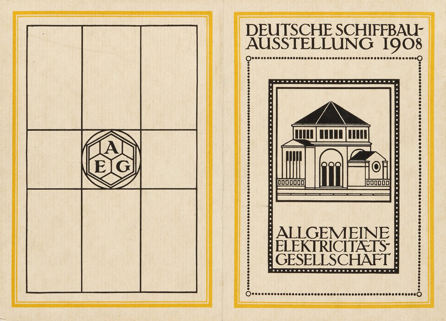
In 1907, Behrens became the artistic advisor at AEG— a Berlin company specializing in electric product design. He oversaw everything from marketing and advertising to product design, to interior design and architecture. In his role, he incorporated geometric structure as a strategy for creating what is considered one of the first examples of a modular and cohesive identity system. His application of design standards to manufacturing and production is considered one of the first instances of industrial design being applied in a corporate context.
Behren’s work marks the introduction of systems thinking into the modernist design perspective. His use of geometry as an underlying structure for design layout and composition would become a foundational element for the curriculum of the Bauhaus and significantly influence the rational approach of Swiss designers in Zurich and Basel. His use of design to establish a unified corporate identity would only become more relevant as businesses expanded across the globe. The visual language of modernism would become the chosen vernacular of international commerce and industry in the twentieth century.
Akzidenz-Grotesk is a typeface that was originally released in 1898 by the Berthold Type Foundry of Berlin. Akzidenz is a grotesque style san serif typeface that was originally designed for utilitarian applications outside of the elevated space of fine printed books. Akzidenz-Grotesk is acknowledged as one of the first typefaces that was released for use as a type system. The typeface included an array weights and which made it particularly useful in the creation of graphic works which required more complex layouts like advertisements and informational materials. By the 1950’s and 1960’s the typeface would be widely used across all applications and would eventually become synonymous with the International Typographic style.
In 1906, Frank Pick became the chief executive officer of the Underground Electric Railways Company of London. He spearheaded the creation of a design system which included modular elements for way-finding and identity. The system included, maps, posters, advertisements, modular location signage, and a custom typeface created by the esteemed calligrapher Edward Johnston in 1916.
Pick commissioned some of the best designers working in London and beyond to create striking posters showcasing the brand. These advertisements, along with various elements of way-finding—maps, markers, location specific signage— were place throughout the city. The Underground Railway’s distinctive red ring functioned as a graphic beacon within the urban landscape of London. The combination of bold geometry, vibrant color, and neutral typography resulted in a recognizable mark that guided commuters to their destinations as they traveled.
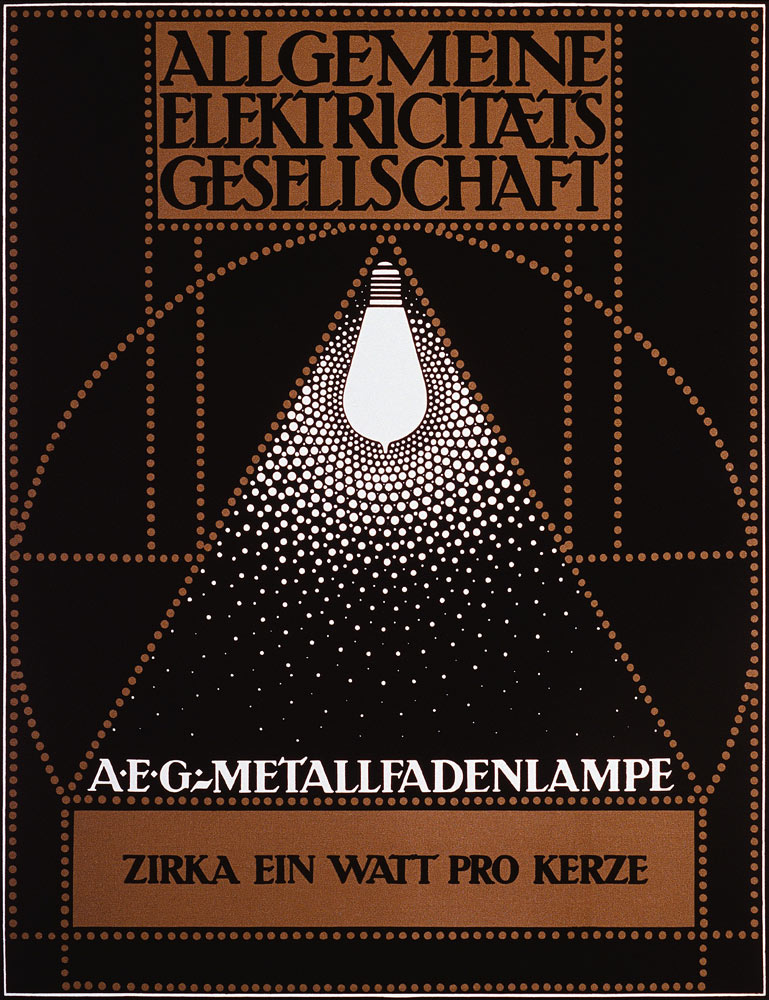
Poster for AEG, Peter Behrens, 1908.
An example of the design system created for AEG by Peter Behrens, 1908.
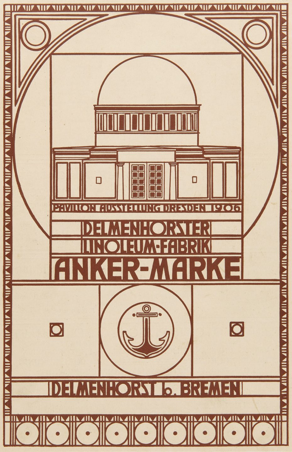
Advertisement for the Delmenhorster linoleum factory, Peter Behrens, 1905-06.
Spread from Celebration of Life and Art, Peter Behrens, 1900. This publication is the first in which a san-serif typeface is used as the primary letterform.
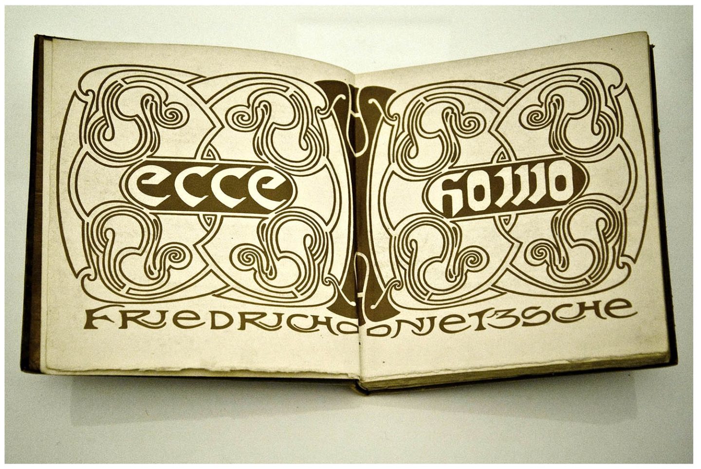
Design for Nietzsche’s Ecce Homo, Henry van der Velde, 1908.
Poster design, Henry van der Velde, 1899.
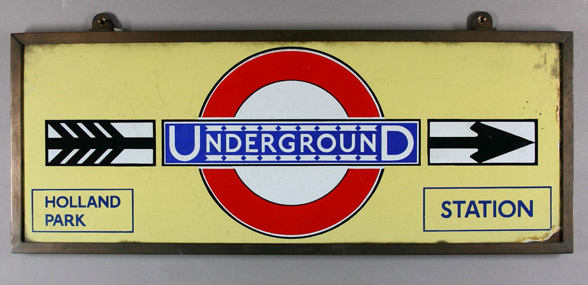
Sign for the London Underground featuring the logo and typeface designed by Edward Johnston and released in 1908.
The Emergence of the Avant Garde
In the midst of numerous political, economic, social, and cultural revolutions throughout the world, new and previously uncharted approaches to creative practice were emerging throughout Europe and beyond. Various movements in the realm of visual art and design were appearing in cities like Paris, London, Zurich, and New York. These movements were defined by artists and designers, through experimentation and innovation, breaking with past modes of process and execution.
This vast array of creative participation during this time resulted in formats and styles that would become standard elements within the modernist approach to art, design, craft, and architecture. These conventions would often be initiated by a singular movement then quickly adopted by artists that were involved in other concurrent movements. Geometry and flat abstraction were fundamental characteristics of the forms associated with cubism and later the art deco style. The Futurists of Italy pushed the boundaries of typography and utilized letter-forms as dynamic elements of visual expression. The surrealists integrated elements of chance and randomness into the creative process. Hannah Hoch’s photo-montages deconstructed the practice of photography and, in the process revealed its potential for creative investigation. The Suprematists and Constructivists of Russia and the De Stijl movement of the Netherlands used distilled geometry in the form of abstract compositions to communicate complex ideas and narratives.
Much of the work by these avant garde artists was political or ideological in nature. They saw their creative practice as an opportunity for social participation. In the wake of great changes taking place in the world around them, artists and designers working at this time believed they could, through their work, contribute to creating an idealistic future.
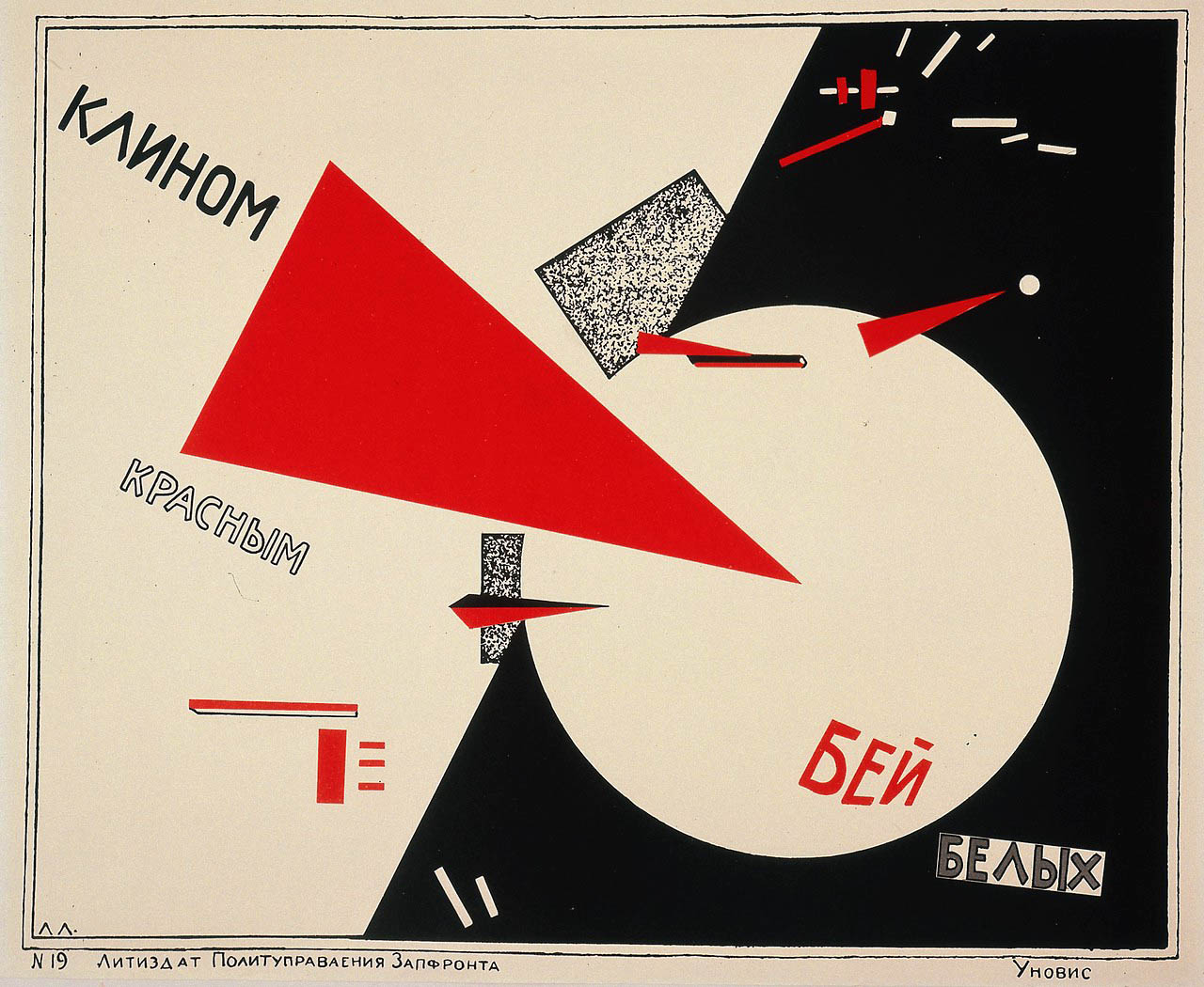
Beat the Whites with the Red Wedge, El Lissitzky, color lithograph on paper, 1919.
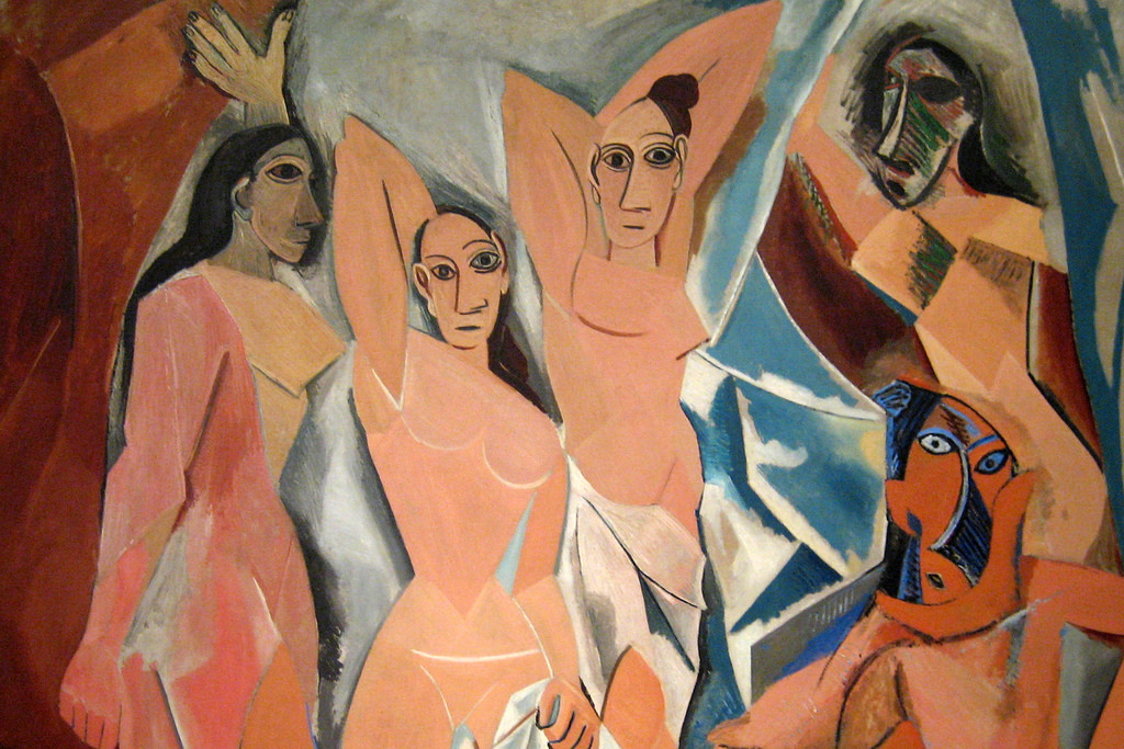
Les Demoiselles d’Avignon, Pablo Picasso, 1907.
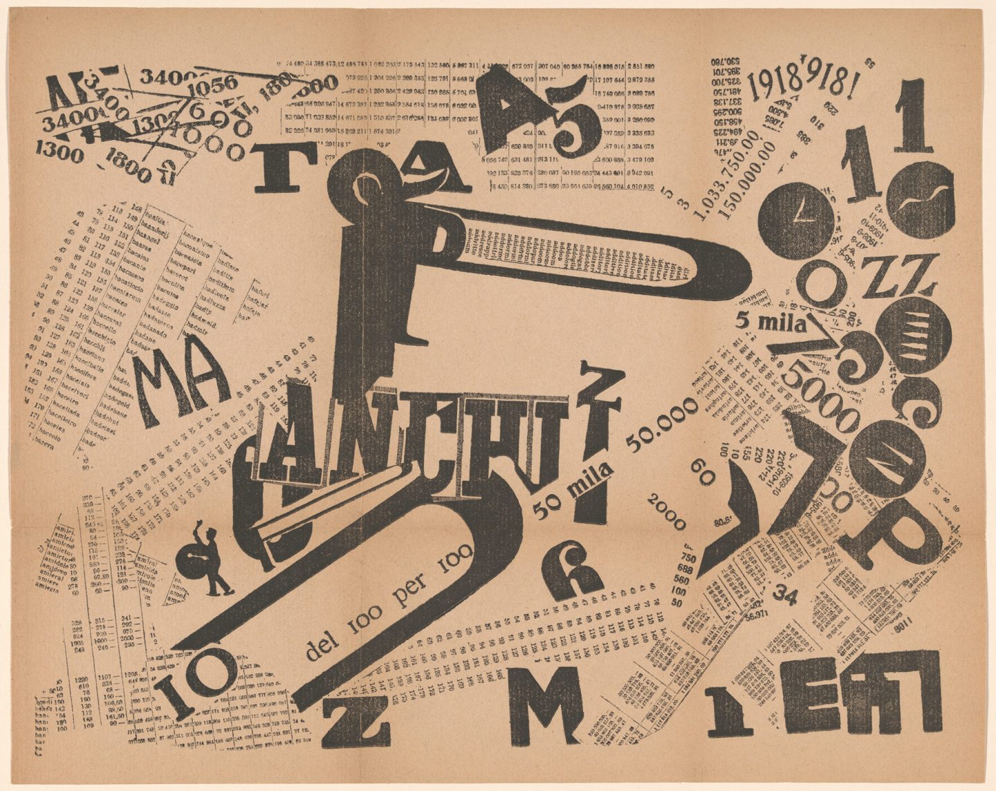
A Tumultuous Assembly. Numerical Sensibility, Filippo Marinetti, Letterpress, 1919.
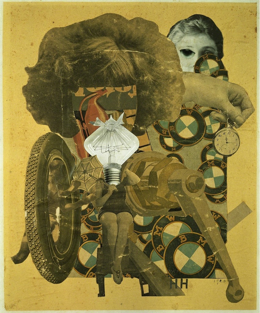
The Beautiful Girl, Hannah Hoch, Photomontage, 1920.
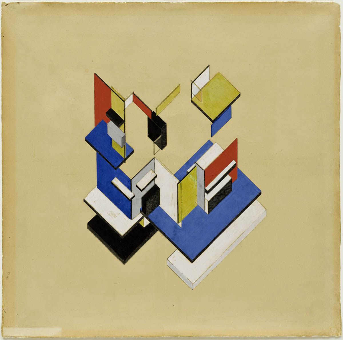
Contra-Construction Project (Axonometric), Theo Van Doesburg, Gouache on lithograph, 1923.
Art Deco
Named for a design exposition that was held in Paris in 1925, Art Deco was a style that began emerging just before World War 1. It resulted from a combination of visual approaches centered on geometry, pattern, and stylization found in avant garde movements such as cubism, art nouveau, and constructivism. In the wake of the destruction of World War 1 and within the rise of capitalism throughout Europe and the US, Art Deco came to represent a new graphic approach within popular culture. Art Deco would play a significant role in integrating the visual innovations of the avant grade movements in Europe with the formats of advertising, marketing, and mass production that arose within the new climate of industry and commerce. The result is a creative practice which uses the elements of design to give form to identity, information, consumer goods, and media within the framework of a capitalist culture.
Art Deco is an extension of avant grade sensibilities filtered through the lens of the emerging consumerist culture of the twenties. Its emergence as a dominant international style marks an important shift in the commercial arts. The Arts and Crafts movement positioned themselves in opposition to consumerist culture and mainstream methodologies; within the genre of Art Nouveau, artists and designers approached the commercial sphere with a sense of artistry and provenance. The soullessness and triviality of mass production was countered with inventiveness, spirituality, and a reverence for nature. Art Deco is a purely visual approach that wholly embraces the machine age and its slick, geometric aesthetic. Its perspective is centered on positioning “the new”— innovation, desire, fashion— as the cornerstone of cultural currency. It was the visual accompaniment to a culture who —through the distractions of hedonism, decadence, and consumerism—was wanting to escape the terrors of war and the pressures of the modern age.
The popularity of Art Deco waned during the Great Depression which began in 1929. The style became more subdued and understated. Its previous role as a tool for marketing and consumerism was compromised by the economic hardship that was prevalent at the time.
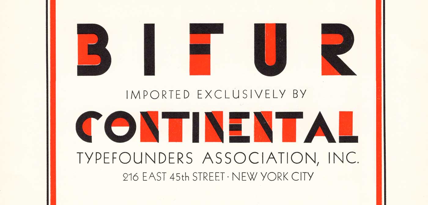
Cover of Continental Type’s 1930 type specimen book featuring type design by A.M. Cassandre.
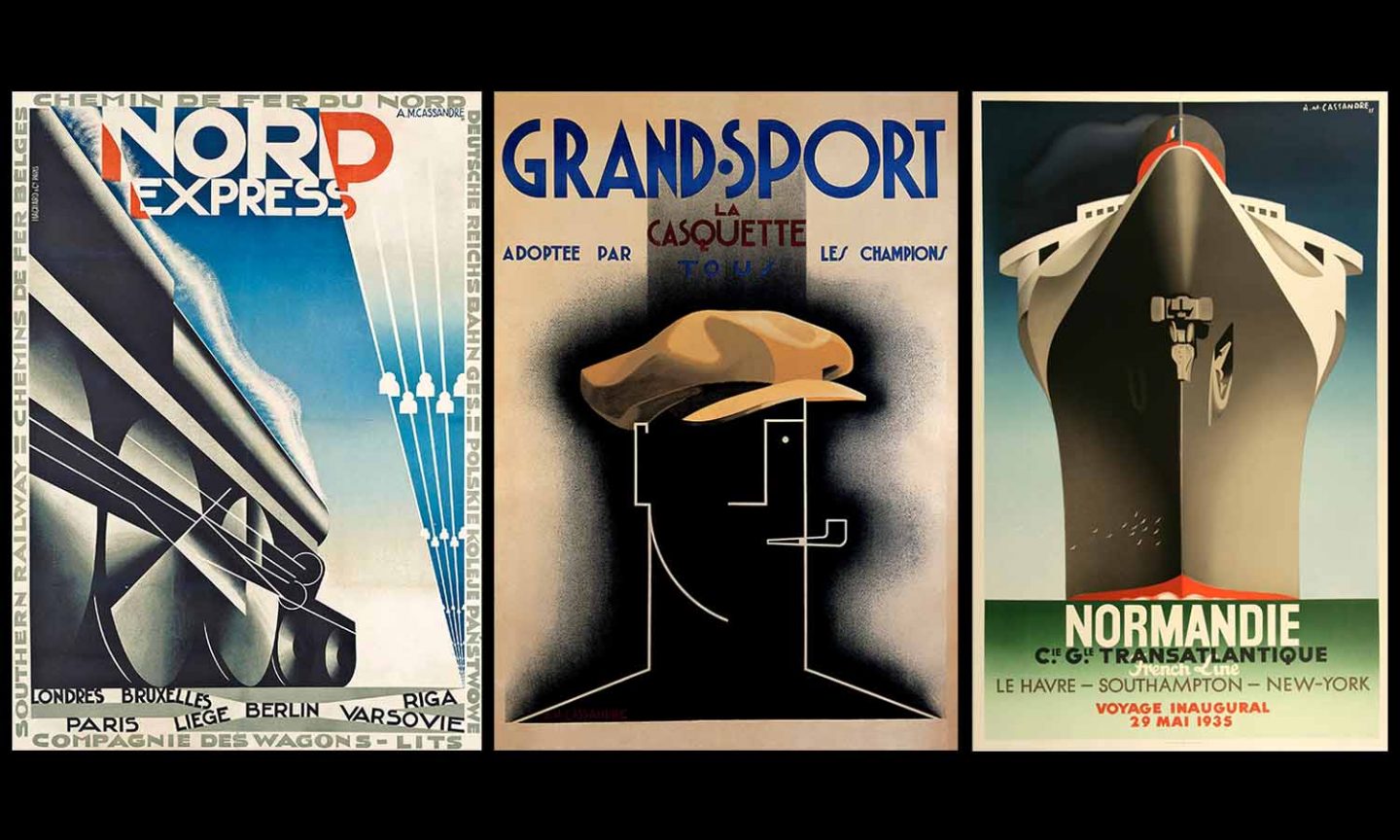
Posters by A.M. Cassandre.
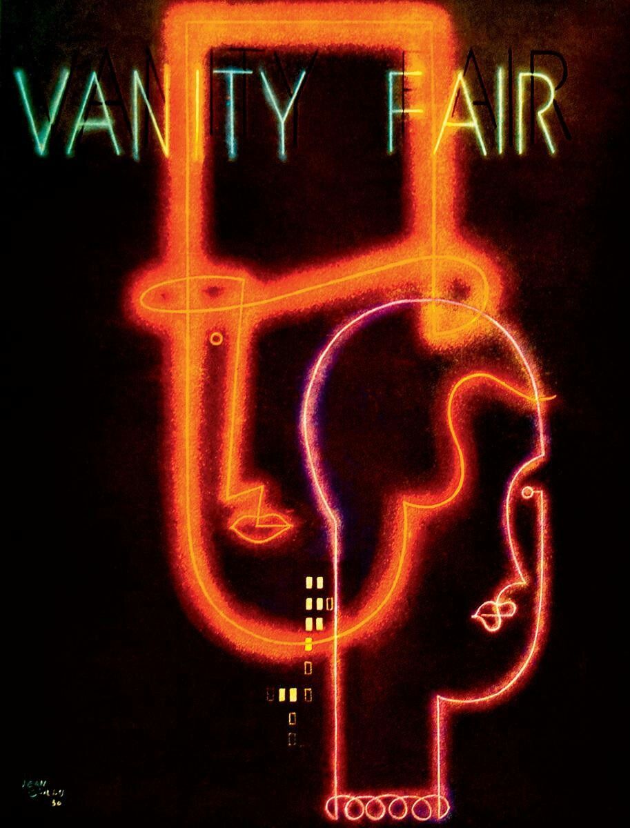
Cover for Vanity Fair, Jean Carlu, 1931.
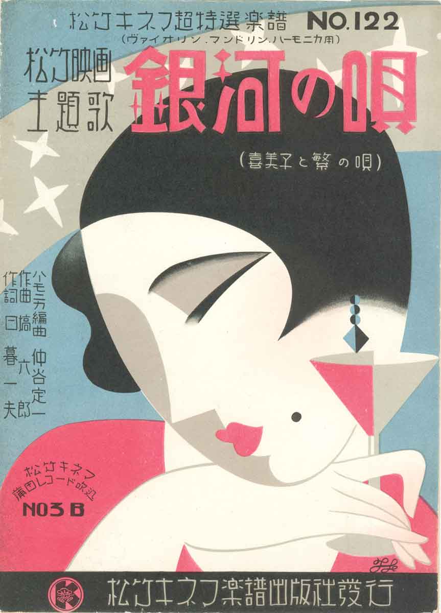
The cover for a Japanese songbook featuring the art deco style, 1931.
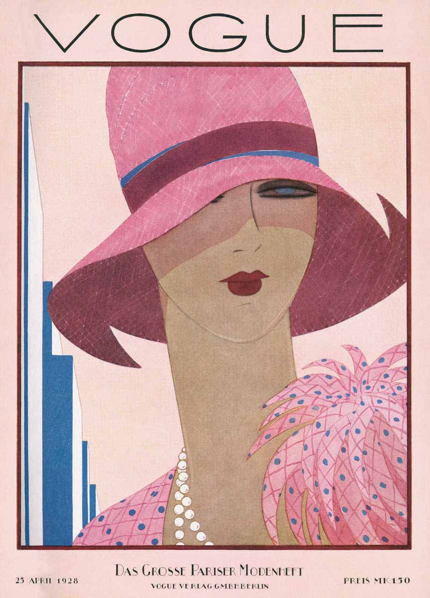
Cover for Vogue magazine, Harriet Meserole, 1928.
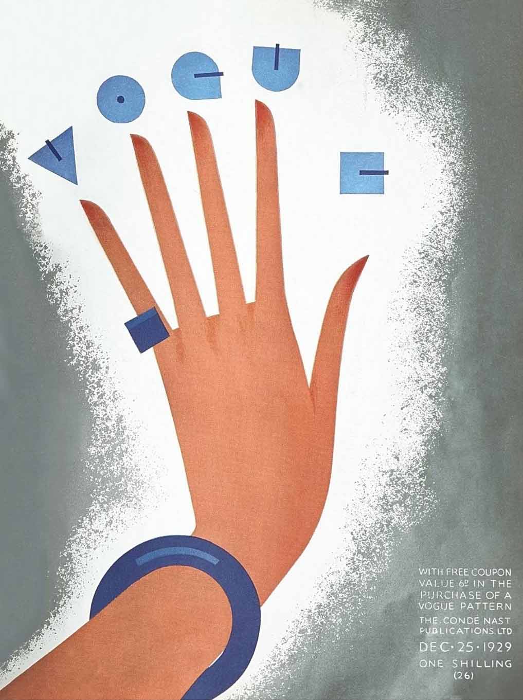
Cover for Vogue magazine, Gullermo Bolin, 1929.
The Bauhaus
The Bauhaus was founded in 1919 in the city of Weimar by German architect Walter Gropius. In the Proclamation of the Bauhaus—a manifesto detailing his strategy for structuring the school’s curriculum—Gropius outlines his utopian vision of integrating art, architecture, design, and craft into a single unified practice.
“Architects, sculptors, painters—we all must return to craftsmanship! For there is no such thing as “art by profession.” There is no essential difference between the artist and the artisan. The artist is an exalted artisan. Merciful heaven, in rare moments of illumination beyond man’s will, may allow art to blossom from the work of his hand, but the foundations of proficiency are indispensable to every artist. This is the original source of creative design.
So let us therefore create a new guild of craftsmen, free of the divisive class pretensions that endeavored to raise a prideful barrier between craftsmen and artists! Let us strive for, conceive and create the new building of the future that will unite every discipline, architecture and sculpture and painting, and which will one day rise heavenwards from the million hands of craftsmen as a clear symbol of a new belief to come.”
Walter Gropius, Proclamation of the Bauhaus, 1919.
Gropius had previously worked as an assistant to architect and designer Peter Behrens and had been exposed to a very specific design approach that focused on objectivity, systems thinking, modularity, and the use of grid based structures.
When choosing his faculty, Gropius had his choice of the leading artist and designers associated with the avant garde movements. The staff of the Bauhaus included Expressionists Wassily Kandinsky and Paul Klee, Constructivists Laszlo Maholy Nagy and El Lissitzky and Theo Van Doesberg from the De Stijl movement in the Netherlands.
Just as Art Deco represents a synthesis of avant garde methodologies, the approach of the Bauhaus incorporated philosophies and visual styles associated with modernist movements and translated them into a standardized curriculum. The distilled geometry of Constructivism, the expressive type of Futurism, and the photo-montage of the Dadaists all come together to form a distinct disciplined approach that would create an impact on creative practice across the globe.
The Bauhaus combined elements of both fine arts and design education. The curriculum commenced with a preliminary course that immersed the students, who came from a diverse range of social and educational backgrounds, in the study of materials, color theory, and formal relationships in preparation for more specialized studies. The school emphasized a focus on craft in the service of elevating the process of mass production. In 1923 the school adopted the slogan “Art into Industry.”
The Bauhaus generated innovations in fields such as printing, metalwork, furniture design, and textile design. Not only were designers embracing new technologies and production methods, they were leading in their development.
Within the Bauhaus, there developed a distinct approach to graphic design. The geometry and distilled forms found in the experimental works of avant garde movements like De Stijl and Constructivism was channeled into the execution of layout and the design of letterforms.
The school changed locations to Dessau in 1925 and then again to Berlin in 1932 where it remained open one more year. An increasingly dangerous political climate played a major role in shaping the evolution of the program in its later years. The school eventually closed in response to the political unrest that was present in Germany at the time which eventually culminated into the emergence of the Nazi party in 1933.
The New Typography
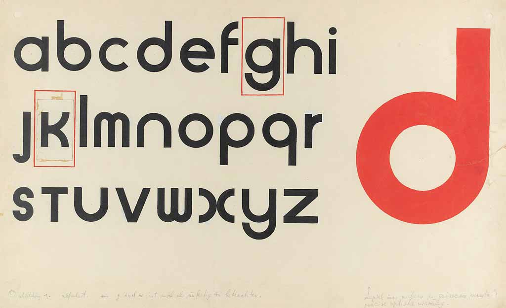
In 1923, the German typesetter Jan Tschichold toured the Bauhaus school in Weimar. Tschichold, who had been traditionally trained as a calligrapher, typographer, and book designer, was so impressed by the school’s distinct approach to layout and graphic design that he immediately adopted the style in his own work. Within the Bauhaus curriculum, the geometry, distilled forms, and inventiveness found in the work of avant garde movements like De Stijl and Constructivism was channeled into the practice of visual communication and typography. Compositions were asymmetrical yet balanced. There was a focus on hierarchy and clarity. The use of photography was experimental—often integrating elements of deconstruction, collage, and photo-montage. There was a sophisticated integration of negative space. Letterforms were often constructed from pure geometric shapes. One such example is the Universal Alphabet created by student Herbert Bayer. Bayer joined the Bauhaus in 1923 and was eventually appointed director of printing and advertising for the school.
Jan Tschichold was also a writer—he produced numerous articles on the subject of design and typography. In his written work, he often focused on the innovations of the Bauhaus; he also surveyed the contributions of emerging Swiss designers working in Zurich and Basel. In 1929 he released the book The New Typography which converted the principles of prominent designers of the time—from the Bauhaus, avant garde movements, and Swiss schools— into a step by step guide for practicing designers.
The design process outlined in Tschichold’s The New Typography would become a prominent visual approach within the sphere of graphic design. The techniques presented in the book codified styles and methods generated by the best design minds throughout Europe into specific standards of execution. Asymmetrical layout, the integration of geometry and grids, the use of geometric san serif letter-forms, the application of systems thinking, photo-montage, and a minimalist approach to layout and composition are all hallmarks of The New Typography lexicon. Now the sensibilities of modernism were a fully formed system that could be understood and applied by designers who didn’t have the benefit of being Bauhaus trained.
Released in 1927 by the Bauer type foundry in Frankfurt Germany, Paul Renner’s Futura perfectly captures the spirit of the Bauhaus and the accompanying New Typography. When designing the typeface, Renner was specifically interested in capturing the zeitgeist of the era, rejecting the previous grotesque or Gothic models of san serifs whose visual character was rooted in the past perspectives of the industrial revolution. He chose to utilize simplified geometric forms and strokes of near equal weight to create letter-forms that epitomize the feeling of modernity that was prevalent at the time.
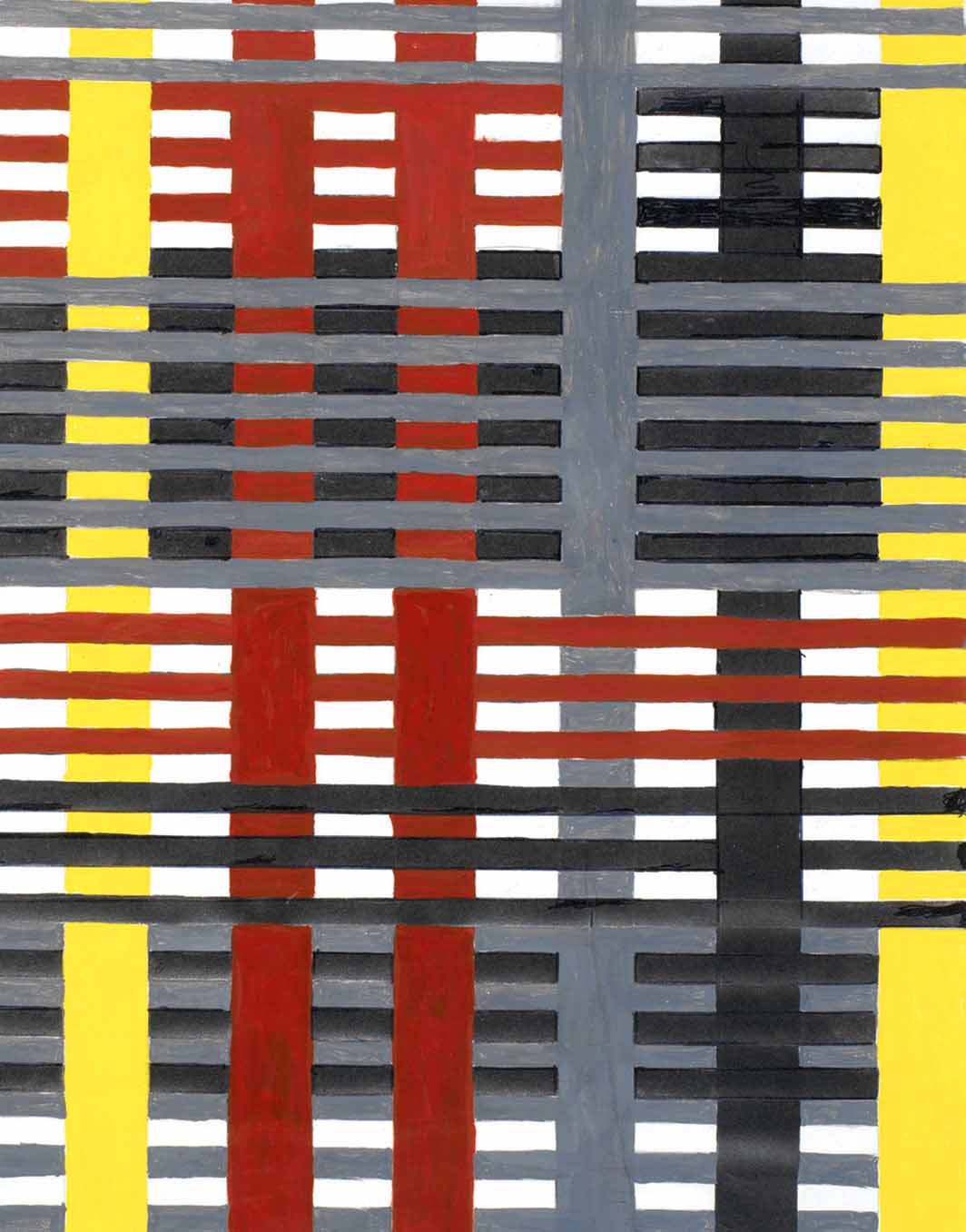
Study for an unexecuted wall hanging (detail), Anni Albers, gouache and pencil on photo offset paper, 1926.
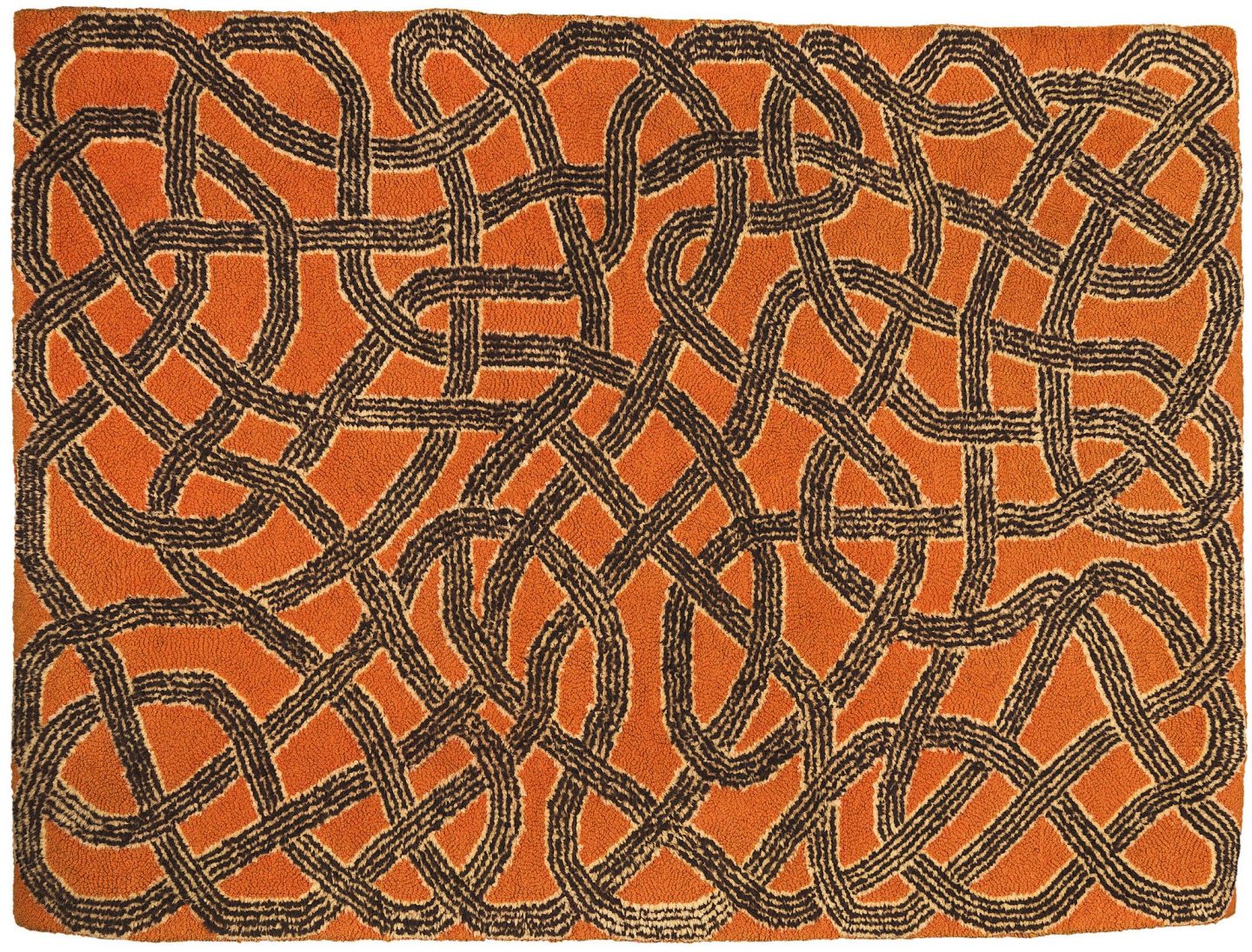
An Anni Albers rug from 1959.
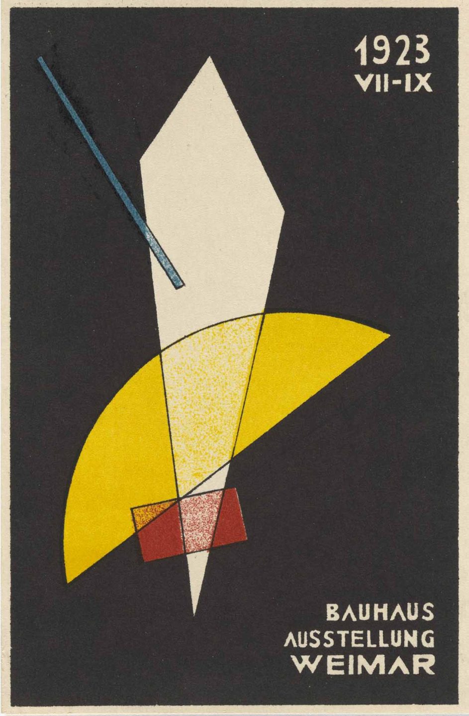
Poster for a Bauhaus exhibition in Weimar, Germany, Laszlo Moholy-Nagy 1923.
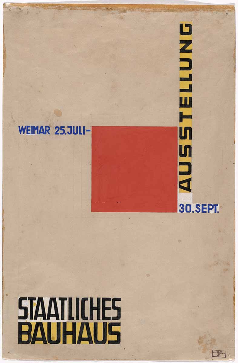
Unused poster design for Bauhaus Exhibition, Weimar, Herbert Bayer, 1923.
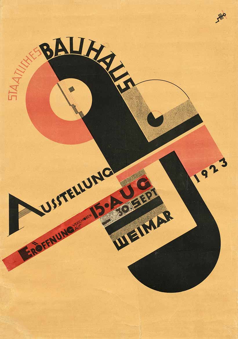
Bauhaus exhibition poster, Joost Schmidt, lithograph, 1923.
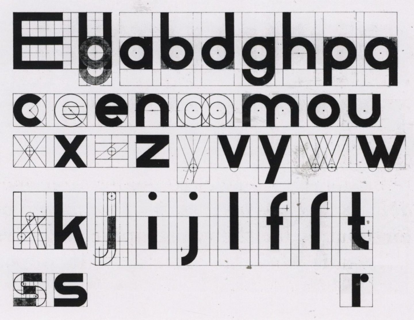
Sketches for Universal alphabet, Herbert Bayer, 1925.
Universal alphabet, Herbert Bayer, 1925.
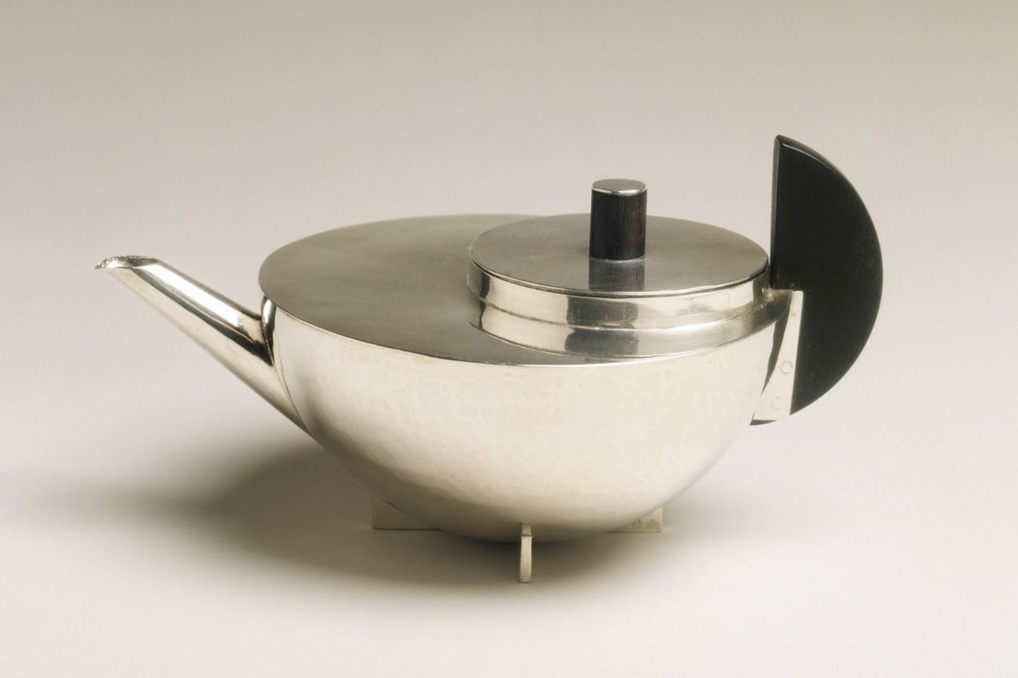
Silver and ebony teapot, Marianne Brandt, 1924.

Table lamp, Marianne Brandt, 1928.
Exhibition poster, Jan Tschichold, lithography, 1938.
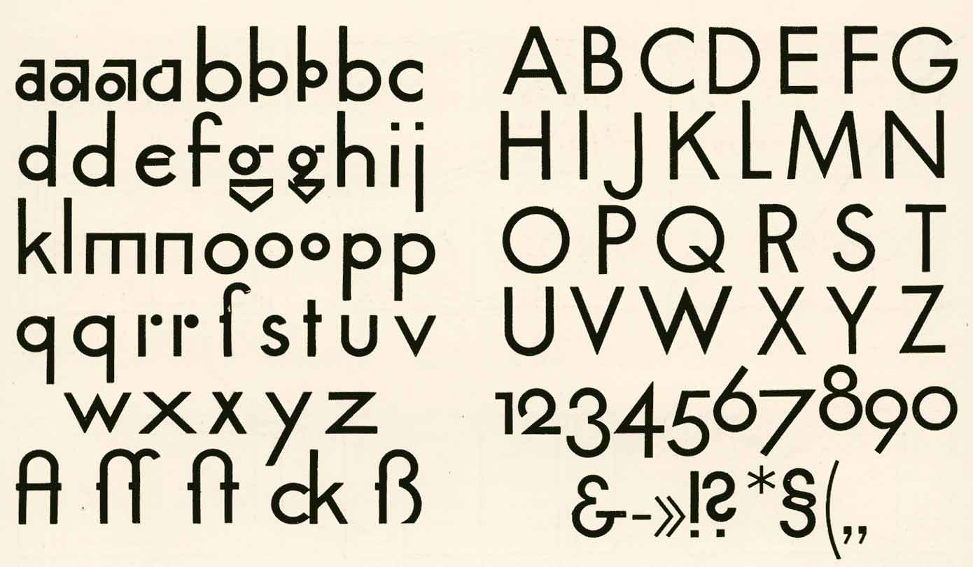
Paul Renner’s first version of Futura, 1921.
The Origin of the Swiss Style
The use of grid systems and geometry had been an integral part of the Swiss design approach for some time. As early as the 1890’s, the design curriculum of Swiss institutions like the Basel school of design included fundamental geometric exercises involving the cube and the line.
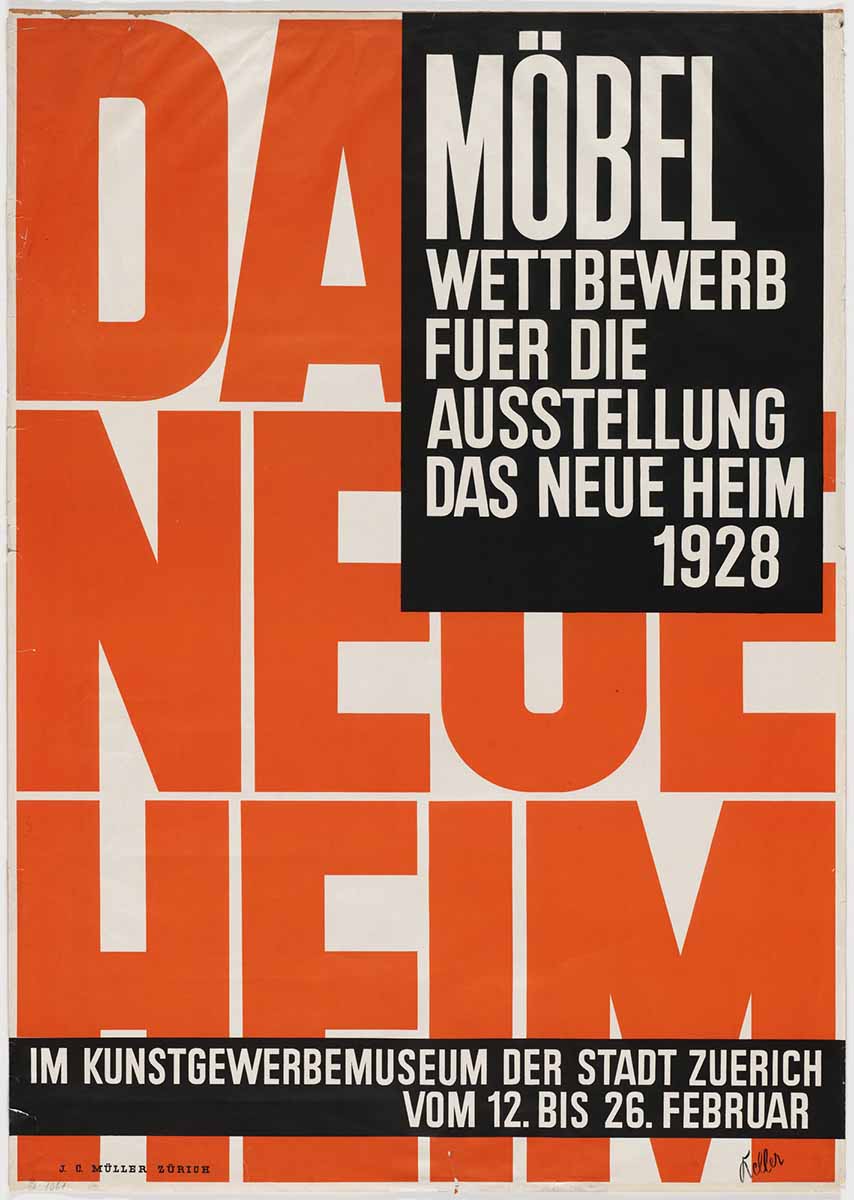
In 1918, Ernst Keller began teaching at the School of Applied Arts in Zurich. He presented an approach that was centered on the use of neutral san serif typefaces and grid systems as primary elements of visual communication. He encouraged his students to push the limits of typography as the central means of graphic expression. One of his students was Theo Ballmer who went on to study at the Bauhaus and later, in 1931, become a professor at the Basel School of Art and Crafts. Other world renowned designers such as Max Bill and Herbert Matter were also working as designers in Switzerland art this time. Unlike other creatives in Europe, who had to contend with the destruction and displacement of World War 2, Swiss designers continued to practice. Switzerland was one of four European countries that maintained an armed neutrality during the war. The country continued to engage in trade and commerce while the rest of Europe was set back by the devastation of warfare. During this time, the Swiss style continued to advance. After the war ended, the Swiss approach would make its way across the globe along with other methodologies developed in Europe by the avant garde movements and alumni of the Bauhaus.
Modernism Goes Global
During the turbulent and often dangerous years of World War II, many of the key figures of the Bauhaus and modernist movements emigrated to other parts of the world where their work and their teaching philosophies would influence generations of young architects, artists, and designers. Bauhaus alumni had a significant impact on US designers. Breuer and Gropius taught at Harvard. Josef and Anni Albers taught at Black Mountain College in North Carolina, and later Josef taught at Yale. Moholy-Nagy established the New Bauhaus in Chicago in 1937. In addition to teaching at the Illinois Institute of Technology, Mies van der Rohe also designed the campus. During the Great Depression in the US, many of the esteemed designers of the early modernist era took on teaching positions because of the lack of paid work available during this time. Their perspectives and approaches became the foundation for a new generation of designers who would emerge after World War 2 in the fifties and sixties.
In the wake of the war, we witness the appearance of a new global climate of connectedness. No longer bound by geography or nationalistic affiliation, many countries are collectively engaging in commerce, capitalism, media, and marketing. Innovation and technology become key factors of marketability, legitimacy, and progress. Modernism becomes the accompanying visual language of this new post-war era. After two World Wars perpetuated by politics and propaganda, the neutrality, order, and graphic dynamism of the modernist approach would resonate with audiences all over the world. The philosophies of the Bauhaus and early Swiss modernists would lay the groundwork for an approach that would represent, for the first time, a visual design language called the International Typographic Style.
In the years after the war, Swiss designers and educators working in Basel and Zurich would play a large part in turning the International Typographic Style into a global movement. Armin Hoffman began teaching at the Basel School of Art and Crafts in 1947. He would go on to mentor designers like April Greiman and Dan Friedman as well as create a body of work that would impact designers from all over the world.
Like Hoffman, Josef Müller-Brockmann was both an educator and working practitioner. From 1957 to 1960, he was a professor of graphic design at Zurich University of the Arts. His work exemplified the International Typographic Style with its employment of mathematical composition and neutral typography. In addition to his influential visual approach, Müller-Brockmann also created a series of publications that would further disseminate the Swiss design ethos around the world. In 1958, he became a founding editor of New Graphic Design a quarterly graphic design journal that featured work from an international array of designers who were working in the the Typographic Style. The publication would play a key role in exposing a world-wide audience to the visual approach of Swiss modernism.
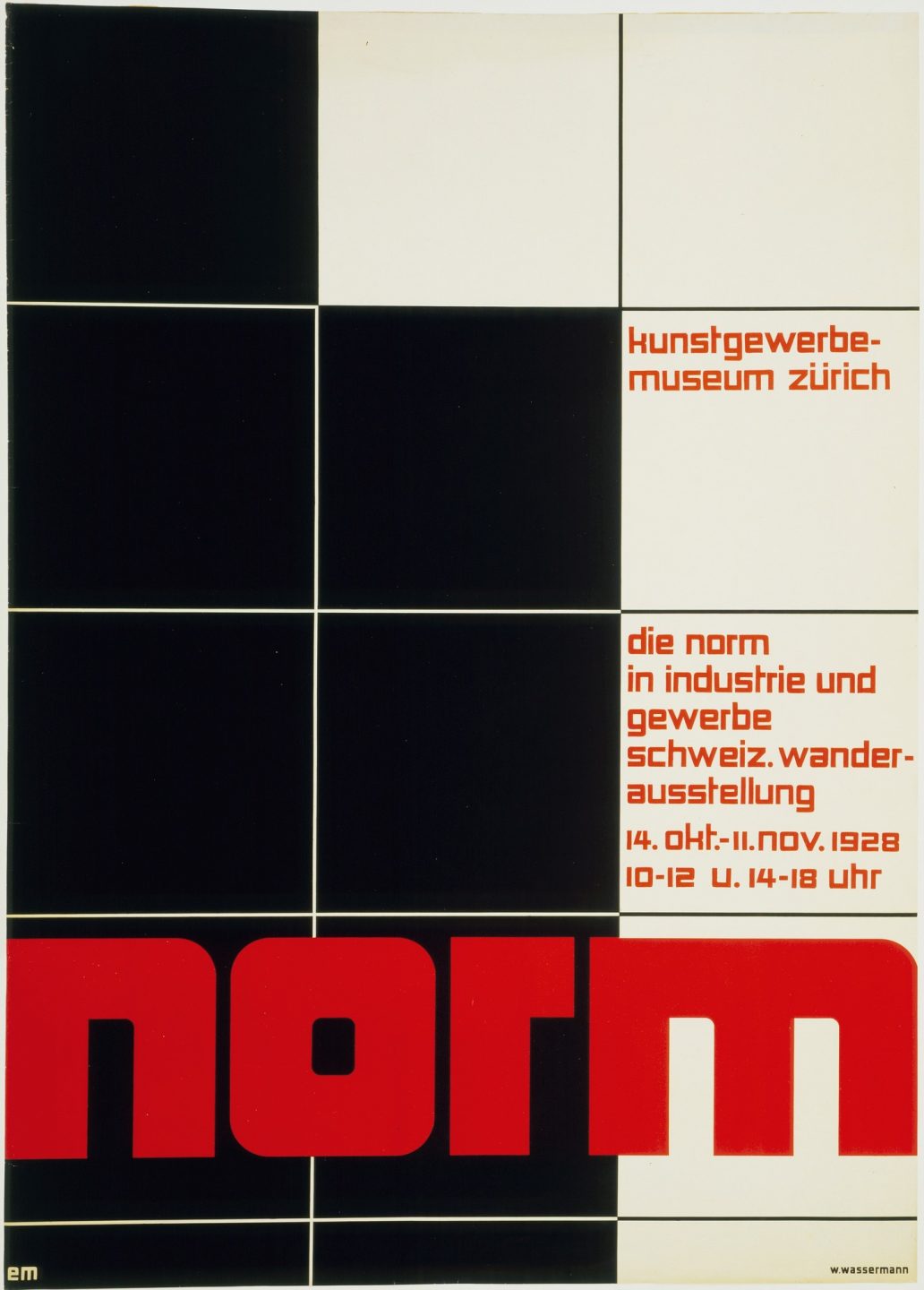
Poster for an exhibition of Swiss industrial design at the Kunstgewerbemuseum Zürich, Theo Ballmer, lithograph, 1928.
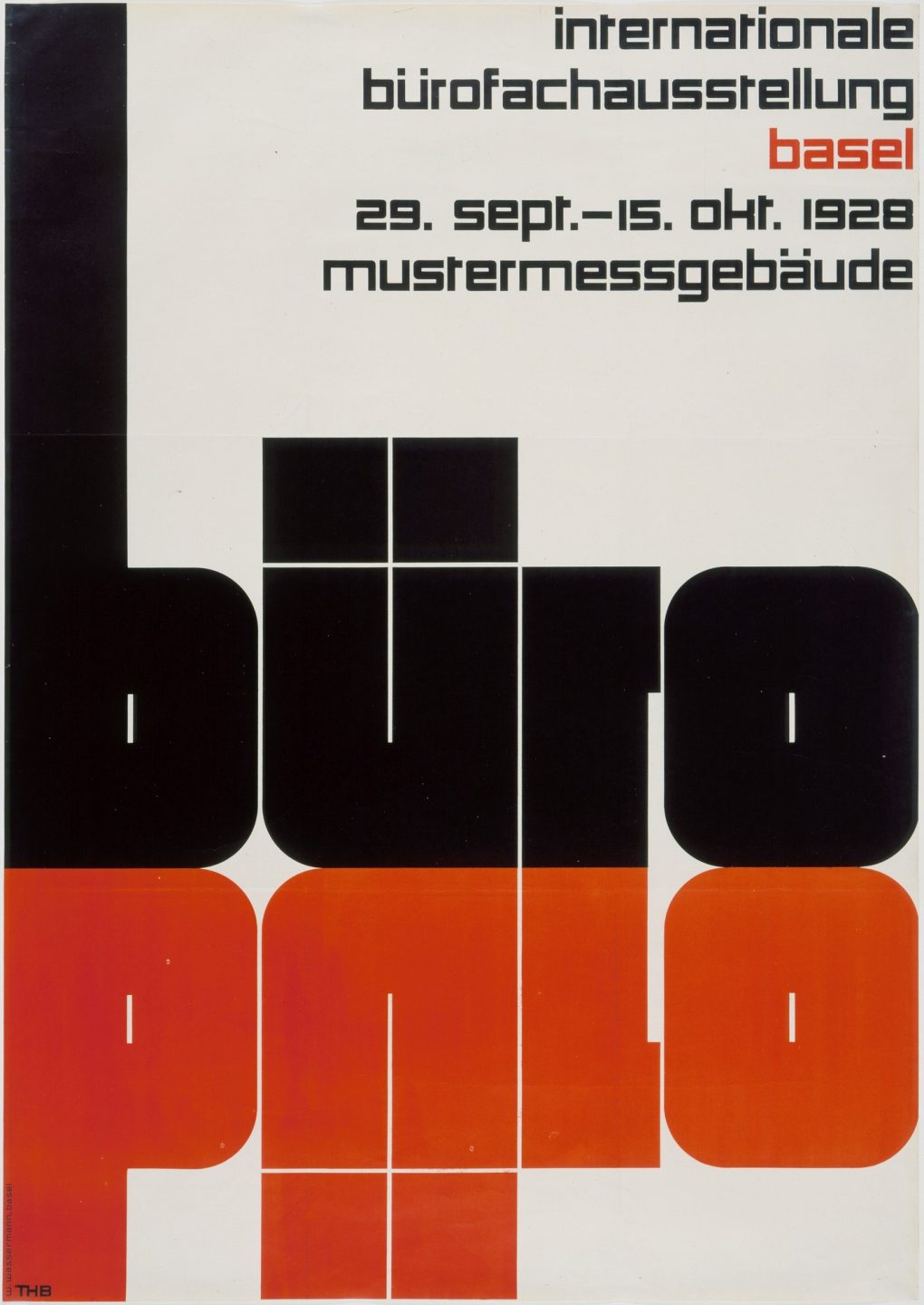
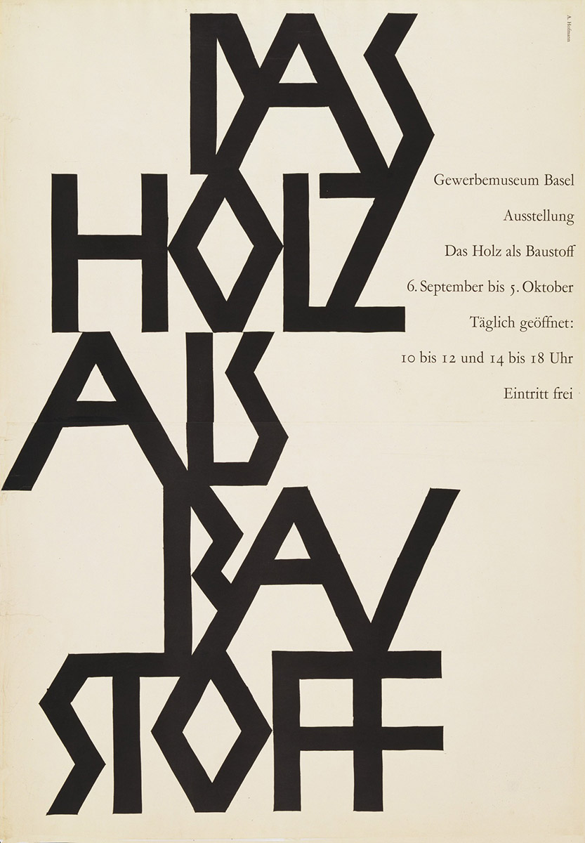
Poster for a Basel office design exhibition, Theo Ballmer, lithograph, 1928.
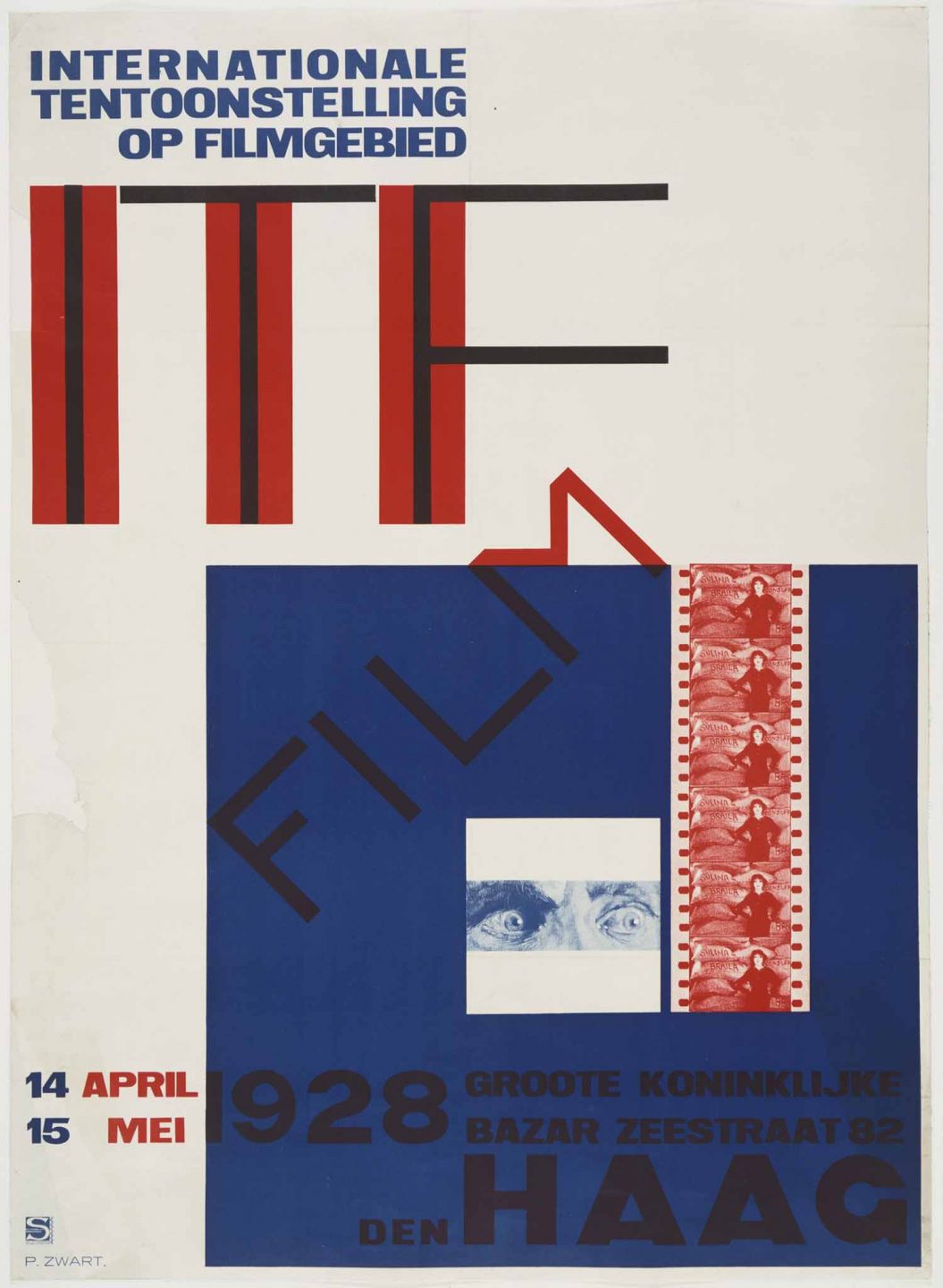
Film festival poster, Piet Zwart, lithograph, 1928.
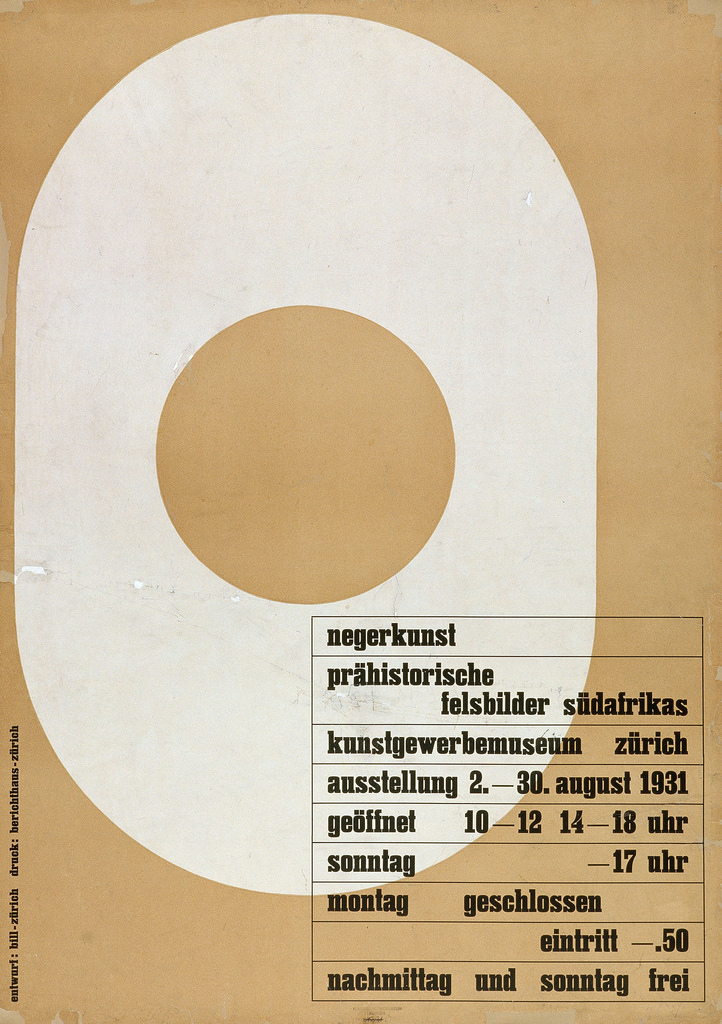
Letterpress poster, Max Bill, 1931.
Screenprinted poster, Ernst Keller, 1928.
Travel posters, Herbert Matter, photolithograph, 1935-36.
Linocut poster, Armin Hoffmann, 1952.
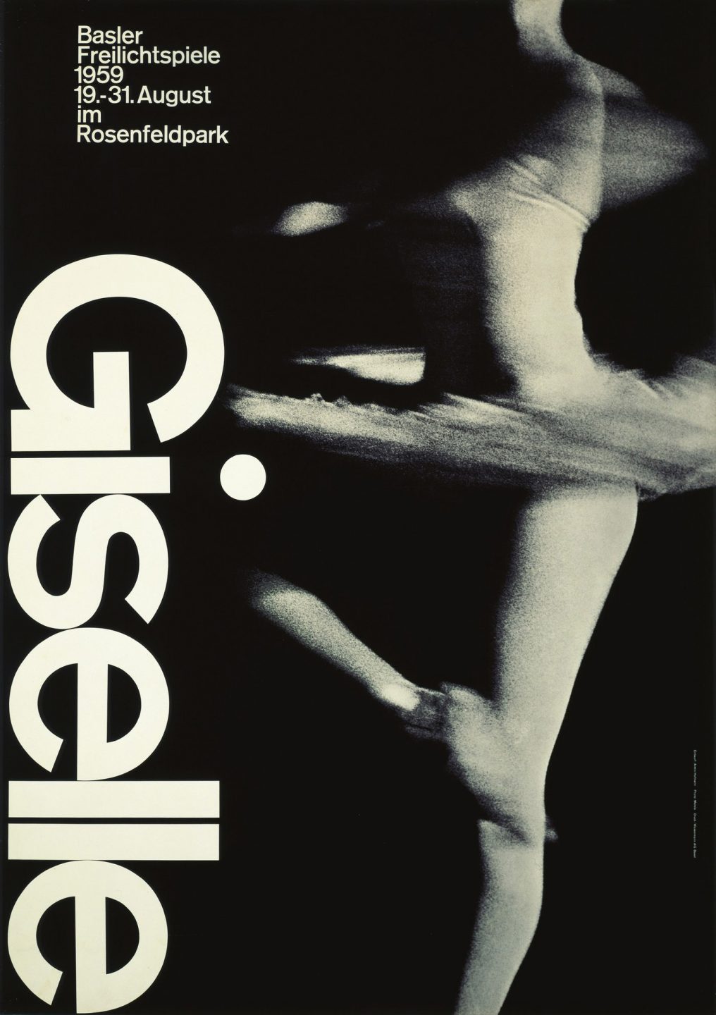
Poster for performance, Armin Hoffmann, photolithograph, 1959.
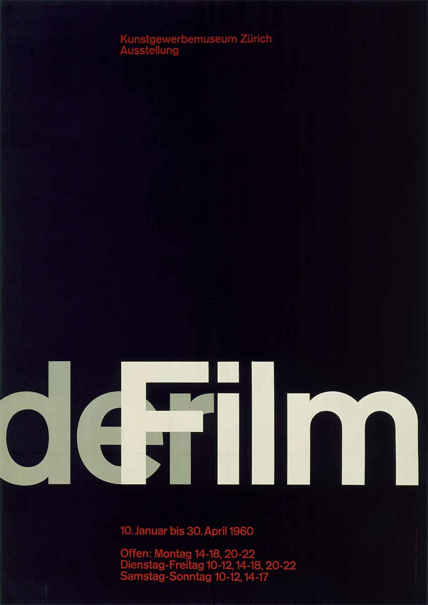
Film poster, Josef Müller-Brockmann, offset lithograph, 1960.
Poster, Josef Müller-Brockmann, offset lithograph, 1960.