01/18/2022
The American Identity
The experiences that shape
a multicultural nation
What the people want is very simple: they want an America as good as its promise.Barbara Jordan, The first Black woman elected to Congress from the South
By the turn of the 19th century, over 95% of the indigenous population of the Americas would perish as a result of the violence and disease brought upon them by European settlers. By the same time, almost 11 million Africans would be brought to the New World to be sold into slavery. Both of these historical accounts exemplify the erasure and exploitation at the core of the colonial campaign for progress and growth that would, by the end of World War 2, establish the US as a leading world power.
In overlooking these aspects of history, the connection between the harsh realities of the past and the inequities of the present is obscured. While it’s important to acknowledge the many ways in which the US has advanced and evolved since its inception; the imprint of colonialism is still very much present in the underlying structures that dictate the circumstances of those living under contemporary American capitalism. From the long-standing unequal distribution of wealth to the current perceptions of power, race, and privilege, it is clear that the past is not behind us.
“The United States of America has had the world’s largest economy for most of our history, with enough money to feed and educate all our children, build world-leading infrastructure, and generally ensure a high standard of living for everyone. But we don’t. When it comes to per capita government spending, the United States is near the bottom of the list of industrialized countries, below Latvia and Estonia. Our roads, bridges, and water systems get a D+ from the American Society of Civil Engineers. With the exception of about forty years from the New Deal to the 1970s, the United States has had a weaker commitment to public goods, and to the public good, than every country that possesses anywhere near our wealth.”
The Sum of Us: What Racism Costs Everyone and How We Can Prosper Together, Heather McGhee
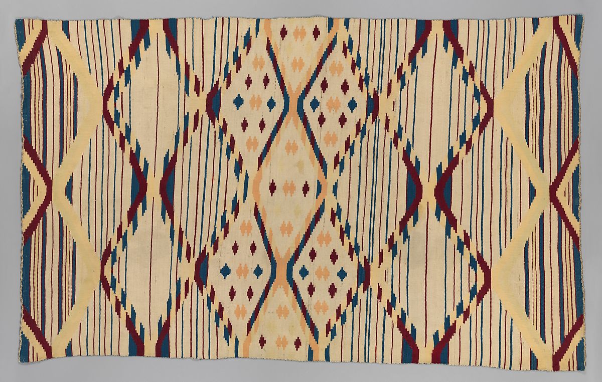
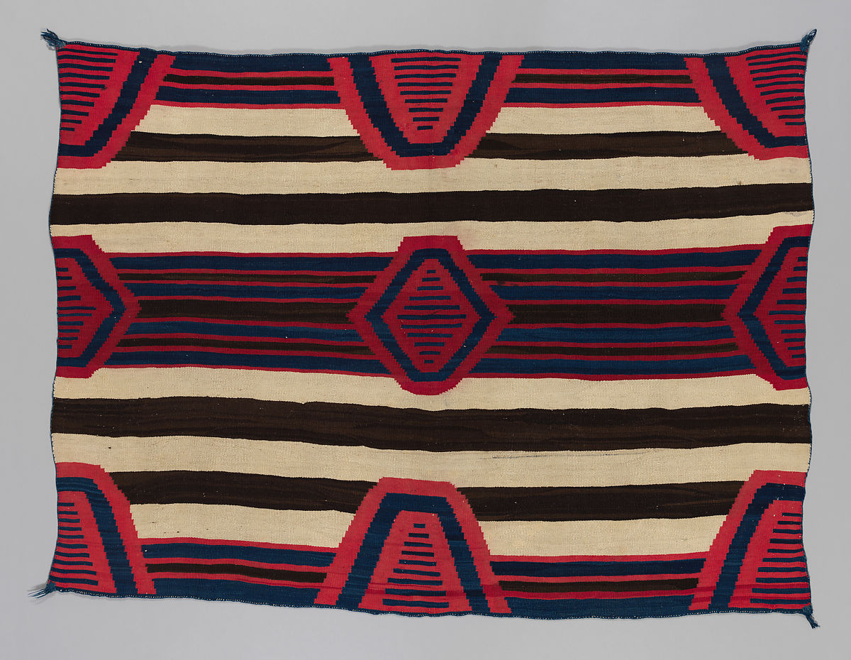
The Navajo Nation
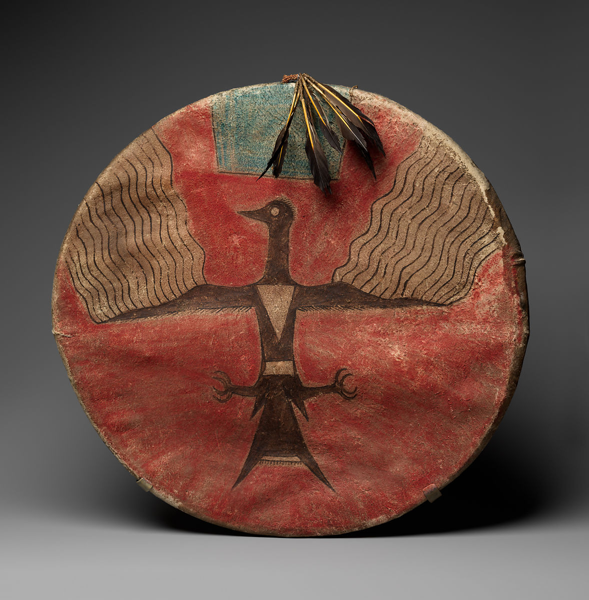
In 1492, when Christopher Columbus first “discovered” the new world. there were almost 600 indigenous tribes residing in North America alone. Each of these tribes represents a singular culture with its own distinct history, language, and approach to art and design.
In the location along the Arizona-Utah border designated as the Navajo Nation, evidence of human inhabitants date as far back as 12,000 BCE. The Navajo tribe first emerged in the Four Corners area of the Colorado Plateau between 1100 and 1500 CE. Spanish settlers first made contact with the Navajo in 1582. From 1860 to 1864, the Navajo tribe retaliated against the US government who had initiated a series of military campaigns to drive the Navajo people from their land. American troops burned down Navajo homes, destroyed crops, and slaughtered livestock. Many Navajos were killed or imprisoned. In 1868, Navajo leaders signed a treaty with the US government and the first Navajo reservation was established at Bosque Redondo in eastern New Mexico—a great distance from the original Navajo territory. Boarding schools and internment camps were set up on this new reservation which employed methods of forced assimilation to separate Navajo people from their history and culture. Later, the treaty was renegotiated and the Navajo were allowed to return to their ancestral homeland.
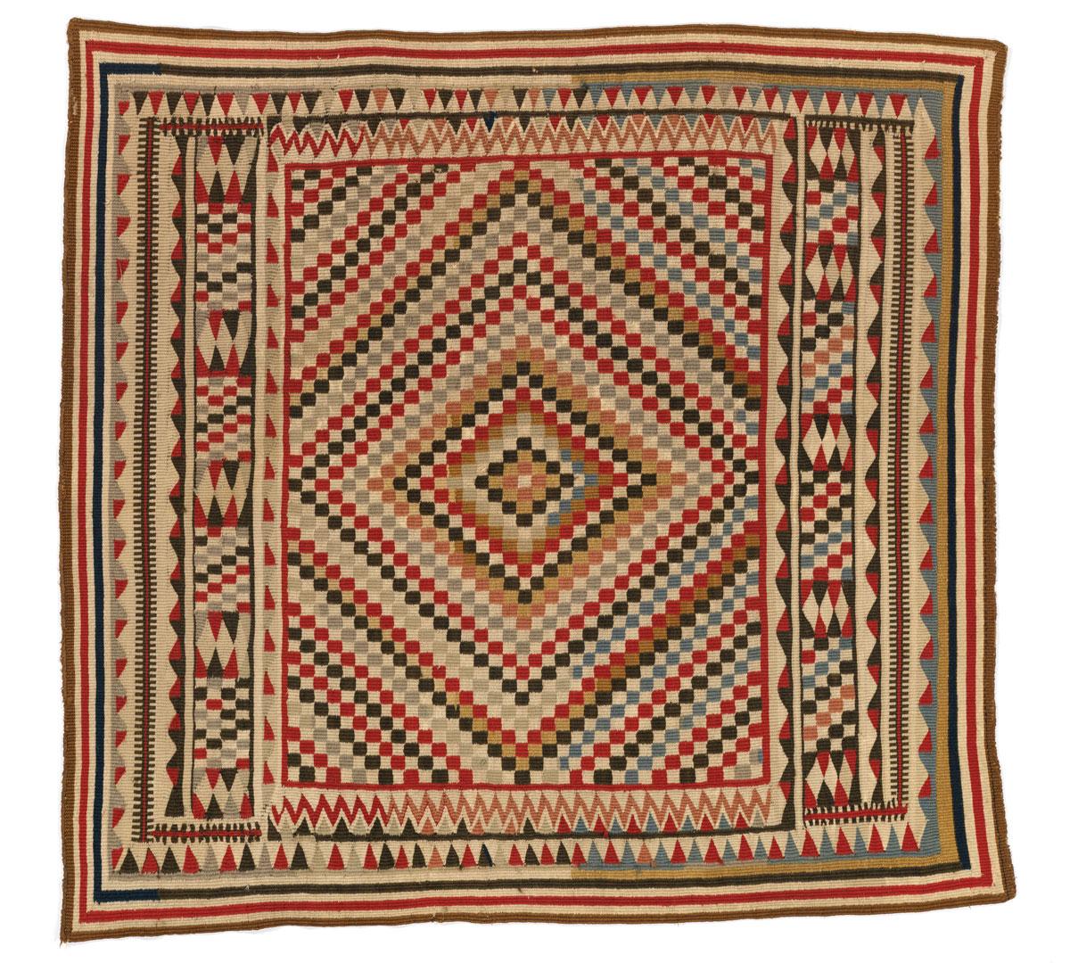
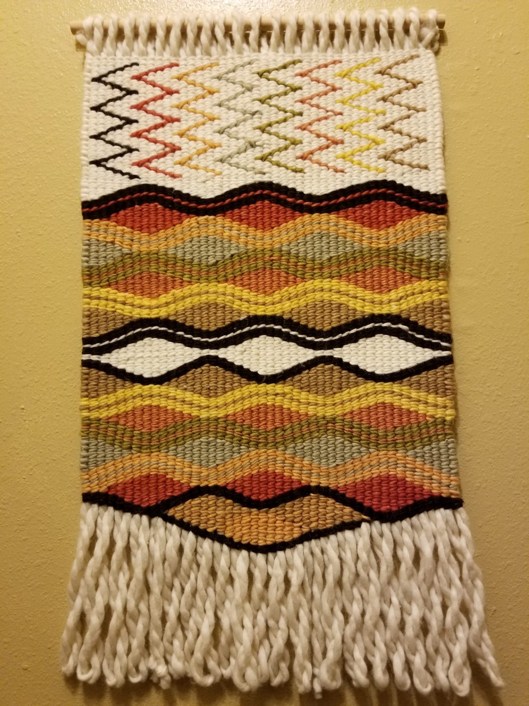
Today the Navajo Nation covers over 27,000 square miles and includes areas of northeastern Arizona, southeastern Utah, and northwestern New Mexico. The current population of the Navajo tribe is over 330,000. The Navajo people are known for their distinct creative culture. Traditional arts and crafts such as pottery, textiles, and basketry are a significant part of the contemporary Navajo culture and economy.
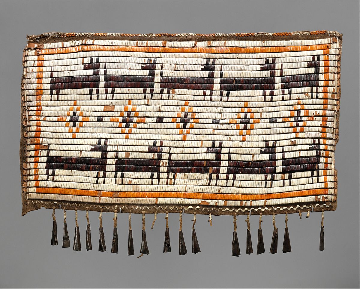
The Sioux Nation
The Sioux are a group of indigenous American tribes made up of three primary subcultures which speak different dialects—the Lakota, the Dakota, and the Nakota. The Lakota, also referred to as the Teton Sioux, are the largest of the three groups and occupy areas in both North and South Dakota. The Dakota, also called the Santee Sioux, live mainly in Nebraska and Minnesota. The Nakota are the smallest group and reside in South Dakota, North Dakota, and Montana.
The Dakota and Lakota are known for their activism.They have a long history of engaging in protest and legal action to fight corruption and injustice. In 1980 the Sioux went to the Supreme Court to reclaim territories they were officially granted through the Fort Laramie Treaty of 1868 but then later denied by the US government. They were awarded over 1 billion dollars but refused the settlement, preferring to, instead, have their land returned to them.In 2016, the Lakota and Dakota of the Standing Rock reservation positioned across the border of North and South Dakota initiated a grassroots opposition to the construction of the Dakota Access Pipeline. Completed in 2017, this underground oil pipeline runs through North Dakota, South Dakota, Iowa, and Illinois and intersects with numerous sites that are sacred to the Sioux people. The protests began out of concern of the pipeline’s impact on the environment and its potential to contaminate water sources in the area.
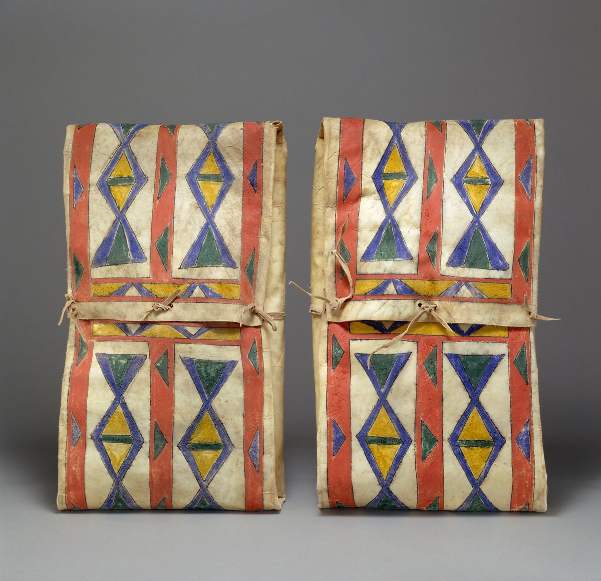
The Sioux have a rich history of art and design. Colorful geometric motifs can commonly be found painted on hides and pottery or woven into clothing and baskets. The forms and symbols used in these artworks have specific meaning or purpose.
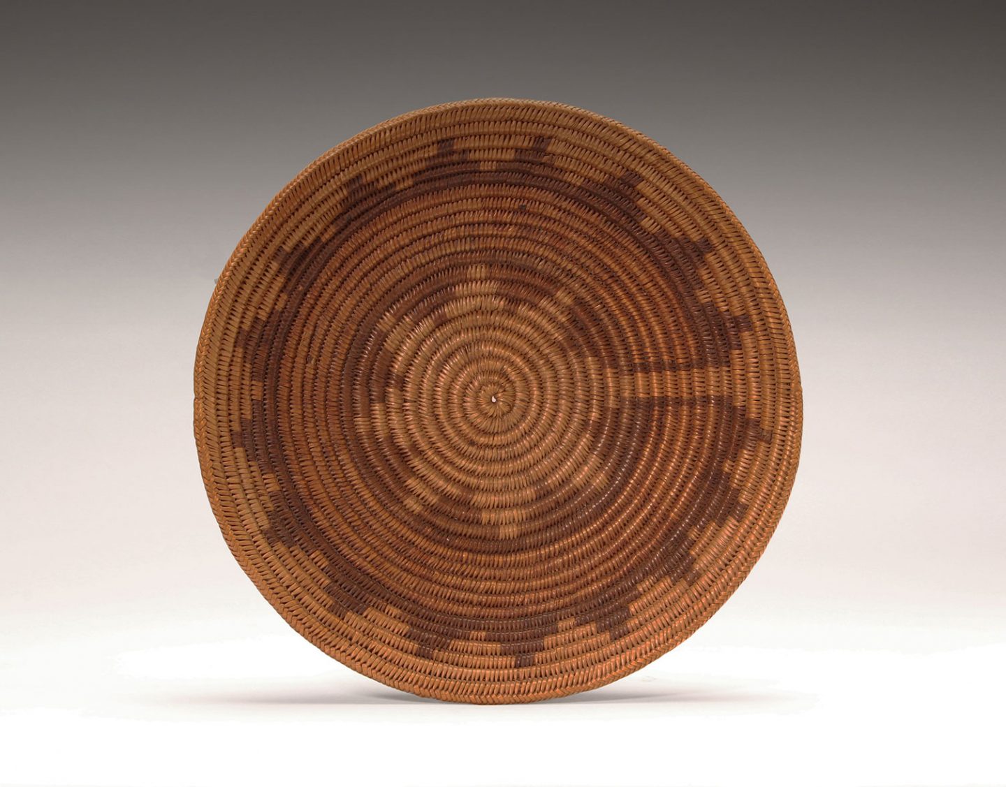
Coast Salish Tribes of the Pacific Northwest
There are over 60 distinct cultures that make up the Coast Salish Nations of the Pacific Northwest. The term “Salish” refers to a language family that is shared across tribes of the region. The earliest settlement of Salish people can be traced as far back as 3000 BCE. European settlers first made contact with Coast Salish tribes in the late 1700’s.
The city of Seattle is named after a Salish chief. Chief Si’ahl, who was part of the Duwamish tribe, was recognized as both a skilled warrior and charismatic leader from an early age. As he matured, he earned a reputation as a gifted public speaker. His most famous speech, given in 1854, was a plea for incoming white settlers to respect both the natural ecology of the Pacific Northwest region and the indigenous populations that have long resided there.
When the growing number of settlers eventually encroached on Duwamish lands, Chief Si’ahl developed partnerships with the leaders of the emerging white communities and worked to establish peaceful relations with them. He formed a friendship with Doc Mayner—a doctor and businessman who was one of the founders of the Duwamps settlement. Mayner convinced his fellow settlers to rename their province “Seattle”—an anglicized namesake in honor of Chief Si’ahl and the Duwamish people. Chief Si’ahl’s image is featured on the official Seal of Seattle which was adopted by the Seattle City Council in 1937.
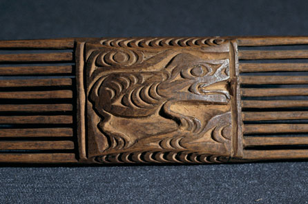
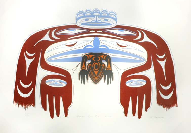
Coast Salish tribes have a long legacy of art, design, and craft that dates back to the pre-modern era. Though there are countless perspectives and approaches that can be found within this creative history, there exists a shared visual vernacular that is unique to Salish culture. This distinct graphic style has roots in a method of carving that has been practiced by pan-coastal tribes in the Pacific Northwest for 5,000 years.
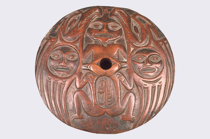
Many traditional Salish works incorporate this style in the form of bold, kinetic forms and vibrant colors featured on wood carvings, woven baskets, and textiles. This approach can also be found in modern Salish works. There are many Salish artists and craftspeople working today who incorporate these time-honored techniques into their contemporary practice as a way of keeping the Salish creative heritage alive.
The Harlem Renaissance
The US Civil War ended in 1865 with the defeat of the Southern Confederacy and the official abolishment of the system of slavery in America. However, the almost 4 million newly freed Black Americans would soon discover that any progress signified by both Lincoln’s Emancipation Proclamation of 1863 and the 13th amendment to the Constitution passed by Congress in 1865 would be severely negated by the new Jim Crow laws which began to be legislated in Southern States in 1877.
For Black citizens, the era of Jim Crow represented a new form of subjugation in the form of mass incarceration, extreme inequity, discrimination, and institutionalized violence and murder. With the 1896 Supreme Court ruling of Plessy v. Ferguson, segregation became the established structure within which separate and inferior resources and opportunities existed for Black communities. Where once the oppression and inhumane treatment of Black people were validated by law, after the end of slavery, the status of Black Americans as second class citizens would be upheld by state sanctioned white supremacy and accepted social patterns of racism, terrorism, and discrimination.
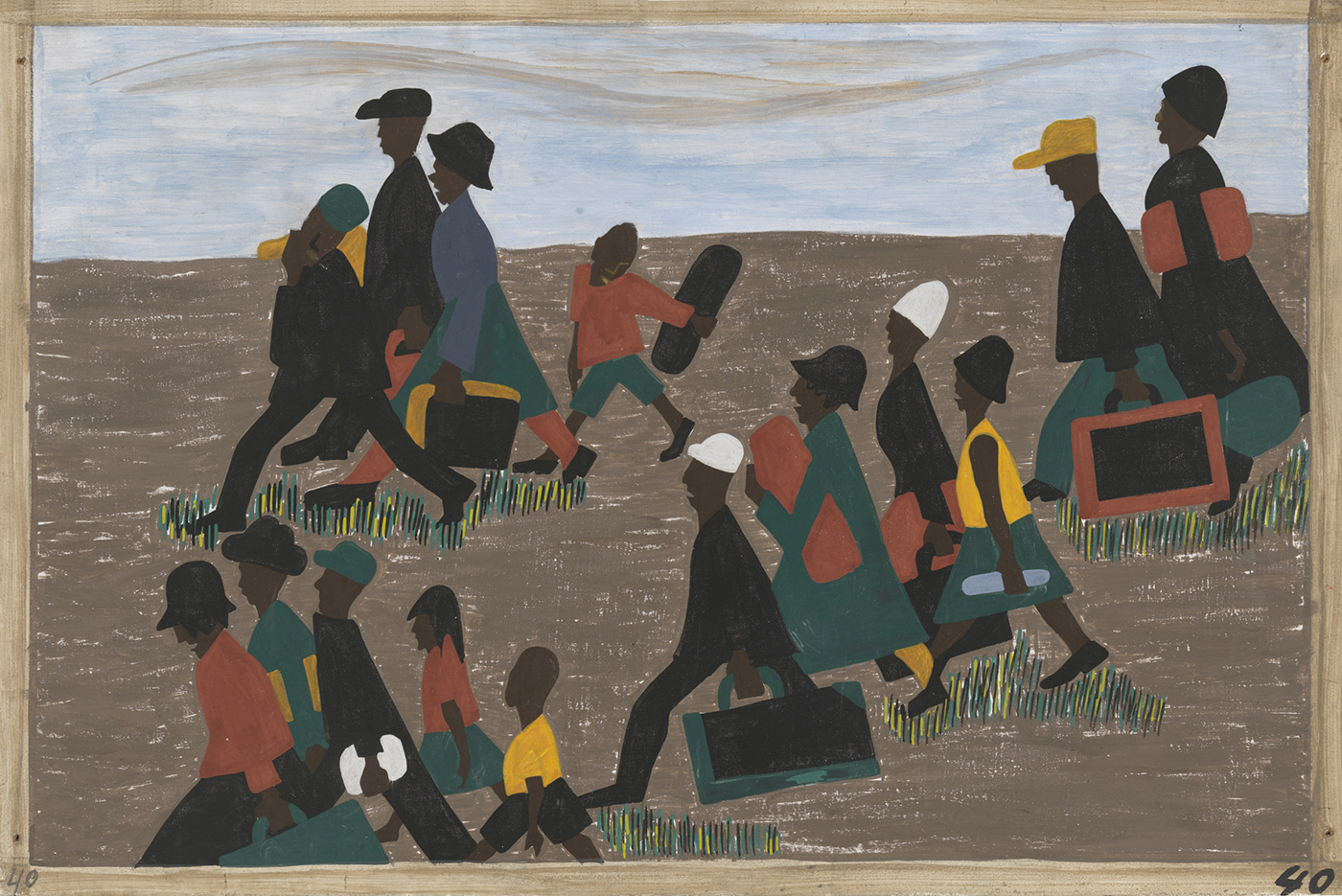
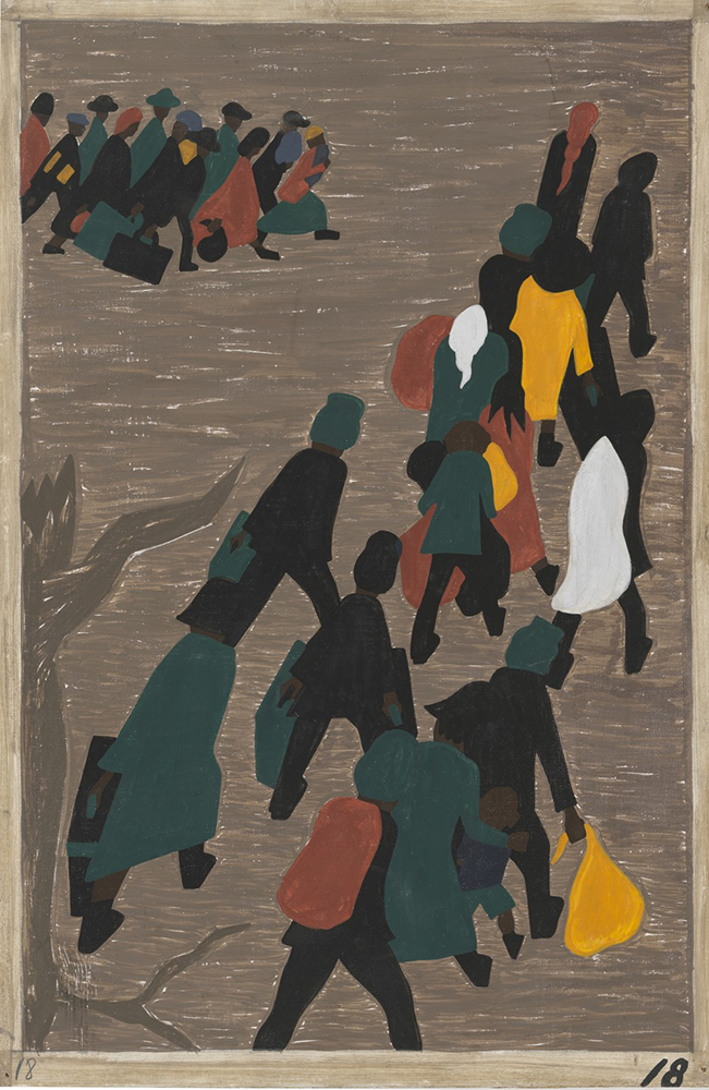
Beginning in the early 1900’s, many Black Americans began to depart from the South in search of a life free from the violence and degradation they were experiencing under Jim Crow. World War 1 generated a labor shortage across the country and many Northern factories began to recruit Black workers from Southern states. By the end of the war in 1919, over 1 million Black citizens had migrated to cities in the North, Midwest, and West. This mass exodus, known as the Great Migration, transformed the American cultural landscape bringing large populations of Black Americans to urban areas across the country.
“They traveled deep into far-flung regions of their own country and in some cases clear across the continent. Thus the Great Migration had more in common with the vast movements of refugees from famine, war, and genocide in other parts of the world, where oppressed people, whether fleeing twenty-first-century Darfur or nineteenth-century Ireland, go great distances, journey across rivers, desserts, and oceans or as far as it takes to reach safety with the hope that life will be better wherever they land.”
—Isabel Wilkerson, The Warmth of Other Suns: The Epic Story of America’s Great Migration
In these new locations, although Black citizens didn’t have to contend with legal segregation as they did in the South, they experienced racism, discrimination, and exclusion in other forms. In crowded cities like Chicago and New York, newly arrived Black Southerners were seen by white locals—often European immigrants who had newly migrated themselves— as competition for jobs and housing opportunities that were scarce and often hard to come by. This resulted in Black communities converging in specific areas or neighborhoods. These areas were often densely populated and defined by economic hardship and lack of public resources and support. In the face of these challenging circumstances, a new Black American identity arose in the 1920’s that was defined not by the legacy of slavery and racism in the US but by an emerging Black creative, economic, and intellectual awakening.
One of the most prominent centers of Black culture to develop during this time was the neighborhood of Harlem located in Upper Manhattan in New York City. Originally designated as an area for affluent White families of New York, the neighborhood never caught on with its intended demographic. By the early 1900’s, in order to fill vacant properties, landlords began to rent to incoming Black residents. Harlem soon grew to be a well known destination for the Black diaspora that was migrating from the South.
By the 1920’s Harlem would begin to attract prominent creative and intellectual luminaries. Poets, artists, writers, and thinkers converged in the neighborhood between the Hudson and Harlem Rivers resulting in a golden age of Black music, art, literature, and scholarship in America known as the Harlem Renaissance.
Musicians like Louis Armstrong, Duke Ellington, and Bessie Smith performed nightly at Harlem Jazz clubs drawing both Black and White audiences alike. Writers like Zora Neal Hurston, Countee Cullen, and Langston Hughes contributed to the formation of a vibrant literary scene in Harlem and founded a short-lived magazine called Fire which gave voice to up and coming writers and poets of the time that were living and working in New York.
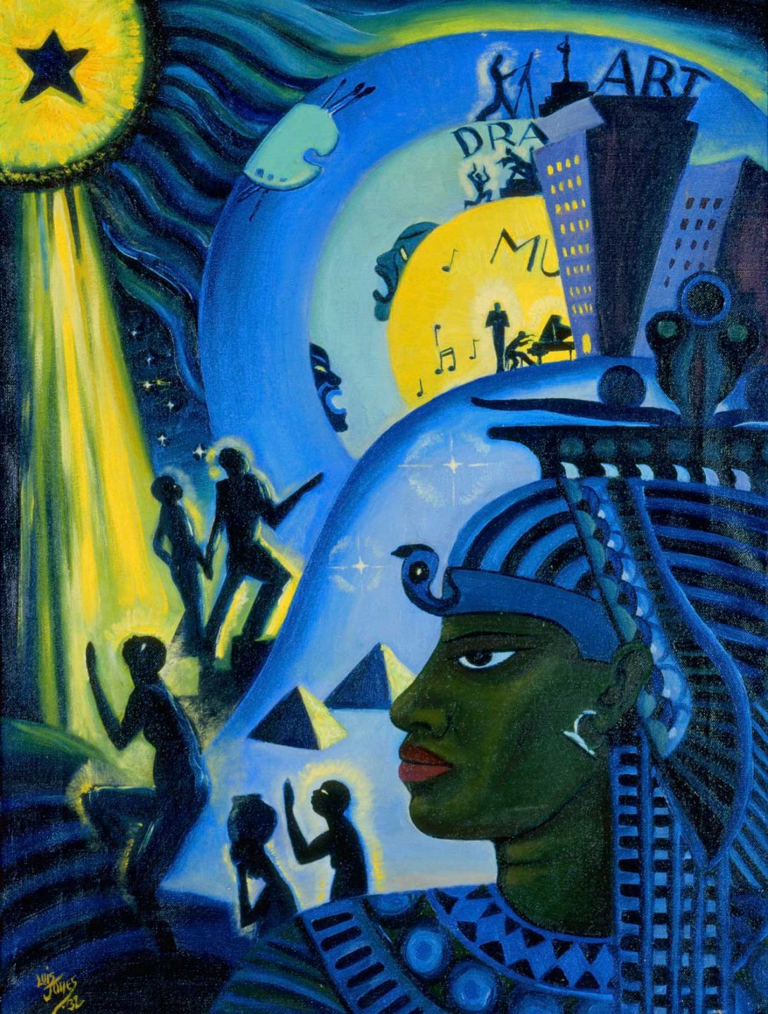
The artists and designers of the Harlem Renaissance both incorporated modernist approaches in their work —art deco, art nouveau, cubism— and expanded on those visual styles to develop a creative vision all their own. Artists and arts organizers working in Harlem during the twenties and thirties understood the relationship between the visual innovation found in the creative contributions of African cultures like the Benin Empire and the Chokwe people and the development of European modernism. They sought to highlight this connection by positioning the creative works of the Harlem Renaissance within a broader cultural context. Many Black artists during this time saw their creative practice as having roots in the rich legacy of African art, craft, and design. They wanted this legacy to be acknowledged, understood, and celebrated within the larger canon of creative history.
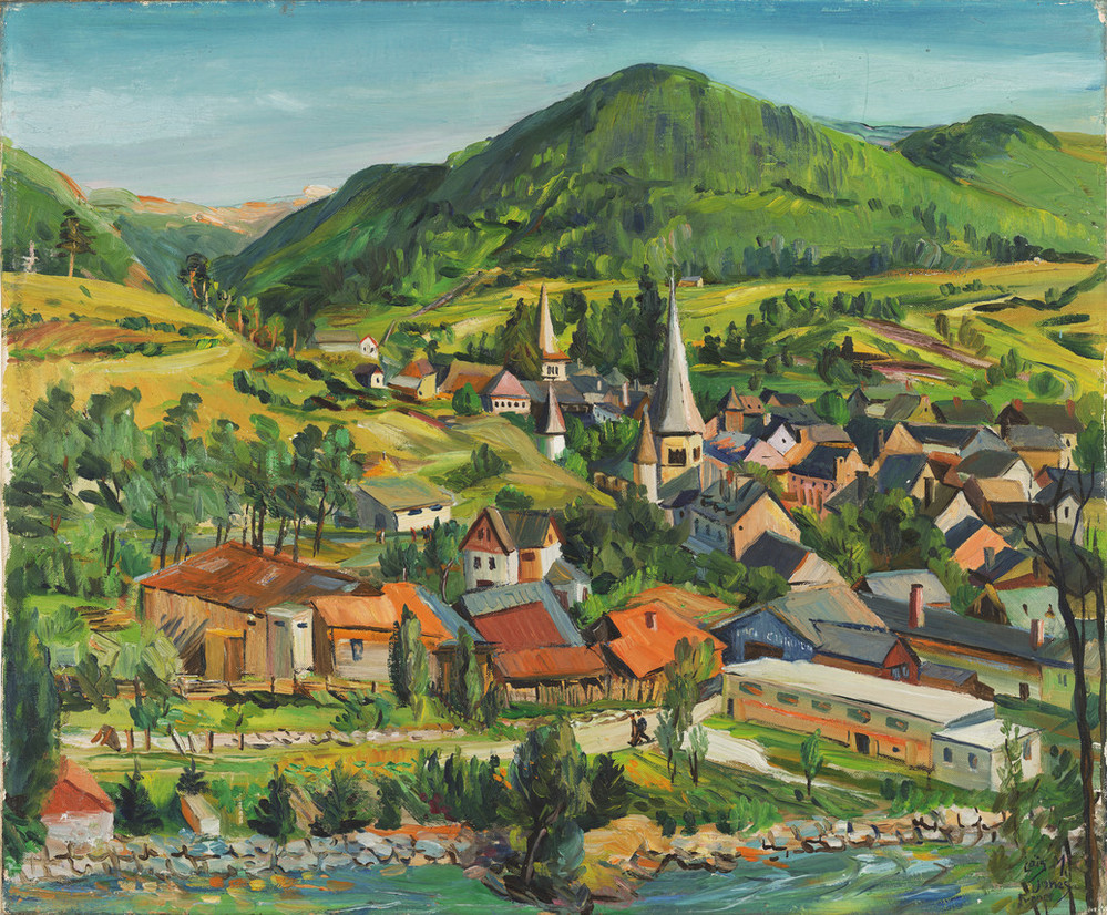
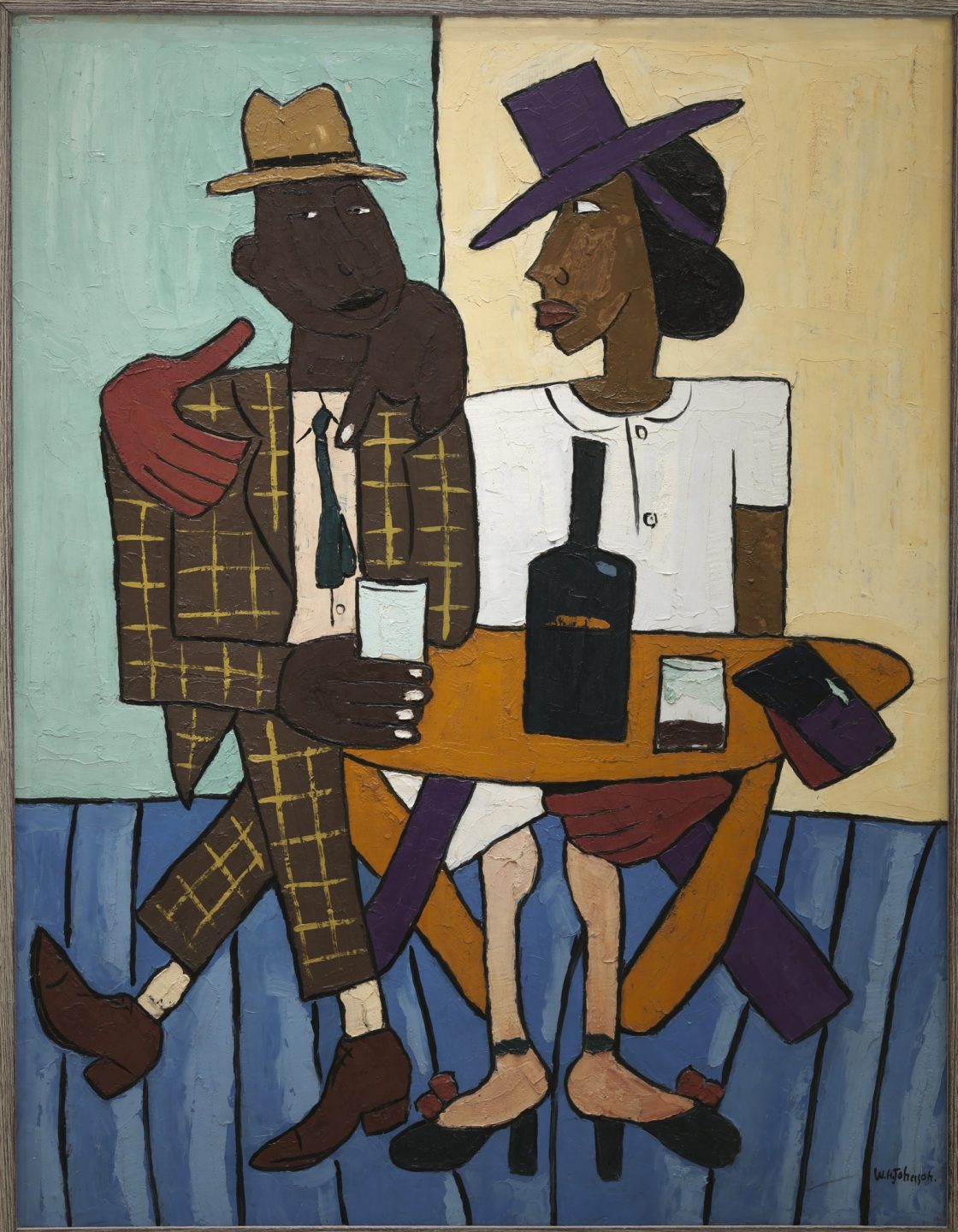
We can see a synthesis of traditional African approaches and contemporary modernist methodologies in many of the visual works from the Harlem Renaissance. In the paintings of Jacob Lawrence, Lois Mailou Jones, and William Henry Johnson, elements of Black history and Black cultural experience are depicted through a sophisticated approach that incorporates abstraction, stylization, and expressive use of form and color.
Aaron Douglas
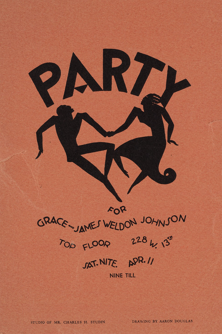
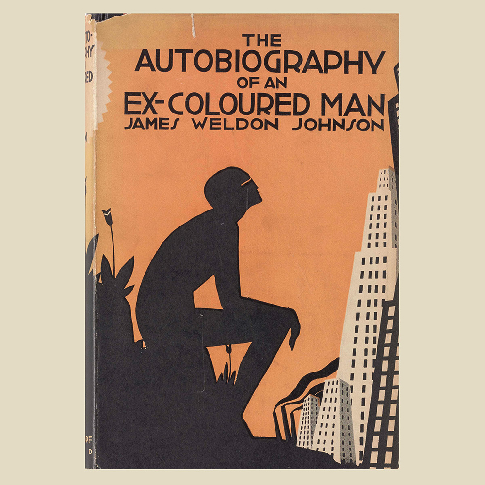
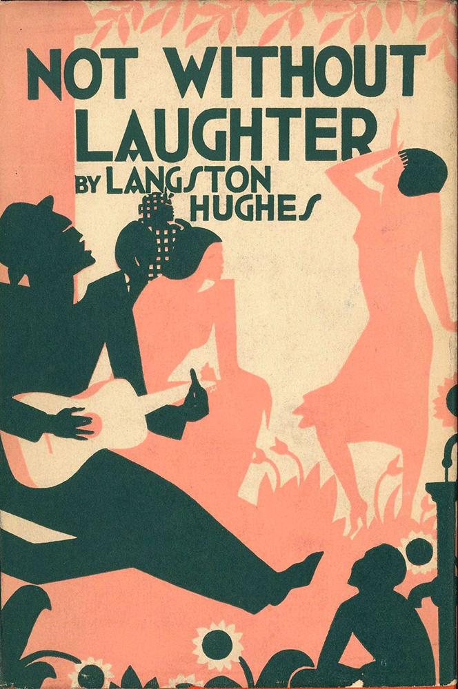
One of the most prominent figures of the Harlem Renaissance is the painter, illustrator, and educator Aaron Douglas. Originally from Topeka Kansas, He earned his bachelor’s degree in fine arts in 1922 at the University of Nebraska and shortly after accepted a position teaching art at Lincoln High School in Kansas City, Missouri. In 1924 he was encouraged by the prominent sociologist and community leader Charles Spurgeon Johnson to move to Harlem. Douglas resigned from his teaching position and moved to Harlem the following year.
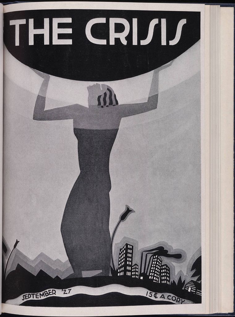
Once in New York, Douglas studied under the German expressionist painter Fritz Winold Reiss and was mentored by the renowned American sociologist, historian, and activist W. E. B. Du Bois. Du Bois pushed Douglas to study the legacy of African art and design as well as the avant garde artists of Europe. Douglas soon developed a signature style which incorporated the bold stylization inherent in African works with the graphic geometry of Art Deco design and typography that was prevalent between the wars. In book covers, magazines, posters, paintings, and murals, Douglas created a dynamic visual approach that would capture the spirit of the flourishing creative movements of Harlem.
This approach can be seen in the covers he design for The Crisis magazine, which was the publication of the National Association for the Advancement of Colored People or NAACP which was formed in 1909 by a group of white progressives and Black activists, one of which was his mentor W. E. B. Du Bois.
The Data Portraits of W.E.B. Du Bois
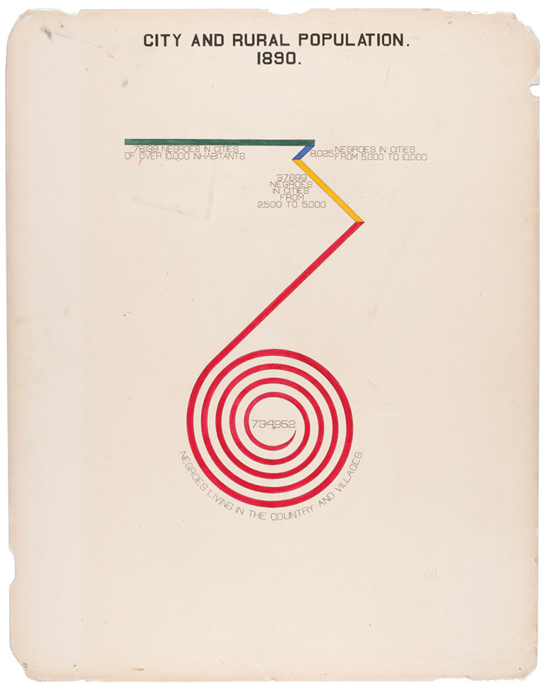
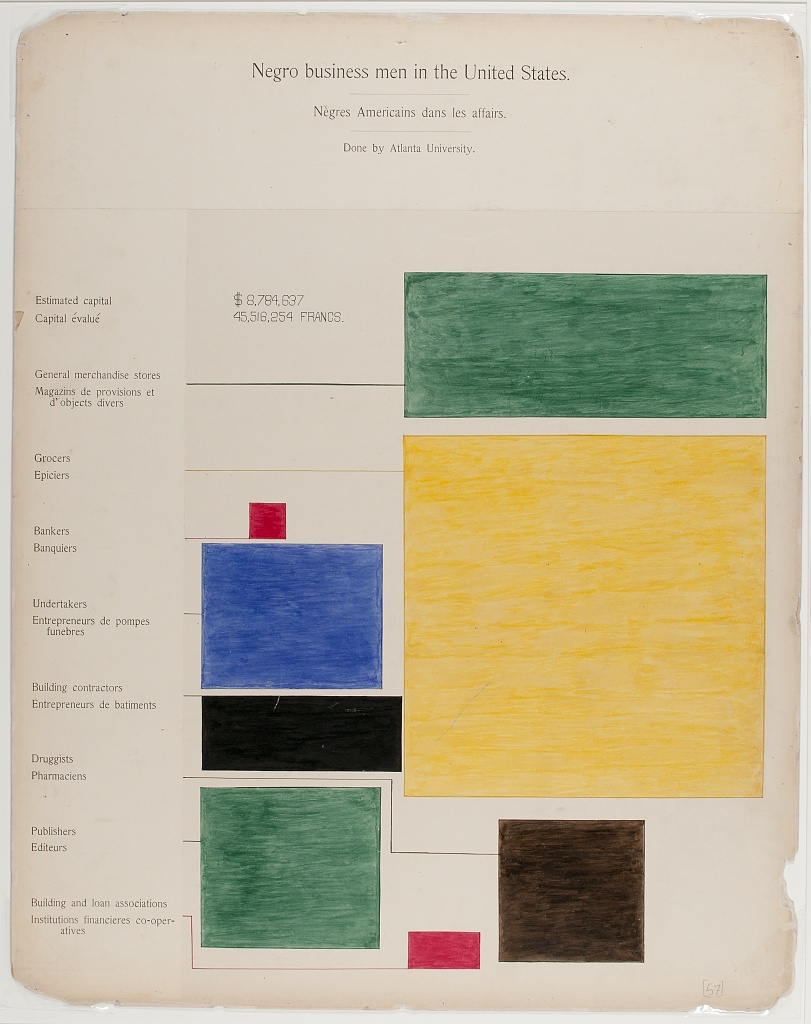
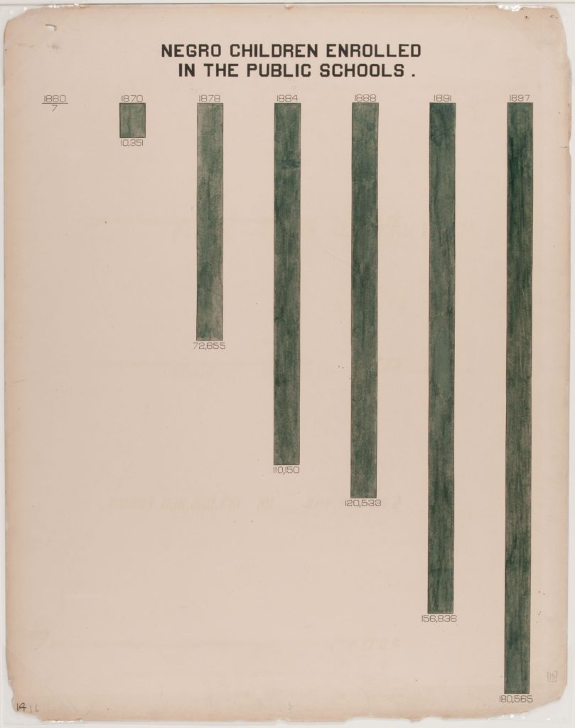
In addition to his work as a writer, sociologist, and trailblazing activist, W. E. B. Du Bois also made a groundbreaking contribution to the field of graphic design with a series of infographics he created in 1899 with a team of students from Atlanta University where he was a professor. The works were developed as part of an exhibition centered on the lives of Black Americans at the turn of the twentieth century. The exhibition, which was displayed at the Exposition Universelle in Paris the following year in 1900, particularly focused on the circumstances and experiences that Black American citizens were facing at the time in the wake of the abolishment of slavery.
When Du Bois was first approached to contribute to the exhibition, its design was already in progress. There were plans to showcase a collections of photographs depicting the everyday lives of Black Americans of the era; however Du Bois wanted to convey these experiences in another way—not through imagery or written narrative, but through data.
Dubois is regarded as a pioneer in the field of sociology having established the first school of American sociology at Atlanta University in 1897. He understood the power of data as a tool for understanding and empowerment. For the Paris exhibition, the professor and his team designed a series of 60 handmade infographics —bold, striking abstract forms in vibrant colors that expressed specific points of information on Black communities like public school enrollment, earned income, political affiliation, and accumulated wealth. These graphic visualizations of data painted a portrait of strength and resilience that was quantifiable. They effectively conveyed the progress that Black Americans were making in education, business, and community building despite the challenges of racism, discrimination, and oppression they encountered on a daily basis.
This use of information and data to facilitate cultural understanding was, at the time, groundbreaking. Equally innovative was the visual approach Du Bois employed in giving form to statistics, facts, and measurements. More than a decade before avant garde movements like the Constructivists and the De Stijl movement would begin to incorporate basic, rudimentary forms as visual subject matter, Du Bois’s data portraits featured a neutral yet dynamic minimalism in the form of distilled geometry, primary colors, and graphic typography. The infographics for the Paris exhibition of 1900 represent an early example of a modernist methodology that would, years later become the standard for contemporary designers throughout Europe and beyond.
European Modernism Makes its Way to the US
The rise of the Nazi regime during the 1930’s in Europe created one of the greatest transitional migrations of intellectual and creative talent in history. Groundbreaking designers such as Walter Gropius, Mies Van Der Rohe, Marcel Breuer, Herbert Bayer, Laszlo Moholy Nagy, Herbert Matter, and Jean Carlu all fled to the US importing the perspectives and approaches of Europe’s avant grade and the Bauhaus. During this time, the US was in a time of great turmoil—attempting to come out of the great depression and entering into the global conflict of World War 2. Many of the groundbreaking creatives who were coming from Europe took positions as educators in the US. The modernist approach would become integrated in the curriculums taught to emerging designers who would go on to define the landscape of American design in the fifties, sixties, and seventies.
From the wars and revolutions of the first half of the 20th century would emerge a new climate of innovation and connection that would define the post-war era. Modernism was the look of this spirit of transformation. New industries centered on media, technology, and marketing would utilize the language of modernism to give form to the messages, images, and information they were transmitting to a global audience.
Beginning in the thirties, creatives who migrated to the US from Europe would, through their distinct perspectives, transform the look of American media, advertising, and publications. From magazines and posters to identity systems and information graphics, the modernist approach of designers like Herbert Matter, Cipe Pineles, and Alexey Brodovich, would define the look of American pop culture and serve as a model for countless designers in fifties, sixties, and seventies.
The expressive type, graphic flatness, and stylized geometry of modernist work perfectly aligned with the vibrant energy of the music, magazines, films, and television shows that began to dominate American popular culture in the Postwar era. The visual vernacular of modernism perfectly expressed the ideas and attitudes of the emerging cultural landscape in America.
New Frontiers
Television and film became booming industries in Postwar America, infiltrating the public consciousness like nothing before. Visual communication became an important counterpart to these media formats. Screens both large and small became a new space for modernist designers to execute their craft. For the first time, designers were incorporating sequence and movement into their work.
During the fifties, designers William Golden and Georg Olden transformed the visual identity of the television network CBS and positioned the station at the forefront of American culture and media. Golden redesigned the network’s identity in 1951. Taking inspiration from traditional Shaker hex symbols he observed on the sides of barns while on vacation in Pennsylvania, Golden created a striking image of an eye which he paired with modern-style serif letter-forms. The resulting identity system evoked a graphic elegance that enabled the station to stand apart from its competitors. From 1945 to 1960, as the director of graphic design, George Olden created identities, title sequences, and advertisements for CBS. He combined his passion for modern art and design with elements of movement and animation. His work earned him several CLIO awards. As a Black man in a predominantly White industry, Olden strove to incorporate his cultural identity into his creative work. In 1963, he designed a US stamp to commemorate the centennial of the emancipation proclamation.
“As the first black American to achieve an executive position with a major corporation, my goal was the same as that of Jackie Robinson in baseball: to achieve maximum respect and recognition by my peers, the industry and the public, thereby hopefully expanding acceptance of, and opportunities for, future black Americans in business.”
George Olden
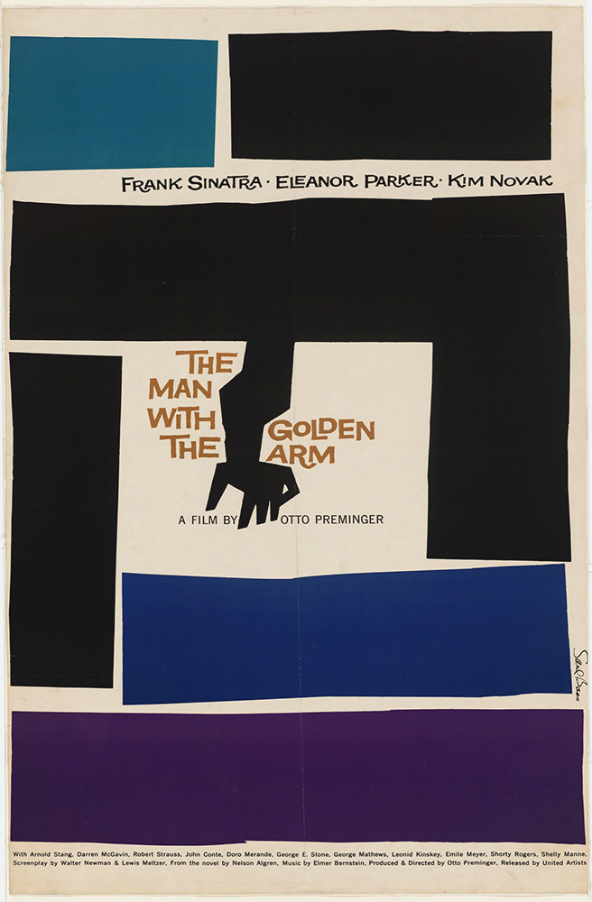
Originally born in the Bronx, Saul Bass attended Brooklyn College where he studied under Hungarian designer György Kepes. Kepes had worked in the studio of László Moholy-Nagy in Berlin and had followed Nagy to Chicago to teach at the Institute of Design in Chicago before working at Brooklyn College.
Saul Bass moved to Los Angeles in 1950 where he wound up working for some of Hollywood’s most prominent filmmakers, including Alfred Hitchcock, Otto Preminger, Billy Wilder, Stanley Kubrick and Martin Scorsese. He designed posters,title sequences, film credits, and storyboards.
Later, Bass wound up designing identities and logos for some of America’s most well known companies and organizations. During his 40-year career Bass earned international recognition as well as countless awards and accolades.
Blue Note Records
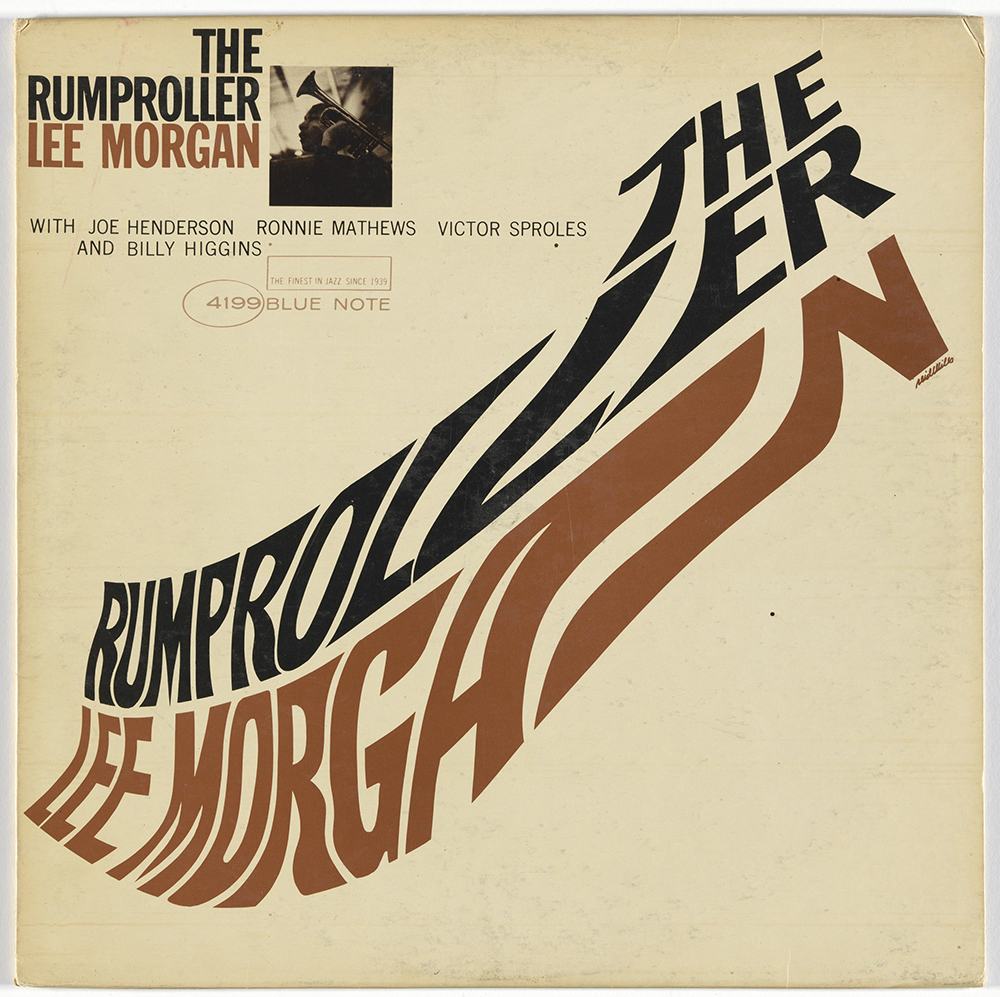
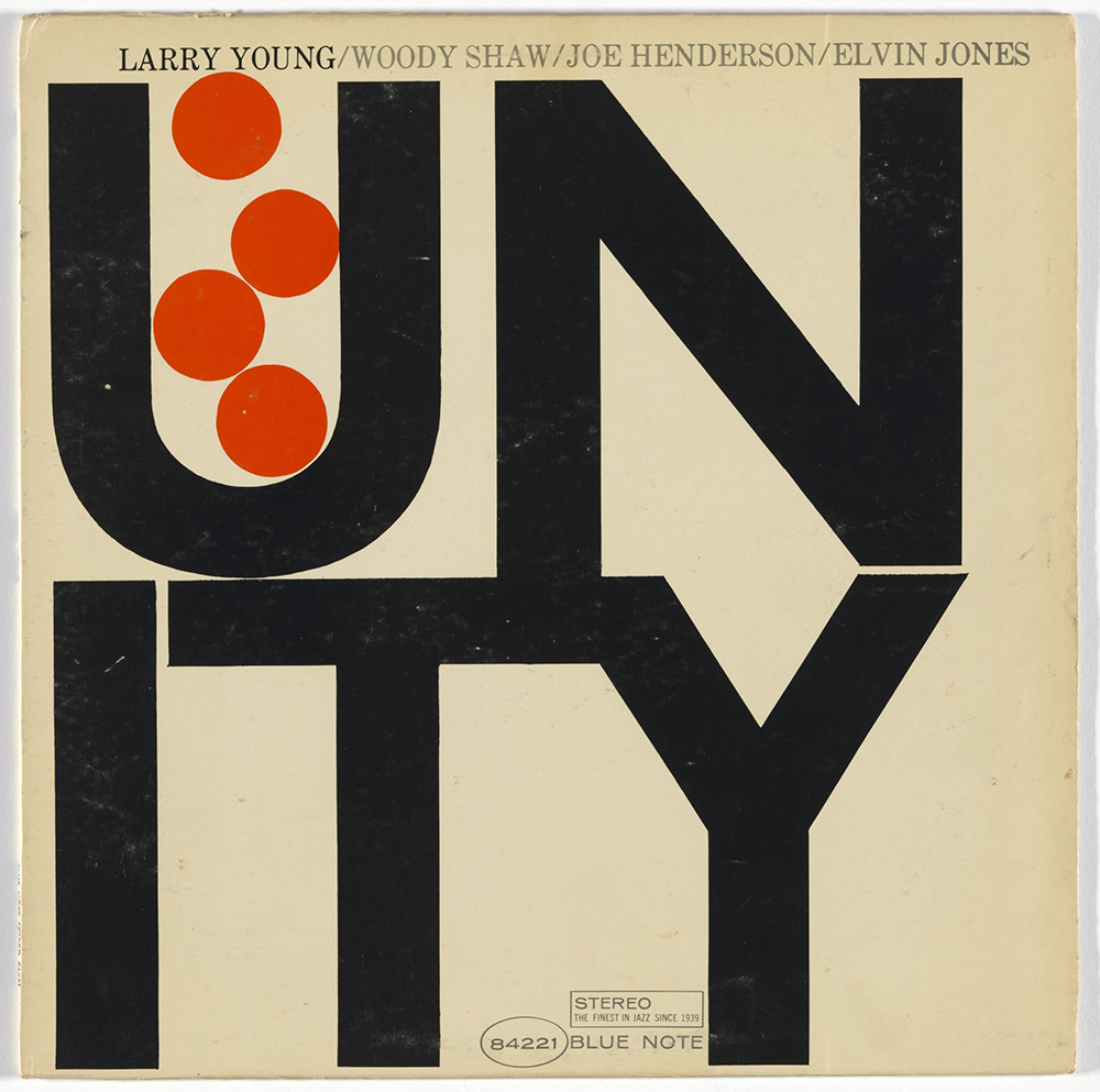
Blue Note records was founded in New York in 1939 by Alfred Lion and Max Margulis. The label was specifically focused on Jazz and became known as much for its innovative and modernist album covers as its music. Lion escaped Nazi Germany in the early 30’s and eventually settled in New York. Later, he helped the photographer Francis Wolff escape as well. When he began releasing albums through the Blue Note label, he incorporated Wolff’s photography on the covers. His stark, black and white images elevated the format of record photography.
In 1955, 28 year old Reid Miles began designing the covers of Blue Note releases. His graphic, minimalist approach would singlehandedly transform the Blue Note company into an iconic and globally recognized label.
