11/16/2021
Propaganda & Protest
Design as a tool for social change
When an individual is protesting society's refusal to acknowledge his dignity as a human being, his very act of protest confers dignity on him.Bayard Rustin
Herb Lubalin
After graduating from Cooper Union in NY in 1939, Herb Lubalin became one of the most prolific and sought after designers in NY. He worked in advertising, editorial design, identity design, and typeface design. His distinct approach mixes a deep knowledge of design history, with a dynamic contemporary style focused on typography and calligraphic letter-forms. He used the new phototypesetting technology of the to develop his signature aesthetic.
Lubalin worked in marketing and advertising for over twenty years before starting his own firm, Herb Lubalin, Inc., in 1964. In his private practice, Lubalin would go on to design typefaces, identities, and publications that became wildly popular and well known during the sixties, seventies, and eighties.
From 1962 to 1971, Lubalin collaborated with New York editor and publisher Ralph Ginzburg in creating a series of design driven publications. Eros was the first in their series of collaborations. Eros was undertaken as a work of art. Art directed by Herb Lubalin, in an elegantly oversized format on both matte and glossy paper, and with hardback covers, it was a coffee-table magazine. A subscription for four issues was $19.95 and was promoted as “the most expensive magazine in the world.” The publication was filled with articles and photo-essays on love and sex. The magazine was shut down after only four issues and Ginzburg was indicted on charges of violating federal obscenity laws by mailing the magazine through the US postal service. He was found guilty by the Supreme Court and sentenced to five years in prison. He was released after only serving 8 months.
Less than a year following his conviction, Ginzburg collaborated with Lubalin on a new magazine called Fact. Rather than focusing on love and sex, Fact focused on the equally controversial topics of culture and politics. To ensure its writers were free to take on any institutions and organizations, Fact took on no advertisers. In three short years Fact had a circulation of over 250k.
Their third publication was called Avant Garde and was published from 1968 to 1971. Like Eros and Fact, Avant Garde embraced radical politics and erotic content despite conservative cultural norms. The magazine ultimately folded due to Ginzburg losing his long-running legal battle with the US government over obscenity charges from the publication of Eros and being forced to serve time in prison.
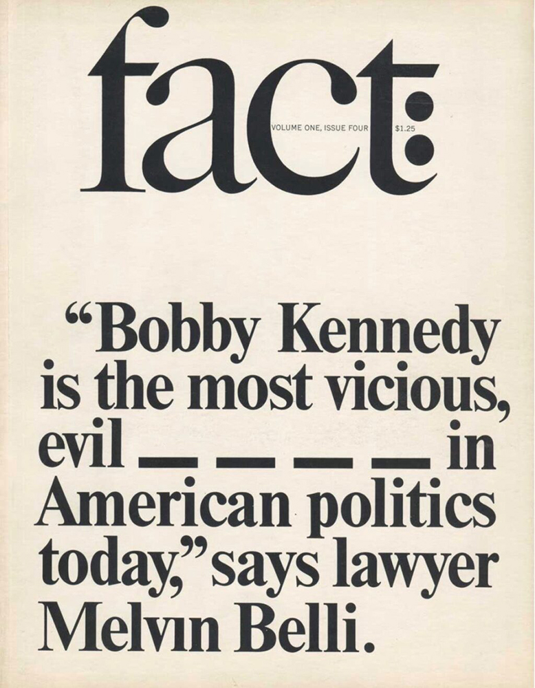
Cover for fact magazine, Herb Lubalin, published with Ralph Ginzburg, 1964.
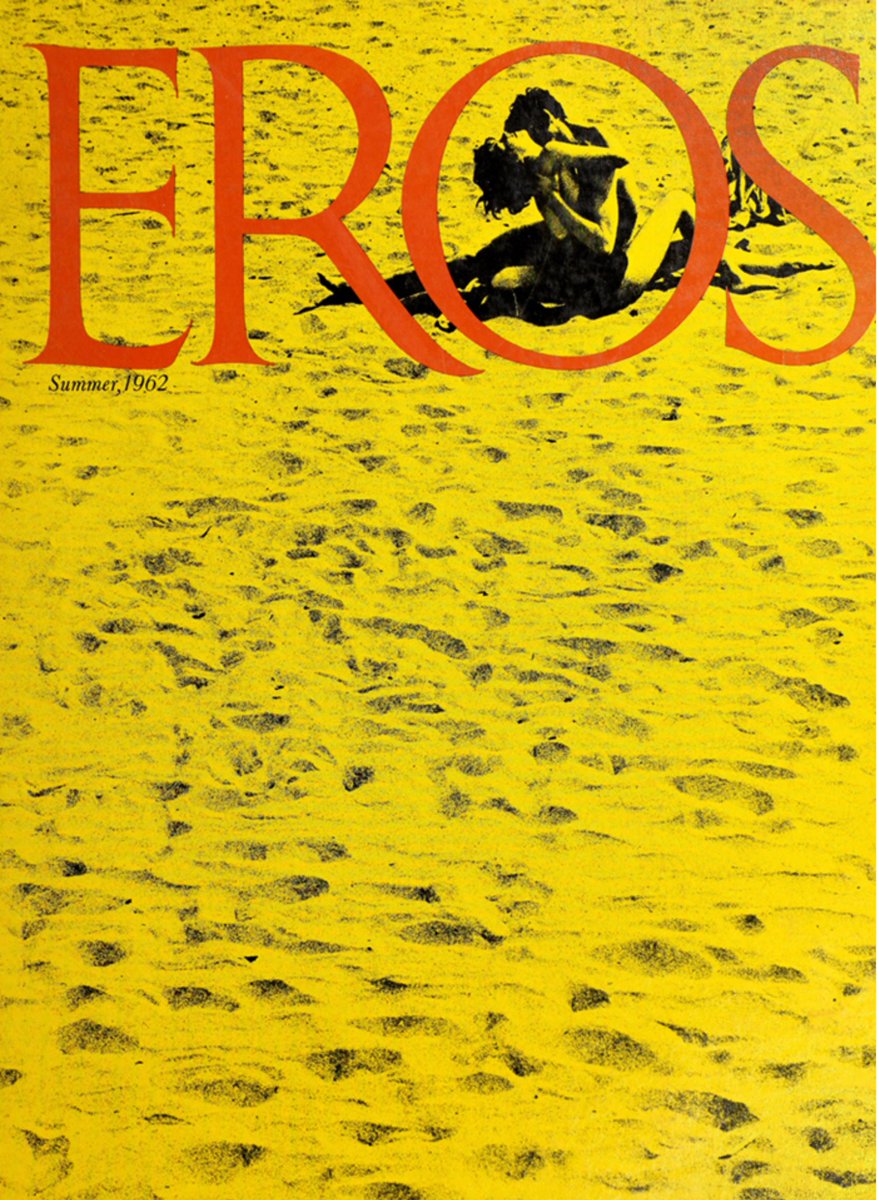
Cover for Eros magazine, Herb Lubalin, 1962.
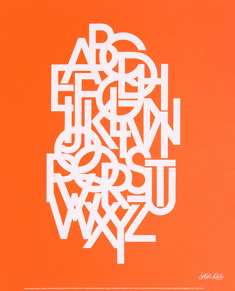
Poster featuring the typeface Avant Garde, Herb Lubalin, 1970.
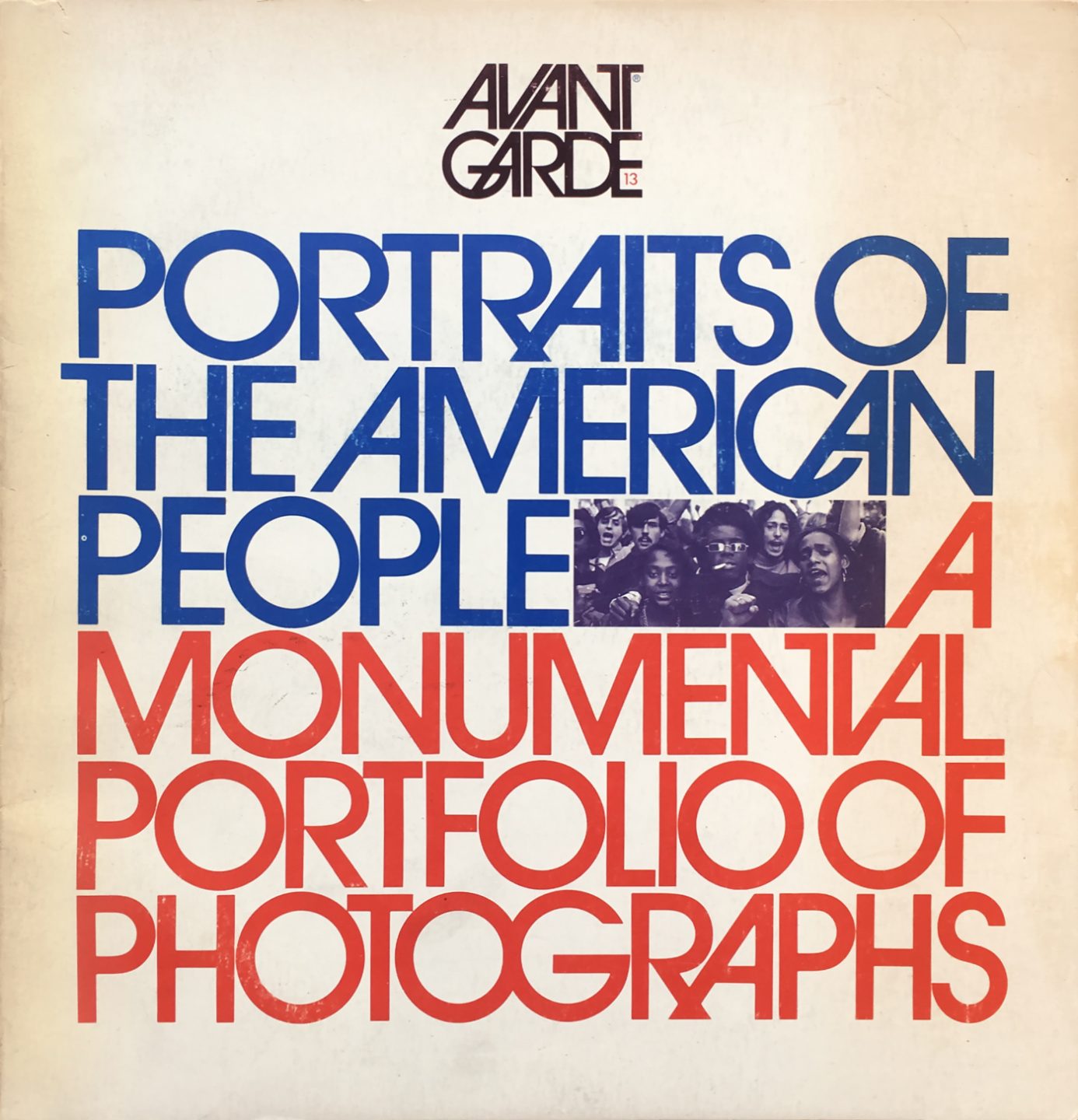
Cover of Avant Garde magazine, Herb Lubalin, 1971.
Archie Boston
Born in 1943, designer and educator Archie Boston attended Cal Arts in 1961—and nearly dropped out to take a job in advertising. Instead, he took an internship at Carson/Roberts during his senior year. After working with his brother Brad on a variety of projects, the two founded the firm Boston & Boston design in 1967. As two Black designers constantly encountering inequality and discrimination within their industry, they decided to use these experiences as cornerstones of their work. Instead of shying away form the topic of race, they chose to instead acknowledge it directly and challenge audiences to rethink their assumptions and prejudices.
In 1969, Archie joined the advertising firm Botsford, Constantine, and McCarthy for eight years. During his time there, he also founded Archie Boston Graphic Design and began taking clients in 1973. Later he became the first black president of the Los Angeles Art Directors Club.
From his 20s onward, Archie has been a teacher. Currently he’s a professor at California State University Long Beach where he’s taught for nearly 40 years.
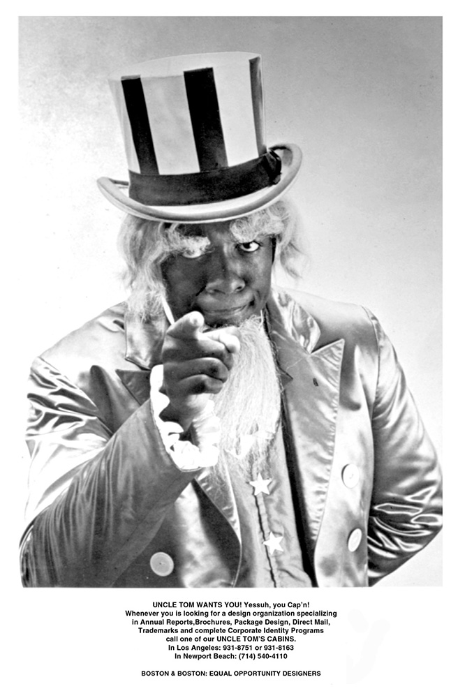
Boston & Boston self-promotional poster, 1967.
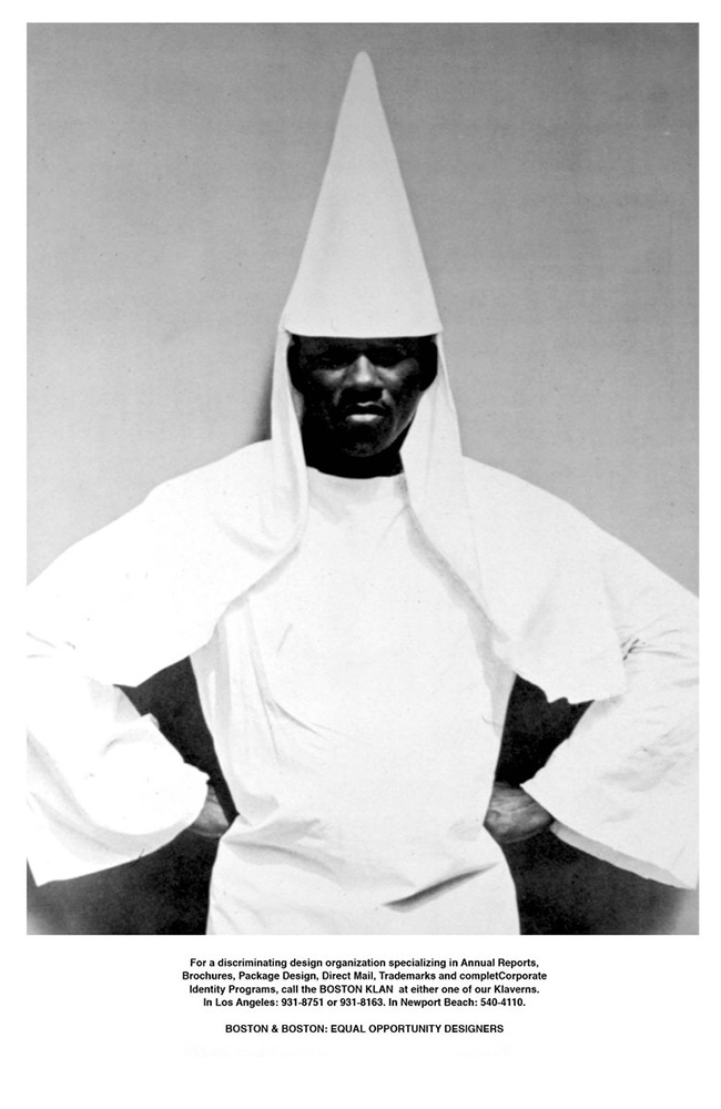
Self-promotional poster for Boston and Boston. 1967.
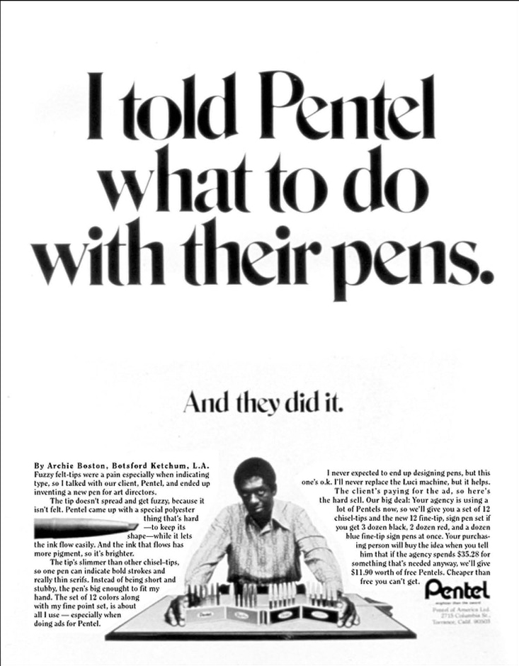
Advertisement for Pentel pens, Archie Boston, 1971.
Memphis Sanitation Strike
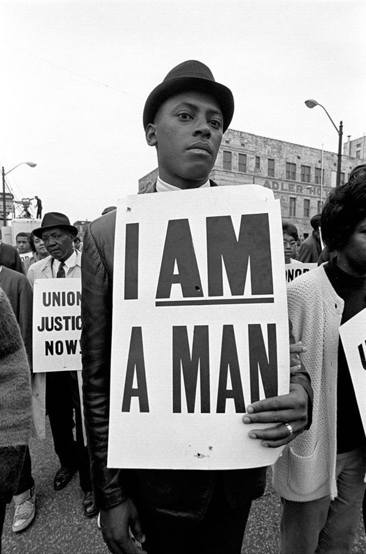
During the 17 and 1800’s, the phrase Am I Not A Man And A Brother? became a catchphrase used by British and American abolitionists. The phrase was eventually made into an emblem which was interpreted into a medallion which was worn by those who sought to abolish slavery and promote justice, humanity, and freedom.
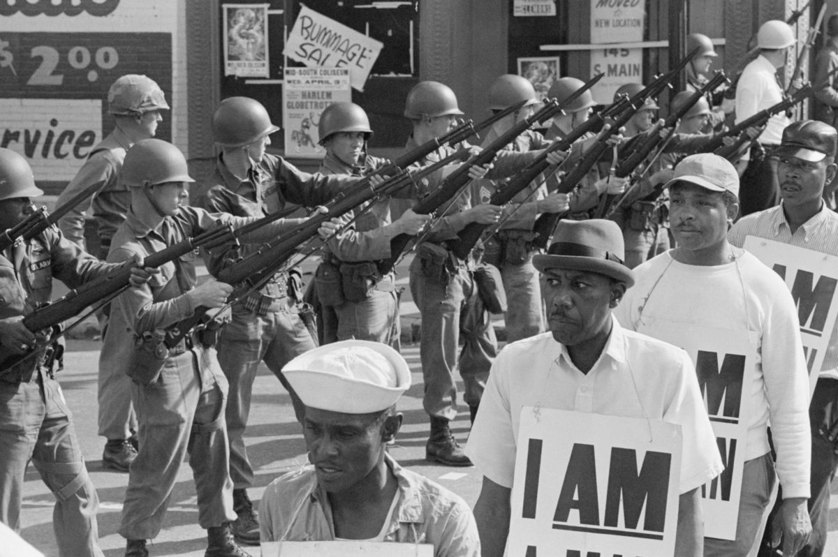
On February 1st, 1968, two Memphis garbage collectors, Echol Cole and Robert Walker, were crushed to death by a malfunctioning truck. Eleven days later, frustrated by the city’s lack of response and fueled by a long pattern of neglect and abuse of its Black employees, 1,300 Black workers from the Memphis Department of Public Works went on strike. The strikers re-appropriated the “I AM A MAN” abolitionist messaging, transforming it into a bold visual mantra. The strikers’ accompanying signs emblazoned with their visual rallying cry, when collectively mobilized, created a dynamic public spectacle within a city that has a long history of segregation and unfair treatment of Black residents.
Images of the protest were spread across the US prompting many people to show their support. Many civil rights activists made their way to Memphis to join the strikers including the reverend Martin Luther King Jr. He spoke to a crowd of 6,000 on April 3—and delivered one of his most famous speeches. He was assassinated the following night.
The strike lasted for over two months and the tension was exacerbated by the assassination of King. The strike ended on April 16, 1968, with a settlement that included union recognition and wage increases, although additional strikes had to be threatened to force the City of Memphis to honor its agreements. The period was a turning point for Black activism and union activity in Memphis.
Since then the simple and distinct “I AM A MAN” message has been re-purposed and reinterpreted by countless people seeking to protest against discrimination and inequality.
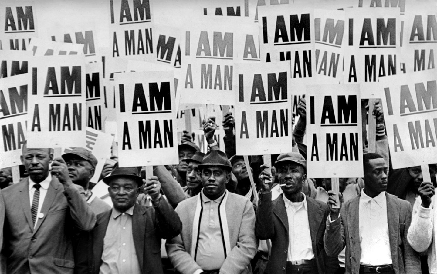
Photograph from the Memphis sanitation strike, 1968.
Photograph from the Memphis sanitation strike, 1968.
Photograph from the Memphis sanitation strike, 1968.
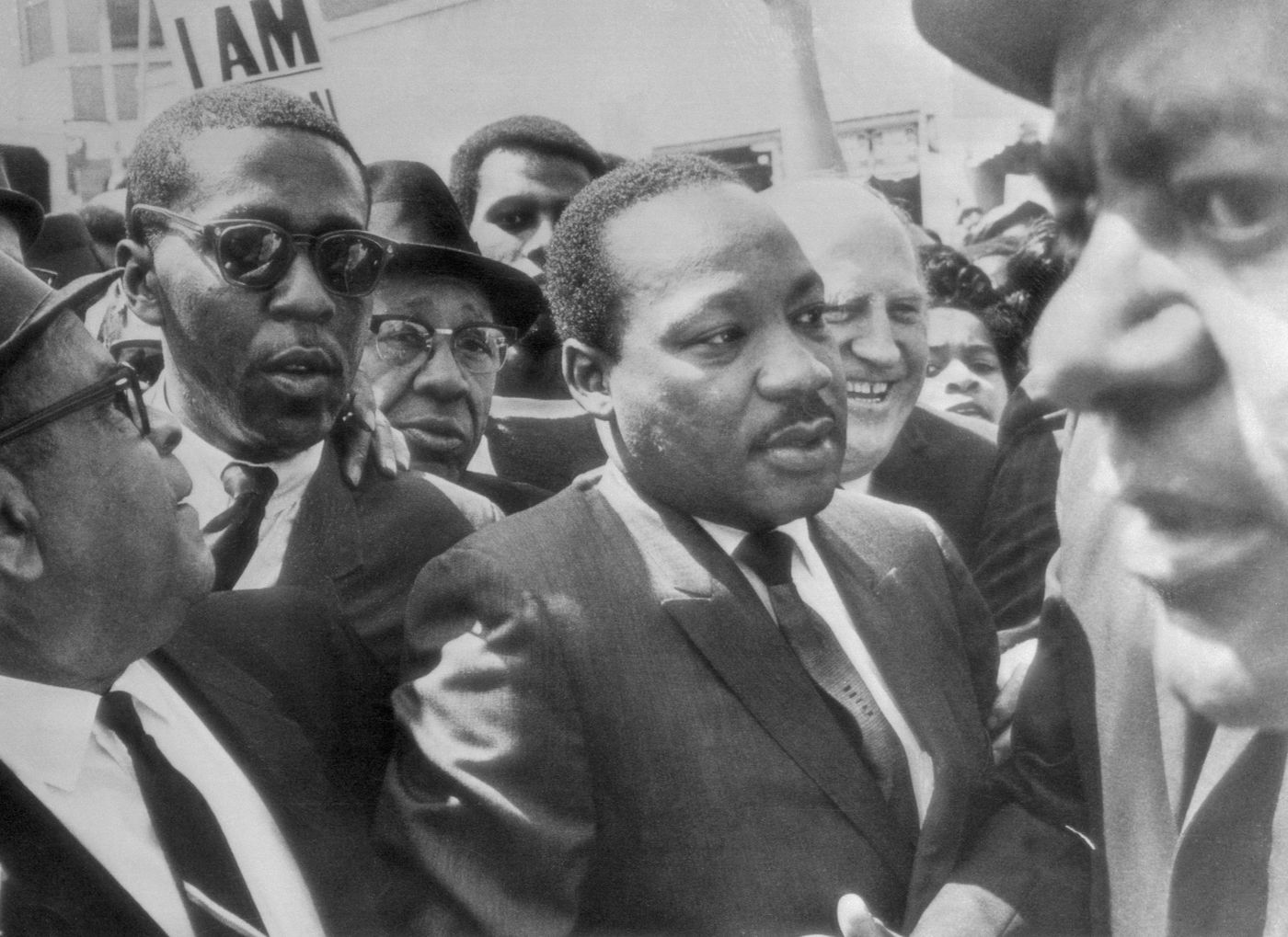
Photograph showing the reverend Martin Luther King Jr. at the Memphis strike.
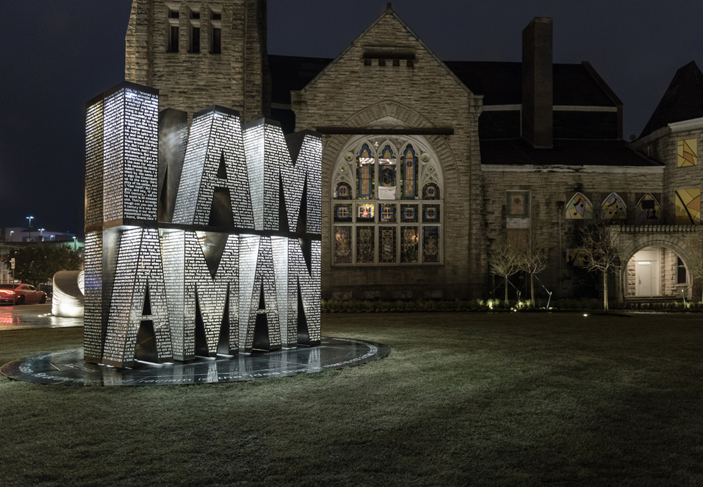
I Am A Man plaza was erected in 2018 in Memphis as a memorial to the sanitation strike of 1968.
Emory Douglas and the Black Panthers
At the 1968 Olympics, African-American athletes Tommie Smith and John Carlos raised a black-gloved fist, and kept them raised until the American national anthem had finished. This was one of the first instances where the new climate of empowerment, action, and defiance that had emerged within America’s black community was displayed before a global audience. A raised fist was used as a logo by the Industrial Workers of the World in 1917. However, it was popularized during the Spanish Civil War of 1936-1939, when it was used as anti-fascist salute.
In 1966 in Oakland, California, a new question emerged, born from the Civil Rights Movement, “How would Black people in America win not only formal citizenship rights, but actual economic and political power?” From this question the Black Power movement, and subsequently, the Black Panther Party for Self-Defense, were formed.
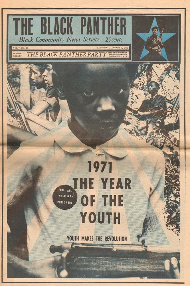
The Black Panther Party established patrols in Black neighborhoods to monitor police activities and protect the residents from police brutality. They developed social services, or what they called survival programs, in Black communities. The programs provided free breakfasts for children, established free medical clinics, helped the homeless find housing, and gave away free clothing and food. The raised fist became their salute, at rallies, at conventions, at marches, and in print. Two years after their founding, in 1967, Emory Douglas became the Minister of Culture for the Black Panther Party and the art director and main designer of The Black Panther, the party’s official newspaper from 1967 to roughly 1980.
The newspaper used bold graphics, photographs, collages, and illustrations to voice opposition to police harassment, poor living conditions, and systemic poverty. At its peak in 1970, the paper had a circulation of 139,000 copies distributed across the United States. The graphic pages with their bold calls to action were often ripped out of the newspaper and wheat-pasted around neighborhoods on buildings, billboards, and sidewalks, sparking community activism.
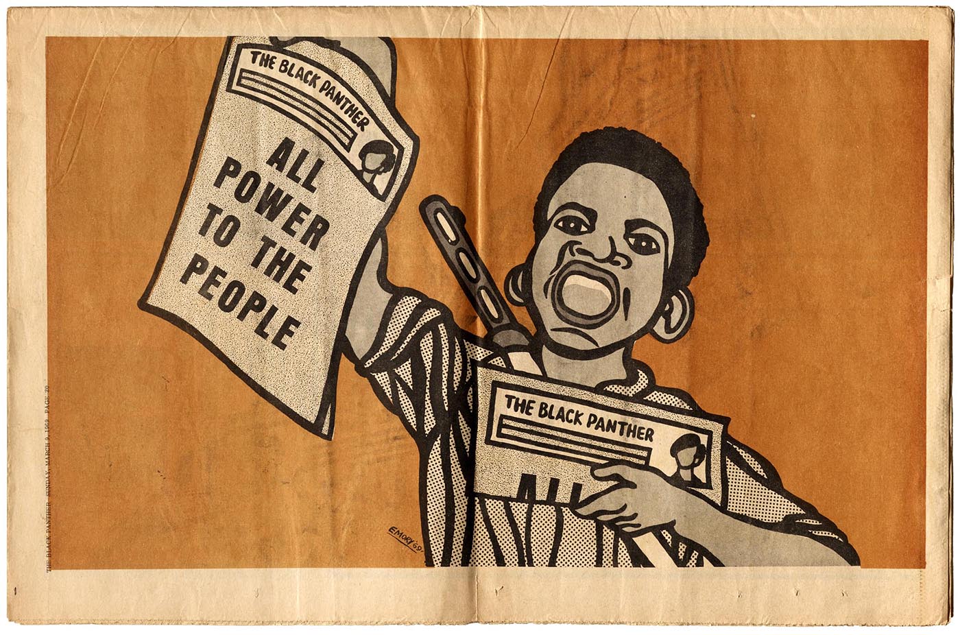
Poster from The Black Panther newspaper, Emory Douglas, 1969.
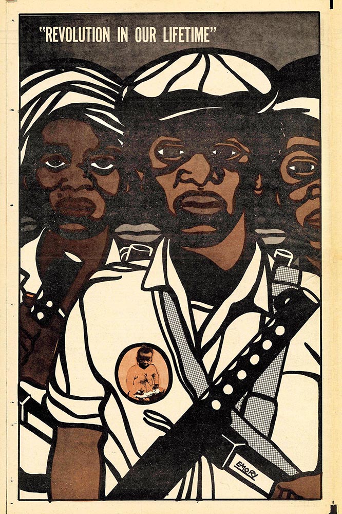
Poster from The Black Panther newspaper, Emory Douglas, 1970.
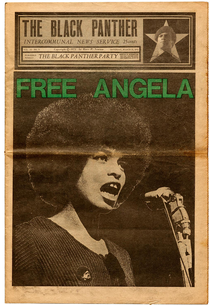
Cover for The Black Panther newspaper, Emory Douglas, 1971.
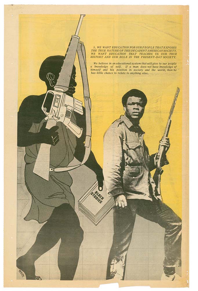
Page from The Black Panther newspaper, Emory Douglas, 1971.
Page from The Black Panther newspaper, Emory Douglas, 1971.
Sheila Levrant de Bretteville
Beginning in the early 1960’s, a new wave of feminism emerged. The first women’s movement occurred during the 19th and early 20th century and centered on women’s right to vote and own property and the right to pursue a career. The women’s movement that rose out of the sixties and seventies broadened the debate to include a wider range of issues: sexuality, family, the workplace, reproductive rights, and official legal inequalities. The movement spanned the globe and was a catalyst for women to focus, for the first time in history on politics, economics, and law making.
A designer named Sheila Levrant de Bretteville was coming of age during this time. She attended Barnard College in Manhattan and Yale University in the late sixties. Starting in the early seventies she began to utilizes her practice of visual communication as a vehicle for feminist principles, community, and diversity. Later in her career, in 1990, she would become the director of the Yale University Graduate Program in Graphic Design.
She joined the staff of California Institute of the Arts or Cal Arts in 1970 and in 1971 founded the first design program for women at the school. She produced and directed numerous feminist programs and publications including organizing the first ever conference centered on woman in design. The poster for the event features a bolt that would become the symbol or icon for the event. The piece of hardware resembles the international symbol for women but also conjures ideas of utility, function, construction, and strength.
Two years after the conference, in 1973, she co-founded the Woman’s Building, a public center in Los Angeles dedicated to women’s education and culture. That same year, de Bretteville founded the Women’s Graphic Center and co-founded the Feminist Studio Workshop, both based at the Woman’s Building.
Since the seventies, de Bretteville’s body of work has utilized elements of graphic design to stimulate public discourse. Graphic messaging, color, and distilled forms are used to challenge dominant cultural perceptions around gender, class, and community. She has created a series of public works that are specifically in service of highlighting and celebrating experiences and identities of demographics that are marginalized or typically overlooked.
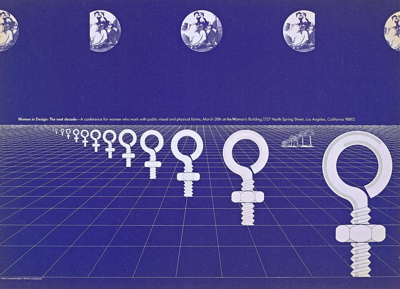
Poster for Women in Design: The Next Decade, Sheila Levrant de Bretteville, 1975.
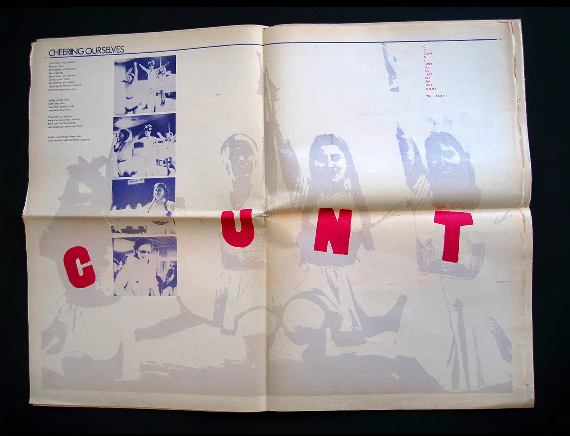
Spread from Everywoman feminist magazine, Sheila Levrant de Bretteville, 1970.
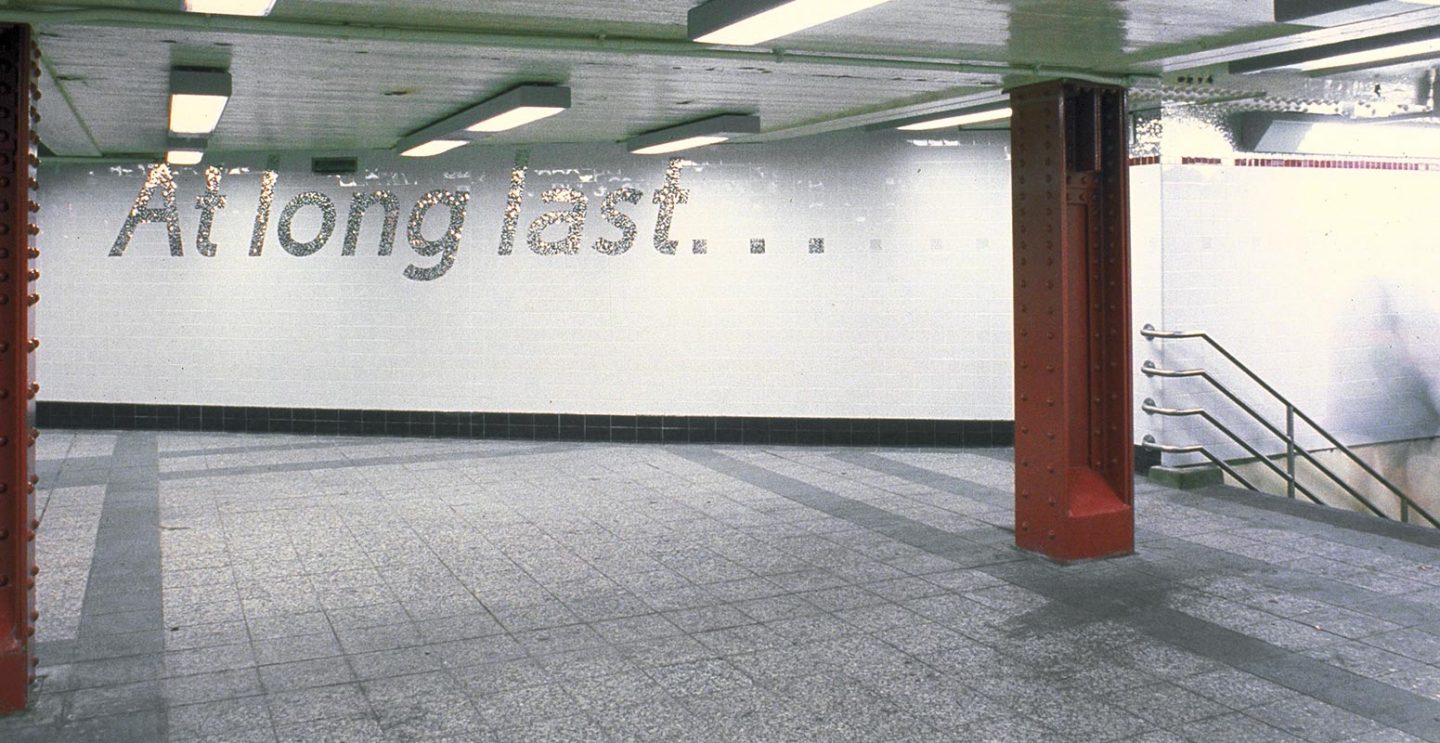
Detail from At the Start… At Long Last… public art installation in Inwood, New York, Sheila Levrant de Bretteville, 1999.
The Peace Sign
By the end of the 1950’s the world had seen the devastation of war— from the two atomic bombs that were deployed in Japan in 1945 to the documented horrors of the Vietnam War that had begun in 1955. In 1957, in London, England, a group of antiwar activists founded the Campaign for Nuclear Disarmament in the wake of widespread fear of nuclear conflict and the effects of nuclear tests. Britain had recently become the third atomic power, following in the footsteps of the USA and the USSR, and had begun testing their own H-bomb.
The organization employed Gerald Holtom to design a symbol that would act as a visual expression of the movement’s aims to be used at a public demonstration in London’s Trafalgar Square. Holtom used a combination of semaphore signals for the basis of his design. Semaphore signals are a system of communication that uses flags to convey information at a distance. The symbol Holtom created is a combination of the semaphore signals for the letters N and D, standing for “nuclear disarmament.” Superimposing these two signs forms the shape of the center of Holtom’s distinct emblem for peace.
The symbol was immediately adopted by the organization and soon appeared on buttons, posters and banners that were used in rallies and protests. The symbol became an effective tool for spreading their antiwar message—so effective in fact that it was soon adopted by other antiwar activists, eventually becoming an iconic symbol of the global antiwar revolution.
During the Vietnam War specifically, as images in the media showcased the unbelievable atrocities that were unfolding overseas, the symbol became a tool to signify disapproval—a means to visually communicate collective opposition and a want for peace. This collective opposition was a key factor in bringing the Vietnam War to an end.
Since then, the peace sign has become deeply rooted in our collective cultural consciousness. It has become part of an essential human value in opposition to conflict and violence. The symbol reminds us that we have a choice and reminds us of our accountability.
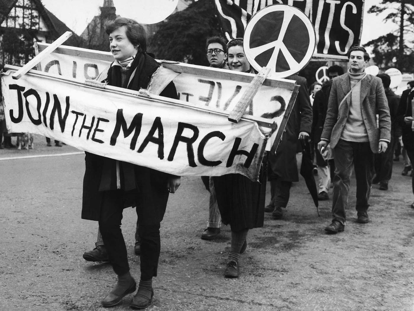
Photograph from a public demonstration for nuclear disarmament, London 1958.
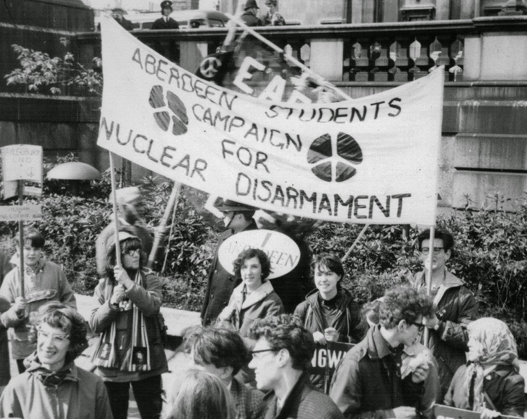
Photograph from a public demonstration for nuclear disarmament, London, 1965.
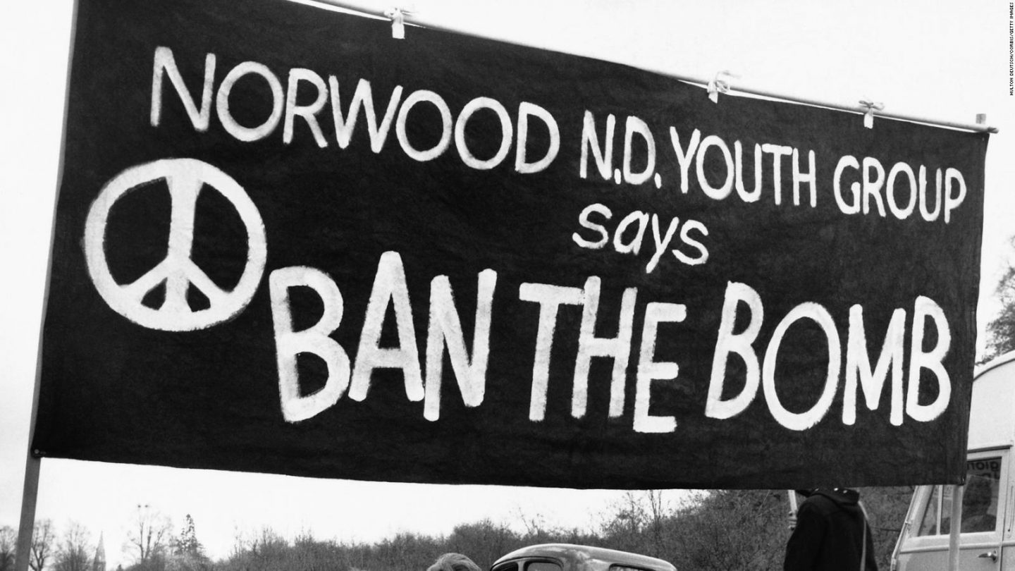
Banner from an anti-nuclear protest, 1960.
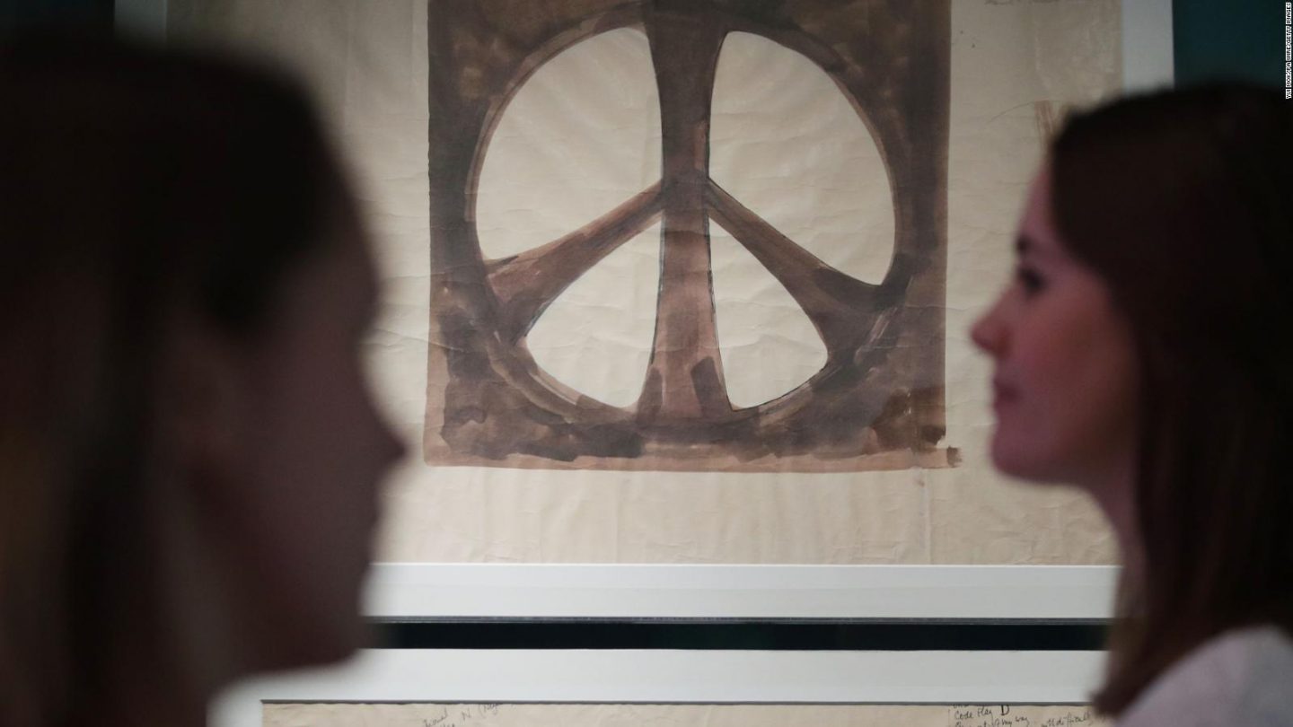
Peace sign original sketch by Gerald Holtom, 1958.
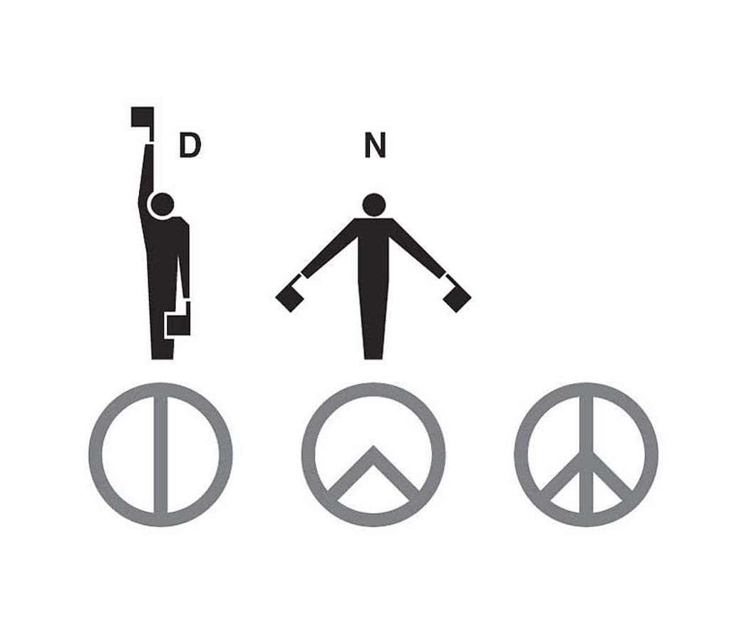
Semaphore signals for “N” and “D” are the basis for Gerald Holtom’s peace sign.
The AIDS Crisis
By the end of 1985, 15,000+ people in the US had contracted AIDS. Nearly half had already died. A third of this population of typically young, otherwise healthy gay men were living in New York City. US President Ronald Reagan had not even uttered the word “AIDS” in public. There was so much fear of people with AIDS, people ostracized members of their own family and hospitals treated patients like they were bio-hazard. Many funeral homes refused to bury the dead.
Frustrated and desperate, a group of gay men in NYC formed a consciousness-raising group in 1986 to explore ideas about creating awareness around the issue. Their friends and lovers were dying, the government wasn’t doing anything and not enough people were talking about it.
They decided that the language of design, specifically the visual vocabulary of the world of advertising with its use of bold phrases and graphic symbology would be an effective approach for increasing public awareness. They sought to create a visual message that would act as a signal—a beacon to unite the gay community but also resonate with a larger audience. It would, like all good advertising, connect with a broad demographic.
After weighing several options they landed on using the pink triangle. The pink triangle was used on Nazi concentration camp uniforms to identify homosexuals. In the context of fears about segregation, quarantine, and internment of HIV-positive people, using the symbol could become a double-edged sword. They changed its color from pale pink to a more vivid fuchsia, Pantone 212 C, which they felt suited the poster’s aggressive tone. They also turned the triangle upside down so the form conveyed a solid based terminating upward into an apex, like that of a pyramid.
They paired this dynamic symbol with an equally dynamic tag-line—Silence Equals Death—the most succinct explanation possible to convey the message that by doing nothing, by ignoring the crisis of AIDS—you are actively perpetuating it.
The group wheat-pasted the poster in the East Village, the West Village, Times Square, Chelsea, and the Upper West Side. Their aim was to target areas where members of the media lived and work. Overnight, they blanketed the city with the campaign creating a dynamic visual spectacle that was impossible to ignore.
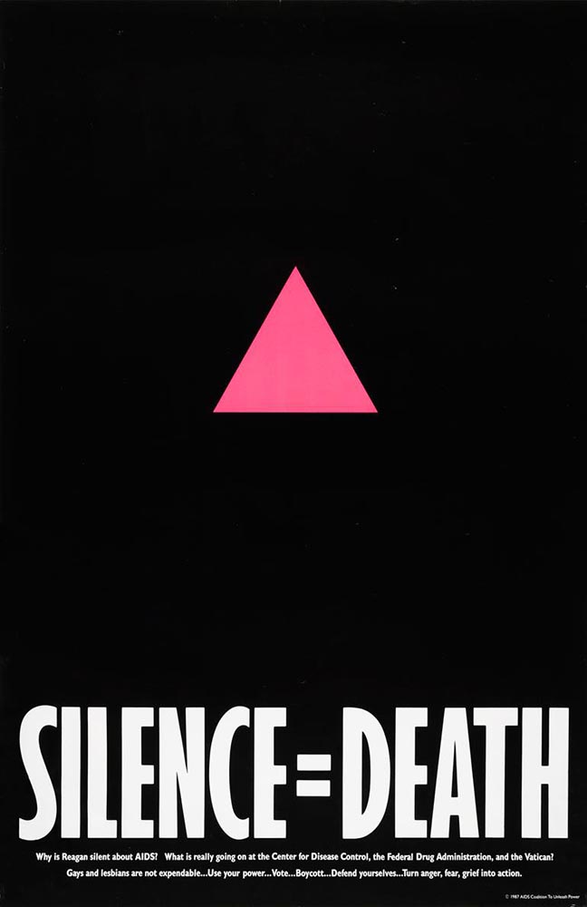
Poster for the Silence Equals Death campaign, AIDS Coalition to Unleash Power or ACT UP, Gran Fury, 1986.
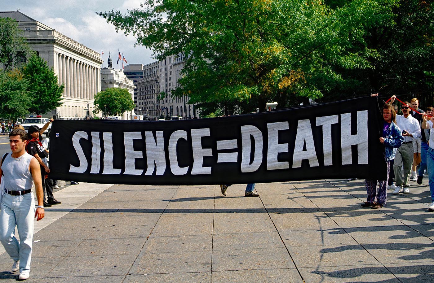
The Silence Equals Death campaign in action at a demonstration in front of the White House in 1992.
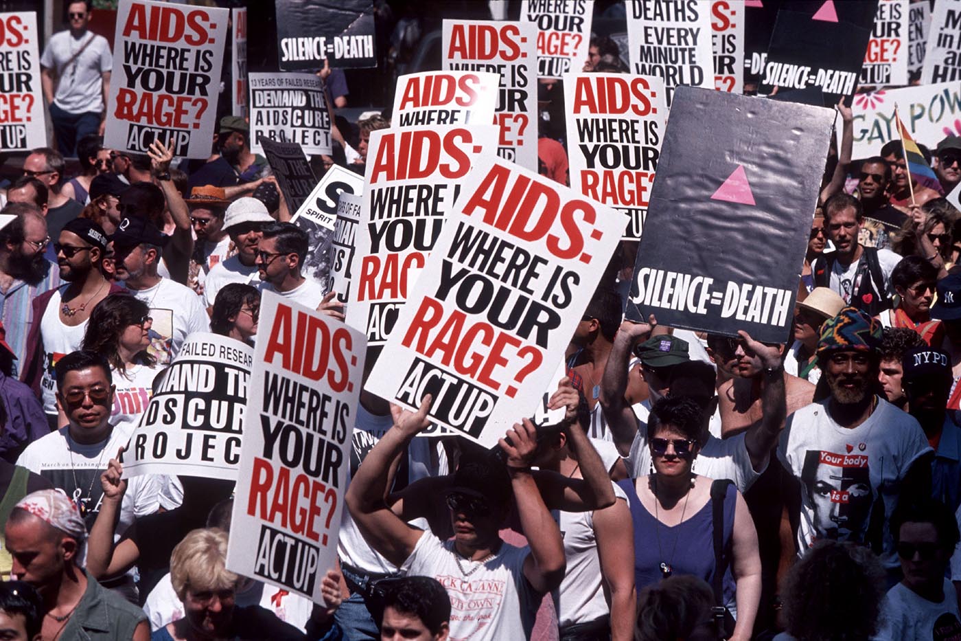
ACT UP protest, New York City, 1994.
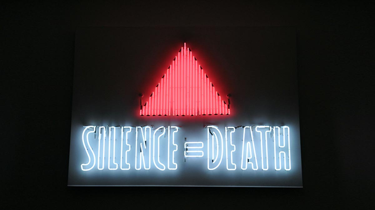
Neon sign featured in the exhibition Let the Record Show . . . at the New Museum in New York, 1987.
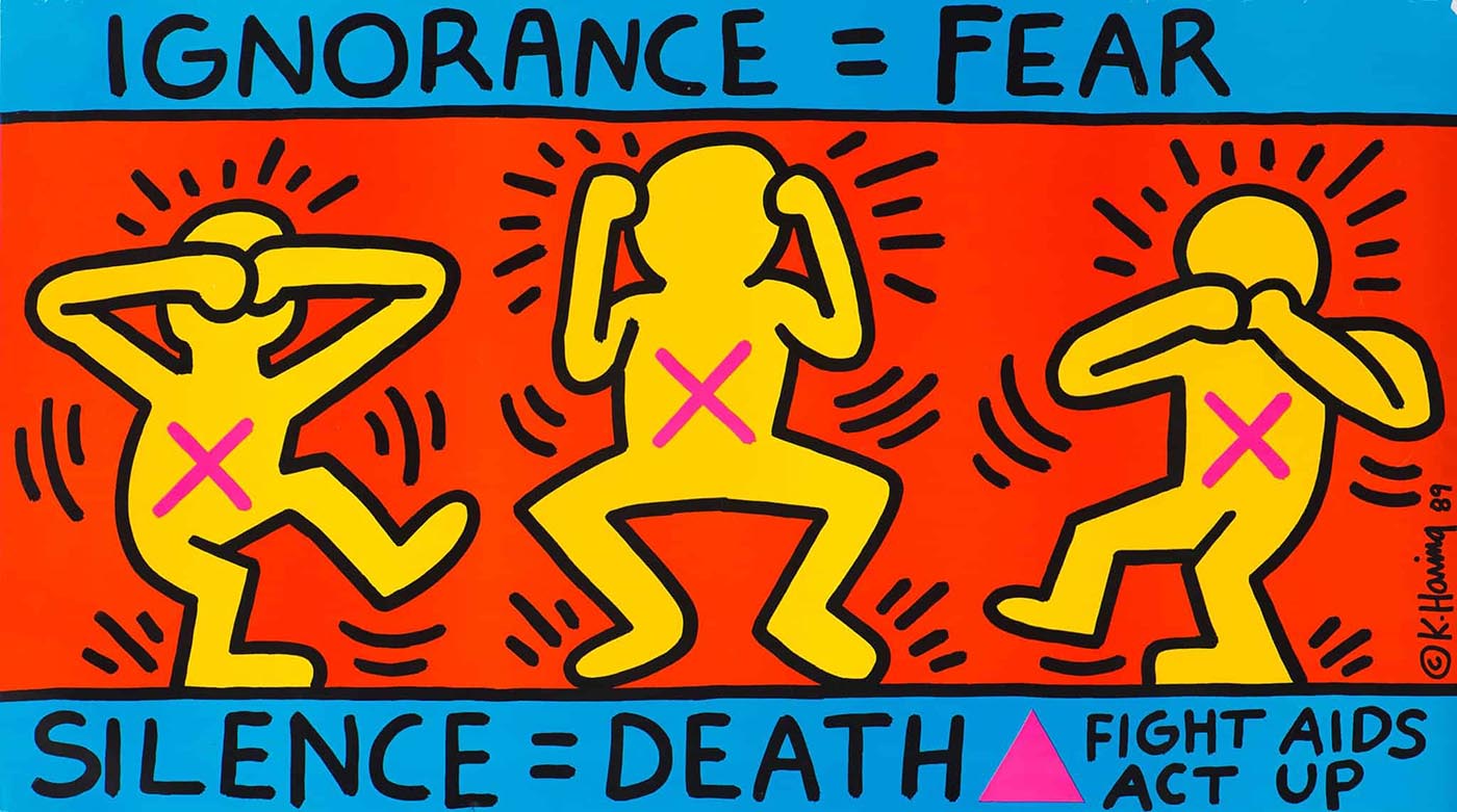
The Silence Equals Death messaging reimagined by the artist Keith Haring, 1989.
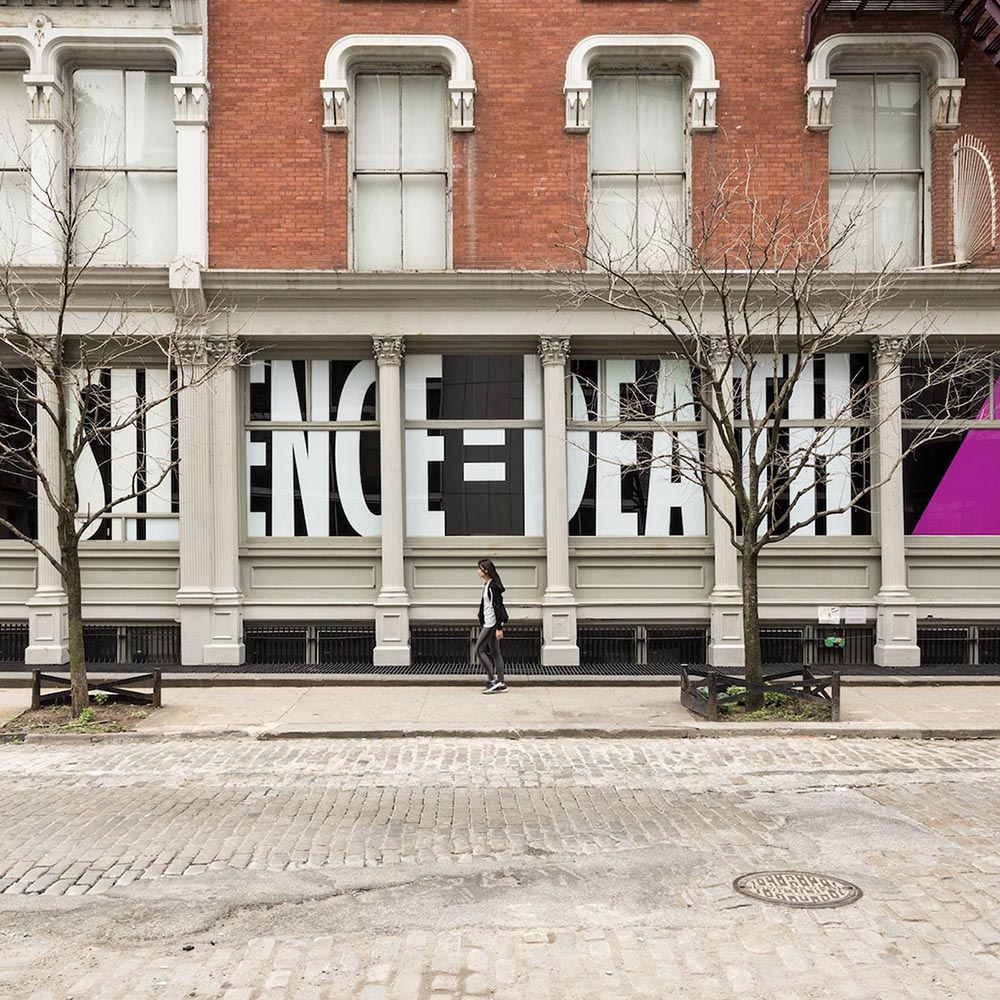
The Silence Equals Death campaign at the Leslie-Lohman Museum of Gay and Lesbian Art in New York.