10/27/2021
Postmodernism and Digital Culture
New technologies expand the field of visual communication
More is more.Deborah Sussman
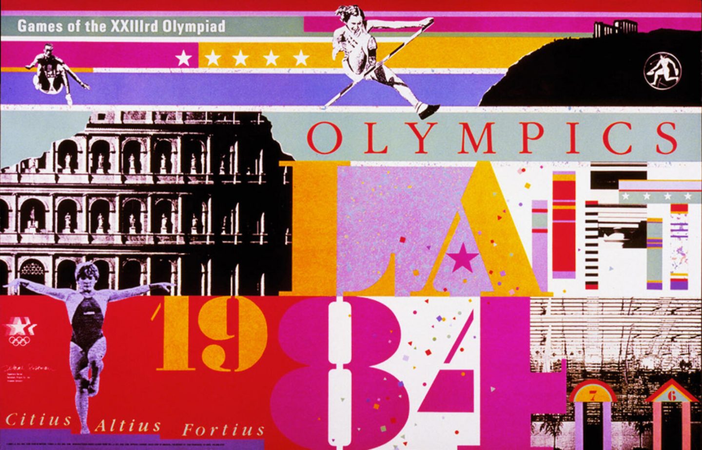
Graphics for the 1984 Summer Olympics in Los Angeles designed by Deborah Sussman. Her vivid, maximalist approach captured the spirit of eighties California New Wave.
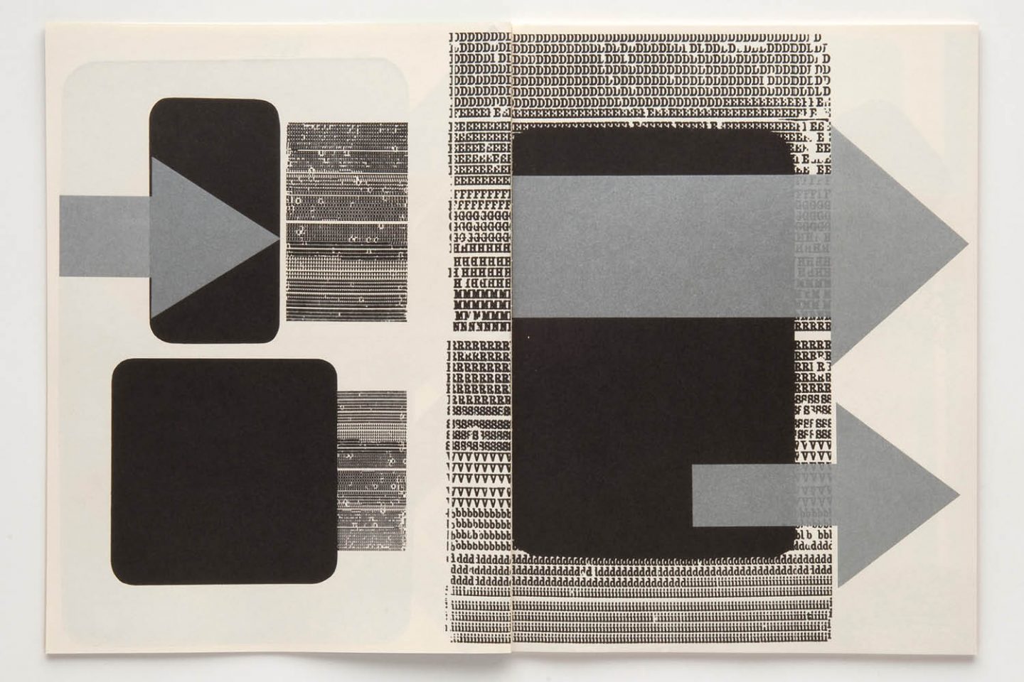
Detail from poster designed by April Greiman featuring distorted, pixelated typography. Greiman’s experimental approach served as an antithesis to the canon of modernism.
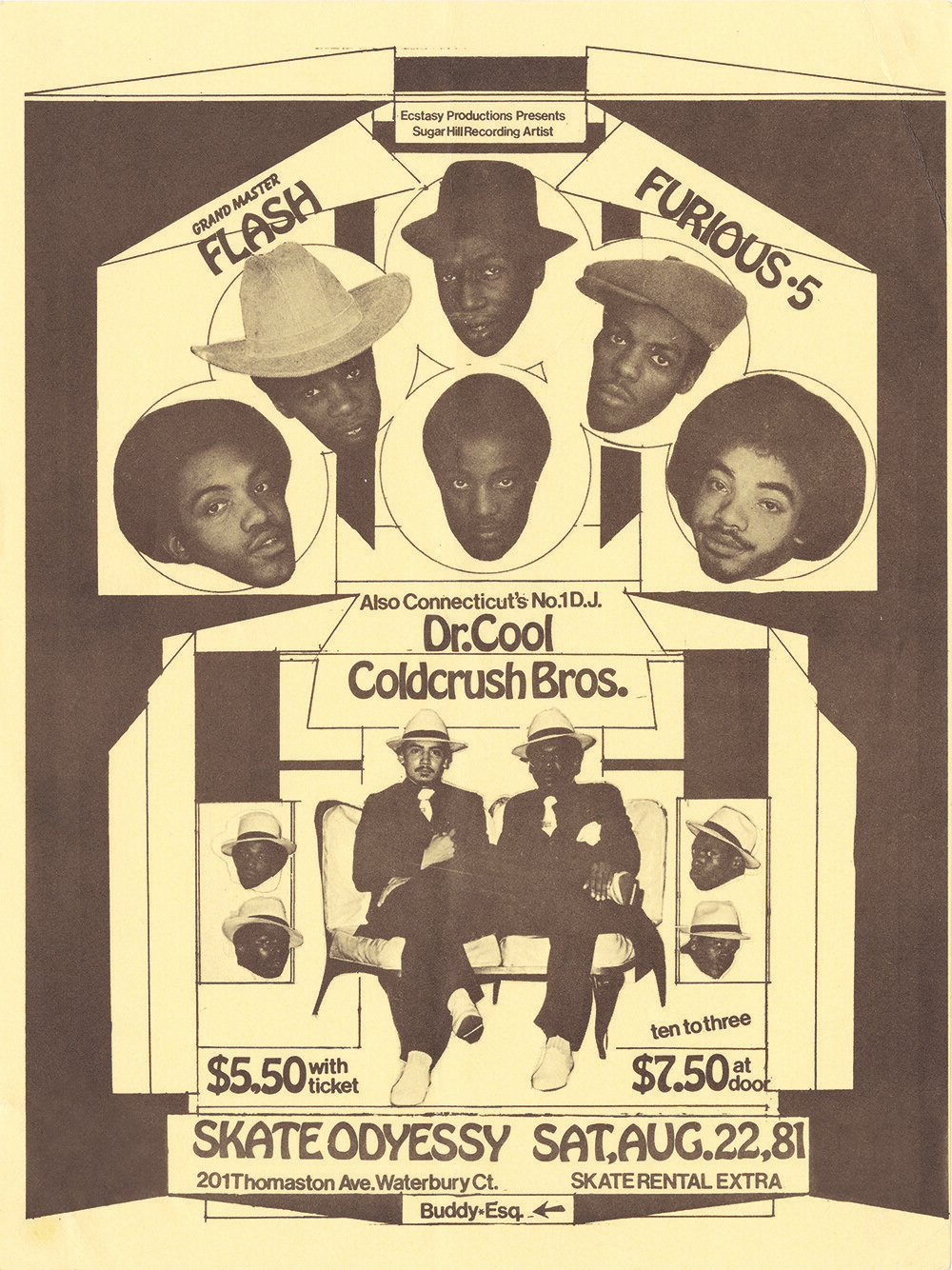
Flier designed by Buddy Esquire, 1980. Esquire’s approach synthesized historic Art Deco influences with emerging formats of DIY marketing and promotion in teh late seventies and early eighties.
In the wake of World War II, new formats and technologies began to surface that would open up the practice of graphic design to a whole new range of audiences who previously did not have access to the means of design production. Beginning in the sixties, these demographics would begin to infiltrate the sphere of commercial design—a space that had formerly been confined to the formal settings of for-profit design studios, in-house corporate environments, and academic institutions. This new crop of creatives would bring with them a wide range of styles, approaches, and motivations that had never before been present within the field of visual communication.
This expansion of graphic expression comes at a time when the dominant style of modernism, once seen as innovative and new, starts to fall out of fashion. Modernist design’s strict criteria of san serif type, grid-based composition, and restrained minimalism, in the midst of shifting cultural perspectives, begins to read as restrictive and irrelevant—particularly to younger generations. Emerging artists and designers of the sixties and seventies were being drawn to alternate approaches. They were departing from modernist sensibilities and instead embracing the rebelliousness and experimentation associated with the counter-cultures that were forming alongside a growing number of grassroots social movements focused on achieving cultural change through protest and activism.
Because these new practitioners came from a variety of backgrounds and practiced their craft within a wide spectrum of contexts, their styles and perspectives were varied and multifarious. Some practitioners mixed elements of modernism with new styles and approaches that existed outside of the modernist oeuvre. Other designers abandoned modernism altogether. This phenomenon of multiple perspectives existing together is a defining feature of the postmodern era.
Psychedelic Posters
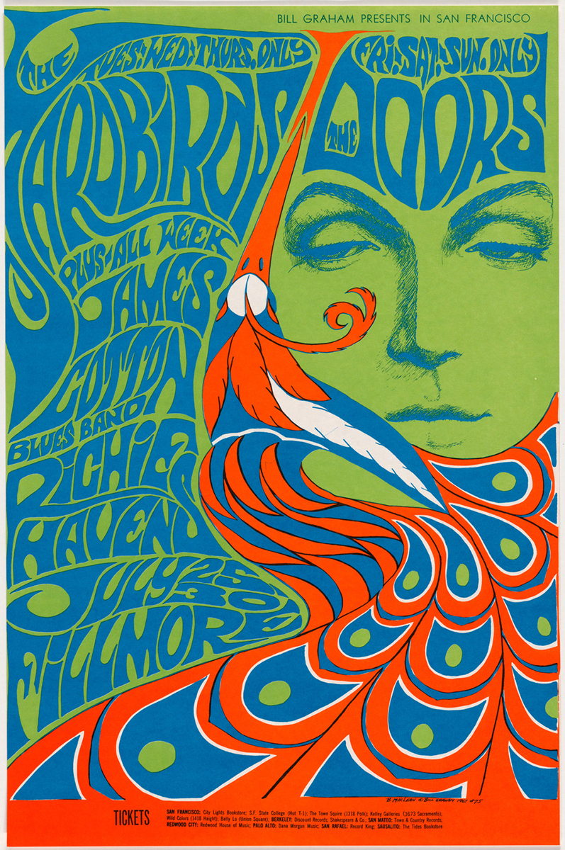
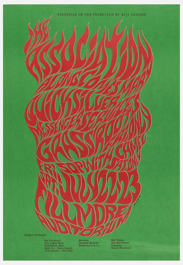
The psychedelic poster movement of 1960s San Francisco stands as an early example of postmodern visual culture. Reflecting the city’s vibrant countercultural scene—rooted in music, activism, psychedelic drug use, and anti-capitalist ideals—these posters rejected modernist principles of order and clarity in favor of excess, distortion, and sensory overload. Designed to promote concerts at iconic venues like the Fillmore and Avalon Ballroom, the work of psychedelic artists such as Wes Wilson, Victor Moscoso, and Bonnie MacLean mirrored the era’s fascination with altered perception and collective liberation.
Visually, psychedelic posters marked a deliberate break from modernism’s forward-looking minimalism. Rather than seeking to envision the future, designers turned backward. They drew inspiration from historic styles—specifically Art Nouveau with its decorative curves and flowing organic forms. This revival of past aesthetics represented a broader cultural impulse to reject the sterile rationalism of modernist design and reconnect with emotional, handmade, and mystical modes of expression. This embracing of the past was synthesized with the graphic intensity of Op Art patterns and colors, these works became immersive visual experiences—vibrating with color, distortion, and movement—that mirrored the altered states and experimental ethos of the 1960s drug and music culture.
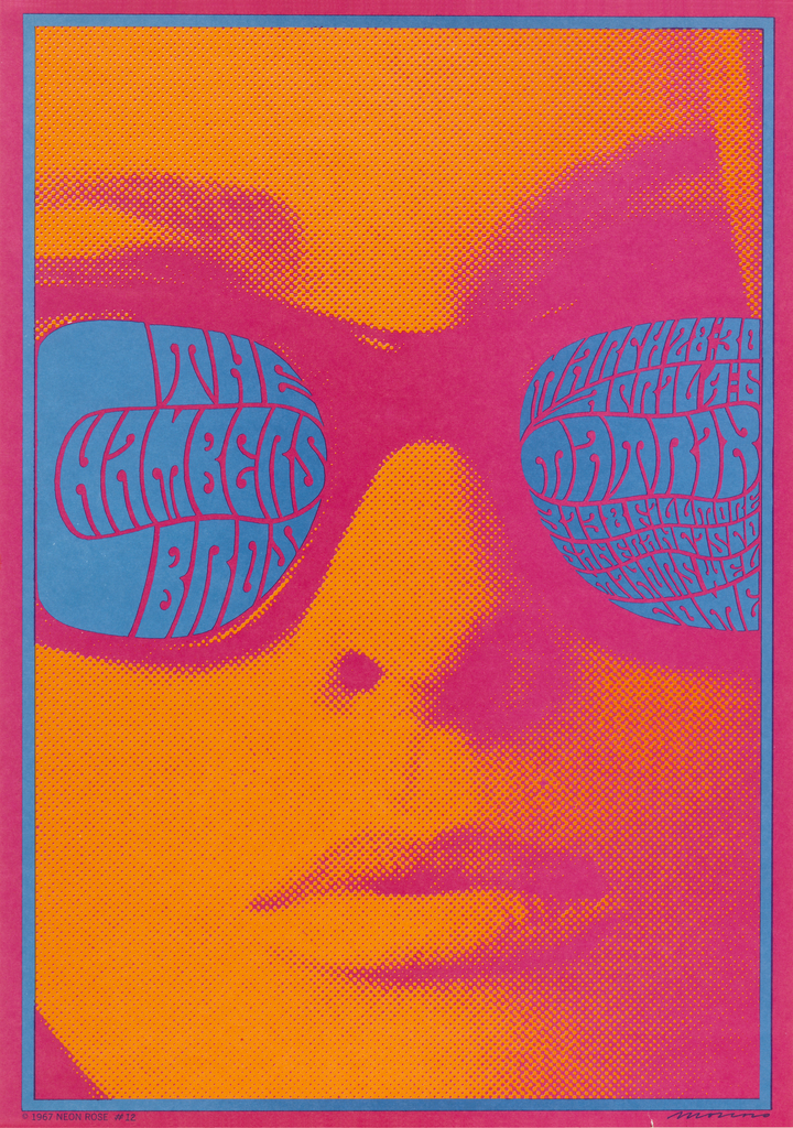
Victor Moscoso, poster for Fillmore Auditorium, lithograph, 1967.
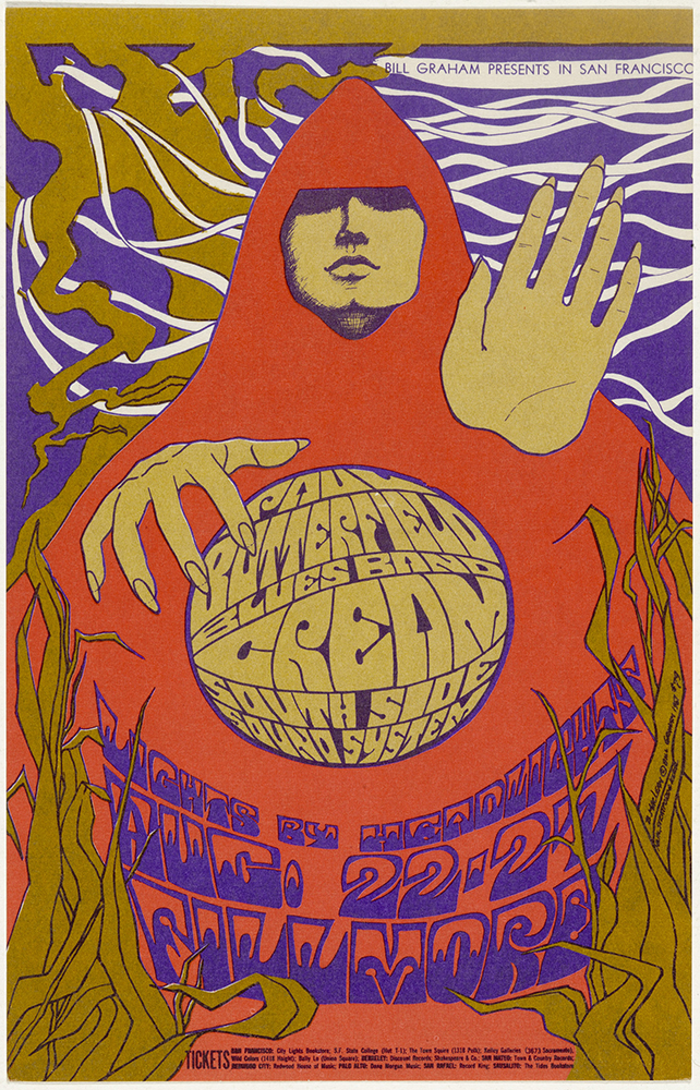
Bonnie MacLean, poster for Fillmore Auditorium, lithograph, 1967.

Victor Moscoso, poster for Fillmore Auditorium, lithograph, 1967.
Bonnie MacLean, poster for Fillmore Auditorium, lithograph, 1967.
Wes Wilson, poster for Fillmore Auditorium, lithograph, 1966.
Phototypesetting
Aside from the linotype machine, the dominant production processes within the printing industry had not changed much after the war. Even Gutenberg’s signature formula for casting type—a mixture of lead and antimony—was still being used well into the twentieth century. The technology that would finally make hot metal type obsolete and act as the bridge to the eventual digital revolution of the eighties was the technology of phototypesetting.
First developed by two French engineers—René Higonnet and Louis Moyroud—the phototypesetting process involves projecting text onto a light-sensitive medium like film or treated paper which is then processed and transferred to lithographic plates for use in offset printing. Phototypesetting would completely change the printing industry. By the 1970’s almost all newspapers had abandoned hot metal type for the phototypesetting process.
This new technology also sparked a revolution in typography. Within the cast metal process, developing new typefaces was laborious and time consuming. Each character of a new typeface had to be individually fabricated into a three dimensional matrix then cast in metal. With phototypesetting, new fonts could be created and implemented without casting, making the creation of typefaces cheaper and easier than ever before.
Phototypesetting presented the possibility of significantly expanding the pool of available typefaces at a time when the industry of design was expanding—being used in more ways by more people within new contexts. This growing field of creatives wanted more than just the typical stable of neutral san serif faces that were dominant in the modernist works of the fifties and sixties.
The development of phototypesetting coincided with an emerging interest in design history—more and more creatives were looking to the past for inspiration, particularly in the area of typography. Many designers began to depart from the future focused ethos of the international typographic style and Swiss approaches. Instead, they moved to past periods and genres for inspiration—early modernist movements, the Industrial Revolution.
Even before phototypesetting became the industry standard, many printers were beginning to collect movable type from past eras to meet a growing interest in historic styles among contemporary audiences. Once phototype replaced cast metal type, companies emerged like Headliners who converted typefaces from earlier periods—wood type, victorian— into the phototype format.
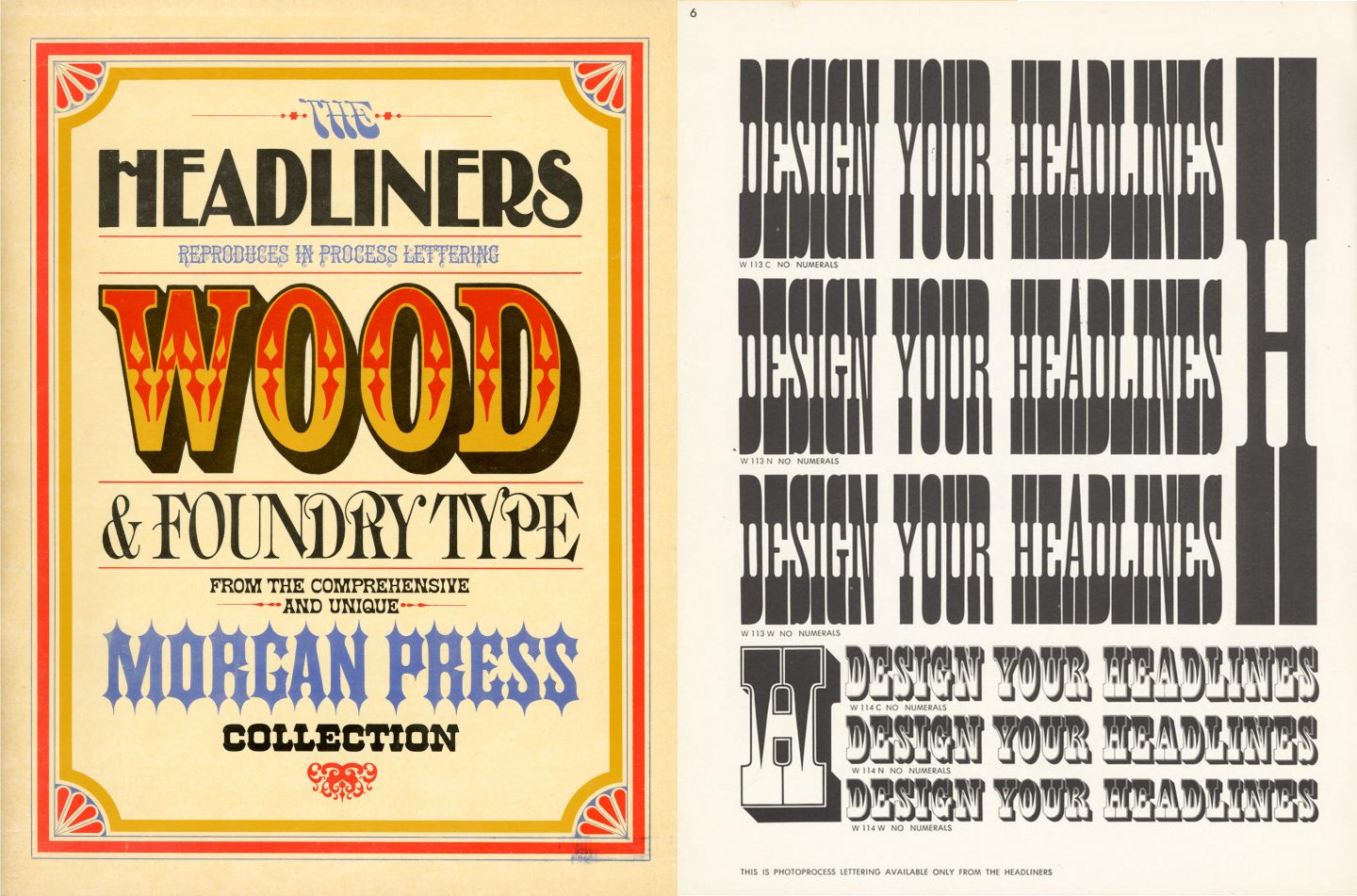
Headliners was a company that offered historic typeface collections in the phototype format.
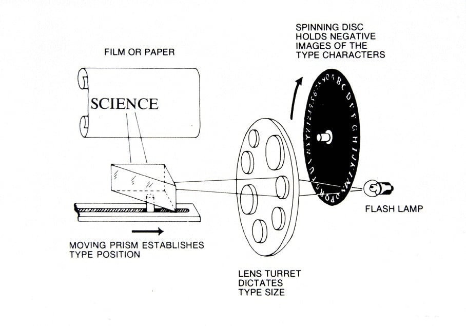
Diagram illustrating the phototype process.
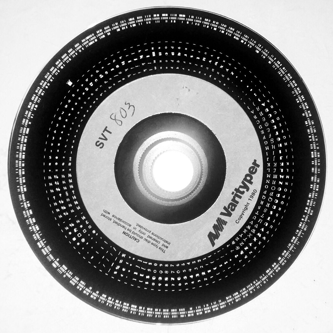
Phototypesetting disc containing multiple typefaces.
DIY Design
The xerox company released its first black and white photo-copier in 1949. By the mid-fifties the machine would become a standard fixture in modern offices. Before this invention, the copying of documents was a tedious task done by hand. As photocopiers grew in popularity, they became more and more accessible to the general public. By the seventies, photocopiers were present in many retail businesses, allowing anyone to make cheap black and white copies.
Letraset dry-transfer letters were first marketed to the public in the early sixties. The product was formatted as a series of plastic sheets containing multiple copies of letterforms within a complete alphabet that could be transferred to a dry surface by applying pressure with a small blunt instrument. Each group of sheets featured a specific typeface at a specific weight and size. You could purchase a complete set of Futura regular at 12 points, Helvetica light at 24 points, or perhaps Bodoni extra bold at 60 points. The sheets would also include punctuation and a complete set of numbers. Up until the release of letraset, typesetting was a process exclusive to design studios and print houses. Letraset put type in the hands of the general public and made the creation of typographic work cheaper and easier than it had ever been before.
Innovations like the xerox machine, dry transfer letters, and phototypesetting—in addition to the format of screen printing which first grew in popularity in the UK in the sixties and would eventually make its way to the states—don’t perhaps seem cutting edge in our age of AI and digital platforms. What made these developments so transformative is that they expanded the ability to create graphic content to a limitless spectrum of practitioners.
Out of this accessibility, the field of DIY marketing was born. Music, performance, and community building were essential aspects of cultural movements like punk, hip hop, and new wave that appeared in the seventies and eighties. Artists and designers tasked with promotion and marketing within these movements utilized new DIY technologies to create graphic works to advertise public programs and events. The new formats of xerox printing and rub-on, dry-transfer letters had their obvious limitations when compared to the process of offset lithography which, even today, stands as a dominant method within professional printing. Designers had to work solely in black and white and were limited to the type styles, weights, and sizes of dry-transfer letters that they could access or afford. Through these restraints came experimentation and visual innovation.
When surveying flyers and posters for punk and hip hop shows in the seventies and eighties you will see a mishmash of pop culture imagery, experimental typography, illustration, texture, pattern, and visual motifs that have no rationality or context. Many of the collaged compositions feature references to past periods and styles—art deco, art nouveau, constructivism, op art, even ancient roman art. The bricolage of DIY music and event marketing represents a stark contrast to the homogeneity of modernism which, by the end of the sixties, had become the style of the establishment.
These new DIY approaches were a significant factor in expanding the field of visual communication and, in turn, sparking the development of postmodernism which, by the eighties would become the accompanying visual vernacular of the arising digital era. Gone were the days of designers adhering to one dominant analogous style. Within postmodernism, there was space for multiple styles and approaches to coexist simultaneously. Modernism’s focus on rationality, function and minimalism is replaced by a practice centered on experimentation, self expression, and digital competency.
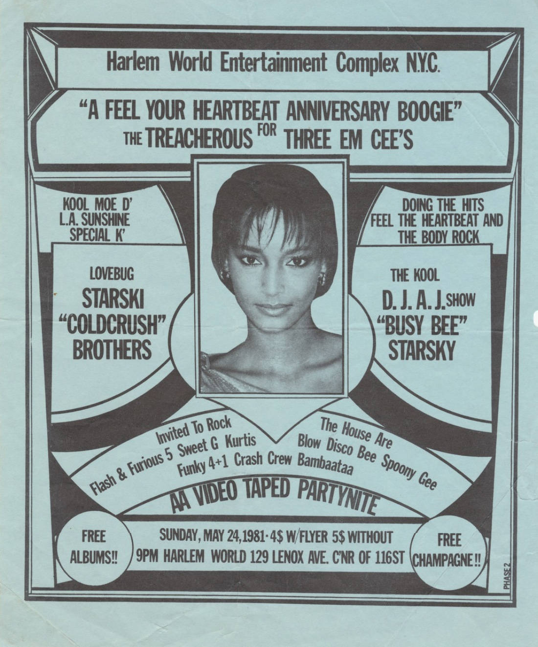
Flier from 1981 designed by Phase 2.
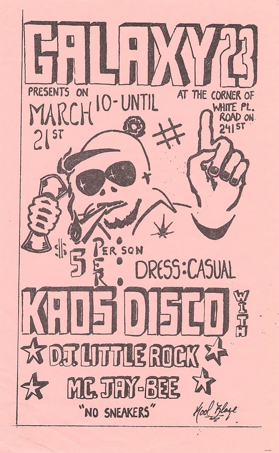
Early hip-hop flyer, 1980.
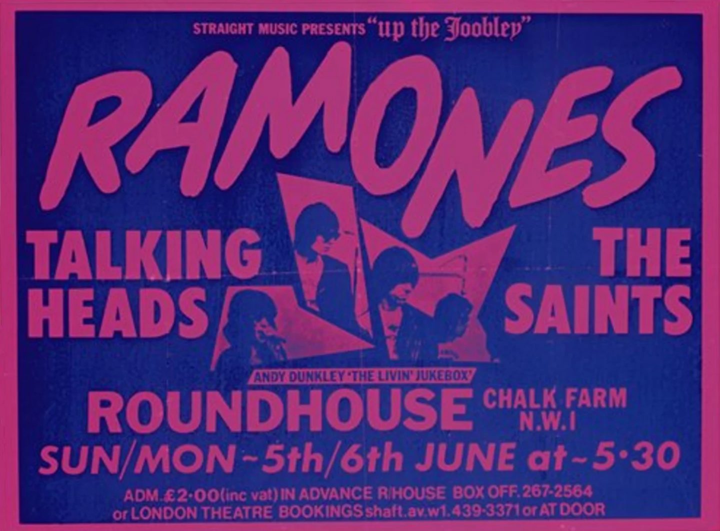
A poster promoting a 1977 concert in London featuring the Ramones, Talking Heads, and The Saints.
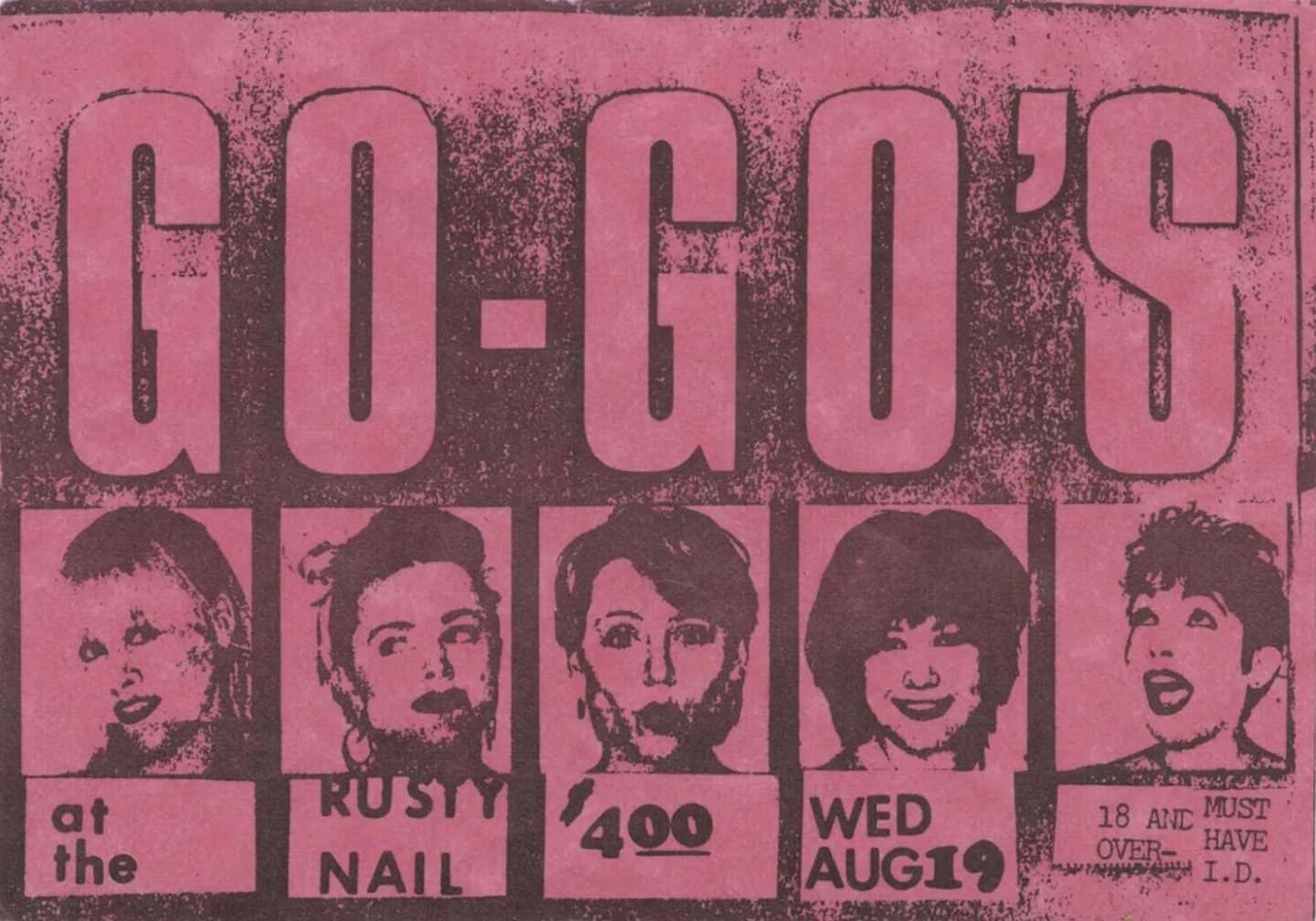
A xerox flyer for a Go-Go’s concert at the Rusy Nail in Sunderland, MA on Aug 19, 1981.
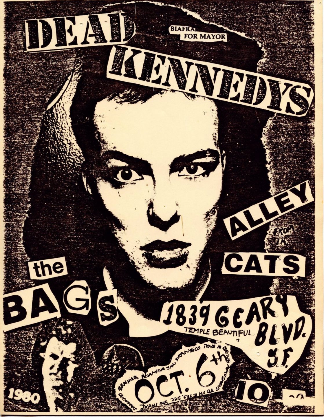
Xerox poster for a show in San Francisco featuring the Dead Kennedys and the Alley Cats, 1980.
Buddy Esquire
One figure who exemplifies the creative innovation that came out of the new DIY formats of the seventies and eighties is the artist and designer Buddy Esquire. Referred to as the “king of hip-hop flyers” by his peers and admirers, Esquire’s work incorporates dynamic typography and graphic shapes within intricate, collaged compositions. Through his unique approach, he transforms the format of grassroots music marketing into an art form.
Largely self-trained Esquire developed a sense of design history through books that he would check out from his local library. He found inspiration in past movements like Art Deco and Constructivism, Esquire synthesized these approaches into a distinct, eye-catching style that became influential within the visual culture of hip-hop and beyond.
Peter Saville
Another artist creating work for the music space in the seventies and eighties was London designer Peter Saville. Like Esquire, Saville was also mining past periods for design inspiration. He was particularly drawn to the early modernist movements like futurism, constructivism, and the work of German typographer Jan Tschichold who’s methodology represented a synthesis of Bauhaus graphic approaches. Saville’s references were often overt to the point of emulation. His cover design for the 1981 New Order album Movement was almost an identical recreation of futurist Fortunato Depero’s cover design for the publication Futurismo from 1932.
Saville designed for British record labels Factory Records and Dindisc where he created designs for such recognizable groups as Joy Division, Roxy Music, Wham, and Peter Gabriel. Later in his career he moved into advertising with a strong focus on fashion. He has created campaigns for iconic brands like Jil Sander, John Galliano, Yohji Yamamoto, and Raf Simons.
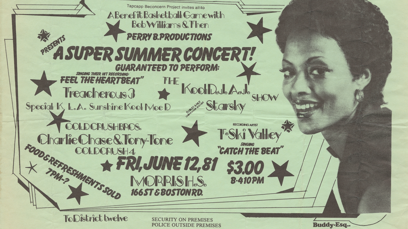
Hip-hop flyer designed by Buddy Esquire, early eighties.
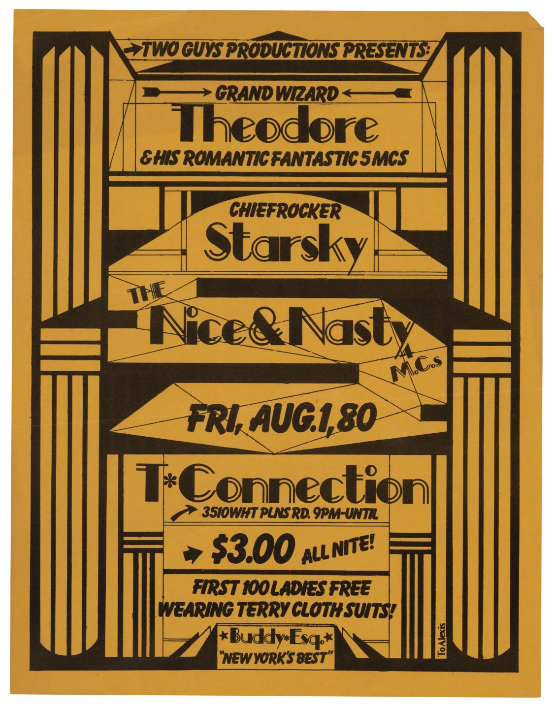
Hip-hop flyer designed by Buddy Esquire, early eighties.
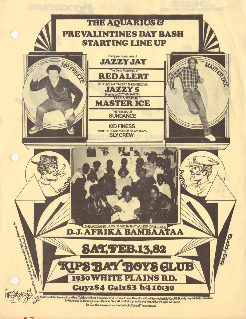
Hip-hop flyer designed by Buddy Esquire, early eighties.
Hip-hop flyer designed by Buddy Esquire, early eighties.
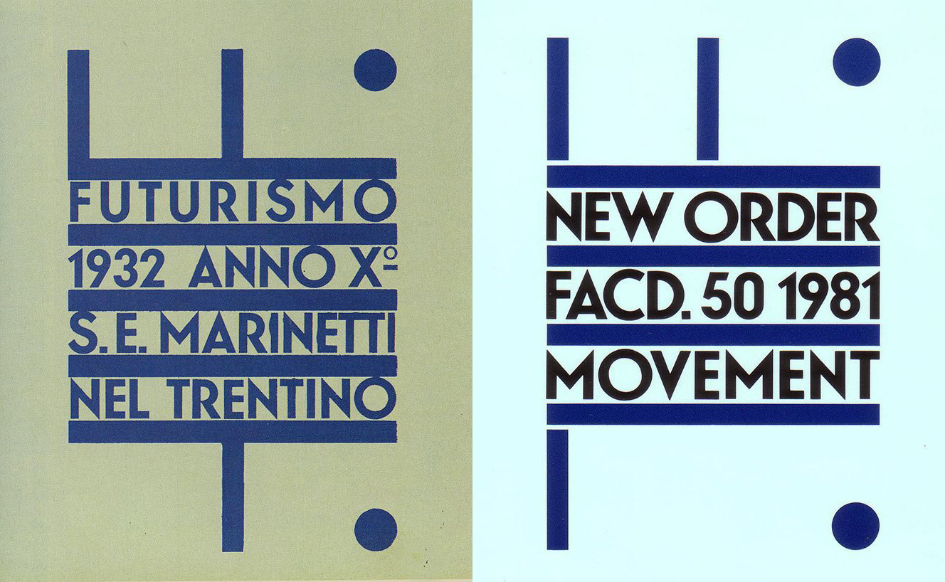
Peter Saville’s design for the 1981 New Order album Movement side by side with its original inspiration—the cover of a 1932 issue of the publication Futurismo designed by Fortunato Depero.
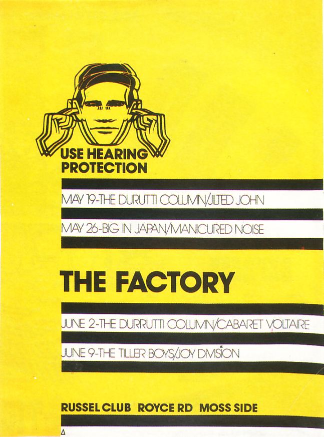
Poster designed by Peter Saville for The Factory, 1977.
Paula Scher
One of the most prominent designers to emerge from the early postmodern era is Paula Scher. Like Esquire and Saville, she also began her design career working in music, albeit in a more corporate context. For a decade she designed album covers— first for CBS records then for Atlantic. During this time, she experimented with multiple styles and approaches in the creation of record sleeve designs for a wide array of music artists.
Scher’s unique point of view stems from a vast knowledge of design history combined with a penchant for innovative experimentation. She continually references preceding eras and genres of design in her work.
In her “Best of Jazz” poster designed for the Smithsonian Institution in 1979, Scher incorporates a dynamic typographic approach which synthesizes the visual styles of early modernist movements—Futurism, the Bauhaus— with the graphic letterforms of wood type posters from the industrial revolution.
First released in 2015, Scher’s graphic identity for the Atlantic Theatre company evokes the stark minimalism of Russian Constructivism. The initial design system features a bold, wedge-like form paired with a vibrant tomato red. El Lissitzky’s iconic 1919 Constructivist work Beat the Whites with the Red Wedge comes to mind as an obvious inspiration for the brand system.
In another example—a 1984 advertisement for the Swiss watch brand Swatch—Scher reappropriates a travel poster designed fifty years earlier by the seminal Swiss modernist Herbert Matter. Plagiarism is part of the design strategy. By referencing Matter’s work, Scher is connecting Swatch to the well known legacy of Swiss design.
Since the nineties, Scher has been a working partner at Pentagram—one of the most celebrated design firms in the world. She continues to create iconic designs for globally renowned clients and has become one of the most recognizable personalities in the field of visual communication.
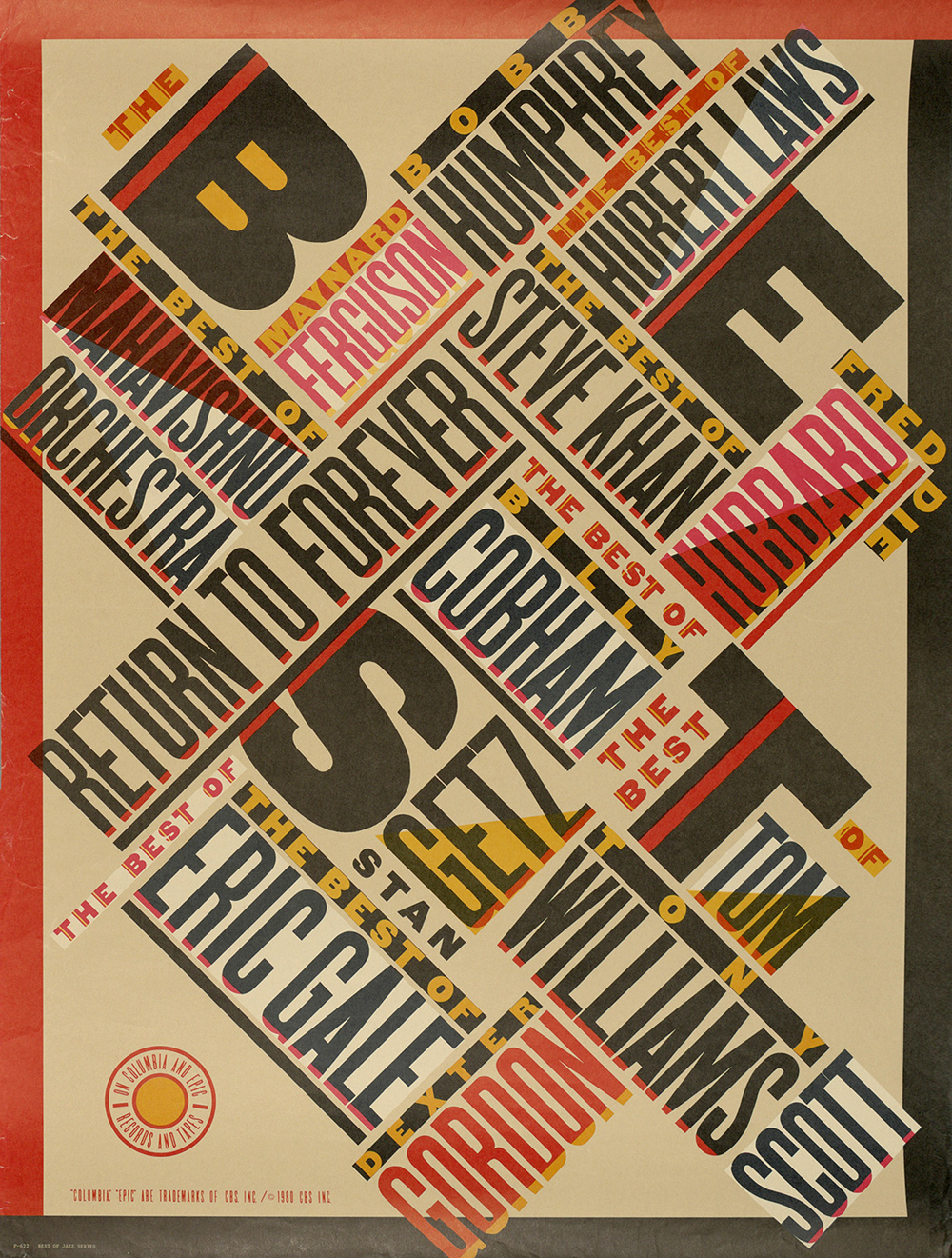
Poster for the Smithsonian Institution, 1979.
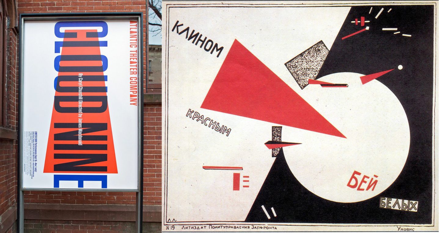
Scher’s 2015 identity for the Atlantic Theatre Company side by side with El Lissitzky’s Beat the Whites with the Red Wedge poster designed in 1919.
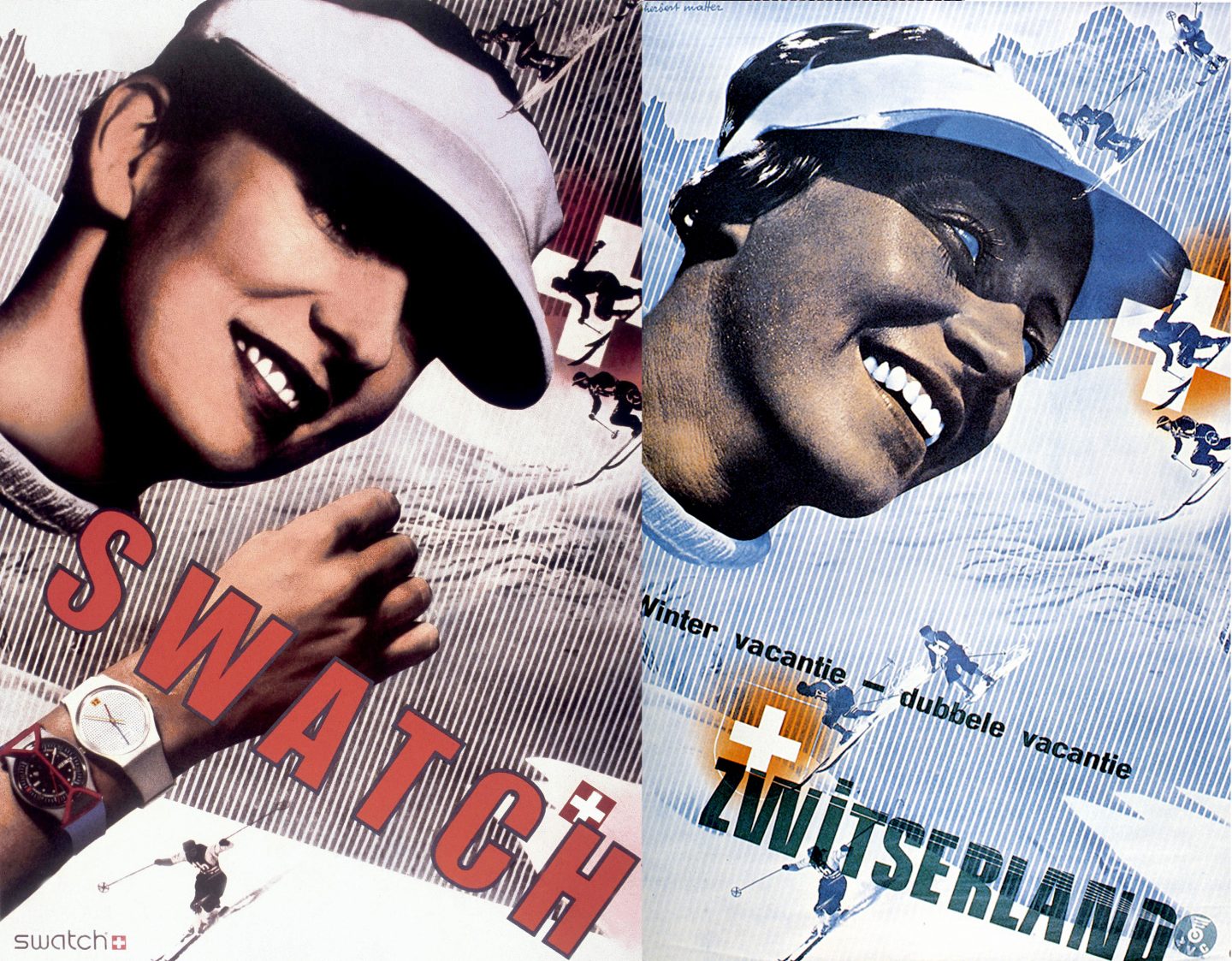
Swatch advertisement designed by Paula Scher in 1984 side by side with a Swiss travel poster designed by Herbert Matter in 1934.
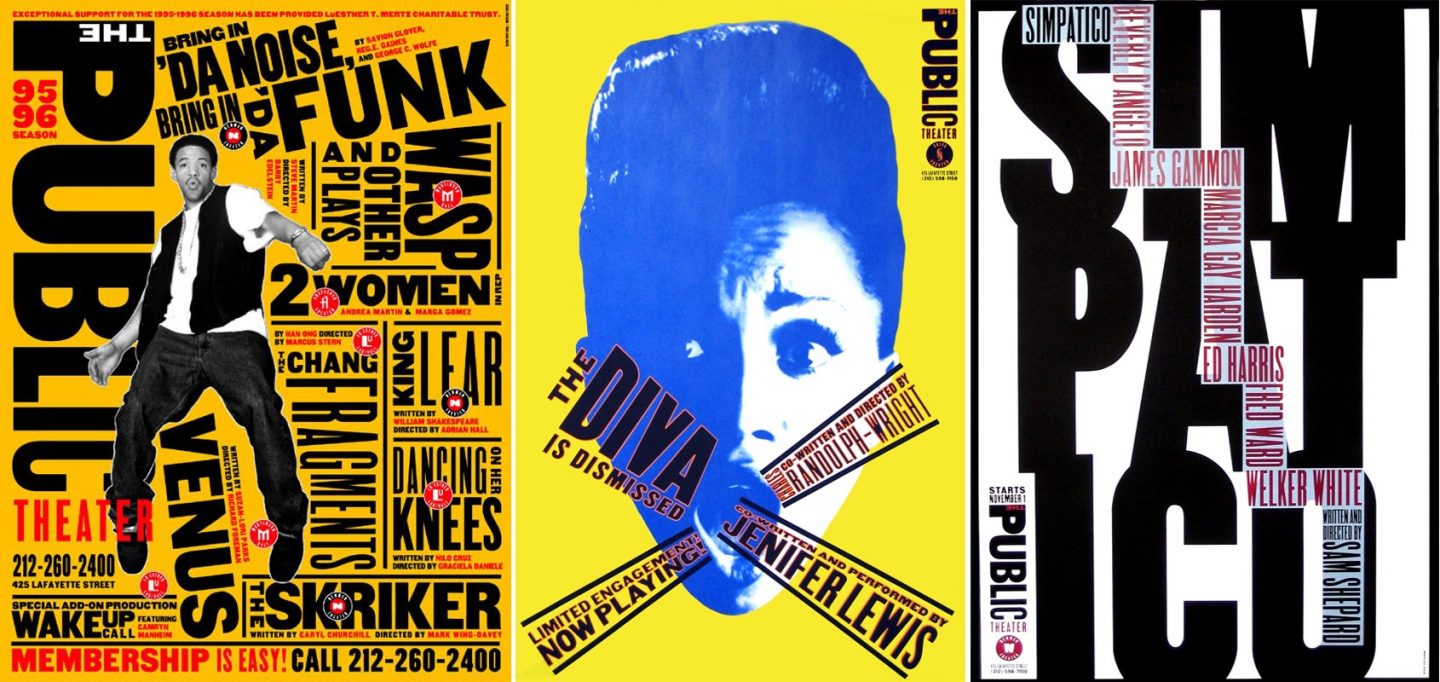
Paula Scher, poster designs for the Public Theatre, 1994.
New Wave
One of the most well-known design movements within postmodernism is New Wave—sometimes called Swiss Punk because of its radical approach to layout and typography and its connection to Swiss modernist principles. New Wave does not represent a single, consistent style among its practitioners; rather, it reflects a shared methodology rooted in experimentation with new technologies and production methods that emerged in the 1970s and 1980s. Designers associated with this movement embraced deconstruction, randomness, and play, consciously departing from the order and clarity of modernism. Many of these early postmodernists had been trained in strictly modernist curriculums. They learned the rules of Swiss design—and then, through process and exploration, broke them again and again.
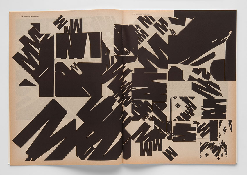
The early development of New Wave is often credited to the influence of German designer, typographer, and educator Wolfgang Weingart. In 1968, shortly after graduating, Weingart was invited to teach typography at the Basel School of Design. At the time, the school’s internationally acclaimed faculty included some of the pioneers of Swiss modernism, such as Armin Hofmann and Emil Ruder.
Weingart’s methodology diverged sharply from that of his peers. In his work, he abandoned the strict principles of Swiss style—the grid, rational typography, and structured layout—in favor of a more intuitive, avant-garde approach. Deconstructed type, abstract forms, textural effects, and seemingly random compositions defined his graphic language. Students under his guidance were deeply influenced by Weingart’s singular perspective; many incorporated elements of his process into their own work.
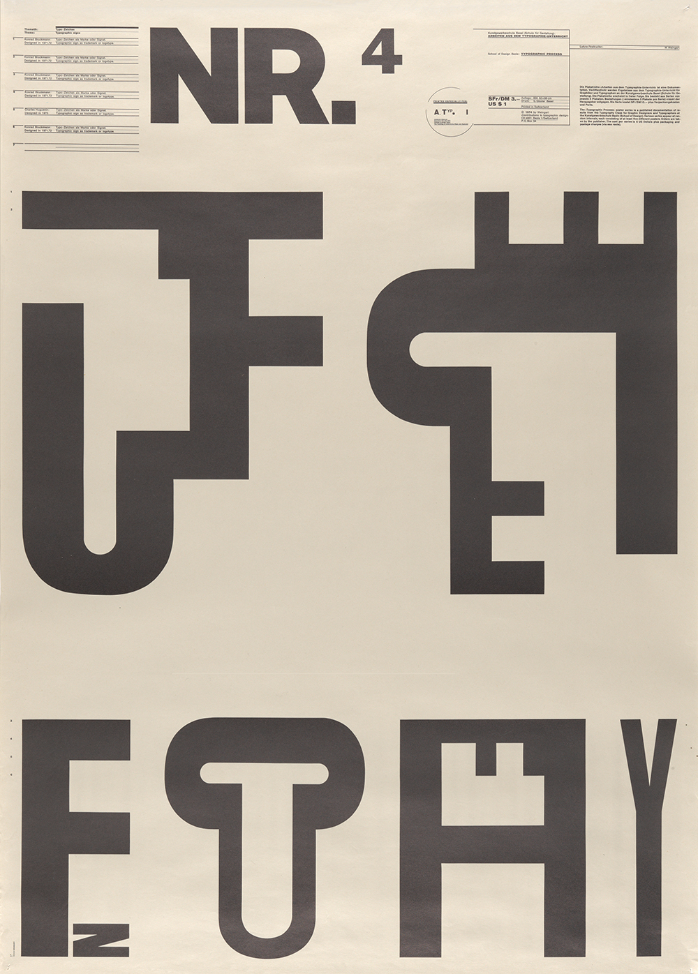
Wolfgang Weingart, poster design, lithograph, 1974.
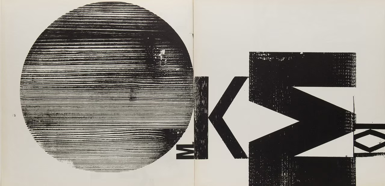
Wolfgang Weingart, double page wood print, 1962.
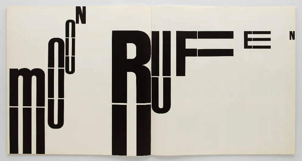
Wolfgang Weingart, typographic experiment, date unknown.
Wolfgang Weingart, typographic experiment, date unknown.
Wolfgang Weingart, typographic experiment, date unknown.
April Greiman and the Dawn of the Digital Era
The designer April Greiman, an alum of the Basel School and a former student of Weingart, would become one of the most prolific practitioners of New Wave in the United States. In 1976, shortly after graduating, she moved to Los Angeles and opened her own studio. By 1982, she had been appointed Director of the Design Department at CalArts, where she began experimenting with emerging technologies. Photography, video, and early computer graphics became central to her process, producing layered compositions in which type and images floated through three-dimensional space against luminous, pulsating fields of color.
Greiman purchased an Apple Macintosh desktop computer soon after its release in 1984. The device included MacPaint, a pixel-based drawing program with line tools, fills, and cut-and-paste graphics. It also came with MacVision, a video digitizer that allowed users to capture still images from video sources. At the time, the Macintosh’s bitmap resolution was rudimentary, limited to black and white. Typography and imagery appeared in blocky, stair-step forms that most professionals considered too crude for serious design. Compared to the prevailing analog methods—rub-on type, photographic collage, and paste-up boards meticulously assembled for reproduction—the computer seemed inadequate. Traditional methods, though tedious, yielded crisp, high-resolution graphics with nearly limitless color and type options.
Greiman, however, embraced the Macintosh’s constraints and turned them into a distinct visual language. In her hands, pixelated forms, low-resolution images, and bitmap type became intentional elements within a visionary style that anticipated the digital age to come. One of her first major works using Macintosh technology was a commission for the Walker Art Center in Minneapolis. She produced an issue of Design Quarterly—a magazine dedicated to architecture and design that the institution had been publishing since the 40s’. Greiman’s solution, titled Does It Make Sense?, was formatted as a large fold-out poster. The piece featured a nude self-portrait of Greiman overlaid with shapes, photographs, and text, intersecting with a hybrid, double image of her physical form. Rather than appearing as a technical limitation or shortcoming, the bitmap quality of the work reads as a deliberate textural artifact of a new digital realm.
For decades, modernism stood as the dominant approach in visual communication, upheld and reinforced by the design establishment. Early in her career, April Greiman’s work was sharply criticized for its maximalist, anti-modern aesthetic and for her embrace of emerging digital tools—platforms that many gatekeepers in the field dismissed as inferior. Over time, however, Greiman came to be recognized as a groundbreaking figure. Her work now marks a threshold in design history—the waning authority of modernism and the dawn of the digital revolution.
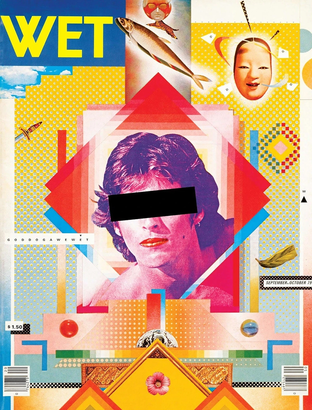
April Greiman, Cover for Wet Magazine, 1979.
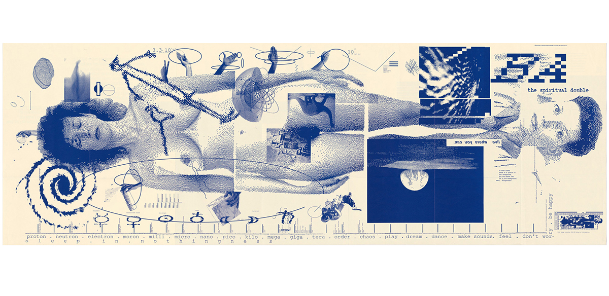
April Greiman, Does It Make Sense?, Design Quarterly #133 for the Walker Art Center, 1986.
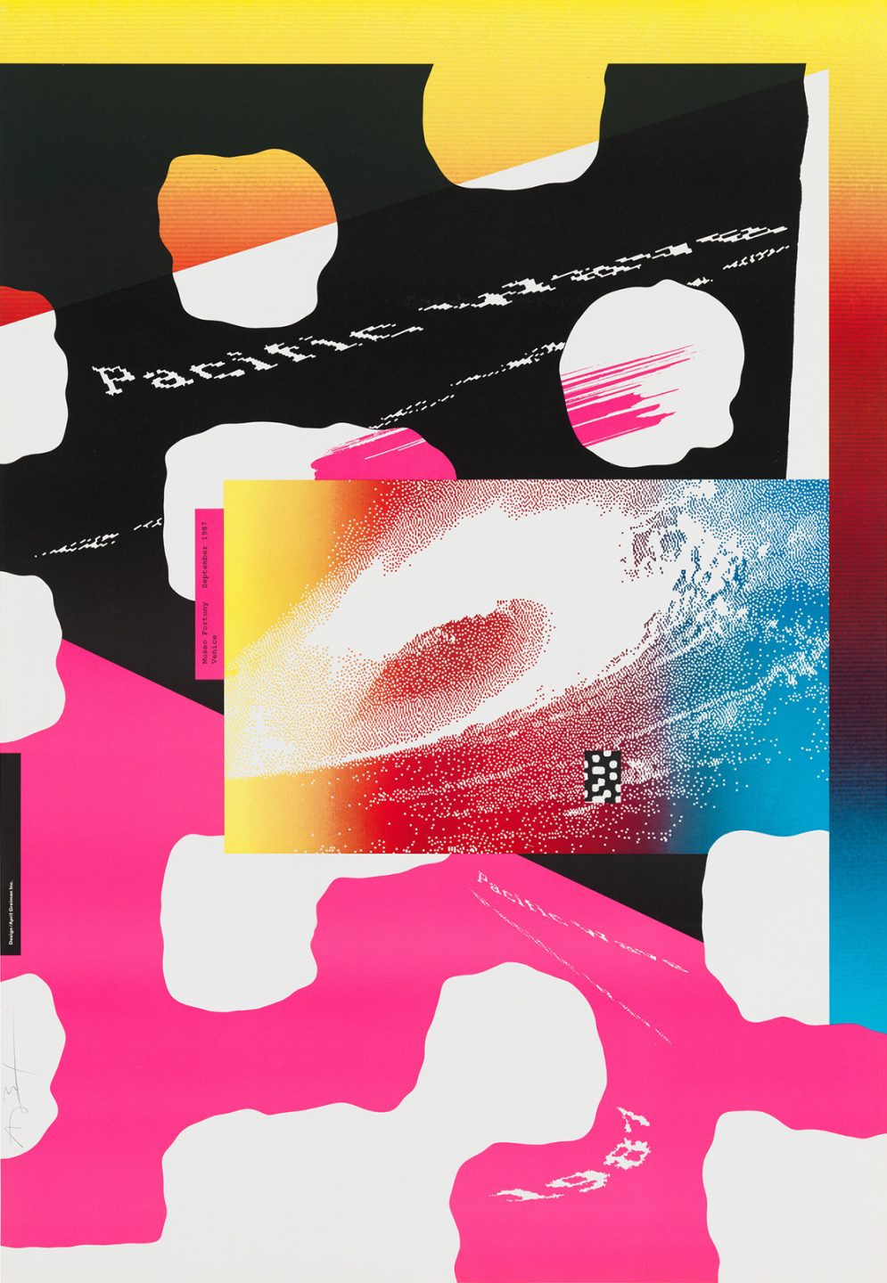
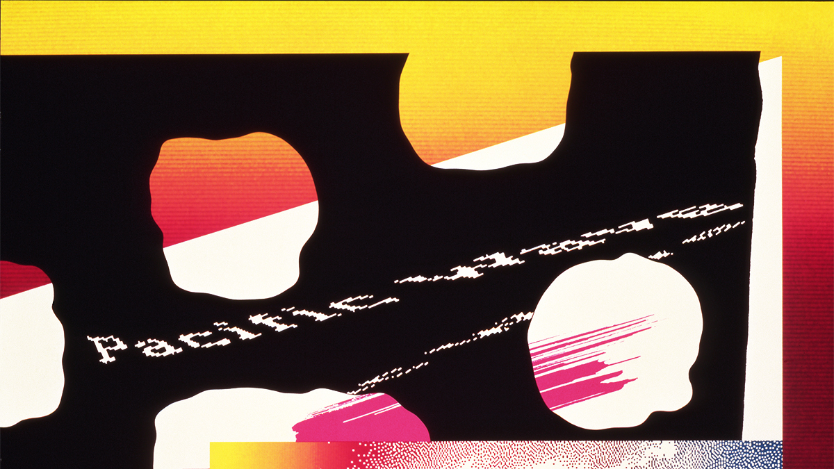
April Greiman, Pacific Wave poster, 1987.
A New Form of Expression
Until the postmodern era, the visual language of media and marketing was largely uniform. Creatives worked within narrowly defined aesthetics that reflected the preferences of the time, serving the interests of commerce and mass communication. These messages appeared almost exclusively in public forums—billboards, magazines, posters, and later television and film—where their impact was amplified by their ubiquity.
Postmodernism disrupted this homogeneousness. No single style could represent a collective spirit in a world of multiplying perspectives and identities. Design began to move beyond its civic and capitalist roles, embracing objectives aligned with counterculture, protest, and activism. Beginning in the 1960s and 1970s, visual communication became a tool for revolutionary organizations and grassroots movements, breaking from the confines of traditional marketing. Self-taught artists and designers entered the field, reshaping its methods and expanding its reach.
Out of this shift, a movement emerged that would become one of the most visible and influential forms of expression. Graffiti and street art first began developing as a distinct cultural phenomenon during the 1970s in urban areas like New York and Philadelphia, and by the 1980s would spread into a global art form. Though it occupied the same urban landscapes as corporate advertising—walls, subways, and transit systems—the intent and methodology were radically opposed to established systems of any kind. Practiced outside academic or commercial contexts, these works embodied an anti-capitalist stance and gave voice to communities that had, up until that point, largely been excluded from mainstream art and design. Graffiti and street art redefined public space, transforming it into a site of creativity, cultural visibility, dissent, and controversy.
The artform of graffiti developed concurrently with hip-hop culture. Both arose from the ingenuity of young people who, with few resources, created powerful new ways to express themselves and connect with their communities. Graffiti crews, like hip-hop collectives, built reputations through style and visibility, and together helped shape a culture that spread from local neighborhoods to global recognition.
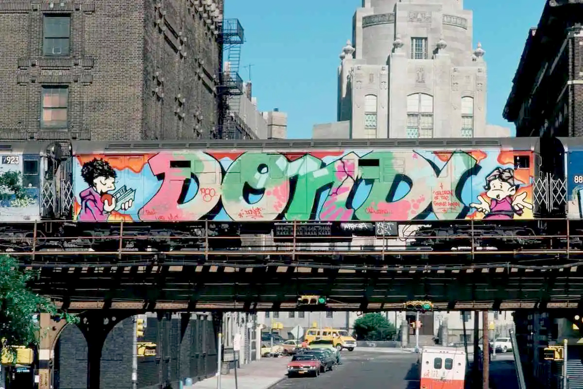
The history of graffiti is often traced to “tagging”—personalized signatures and monikers scrawled across city surfaces. Early figures like Taki 183 and Cornbread (Darryl McCray) gained notoriety in New York and Philadelphia, establishing graffiti as a form of visibility and resistance. In the 1970s and 1980s, artists such as Dondi White, Lady Pink, Lee Quiñones, and Futura 2000 elevated the medium, moving from simple tags to elaborate murals and striking interlocking letterforms referred to as “wildstyle”. Their work turned subway trains and building walls into moving canvases that captured public attention and documented urban identity.
By the late 1980s and 1990s, street art expanded beyond graffiti writing into stencils, wheatpastes, and large-scale interventions. Artists like Jean-Michel Basquiat and Keith Haring bridged the street and the world of upscale galleries and museums, translating the energy of graffiti into the context of contemporary art. Later figures such as Shepard Fairey, Banksy, and Kaws carried this trajectory forward into the mainstream, creating work that blended visual wit, political critique, and mass appeal. Today, graffiti and street art have become a global phenomenon, with practitioners from São Paulo to South Africa to Berlin to Tokyo continuing to transform public space. What began as acts of rebellion now coexist with commissioned murals, biennials, and even museum exhibitions—an ongoing tension between underground authenticity and institutional recognition.
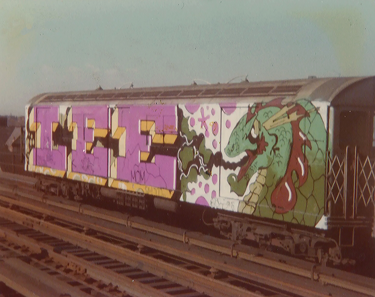
Lee Quinoñes, Year of the Dragon, spray-painted subway car, New York, 1979.
Dondi, Children of the Grave Part Three, spray-painted subway car, New York, 1980.
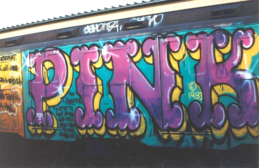
Lady Pink, spray-painted subway car, New York, 1983.
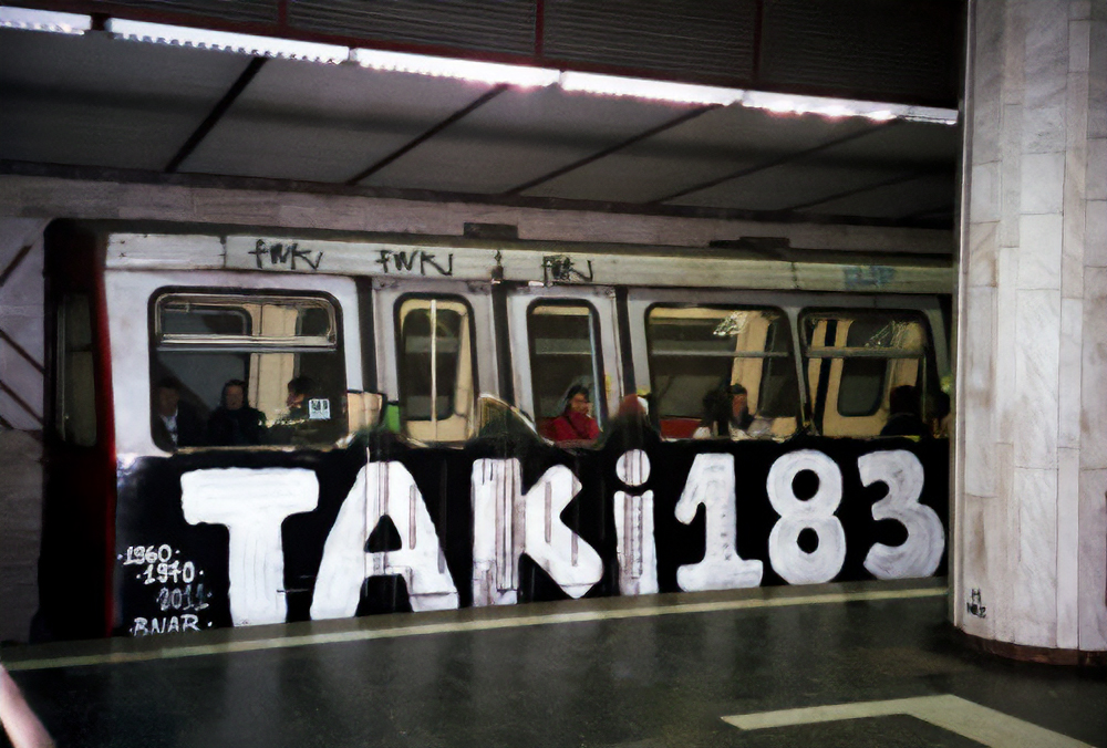
Taki 183, spray-painted subway car, New York, 1971.
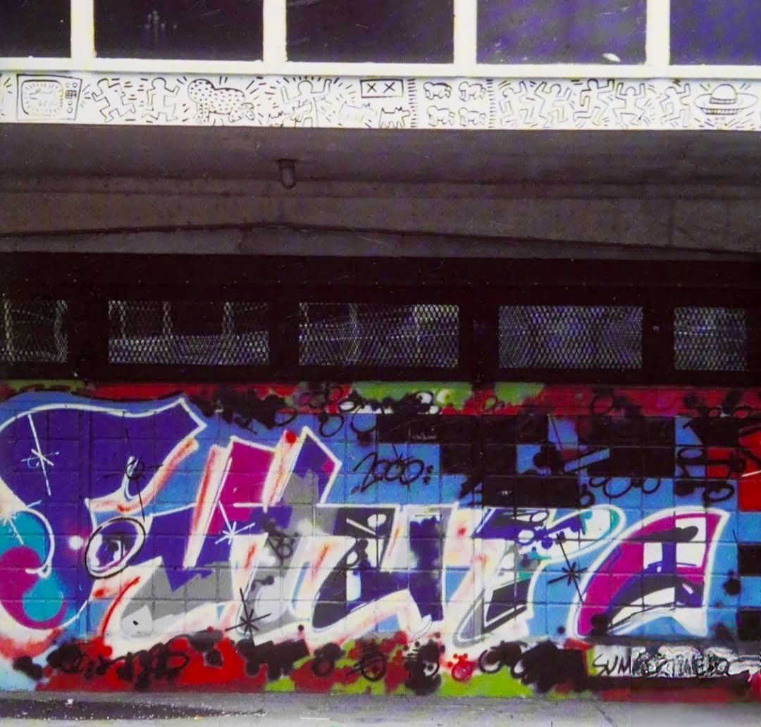
Futura 2000 and Keith Haring, Mural, Lower East Side, New York, 1981.
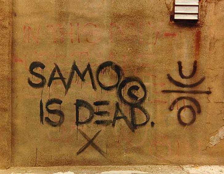
Jean-Michel Basquiat, SAMO IS DEAD, graffiti tag, 1979.
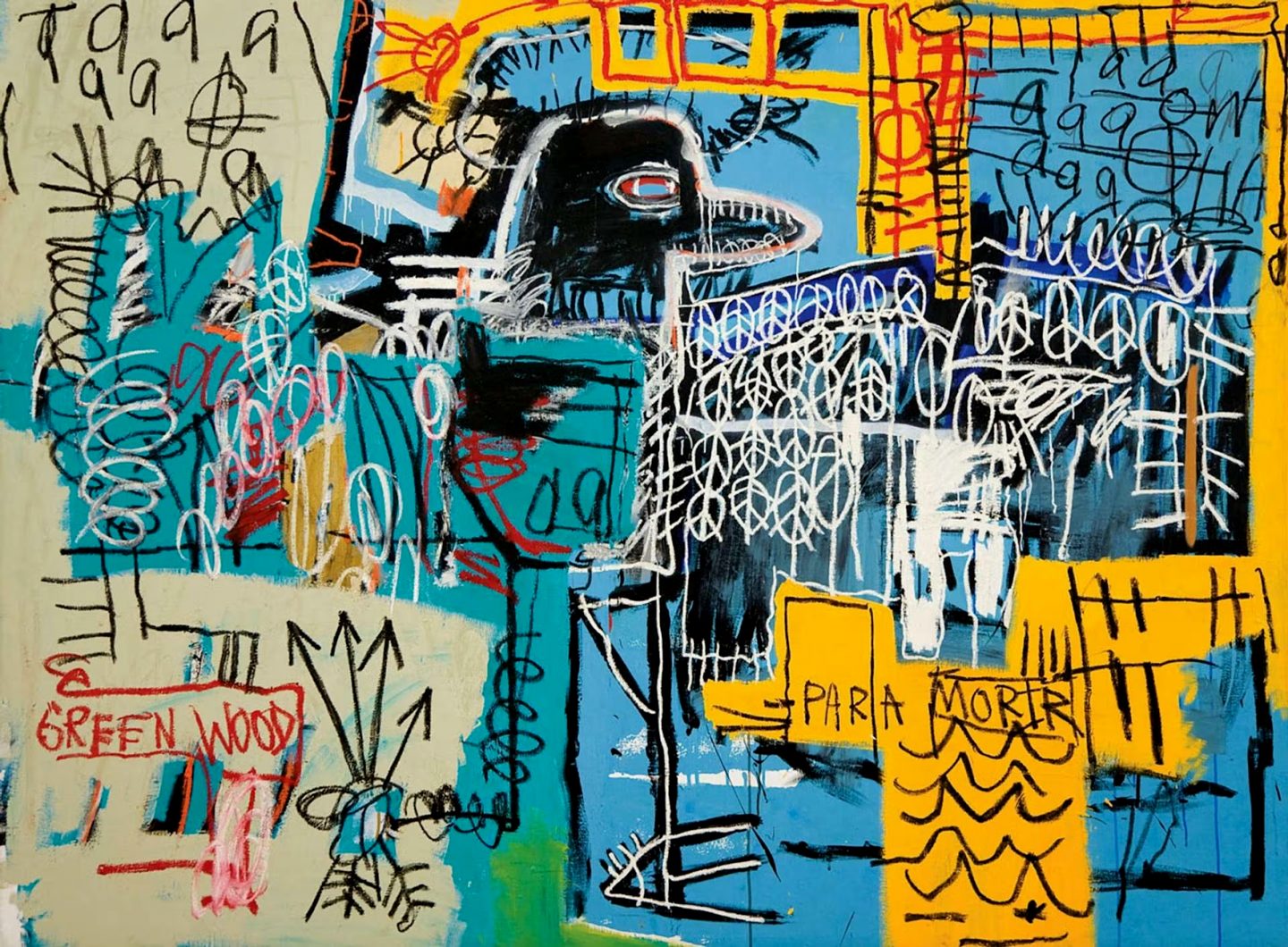
Jean-Michel Basquiat, Bird On Money, acrylic and crayon on canvas, 1981.
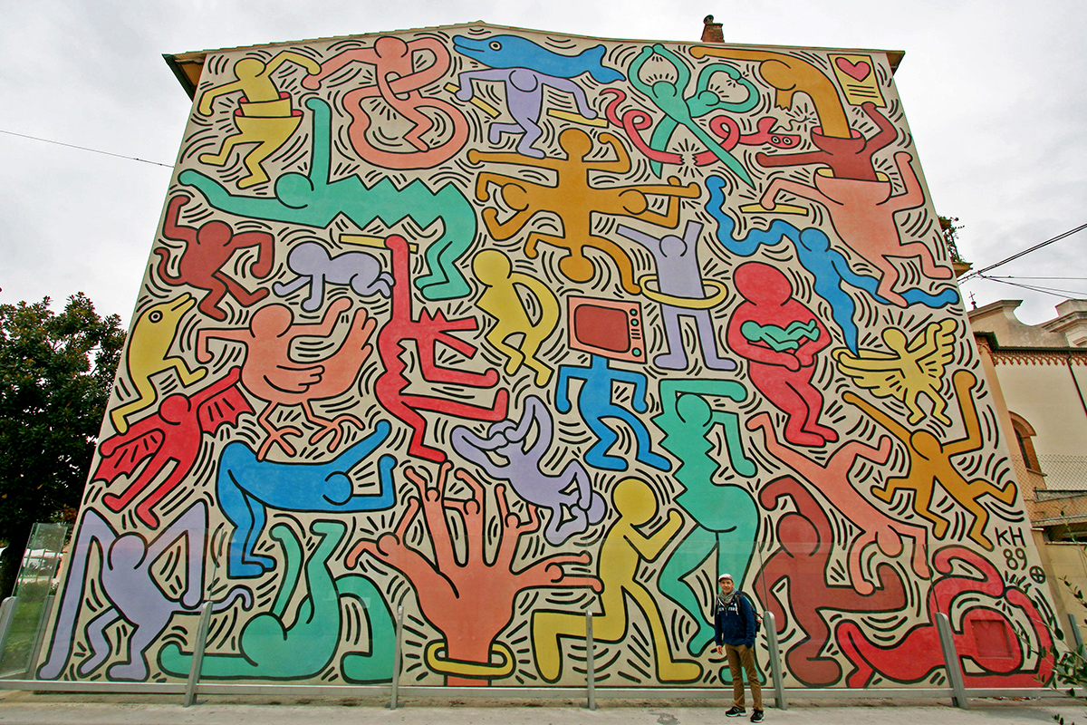
Keith Haring, Tuttomondo, mural at the Church of Sant’Antonio, Pisa, Italy, 1989.