04/01/2022
The Printed Word
A look at the genesis of printing and typography
Alphabets remain one of humankind’s grandest achievements. Alphabetic writing became the mortar binding whole communities against limitations imposed by memory, time, and place. Greater access to information permitted broader participation in public affairs..Philip B. Meggs
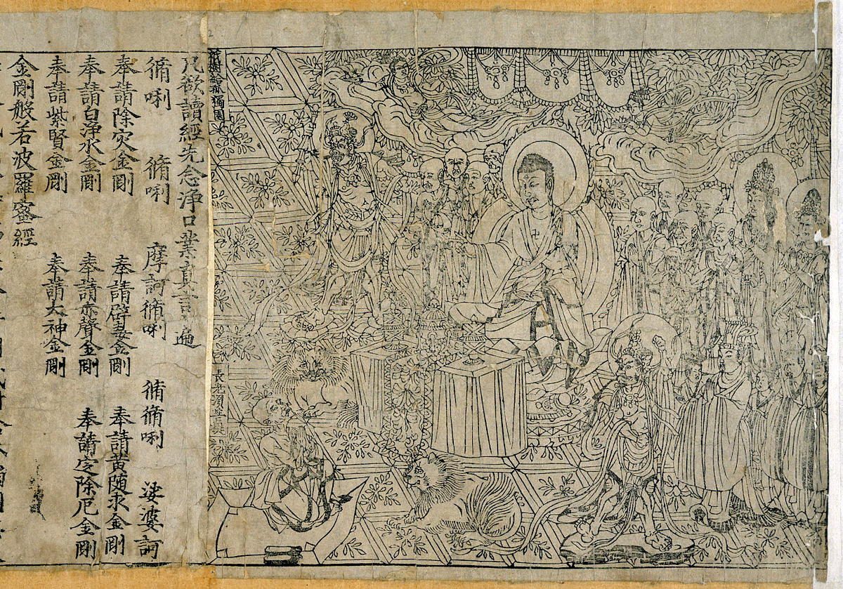
The intricate frontispiece of the Diamond Sutra from Tang Dynasty China, the world’s earliest dated printed book, AD 868.
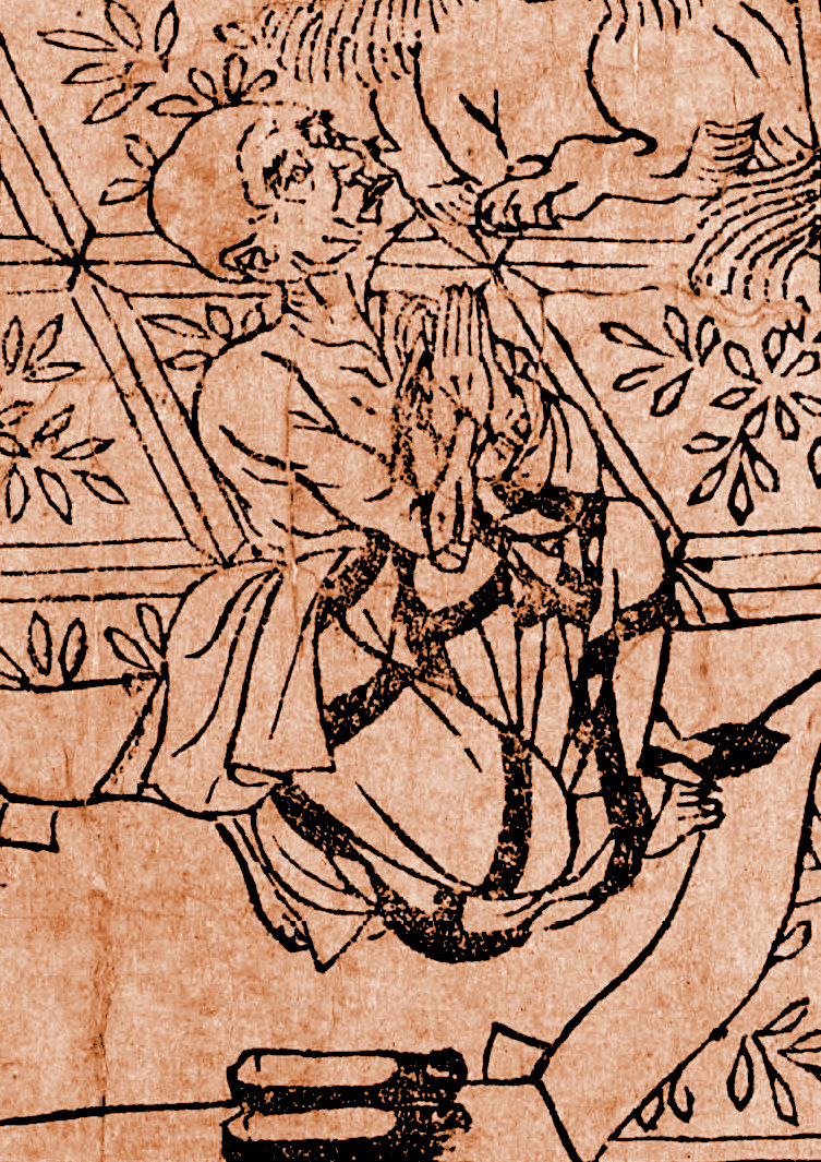
A detail from the Diamond Sutra.
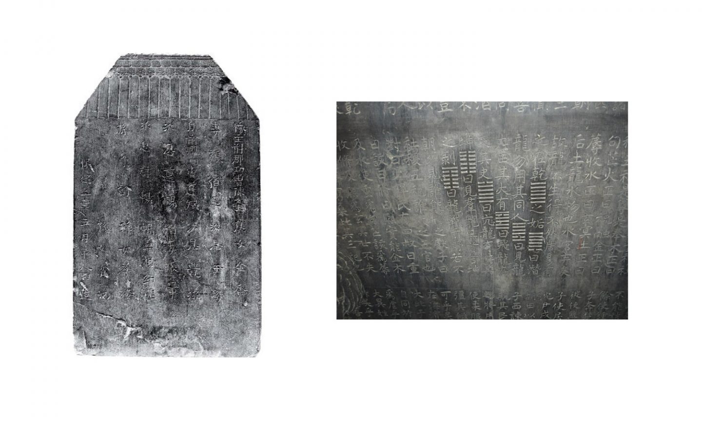
Stone tablet containing the work of Confucius, 2nd Century. Buddhist followers would create rudimentary relief prints from the characters incised on the surface.
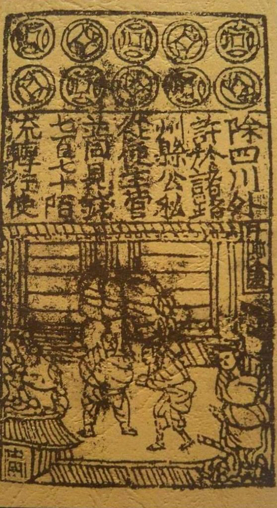
11th century paper-printed money from the Song Dynasty, China.
The development of the Phoenician alphabet marks a crucial milestone in the development of human consciousness. This set of 22 abstract symbols would become a foundation for many of the world’s written languages. Through the war, commerce, and colonialism of the next 3 millennium, the use of alphabetic writing systems would spread across all continents and contribute to the global connectedness of the modern era.
But language was not the only component of advancement and progress. Technology, industry, and innovation were also key factors in the emergence of the industrialized world of the 18th century and beyond. And while language is often the result of contributions from multiple cultures—adopted from one and then built upon by another—many of the inventions which truly changed the course of human history came from one country—China.
In the area of East Asia that is modern day China, there is evidence of advanced civilization that dates as far back as 2000 BCE. The Shang dynasty, the first recorded dynasty of the Chinese civilization, spanned between 1600 and 1046 BCE. During this time, an early iteration of Chinese script, called oracle bone script, was widely used.
Chinese Innovations
Four Chinese innovations which significantly contributed to the evolution of the modern era were gunpowder, the compass, the process of printing, and paper. The first formula for gunpowder appeared in the 11th century during the Song Dynasty. Though first associated with the practice of alchemy and initially implemented in the creation of fireworks, the use of gunpowder would fundamentally transform the nature of war and, in turn, global politics. Gunpowder was first introduced into the West in the 13th century. The magnetic compass was being used in China for navigation by 1040. Compasses were being used in Europe by 1190, and in the Arab world by around 1232.
There are two theories as to how printing first developed in China, the first credits printing to the use of signature seals or “chops” which incorporate, in essence, a rudimentary form of printing as the resulting stamp or impression is created from a matrix which acts as an elevated negative of the final image. Another theory is that, beginning in 165 CE in China, the writings of Confucius were carved into stone tablets. No one could carry these around because of their weight; they were heavy and took up a lot of space. When they were stored, they were aligned in rows like tombstones. People began making relief ink rubbings from the stone works.This relief making process is a basic precursor to relief printing. During the Tang Dynasty in the 7th century, woodblock printing had fully developed in China. The oldest surviving book The Diamond Sutra- a collection of Buddhist teachings— was created in 868.
More than four centuries before movable type was developed by Johannes Gutenberg in Mainz Germany-Chinese inventor and artisan Bi Sheng created the first instance of movable type in history— in 1041 during the Song Dynasty. The individual modular pieces were made of porcelain. Chinese scholar Shen Kuo describes the details of Bi Sheng’s system:
“During the reign of Chingli, 1041–1048, Bi Sheng, a man of unofficial position, made movable type. His method was as follows: he took sticky clay and cut in its characters as thin as the edge of a coin. Each character formed, as it were, a single type. He baked them in the fire to make them hard. He had previously prepared an iron plate and he had covered his plate with a mixture of pine resin, wax, and paper ashes. When he wished to print, he took an iron frame and set it on the iron plate. In this, he placed the types, set close together. When the frame was full, the whole made one solid block of type. He then placed it near the fire to warm it. When the paste [at the back] was slightly melted, he took a smooth board and pressed it over the surface, so that the block of type became as even as a whetstone. For each character, there were several types, and for certain common characters, there were twenty or more types each, in order to be prepared for the repetition of characters on the same page. When the characters were not in use he had them arranged with paper labels, one label for each rhyme-group, and kept them in wooden cases.”
Joseph Needham, Science and Civilization in China: Paper and Printing. Cambridge: Cambridge University Press. Page 201-202.
Later, in the 1300’s the government official Wang Zhen created a wood version of Bi Sheng’s movable type system and in 1490 the printer Hua Sui developed a version in bronze. Because of the large number of Chinese characters in use during this time—roughly 40,000—the movable type method was considered expensive and inefficient. The movable type system wouldn’t replace woodblock as the dominant means of production until the modern era.
Though the first paper was documented in China during the Eastern Han period (25–220 CE), there are physical fragments that date as far back as 179 BCE. The exact date or inventor of the paper making process is not known. According to record, paper was invented in 105 CE by Cai Lun, an imperial official of the Han dynasty. These first samples are made of mulberry, fishing nets, old rags, and hemp.
Before the advent of paper, Chinese documents were ordinarily written on bone or bamboo tablets and scrolls. These formats were heavy, awkward, and hard to transport. Bamboo scrolls—like papyrus scrolls—were delicate and brittle. Silk was sometimes used as a recording medium but was expensive and impractical. The biggest impact of paper was its effect on Chinese writing and written culture. Books could be carried by hand rather than transported by cart. As a result, a reading culture emerged and individual collections of literary works increased in the following centuries.
By the 1100’s papermaking and woodblock printing made their way to Europe. In 1276, the first paper mill was established in Italy and in 1348 one opened in France. The mills began incorporating watermarks in their paper as early as 1282.
By the mid 1300s, ephemera like playing cards and small religious booklets began to appear which were produced using the woodblock printing method. These printed items were significant tools for increasing intellectual engagement and literacy outside of the elite classes in medieval Europe. Before these goods appeared, peasants and lower class citizens had little opportunity for mental stimulation. Playing cards in particular had a significant effect on the development of mental cognition and memory. Simple card games required sustained focus and the memorization and comprehension of repeated numbers and symbols.
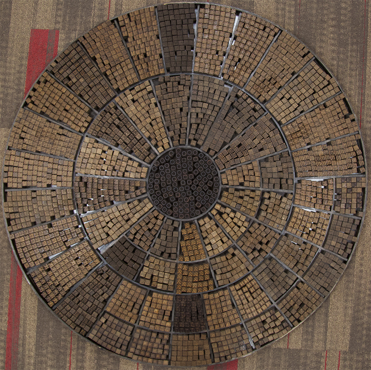
A Revolving typecase containing a movable type system of Chinese characters.
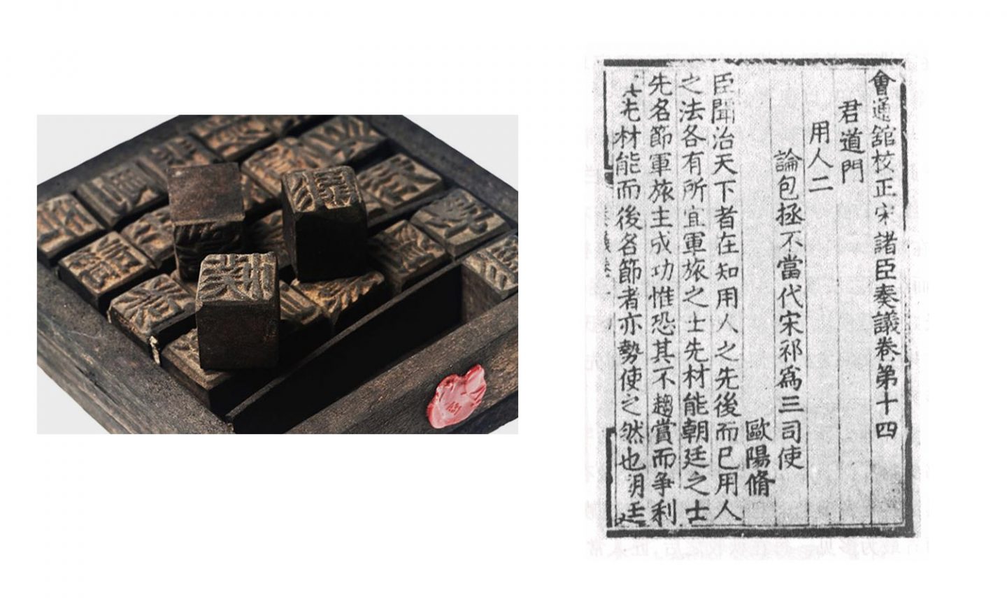
Left: Chinese movable type made of fired clay. Right: A page from a book by the legendary printer Hua Sui. The publication was printed in 1490 using metal movable type.
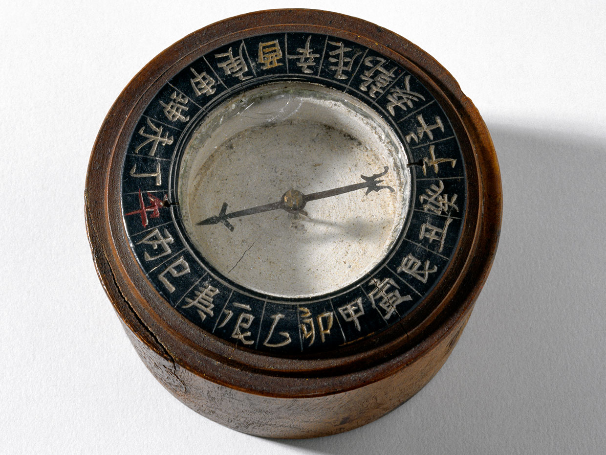
Antique Chinese compass.
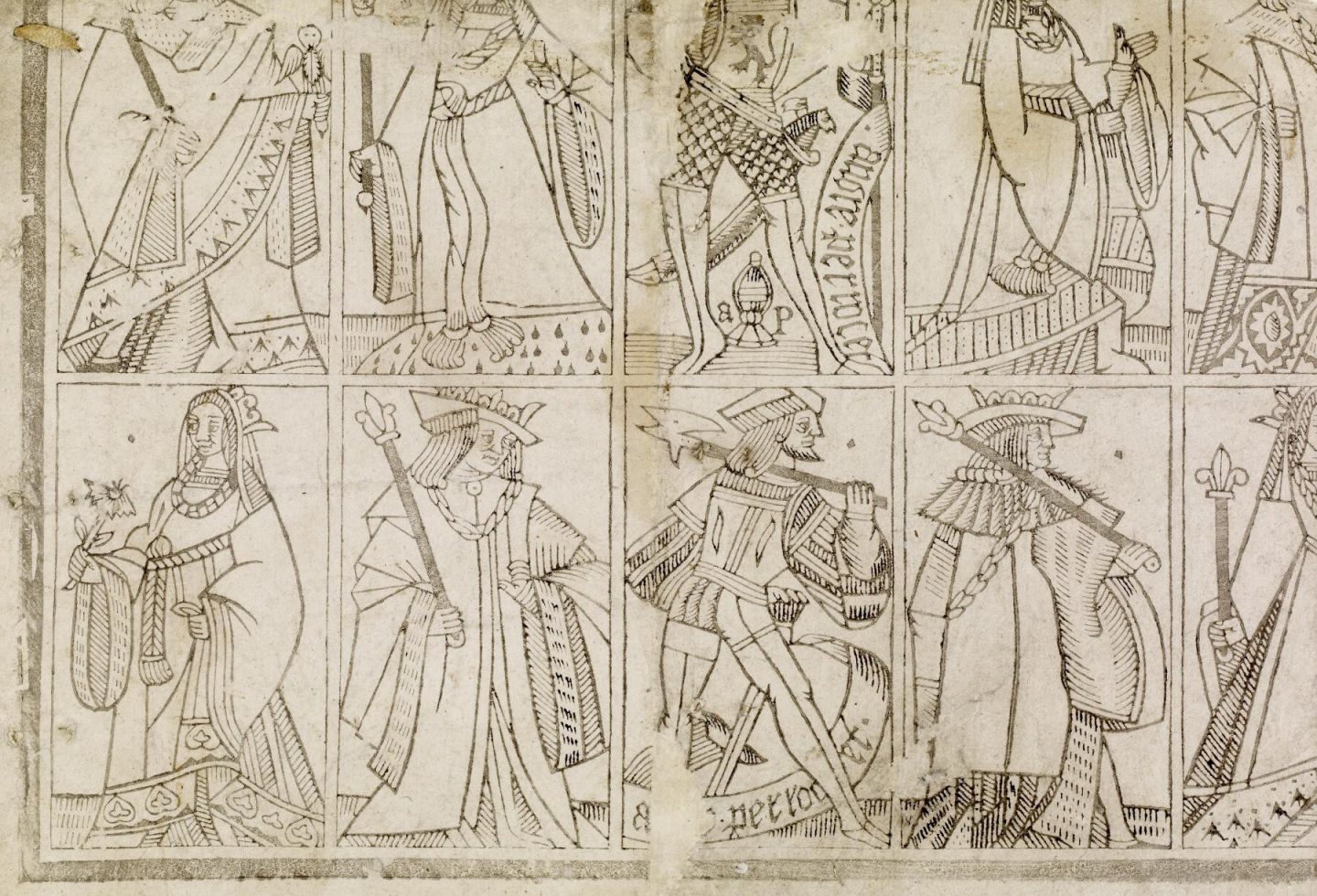
Early woodblock printed playing cards, 1491—1524.
The Appearance of Blackletter
When paper and woodblock printing were first beginning to appear in the 12th century, Europe was in the beginnings of the Gothic period. The Gothic period refers to a style in art, design, and architecture which emerged in France in the 12th century and spanned throughout Europe up until the 16th century.
The Gothic perspective is the visual embodiment of a culture centered on religious ideals and values. Its features are severe and dramatic—characterized by intricate facades, luminous stained glass, pointed arches, vaulted ceilings, and elaborate decorative elements. The Gothic approach seamlessly aligned with the opulence of illuminated manuscripts.
During this period, the demand for books was growing. Universities and centers of education were being built in major cities throughout Europe. There was an increase in literacy and, in turn, scholarship. More and more books were being commissioned by private institutions or individual wealthy connoisseurs who were building up their personal libraries. Books were no longer confined to the libraries of churches and monasteries.
Books needed to be made faster and cheaper—circumstances which would lay the groundwork for the development of the technology of printing that would eventually sweep across Europe in the late 1400’s. But, before the advent of mechanized movable type, scribes would, over the course of many years, respond to the increasing demands for speed and efficiency through the execution of their handwritten letterforms.
By the 11th century, the Carolingian Minuscule had become standard throughout Europe; however, the wide and extremely legible forms of the Carolingian style were hard to reproduce quickly and took up a considerable amount of room on the page. Scribes needed letterforms that could be written quickly and that were more vertical so you could fit more words on a line.
These scribes were also working during a time when the Gothic perspective was emerging all around them. Beginning in the 11th century, Gothic cathedrals were being built throughout Europe. Tall sinewy spires, pointy arches, dark and moody interiors, and large looming windows created an atmosphere of gloomy verticality. Structural forms were thin and elongated as if stretching upwards toward the heavens. The Gothic approach also made its way into the design of furniture and fashion.
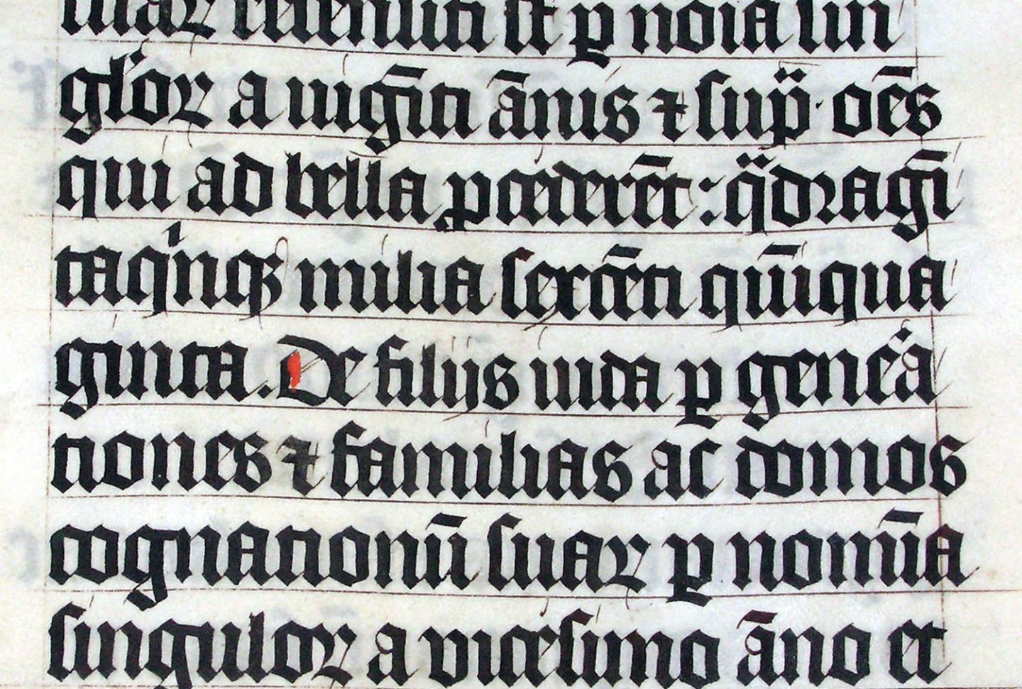
This combination of factors led to the emergence of Blackletter styles that began to appear in 11th century illuminated manuscripts. These handwriting styles originated in Northern Europe but eventually made their way to prominent cities like England, France, and Germany. The Blackletter style is also known as Textura because the close consistency of its repeated vertical forms resembles an interwoven “texture” like that of fabric. When viewed in context of the prevailing Gothic style of architecture and design of this period, there seems to be a shared aesthetic sensibility. The repeated vertical forms of Blackletter brings to mind certain details found in the cathedrals and monasteries of the day—lacy mullions bisecting slender arching windows or spindly buttresses capped with spiky spears. The inky dark text was accompanied by images of holy mythology, further amplifying the sense of divine melancholia.
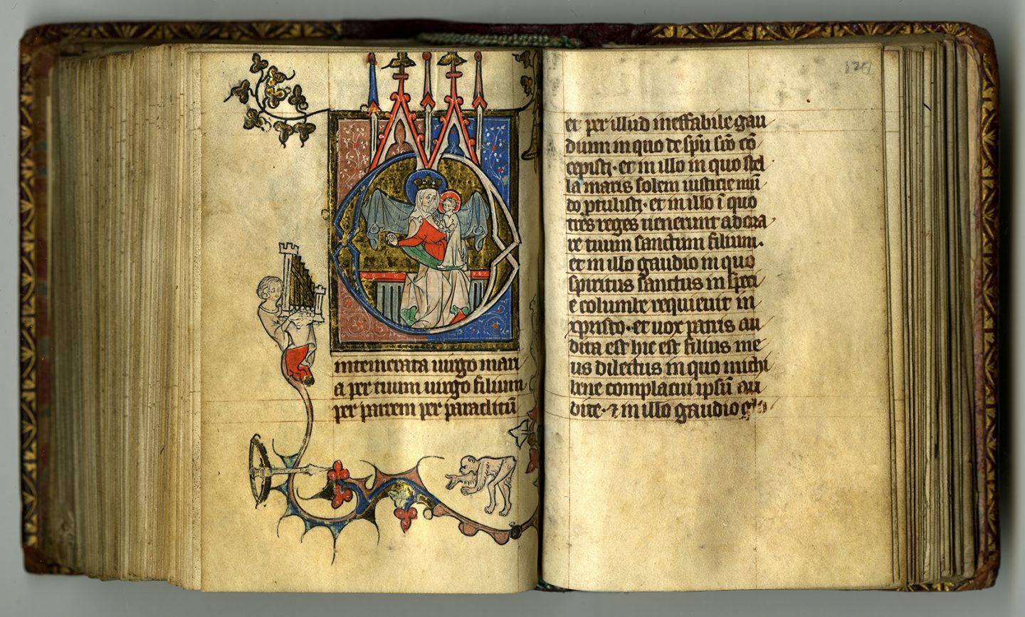
Book of Hours, Northern France, dated 1330.
Example of Blackletter or Textura lettering.
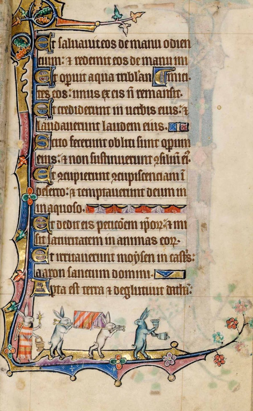
A page from the Macclesfield Psalter, an illuminated manuscript created in England between 1330 and 1340.
The Humanist Script
By the 1300’s, a renewed interest in humanist writings, specifically works from the Greek and Roman Empire, began to emerge in certain areas throughout Europe. One of those places was the city of Florence Italy. At this time, something very special was happening in the city of Florence. It was quickly becoming known as a center for art, education, and culture. Scholars, painters, sculptures, and poets were flocking to the city to be part of the blossoming Italian Renaissance. Humanism—the belief in the ability of humans to shape the world, not through divine intervention, but through rational thought and action—was a foundational element of the Renaissance perspective. Contributions from ancient Greek and Roman culture—art, philosophy, mathematics, architecture, and typography—were seen as important points of reference. Students were researching these ancient cultures for knowledge and inspiration. The Renaissance developed out of a renewed interest in humanism—rational thought, vibrant culture, intellectual pursuit—which was in stark contrast to the prevailing religious value system that, up to this point, had dominated the medieval perspective.
By this time, more and more manuscripts were being made by commercial scriptoriums outside of a religious context. Many of the scribes were being employed by educational institutions. This resulted in more books being made that were centered on secular subjects like mathematics, history, and classical literary works.
The leading scholars of this era were the scribes who were creating these new humanist works. They were the ones hand lettering these early Renaissance manuscripts. The prevailing lettering style of the period—the Gothic Textura or Blackletter—did not align with the sensibilities of Renaissance Italy nor did it exemplify the humanist subject matter it was to represent. These Italian scribes and scholars were unhappy with the style of Blackletter. It wasn’t legible. It was dated. It was dark and heavy. They wanted an alternative. They searched for something more readable and more refined. They sought a style of letterform that aligned with the humanist subjects they were writing about.
The Italian scribes, working in Florence at the start of the Renaissance, developed a new style—a Humanist Script. The inspiration for this Humanist Script came from two places. First, the minuscules or lowercase letters referenced the letter-forms of the Caroline minuscule which scribes and scholars came across in their studies and mistakenly thought were examples of ancient Greek and Roman writing. They referred to this script as “littera antica” or antique letters. Second, the majuscules or uppercase letters were inspired by the Roman inscriptions which graced the facades of the ancient architectural relics from the Roman Empire that still existed all over Florence and other Italian cities. These letterforms were inscribed on the sides of buildings and memorials. Their perfect proportions and idealized forms made them ideal for humanist works.
These two references serve as the foundation for what is considered one of the most exquisite examples of hand lettering styles in history. This new writing style rapidly gained popularity and was quickly employed for works commissioned to fill the libraries of wealthy Florentine families and leading educational institutions of the region. By the time the first printing presses began to appear throughout Europe, Humanist Script was well known and well regarded.
Page from the Book of Hours featuring the humanist miniscule, Bologna, 1497–1500.
Gutenberg's Movable Type
By the early 1400’s several attempts had been made to create a printing system that used movable type. The demand for books continued to grow throughout Europe. The processes for woodblock printing and paper making that had come from China further set the stage for the inevitable. Many people understood that there was a significant financial opportunity for anyone who created a system of movable type for printing Latin letterforms. There had been attempts made in the Netherlands, Germany, and France with no success.
In 1446 when Johann Gutenberg finally developed a successful working movable type system, he had already spent ten years developing his printing press in his workshop in Mainz Germany. Some of his early print project on his newly developed press included a German poem, numerous calendars, and books on Latin grammar. Gutenberg would spend another ten years testing and experimenting before embarking on his first significant project—a forty-two-line Bible that would later be referred to as the Gutenberg Bible.
The letter-forms used to cast his movable type were modeled after the Blackletter style that was dominant in Germany at the time.
Towards the end of the project, Gutenberg began to run out of money. Johann Fust, a wealthy Mainz merchant, lent Gutenberg enough money to complete his printing of the forty-two-line Bible. Just as Gutenberg had finished printing (the ink was drying on the final pages), Fust seized his equipment and put a lock on his printing studio claiming Gutenberg had missed loan payments. He teamed up with Gutenberg’s assistant Peter Schoeffer, and together they established Fust and Schoeffer, the worlds first printing firm. There first publication—the forty-two-line Bible that had been twenty years in the making.
The Impact of Printing
Printing quickly spread throughout Europe. By the turn of the century there were presses in England, France, Italy, Belgium, and countless other prominent cities. The impact of mechanized printing was remarkable. In less than fifty years after the printing of the Gutenberg Bible, more than ten million printed books had been produced.
“Once the middle class was able to afford reading material, the demand for books in different languages rose. The common people now had the drive to learn to read and seek education, which led to the birth of a culture that encouraged knowledge. Movable type helped to preserve ideas of the time and make information more reliable and have less discrepancies.” —Philip Meggs
The European Renaissance is generally thought of as the period of transition between the medieval and the modern world, setting the stage for the age of enlightenment, the industrial revolution and the birth of modernism. It began in Italy with the Classical revival in the fourteenth century. Design in all forms—typography, book layout, illustration—were all reinterpreted and modernized by Italian printers and scholars with a focus on humanism and the sharing of knowledge and culture.
Reading and the ability to share and spread ideas through printing set in motion a more comprehensive understanding of time, relationships, and consequences which led to a greater understanding of the possibilities within the human experience. Literacy facilitated self awareness and actualization, community and collaboration.
The technology of printing completely transformed the world and is considered one of the key factors that fueled the Renaissance and brought about the end of the dark ages. Printing is also the first example of a mechanized handwork. Its development would inspire the mechanization of other types of handwork and is one of the key milestones that sparked the industrial revolution which began in England in 1760.
The information spread through printing took power from the church and placed it in the hands of the public. The church could not control the rise of information. This eventually lead to the Protestant Reformations—a series of revolts against the abuses and totalitarian control of the Roman Catholic Church that took place in Germany in the early 1500s. This is one of the first examples of typography being used as a tool for activism and social reform.
The Genesis of Typography
As we begin to survey the evolution of printed typography, it is helpful to understand the early technology of movable type and the process within which letterforms were designed and produced.
Gutenberg’s process was not new. Systems of movable type had already been created in China, Korea, and Japan. The basic approach of his press was an adoption of the woodblock printing process which was first developed in China and was in widespread use in many parts of the world at the time. The success of Gutenberg’s invention was due to a number of key factors. Within the basic process of printing he incorporated numerous elements of mechanization which resulted in significant improvements in speed, efficiency, consistency and quality. Compared to the Chinese and Japanese alphabets, the Latin alphabet had a moderate number of letters making the creation of hand cast, interchangeable character sets a reasonable undertaking. The materials he employed for casting letters —a mixture of lead, tin, and antimony—was so successful that the formula is relatively unchanged to this day. He also developed a successful matrix system for casting type.
“The first part of Gutenberg’s invention was the production of molds for printing type. First, a letter is engraved in reverse and raised on the tip of a hard metal rod, such as steel. This creates a punch. Such punches for embossing letters were already known in Gutenberg’s time and were used, for example, by goldsmiths.
…The punch is punched into a piece of softer metal, such as copper. The result is a deepened and laterally correct image of the letter and thus a casting mold. This mold as the counterpart to the punch is called the matrix. With a matrix any number of type or “sort” can be cast. As the underlying molds of a font, the matrices were of great value to the printers and were carefully stored so that new, identical sorts could be cast if necessary.”
—Dr. Julia Bangert, Gutenberg’s Inventions
When reviewing Gutenberg’s process for casting the modular pieces which contained the raised form of the characters, it’s important to consider the point in the procedure in which the letterforms are actually designed. The first step, when the negative or reversed form of the letter is engraved on the tip of the steel rod or “punch”, is the point where the visual “appearance” of the letter is determined. This technique of “punch cutting” is what would, over the next 400 years, define the evolution of the design of Western typography. This evolution would be driven by concerns of legibility, print quality, and aesthetic vision and would result in visual distinctions that are the basis for the categories or classifications of typography that are still in use today.
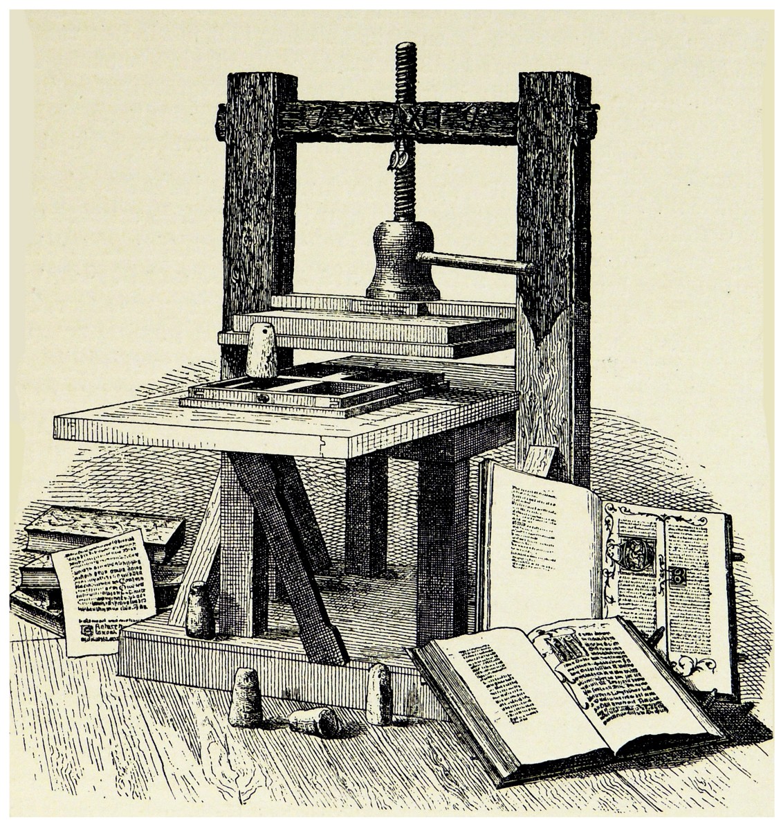
An illustration of Gutenberg’s printing press.
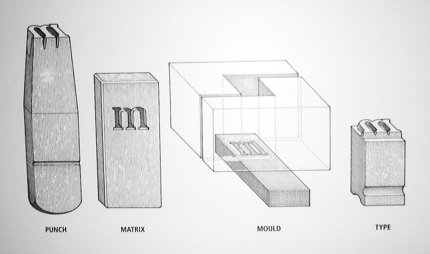
A diagram of the separate components involved in the type casting process.
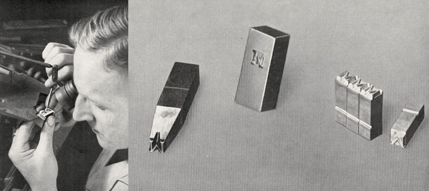
Left: A punch being hand carved for the mold making process. Right: Punch, matrix and final cast letterforms.
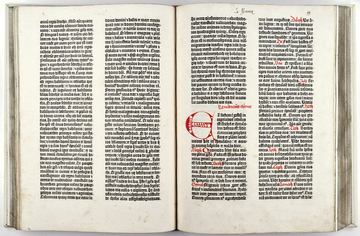
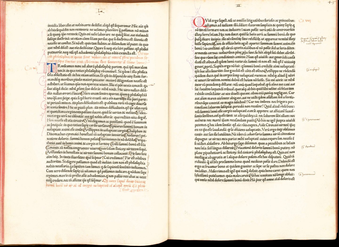
A spread from the Gutenberg Bible.
The printer’s mark of Fust and Schoeffer.
Humanist Type
In 1465, the printers Arnold Pannartz and Conrad Sweynheym—were invited to open the first printing press in Italy— in a town called Subiaco just south of Florence. Both had previously worked for Fust and Schoeffer in Germany. By this time, Humanist script was replacing Blackletter as the dominant writing style in central Italy. When the two printers were deciding on what style from which to model their movable type, Humanist Script was the obvious choice. The resulting typeface is the first instance of Roman-style typography.
In the late 1400’s Venice would become the center for Italian book design. Many innovative designers, typographers and illustrators were working to establish a Venetian approach at this time. One of the printers at the forefront of this movement was Nicolas Jensen. Nicolas Jensen was a skilled die cutter in France who went to Germany to learn printing only to set up one of the first presses in Venice. His typefaces are considered some of the first examples of an elevated approach to typography that focuses on legibility and the consistency of letter-forms—using the humanist script as a starting place.
The typographer and book designer Bruce Rogers created a humanist revival typeface called Centaur in 1929. The letter-forms are based on those designed by Jensen in 1470.
Characteristics of Humanist Type:
• first appeared during the 1460’s and 1470’s
• visual expression mimicked calligraphic letter-forms of the humanist script
• small x-height
• angled calligraphic stroke including sloped crossbar on lowercase “e”
• low contrast between thick and thin strokes
De Divinis Institutionibus, printed by Arnold Pannartz and Conrad Sweynheym in humanist type, 1465.
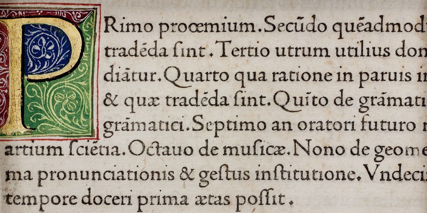
An example of Nicolas Jenson’s humanist typeface from the book Quintilianus, Venice 1471.
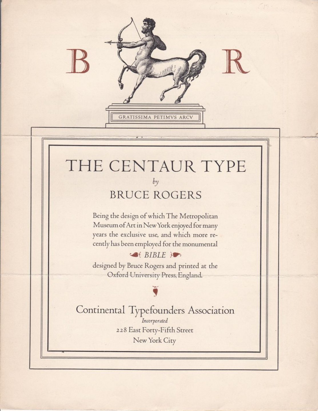
Centaur type created by Bruce Rogers in 1929, based on the humanist typefaces of Nicolas Jenson.
Old-Style
Old-Style letter-forms represent the first examples of typographers not just reproducing typography directly from written sources; rather, they begin to alter and revise the forms to achieve improved printing quality and to align with a specific aesthetic vision.
Aldus Manutius, a humanist and scholar of the Italian Renaissance, set up the Aldine Press in Venice in the late 1400’s at age 45 to produce work from the great thinkers of the Greek and Roman era. One of the things that the Aldine press is most known for is the typographic contributions by the Aldine Press’s punch-cutter Francesco da Bologna also known as Griffo.
He researched pre-Carolingian scripts to create what is still considered today to be a typographic masterpiece—the typeface Bembo. His goal was to create a typeface that was directly aligned with the original Roman letterforms. He used grid and mathematics in the construction of his letters and made adjustments to create optical consistency and alignment. One example of this is his extending the ascenders of his lowercase letters so they were taller than the height of capitol letters. In letter-forms at this time, there was a tendency of capitals looking too large within bodies of text.
In 1501 Aldine Press published the first pocket-sized books to address the need for smaller more portable publications. For these smaller works, Griffo designed the first italic typeface. The letters were based on a writing style called cancelleresca or sometimes referred to as Chancery Cursive—a slanted handwriting style used by Italian scholars who liked it’s speed and informality.
Characteristics of Old-Style Type:
• first appeared during the late 1400’s
• more refined and less based on exact reproduction of hand lettered type
• stress of letter-forms are less angled and more perpendicular • more contrast between thick and thin strokes
• crossbar of “e” perfectly straight
The 16th century is known as the golden age of French typography. During this time, many printers contribute to the evolution of Typography.
Born in Bourges, Geoffroy Tory first studied lettering in Italy and was exposed to the Italian incarnation of the Roman letter-form. He became a renowned designer throughout France creating typefaces and graphic elements for use in countless printed works including printers marks, decorative capitals, borders, and even an italic typeface. His beautiful page layouts feature set type and hand cut woodblock illustrations earned him the honor of being appointed printer to the king in 1530.
In 1529, Tory published a book called Champfleury which focused on the art and science of typography and letter-forms. In one section he compares the proportions of Roman letter-forms with the ideal proportions of the human figure and face.
The typefaces of Claude Garamond were considered so beautiful and exquisite that he is credited with eliminating Gothic textura typefaces from compositors cases all over Europe based on the quality of his fonts alone— except in Germany where black-letter still was used up until the early 20th century.
The work of Tory and Claude Garamond is considered a major shift from the hand drawn letterform being a significant visual reference. They focused more on the structure and Geometry of original incised Roman letters, legibility, consistency, tone, and the characteristics and potential of the format of steel cutting and engraving resulting in letter-forms that were completely evolved to the technologies of the day.
London engraver William Caslon, began designing typefaces in 1720 with almost immediate success. He first experimented with creating an Arabic font. He eventually designed the face he is most famous for—Caslon Old-Style in 1722.
Caslon became a prominent typeface in the new American colonies when Benjamin Franklin used Caslon when printing the Declaration of Independence in 1776.
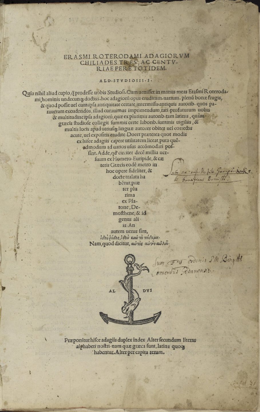
Detail from Adagia, printed by Aldine Press, 1508, the opening page shows the Aldine Press signature printing mark—the dolphin and anchor—which was based on an ancient Roman coin given to Aldus Manutius by the Italian scholar and poet Pietro Bembo.
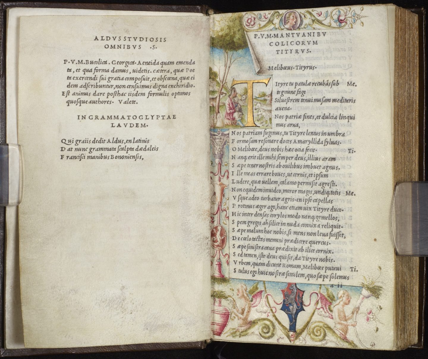
The 1501 Aldine Virgil, the first book printed entirely in italic type created by Griffo.
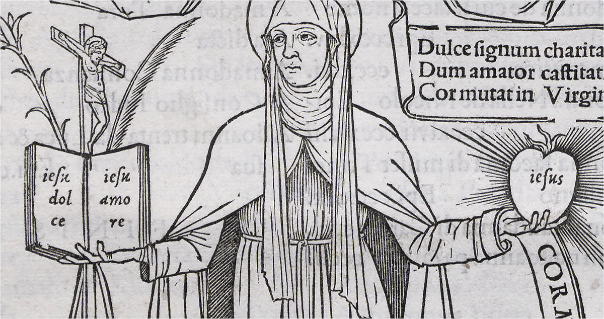
The words ‘jesu dolce, jesu amore’ printed in Griffo’s first italic type. Epistles of Saint Catherine, Aldus Manutius, Venice 1500.
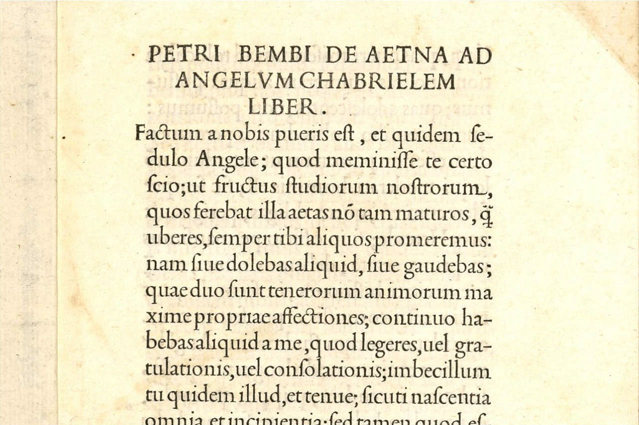
Pietro Bembo, Incipit of De Aetna ad Angelum Gabrielem liber, Venice, Aldine Press, 1495-1496. This publication features Griffo’s most celebrated typeface.
Experimental type by Geoffroy Tory.
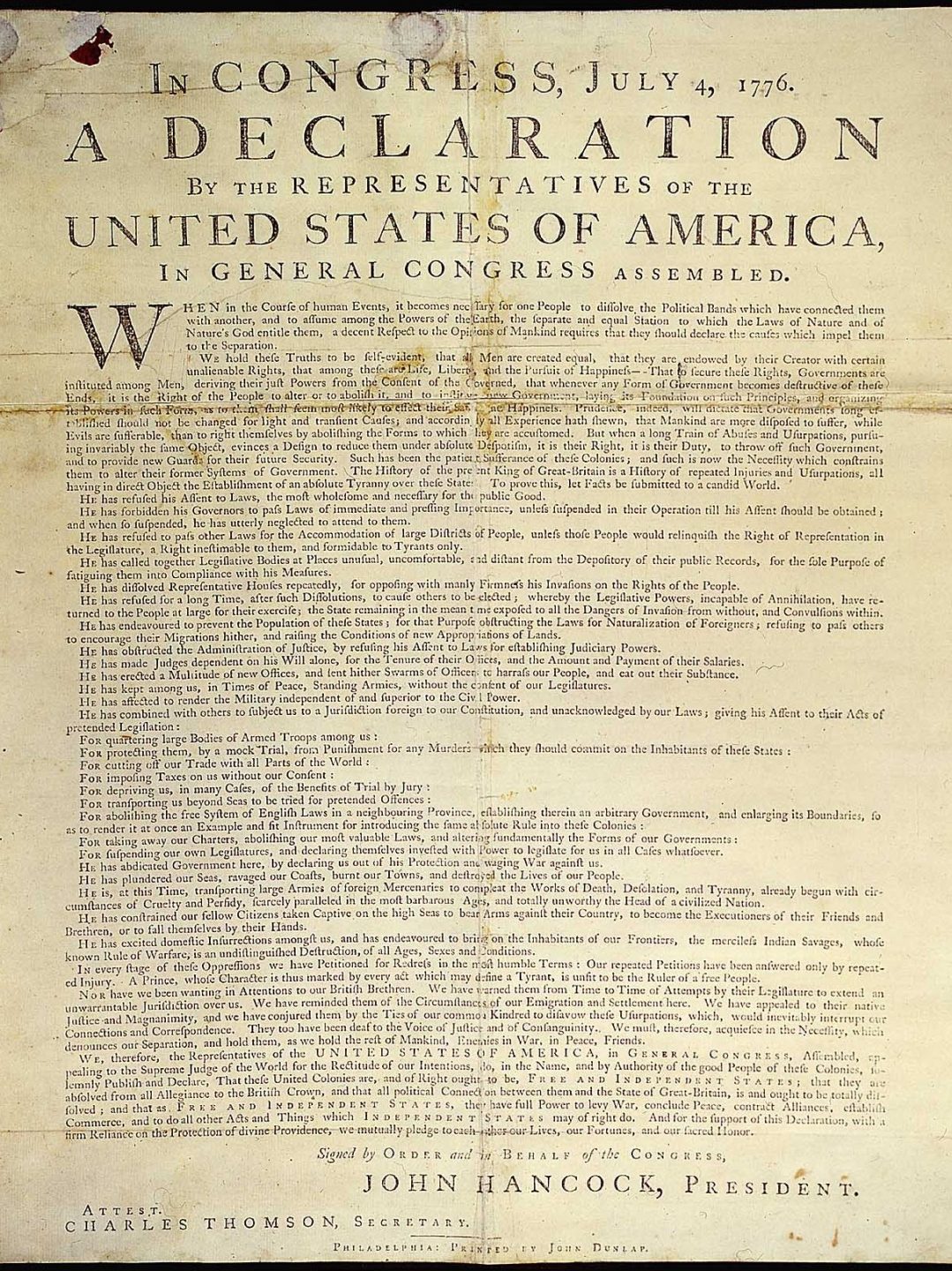
The Declaration of Independence set in Caslon.
Transitional
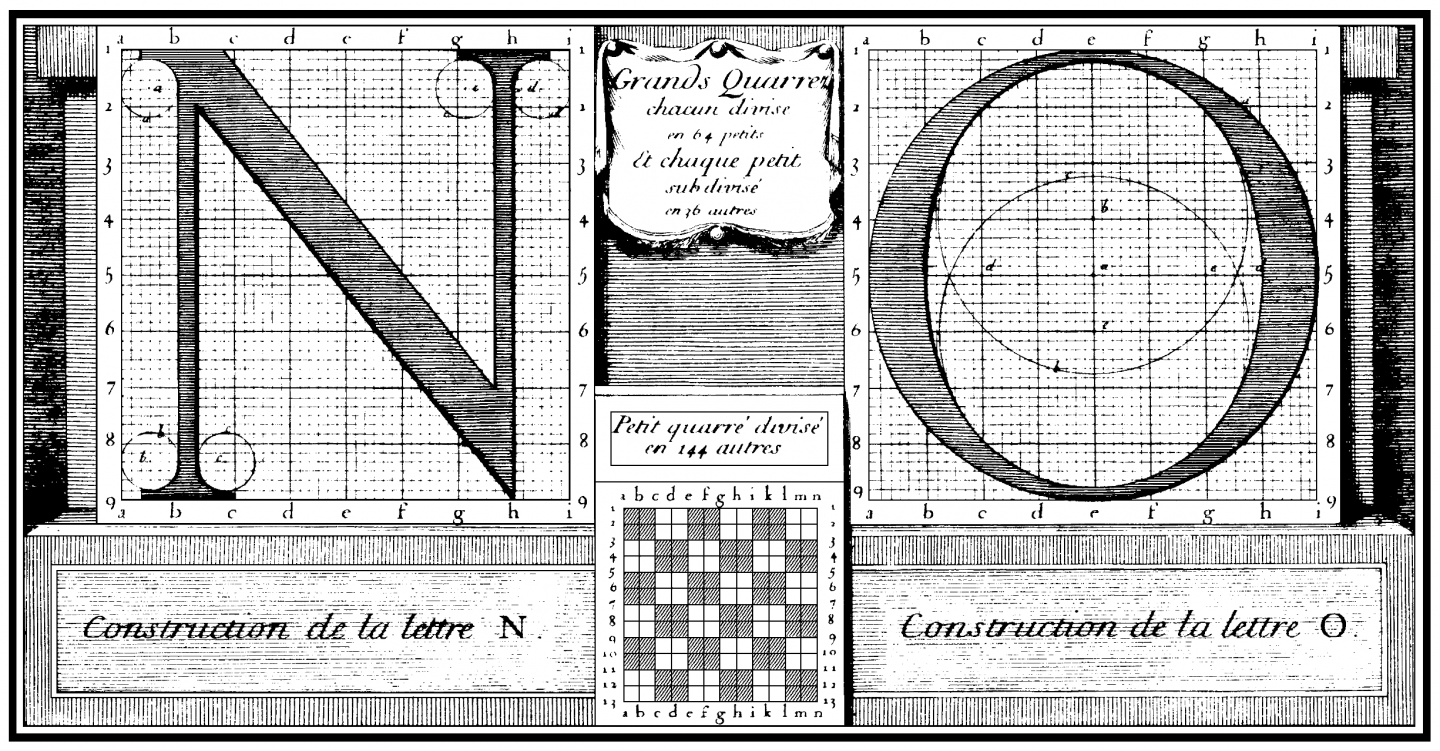
In 1692 The French King Louis XIV ordered scholars to develop a new type for the royal printing office in order to restore and elevate the quality of printing. This was after a period of decline in the standards of French printing and design in the early 1600’s.
The design of the new typeface was spearheaded by a mathematician named Nicolas Jaugeon and each letter was constructed using a grid of 2,304 squares. The new design was a further break from the original calligraphic reference point of letter-forms. The design was achieved by using drafting and measuring instruments and by incorporating optical aesthetic perception. The new face was called Romain du Roi and the Medailles portfolio was the first printed book featuring the type. Using the typeface for any application outside of the royal office was a criminal offense.
The Romain du Roi is the first example of what is called the transitional style. The transitional style marks a break with old style fonts which have calligraphic qualities, near consistent stroke weight, and bracketed serifs. The Romain du Roi is a turning point in type design in which the calligrapher is replace by the engineer as the dominant typographic influence.
Characteristics of Transitional Type:
• first example is the Roman du Roi of 1692
• complete break with calligraphy
• grid and mathematics as the foundation for structure
• completely perpendicular structure
• high contrast, thick and thin strokes
Rococo in France
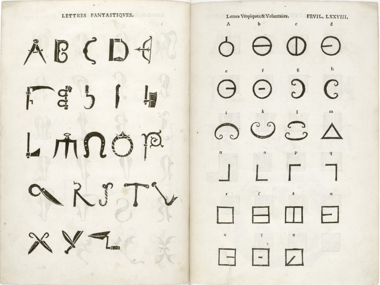
The style of French design, art and architecture that flourished during the 1700’s is called Rococo and is defined by it’s lavish ornamental style full of flowery forms and delicate scrollwork.
Pierre Simon Fournier le Jeune at the age of twenty four established an independent foundry where he created a fanciful style that incorporated countless decorative fleurons—flower shaped ornaments and intricate decorative typefaces which included visually fourishes like vines, outlines and shaded areas. Fournier also created a point system for typographic measurement and standardization that was widely used during his lifetime.
The Rococo style mirrors, in it’s maximalist utilization of ornament and flourish, the extravagant lifestyles of the wealthy Parisians of the era. Their lives of excess contrast sharply with the experience of the poverty stricken masses of the time. This sharp contrast between the rich and the poor eventually led to a revolt against the monarchy—The French Revolution of 1789. After the fall of the ruling class, the Rococo style, with it’s visual opulence and fanciful refinement immediately fell out of
The Innovations of Baskerville
Born in Birmingham England in 1707, John Baskerville first made his fortune in manufacturing. At the age of 44 he began to experiment with printing and type design. His typefaces represent the high point of the transitional style. With expanded contrast between thick and thin, wider letter-forms, and a refined approach to the structure of serifs, his fonts have a visual look that is elegant, light, and refined. His approach to book layout is open and spacious—he is one of the first designers to use whitespace as a visual element.
He also developed a new approach for paper making. He created sheets that were smoother and glossier than any paper used before by creating a finer mesh to be used in the paper making process and a hot press of copper rollers to smooth out the paper’s surface.
He became the printer for the University of Cambridge in 1758. His first edition of the King James Bible, printed in his own typeface on fine paper, is a monument of stately design and functional clarity.
Romain du Roi copperplate engraving, 1692-1702.
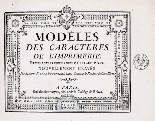
Pierre Simon Fournier Specimen, 1742.
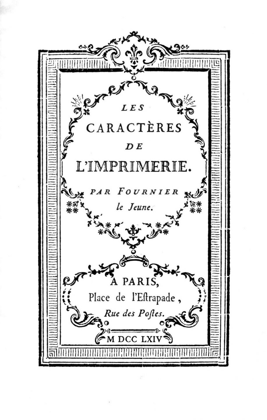
Page from Pierre Simon Fournier’s 1764 publication Les Caractères de l’Imprimerie.
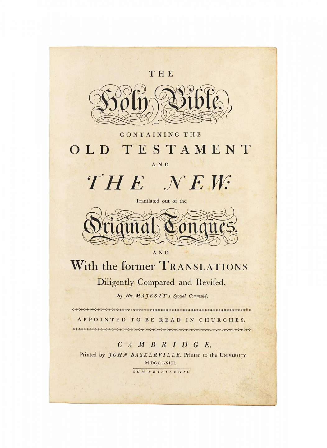
Title page from John Baskerville’s Holy Bible, 1763.
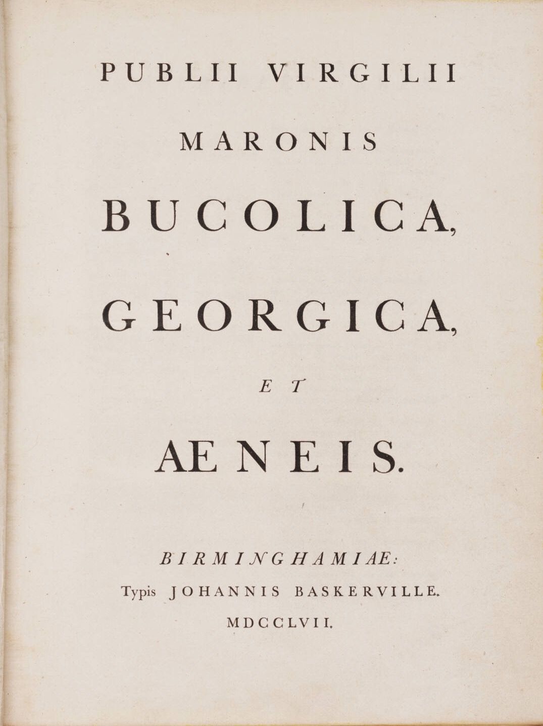
1757 edition of Publii Virgilii Maronis Bucolica, Georgia, et Aenis, printed in Birmingham by John Baskerville.
Modern
Giambattista Bodoni,born in Northern Italy, was trained as a punch-cutter and printer in Rome. When his mentor committed suicide, Bodoni left Rome with hopes of traveling to England to work for John Baskerville. Before his journey, while visiting his parents, he was asked to run the royal press in Parma, Italy in 1768. He accepted the offer and became the official printer of the court.
In the beginning, he was heavily influenced by the Rococo style of Pierre Simon Fournier. After the French revolution, Rococo design was looked down upon. Bodoni began to develop a more distinct style of page layout and eventually type design. His letter-forms are the beginning of what is known as the modern style.
The Didot’s were a family of French printers, punch-cutters and publishers whose studio was located in Paris. Pierre Didot and Firmin Didot took over the family businesses—Pierre lead the printing office and Firmin oversaw the type foundry.
The Didot’s used the work of Fournier as a foundation from which they created higher contrast, more stylized letter-forms. The work of Firmin Didot is specifically considered one of the initial examples of the Modern style.
Characteristics of Modern Type:
• first examples are the work of Giambattista Bodoni and Firmin Didot
• high contrast
• unbracketed serifs
• vertical axis
• extreme stylization
• thin horizontal strokes
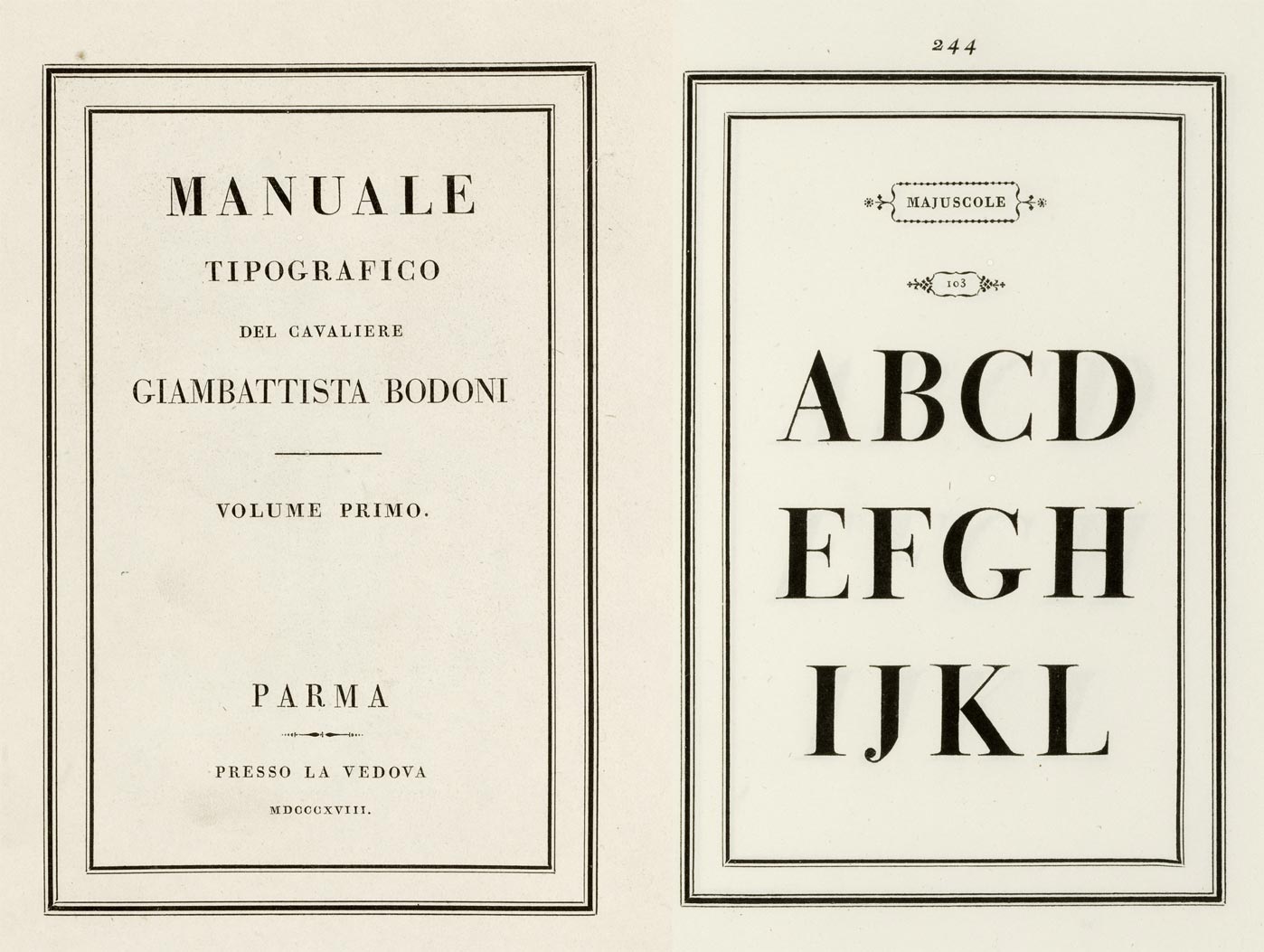
Pages from Giambattista Bodoni’s Manuale Tipografico of 1818.
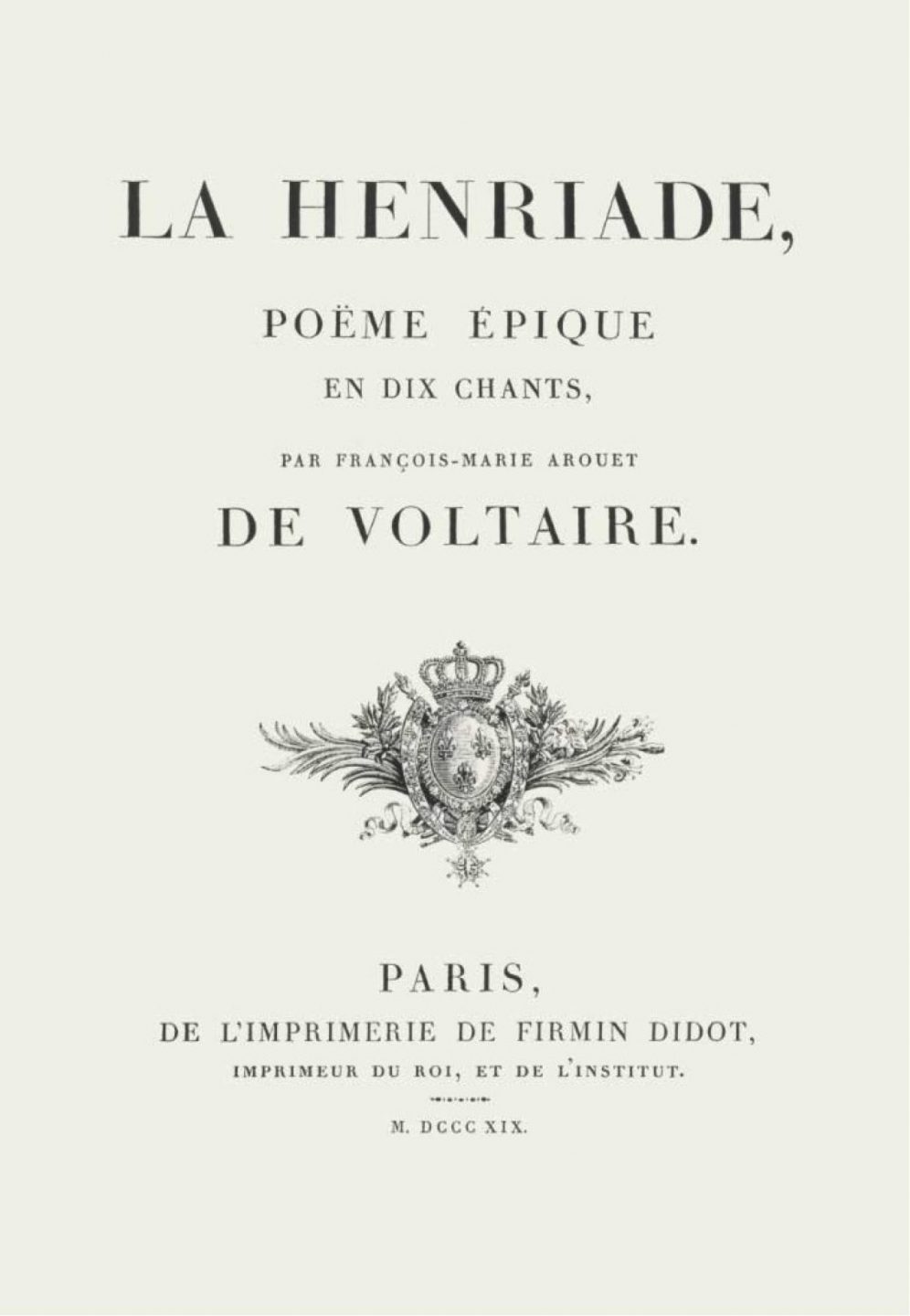
La Henriade, Poeme epique en dix chants, de Voltaire, Firmin Didot, 1819.
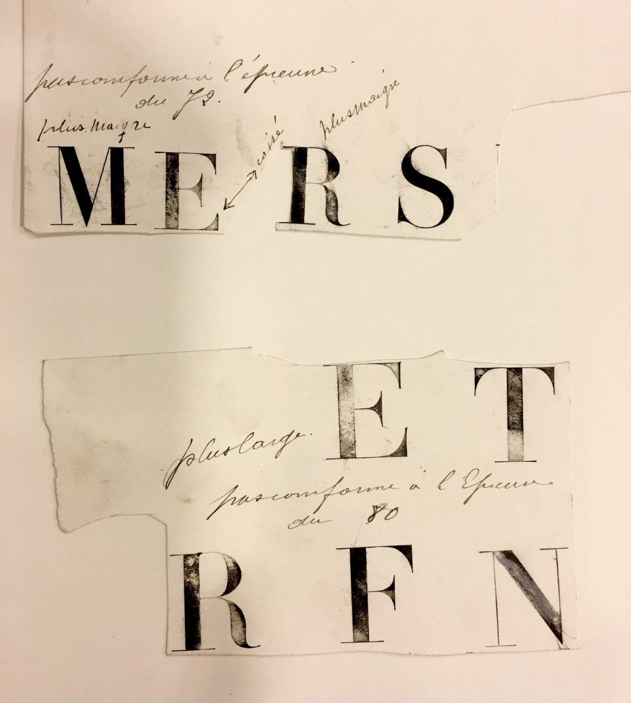
Proofs made from Didot punches along with design comments.
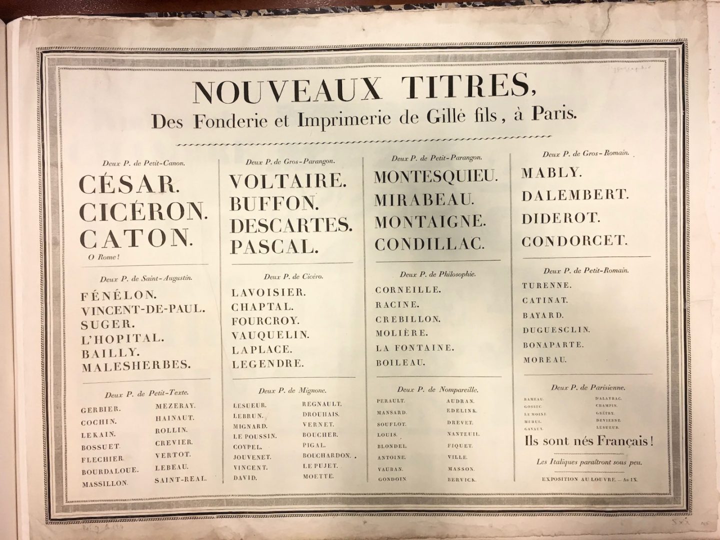
Page from a Joseph Gillé type specimen, 1808.
The Industrial Revolution
The expanding technology of printing in Europe, the invention of the steam engine, the age of enlightenment, and advances in the production of iron and steel are all factors that contributed to the Industrial Revolution.
During this time, advances and innovations built on one another as people from all fields began to collaborate and connect within new industries and methods of production. Important developments like photography, the x-ray, the telephone, the automobile, the airplane, and countless other inventions appeared during this time. There was an influx of new ideas, new products, and new methods of selling the resulting commodities. The world of marketing had arrived.
Within this filed of marketing, type began to appear at larger sizes. In order to give visibility and prominence to the message it was sending or the goods and services it was selling, type kept getting bigger, louder, and more graphic. Type designers and type setters had a new inspiration and impetus from which to work — to create type that was big, bold, and eye catching.
The approach of using type as an image arose out of this new space of marketing and advertising. Advertisements began appearing within the physical environment in the form of posters, billboards, signs, broadsides, and publications.
To accommodate these new spaces, type designers kept inventing new and more dynamic faces to grab attention. By the industrial revolution, the process of printing had not changed that much since Gutenberg’s original method. Cast metal type was still the prevailing method for printing. The metal would get brittle and break if used at too large a size.
In 1827, Darius Wells perfected a method for carving type out of wood when he developed a lateral wood router—a machine that could quickly carve intricate forms out of wood. This method allowed for the creation of type at extremely large size. The resulting format of wood-type posters became a dominant visual medium for advertisements of the era. The posters most often combined large wood type letter-forms with the smaller cast metal type that was already in use.
In the midst of all these new letterforms, another style of type quietly made its debut. In 1816, in the specimen sheet of William Caslon IV featured one of the first known instances of a san serif printing type. The san serif style gradually grew in popularity due to its clarity and legibility. San serif typefaces became an ideal choice for posters and broadsides which were read at a distance. It wasn’t until 1900 that a san serif would be used for running text by the designer Peter Behrens in his seminal publication Celebration of Life and Art.
Steam Powered Type
Up until the 1800’s, the presses were not that different from the one Gutenberg first developed. The steam powered press first developed in 1810 and by 1830 it could print 4,000 impressions an hour compared to the 250 impressions printed per hour through a hand press.
In 1886, Ottmar Mergenthaler created the linotype machine. The machine had a typewriter like keyboard of over ninety buttons which activated brass matrices that were negatives. These components joined together to create lines of type. Once the desired combination was set, hot molten lead was poured into the brass forms to create a line of raised letter-forms. This invention made printing cheaper and faster leading to the expanded publication of books, magazines, and newspapers. More people were able to access more printed materials.
Example of wood-type letterforms.
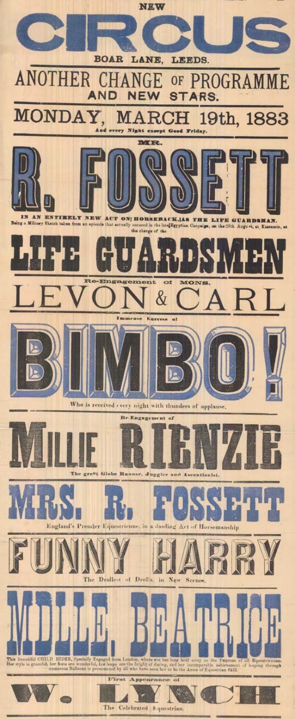
Wood-type poster from 1883.
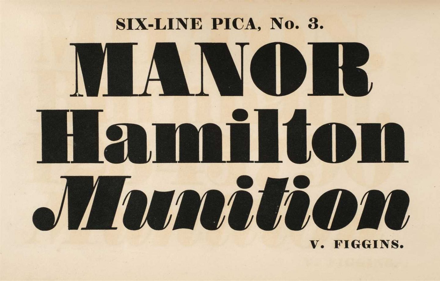
Fat Face specimen from Vincent Figgins, London, 1830’s.
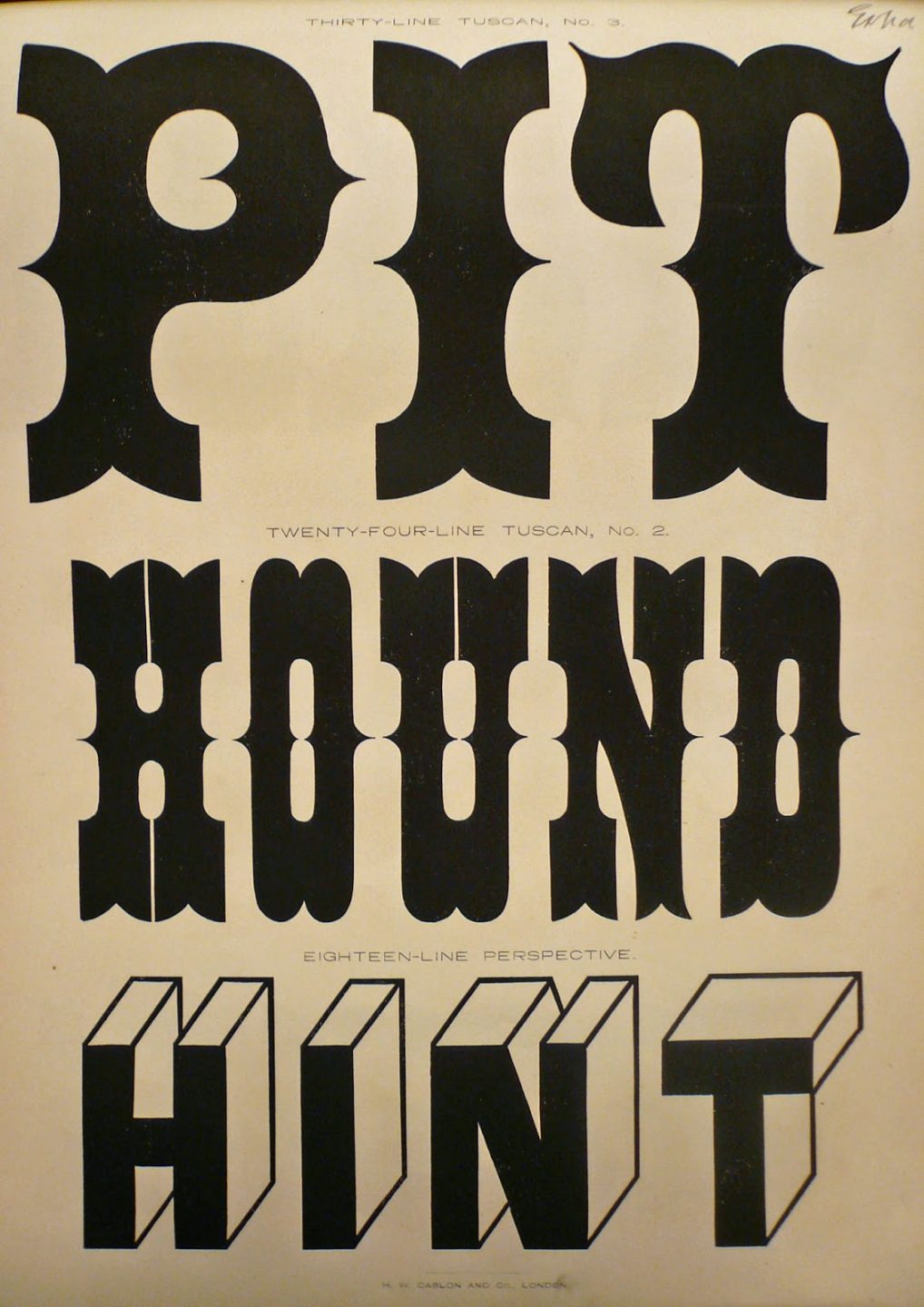
Page from a wood-type specimen book from H.W. Caslon and Co., London.
The first san serif appeared in the specimen book of William Caslon IV in 1816.
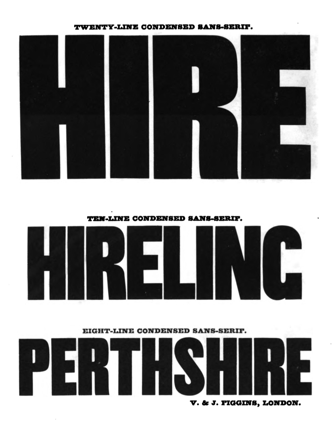
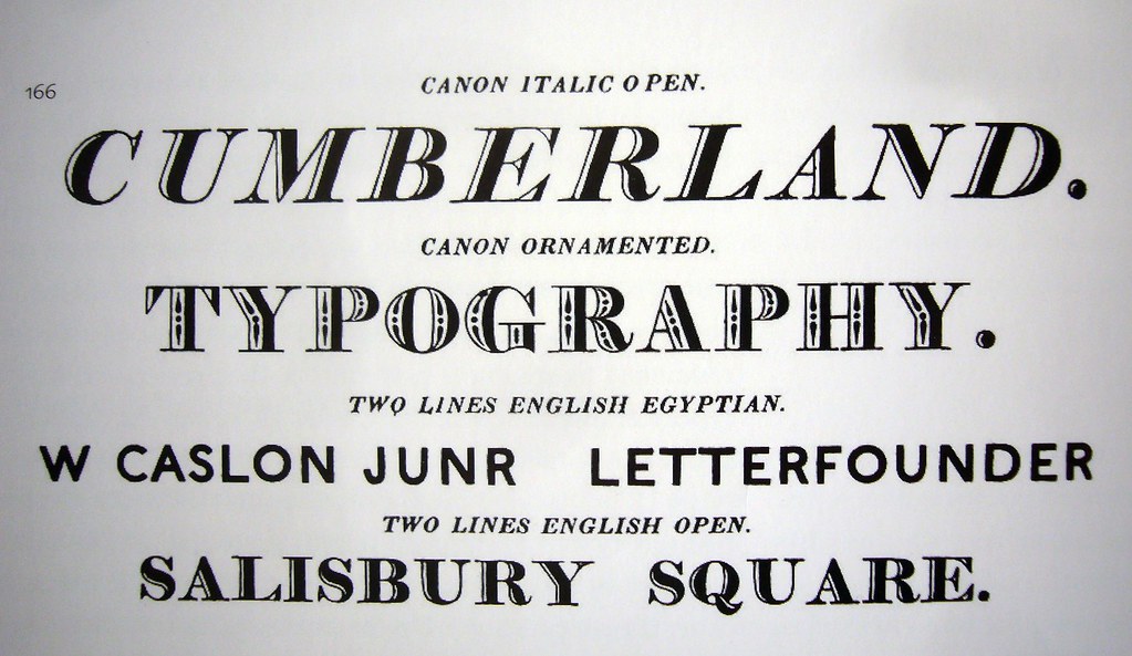
Condensed sans-serifs from the 1845 specimen of Vincent Figgins. By this time his sons were running the company.